Driving traffic to your website is only half the battle. The real challenge, and where sustainable growth lies, is converting those visitors into loyal customers. If your analytics show high traffic but disappointingly low sales or leads, it's a clear sign that you need to focus on optimizing the user journey. This is where Conversion Rate Optimization (CRO) comes in. It's not about guesswork; it's a data-driven discipline focused on understanding user behavior and systematically improving every touchpoint to maximize performance.
Effective CRO involves a structured approach to identifying friction points and testing solutions. For a deeper dive into the overall methodology, you can explore various strategies to improve website conversion rate before diving into our specific tactics. In this comprehensive guide, we will explore 10 high-impact conversion rate optimization strategies that go beyond the basics.
From A/B testing frameworks used by industry leaders to sophisticated personalization techniques, these actionable insights, like those we implement for our clients, will provide you with a clear roadmap. You will learn how to turn your website into a powerful conversion engine and achieve measurable business growth, transforming clicks into tangible revenue. Let's get started.
1. A/B Split Testing: The Foundation of Data-Driven Decisions
A/B testing, also known as split testing, is a methodical approach to compare two versions of a webpage or app element to determine which one performs better. It is one of the most fundamental conversion rate optimization strategies because it replaces guesswork with statistical evidence, allowing you to make confident, data-backed improvements. The process involves creating a variation (Version B) of an existing page element (Version A, the control) and showing each version to a different segment of your audience simultaneously.
By tracking which version achieves your goal, like a form submission or a product purchase, you can definitively identify the more effective design. For instance, SaaS giant HubSpot famously increased sign-ups by 24% just by testing a red call-to-action (CTA) button against a green one. This demonstrates that even minor adjustments, when validated through testing, can yield significant performance gains.
The A/B Testing Workflow
The core of successful A/B testing is a structured process. It begins with a clear hypothesis, such as "Changing the CTA button text from 'Submit' to 'Get My Free Quote' will increase form completions because it better reflects user intent." From there, you isolate that single variable and run the test.
This infographic outlines the simple, three-step workflow at the heart of every A/B test.
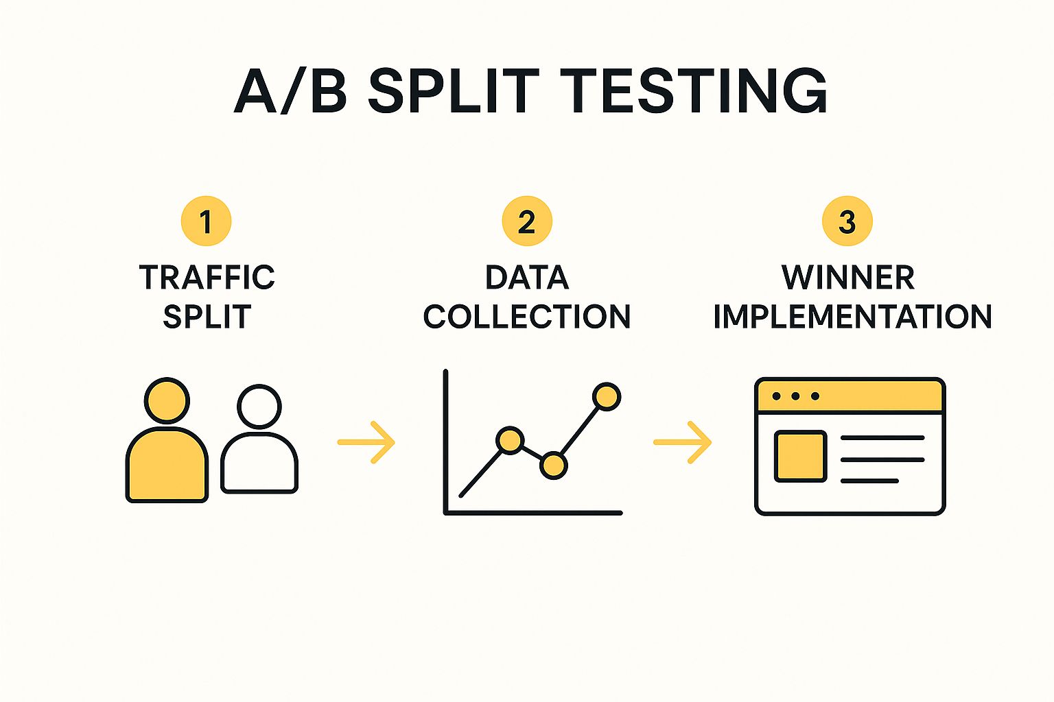
Following this sequence ensures that visitor traffic is evenly distributed, data is collected reliably, and the winning variation is implemented to capture its full conversion lift.
Actionable Tips for Effective Testing
To get clean, actionable data from your tests, adhere to these best practices:
- Isolate Variables: Test only one element at a time (e.g., headline or button color, not both) to know exactly what caused the change in performance.
- Ensure Statistical Significance: Use a large enough sample size to trust your results. A test result with 95% or higher statistical confidence is the industry standard.
- Run Full Business Cycles: Let tests run long enough, typically at least one to two weeks, to account for fluctuations in traffic behavior on different days.
2. Landing Page Optimization: Designing for a Single Purpose
Landing page optimization is a powerful conversion rate optimization strategy that involves creating dedicated, standalone web pages designed for a specific campaign or offer. Unlike a homepage with dozens of links and distractions, a landing page focuses a visitor's attention on a single goal, such as signing up for a webinar, downloading an ebook, or requesting a quote. This focused approach eliminates decision fatigue and guides users directly toward the desired action.
By creating a seamless experience from ad click to conversion, you can significantly boost performance. For example, by using simple, benefit-driven landing pages, Slack achieves an impressive 32% conversion rate for its free trials. This demonstrates how removing navigation and other distractions keeps visitors locked in on the value proposition.

The Landing Page Optimization Workflow
The core principle is message match: the promise made in your ad, email, or social media post must be instantly reflected on the landing page. This builds trust and orients the visitor immediately. From there, the page's design, copy, and form work together to persuade the user to act. This focused journey from click to conversion is why specialized landing pages consistently outperform generic website pages for paid campaigns.
Actionable Tips for Effective Landing Pages
To build landing pages that convert, implement these proven tactics:
- Match Headlines to Ad Copy: Ensure your landing page headline directly mirrors the language in the ad that brought the visitor there.
- Use Compelling Above-the-Fold Content: Place your unique value proposition, a captivating image or video, and your primary call-to-action where users can see them without scrolling.
- Include Social Proof and Testimonials: Build credibility with logos of well-known clients, customer quotes, or case study statistics.
- Optimize Form Fields: Only ask for the information you absolutely need. Reducing the number of fields can dramatically decrease friction and increase submissions.
3. Call-to-Action (CTA) Optimization: Guiding Users to Action
Call-to-Action (CTA) optimization is a critical conversion rate optimization strategy that focuses on refining the buttons, links, and text that prompt users to take a specific action. An effective CTA acts as a clear signpost, guiding visitors toward a conversion goal like making a purchase, signing up, or downloading a resource. It combines persuasive copywriting, strategic visual design, and thoughtful placement to eliminate friction and motivate users to click.
This strategy is powerful because CTAs are the final gateway to conversion. For example, by simply changing its button text from the generic "Order Information" to the benefit-driven "Get My Free E-Book," ContentVerve saw a 90% increase in clicks. This highlights how small tweaks to copy and design can produce dramatic improvements in user engagement and conversion rates.

The CTA Optimization Workflow
Successful CTA optimization is a continuous cycle of analysis, hypothesis, and testing. It begins by identifying underperforming CTAs through analytics and heatmaps. You then form a hypothesis about why it’s failing, such as "The button color doesn't create enough visual contrast, causing users to overlook it." Based on this, you design and test a variation to validate your assumption and improve performance.
This iterative process ensures every element of your CTA, from its color to its copy, is fine-tuned to maximize clicks. Implementing a clear and compelling CTA is a direct lever you can pull to increase leads and sales.
Actionable Tips for Effective CTAs
To create CTAs that convert, focus on clarity, urgency, and value. Follow these best practices to get started:
- Use First-Person Language: Frame the action from the user’s perspective. "Get My Free Trial" often outperforms "Get Your Free Trial" because it fosters a sense of ownership.
- Create Visual Contrast: Ensure your CTA button stands out from the surrounding page elements. Use a bold, contrasting color that draws the eye without clashing with your brand palette.
- Emphasize Benefits, Not Actions: Instead of generic commands like "Submit" or "Download," focus on what the user gets. "Join Free for a Month" is far more compelling than "Register."
4. Social Proof Implementation
Social proof is a powerful psychological principle where people assume the actions of others reflect correct behavior in a given situation. As a conversion rate optimization strategy, it involves showcasing evidence that other people trust and value your brand. By displaying testimonials, reviews, user counts, and expert endorsements, you reduce customer friction and build credibility, assuring new visitors that they are making a wise choice.
This strategy taps into a fundamental human need for validation, making it an essential tool for overcoming purchase anxiety. For example, Basecamp famously increased trial sign-ups by 102% by prominently featuring logos of well-known customers on its homepage. This single change provided instant third-party validation, encouraging new users to sign up with confidence.

Leveraging Social Proof Effectively
The key to successful social proof is authenticity and relevance. Simply having a testimonial isn't enough; it needs to resonate with your target audience and feel genuine. You can showcase user-generated content, display real-time activity notifications like "25 people are viewing this now," or feature detailed case studies.
The goal is to provide tangible evidence that people like your prospective customers have found success with your product or service. This proof of concept is often the final nudge a user needs to convert.
Actionable Tips for Implementation
To maximize the impact of your social proof efforts, focus on these best practices:
- Showcase Specifics: Use testimonials that include real names, photos, and specific results. A quote like "We increased lead generation by 45% in three months" is far more compelling than "Great service."
- Use Real-Time Data: Integrate tools that show recent purchases, sign-ups, or active user counts to create a sense of urgency and popularity.
- Highlight Authority: Display industry certifications, awards, or positive media mentions. This form of "expert social proof" builds immense trust and positions your brand as a leader.
5. Form Optimization: Streamlining the Path to Conversion
Form optimization is a critical conversion rate optimization strategy focused on simplifying the user's data submission journey. Every field in a form presents a potential point of friction, and by reducing that friction, you can dramatically increase completion rates. This process involves scrutinizing every element, from the number of fields and their labels to the layout and submission button, to eliminate barriers that cause users to abandon the process.
The goal is to make filling out the form feel effortless and intuitive. For example, travel giant Expedia famously increased annual profits by $12 million simply by removing one optional field ("Company Name") from its booking form. This proves that even seemingly minor adjustments to your forms can lead to massive gains in revenue and lead generation. Similarly, ImageScape boosted its conversions by 120% after replacing a long, intimidating form with a user-friendly multi-step version.
Key Principles of High-Converting Forms
A successful form guides the user seamlessly from start to finish. It begins with asking for only what is absolutely necessary, progressively capturing more information if needed. The design should feel clean, logical, and reassuring.
Pioneered by web design experts like Luke Wroblewski, modern form design prioritizes the user experience above all else. By reducing cognitive load and building momentum, you encourage more users to complete the desired action.
Actionable Tips for Form Optimization
To turn your forms into conversion machines, implement these best practices:
- Minimize Fields: Only ask for essential information. You can always gather more data later. For instance, start with just an email address for a newsletter sign-up.
- Use Smart Defaults and Autofill: Pre-populate fields with known information or leverage browser autofill to save users time and effort.
- Break Long Forms into Steps: For complex data collection like quotes or registrations, use a multi-step format with a progress bar to make the task feel less daunting.
- Implement Inline Validation: Provide real-time feedback as users fill out fields, telling them immediately if their input is valid or incorrect, which prevents frustrating submission errors.
6. Page Load Speed Optimization
Page load speed optimization is the technical process of reducing the time it takes for a webpage to become fully visible and interactive for a user. In today's fast-paced digital environment, speed is no longer a luxury, it's a critical component of user experience and a powerful conversion rate optimization strategy. Slow-loading pages frustrate visitors, leading directly to higher bounce rates, abandoned shopping carts, and a negative brand perception. Even a one-second delay can significantly impact your bottom line.
The proof is in the data. Major retailers have quantified the immense value of speed: Walmart saw a 2% conversion rate increase for every one-second improvement in load time, while AutoAnything boosted sales by over 12% after cutting its page speed in half. These examples show that optimizing for speed is a direct investment in revenue generation, as it ensures users can access your value proposition without friction.
Why Speed Is a Conversion Killer (or Booster)
A slow website fundamentally disrupts the user journey. It creates uncertainty and friction at the most critical moments, such as when a customer is about to make a purchase or fill out a lead form. Conversely, a fast, responsive site builds trust and keeps users engaged, making them more likely to convert. Optimizing speed addresses user impatience and meets the high expectations set by search engines like Google, which use page speed as a key ranking factor.
Actionable Tips for Faster Load Times
To get tangible results from your speed optimization efforts, focus on these high-impact actions:
- Compress and Optimize Images: Use tools to reduce image file sizes without sacrificing quality before uploading them to your site. This is often the biggest and easiest win.
- Enable Lazy Loading: Configure images, videos, and even content sections "below the fold" to load only as the user scrolls down the page.
- Minimize Code: Use tools to minify HTML, CSS, and JavaScript files, which removes unnecessary characters and comments from the code to shrink its size.
- Leverage Browser Caching: Instruct browsers to store static files (like your logo and CSS files) locally, so repeat visitors don't have to re-download them every time.
7. Mobile Optimization: Capturing the On-the-Go Customer
Mobile optimization is the practice of ensuring your website delivers an excellent user experience on smartphones and tablets. With mobile devices now driving the majority of web traffic, this is no longer an optional tactic but a core component of any effective conversion rate optimization strategy. It involves more than just a responsive layout; it means tailoring the entire user journey, from navigation to checkout, for the unique context of a mobile user.
This approach acknowledges that mobile users behave differently. They often have less time, are easily distracted, and use touch-based navigation. For instance, Flipkart, a major e-commerce player, saw its conversions increase by a staggering 70% after implementing a mobile-first design philosophy. This proves that a seamless mobile experience directly translates into significant revenue growth by removing friction for a huge segment of your audience.
The Mobile-First Workflow
A successful mobile optimization strategy prioritizes the mobile experience from the very beginning of the design and development process. Instead of designing for a large desktop screen and then trying to shrink it down, you start with the smallest screen and scale up. This "mobile-first" approach, championed by experts like Luke Wroblewski, forces you to focus on core content and functionality, resulting in a cleaner, more efficient experience across all devices.
This workflow ensures that essential features are prominent and accessible, load times are minimized, and navigation is intuitive for touch-based interaction, creating a foundation that performs better for everyone.
Actionable Tips for Mobile Excellence
To transform your mobile traffic into conversions, implement these best practices:
- Design for Thumbs: Place key navigation elements and call-to-action buttons within the easy reach of a user's thumb.
- Simplify Forms: Reduce the number of form fields and use mobile-friendly inputs (e.g., numeric keypads for phone numbers) to streamline data entry.
- Optimize for Speed: Compress images and leverage browser caching to ensure your pages load quickly, as mobile users are particularly impatient with slow sites.
- Increase Touch Target Size: Make buttons and links large enough to be easily tapped without accidental clicks, improving usability and reducing frustration.
8. Personalization and Dynamic Content
Personalization is a powerful conversion rate optimization strategy that involves tailoring content, offers, and user experiences to individual visitors. By leveraging user data like browsing history, location, or past purchases, you can replace generic content with dynamic elements that adapt in real-time. This creates a more relevant and engaging journey, making visitors feel understood and valued, which directly boosts conversion rates.
This approach goes beyond simply using a visitor's first name in an email. It’s about creating a fundamentally different experience for different user segments. For instance, e-commerce titan Amazon attributes up to 35% of its sales to its recommendation engine, a prime example of personalization in action. Similarly, Netflix's personalization algorithm is estimated to save it over $1 billion annually by reducing customer churn. These examples show how customized experiences are central to modern digital success.
Implementing Personalization Effectively
The journey into personalization begins with data. By collecting and analyzing first-party data, you can understand user behavior and segment your audience into meaningful groups. You can then serve dynamic content, such as custom headlines, unique product recommendations, or geographically relevant offers, to each segment. This targeted method ensures that every user sees the most compelling version of your site.
For example, a visitor from a cold climate could be shown winter coats on an apparel homepage, while a visitor from a warm climate sees t-shirts. This simple adjustment, powered by dynamic content, makes the user experience immediately more relevant and is a cornerstone of effective personalization.
Actionable Tips for Personalization
To get the most out of your personalization efforts, follow these best practices:
- Start Simple: Begin with basic segmentation based on factors like new vs. returning visitors or traffic source before moving to complex behavioral personalization.
- Leverage First-Party Data: Use data you collect directly from your audience for the most accurate and effective targeting.
- Test Everything: Always A/B test personalized content against a generic control version to prove its impact and measure ROI.
- Prioritize High-Value Segments: Focus your initial efforts on personalizing the experience for your most profitable customer segments or highest-traffic pages.
9. Exit-Intent Popups and Behavioral Triggers
Exit-intent technology is a powerful conversion rate optimization strategy designed to re-engage visitors just as they are about to leave your website. It tracks user behavior, such as mouse movements toward the browser's back or close button, and triggers a last-second popup or overlay. This gives you one final opportunity to present a compelling offer, capture an email address, or direct them to valuable content before they abandon your site for good.
This tactic is effective because it targets users at a critical moment of decision, aiming to recover potentially lost conversions. For example, popular tool Sumo helped AppSumo recover 15% of its abandoning visitors using this exact method. By presenting a targeted message, you can address common objections or provide an incentive that convinces them to stay and convert.
Triggering Popups Effectively
The success of this strategy hinges on triggering the right message at the right time. Exit-intent is just one type of behavioral trigger. You can also deploy popups based on scroll depth (e.g., when a user has scrolled 70% down a page), time on page, or even specific user actions. This ensures the message is relevant to the user's current engagement level.
These triggers allow you to segment your offers. A new visitor might see a welcome discount, while a returning visitor might see a notification about a new blog post. This level of personalization makes the interruption feel less like an advertisement and more like a helpful suggestion.
Actionable Tips for High-Converting Popups
To maximize effectiveness and avoid annoying your visitors, follow these best practices:
- Offer Genuine Value: Provide a compelling reason for them to act, like a discount, a free resource, or exclusive content.
- Use Clear Calls-to-Action: The popup’s purpose should be immediately obvious. Use strong, action-oriented headlines and button text.
- Ensure Mobile-Friendliness: Popups must be responsive and easy to close on smaller screens to avoid frustrating mobile users.
- Limit Frequency: Don't show the same popup to a visitor every time they visit. Use cookie settings to control how often they appear.
This approach is especially effective for building your mailing list, which is a crucial asset for long-term customer relationships. By capturing leads, you can continue the conversation and nurture them toward a sale. To discover more about turning these leads into loyal customers, you can explore our professional email marketing services.
10. Trust Signals and Security Optimization
Trust signals are visual and textual elements designed to build credibility and reduce visitor anxiety by demonstrating that your website is secure, reliable, and legitimate. This is a critical conversion rate optimization strategy because it directly addresses the subconscious fears that prevent users from making a purchase or submitting their information. By prominently displaying security badges, guarantees, and clear contact details, you overcome skepticism and build the confidence needed for conversion.
For example, Blue Fountain Media famously increased form conversions by 42% simply by adding a Verisign security badge to their page. Similarly, GoDaddy saw an 18% increase in sales after making their phone number more prominent, reassuring customers that real people were available to help. These examples show that making users feel safe is a direct path to higher conversions.
How to Build Credibility with Trust Signals
Building trust isn't about one single element but a combination of signals that reinforce your legitimacy. The goal is to create an environment where the user feels completely comfortable taking the next step, whether that's entering their credit card details or signing up for a newsletter. This involves a thoughtful placement of universally recognized symbols and transparent business information.
“Your website may have the best product in the world, but if visitors don’t trust you, they won’t buy it. Trust is the currency of the web.”
Implementing these signals near key decision points, like checkout forms or contact fields, can have a significant impact on user behavior.
Actionable Tips for Effective Implementation
To successfully integrate trust signals and boost user confidence, follow these best practices:
- Display Security Badges: Place recognizable logos like Norton Secured, McAfee Secure, or BBB near checkout areas and forms where sensitive information is collected.
- Provide Clear Contact Information: Showcase a physical address, a dedicated phone number, and an email address to prove your business is real and accessible.
- Showcase Guarantees: Clearly state any money-back guarantees, free return policies, or satisfaction guarantees to reduce perceived risk for the buyer.
- Leverage Social Proof: Use testimonials, case studies, and customer reviews to show that other people have had positive experiences with your brand.
For a deeper dive into securing your site, explore these web application security best practices to ensure your technical foundation supports your trust-building efforts.
Conversion Rate Optimization Strategies Comparison
| Strategy | Implementation Complexity 🔄 | Resource Requirements ⚡ | Expected Outcomes 📊 | Ideal Use Cases 💡 | Key Advantages ⭐ |
|---|---|---|---|---|---|
| A/B Split Testing | Medium - requires setup and traffic split | Moderate - needs traffic & analytics | Data-driven conversion improvements | Testing variations to optimize conversions | Reduces guesswork; statistical validation |
| Landing Page Optimization | Medium - design and development effort | Moderate - separate pages per campaign | Higher conversion rates; improved user flow | Campaign-specific landing pages | Increases focus; improves tracking |
| CTA Optimization | Low - simple design & placement tweaks | Low - quick to implement & test | Immediate increase in conversion rates | Optimizing buttons and calls to action | Low cost; fast impact |
| Social Proof Implementation | Low to Medium - content gathering effort | Low - content creation & management | Builds trust; boosts conversions | Adding testimonials, reviews, endorsements | Enhances credibility; reduces hesitation |
| Form Optimization | Medium - UX/UI design & technical tweaks | Moderate - development & testing | Higher form completion rates | Improving lead capture forms | Reduces friction; improves lead quality |
| Page Load Speed Optimization | High - technical expertise required | High - ongoing monitoring & tuning | Better user experience; SEO improvements | Performance-focused sites with traffic issues | Directly affects bounce rates & conversions |
| Mobile Optimization | Medium - responsive design & testing | Moderate - device testing & updates | Enhanced mobile conversions & usability | Mobile-heavy traffic sites | Captures mobile users; improves accessibility |
| Personalization & Dynamic Content | High - complex data analytics & ML | High - data, tools, compliance effort | Significantly higher engagement & conversions | Customizing user experiences | Increases relevance; improves ROI |
| Exit-Intent Popups & Behavioral Triggers | Low to Medium - trigger setup & design | Low - popup tools & A/B testing | Recovers abandoning visitors | Preventing cart abandonment & subscriber loss | Cost-effective; measurable uplift |
| Trust Signals & Security Optimization | Low - badge placement & content updates | Low to Moderate - certification costs | Increases purchase confidence & conversions | E-commerce and transactional sites | Builds credibility; reduces anxiety |
Conversions start with being found, and more buyers now begin inside AI assistants. An AEO audit shows how your business appears in AI search so you can capture demand before it reaches your site.
Start Optimizing: Your Path to Higher Conversions
You've just explored ten powerful conversion rate optimization strategies, from the foundational principles of A/B testing and landing page optimization to the nuanced tactics of personalization and social proof. While each strategy holds the potential to significantly boost your website's performance, the true key to success lies not in a single, magical fix but in cultivating an ongoing culture of data-driven improvement. The digital marketplace is dynamic; what works today may be less effective tomorrow. This is why consistent, iterative optimization is no longer optional—it's essential for sustainable growth.
From Insights to Action: Your Next Steps
The journey to higher conversions begins with a single, well-informed step. Don't feel overwhelmed by the need to implement everything at once. Instead, adopt a methodical approach by starting with your website's most critical friction points. Use analytics to identify pages with high traffic but low conversion rates, or where users frequently abandon their journey. Is it a confusing navigation menu? A lengthy checkout form? A slow-loading mobile experience?
Once you've identified a clear opportunity, select one of the conversion rate optimization strategies from this article that directly addresses the problem. Formulate a clear hypothesis, such as, "By reducing the number of form fields from seven to four, we can increase form submissions by 15%." This creates a measurable goal and a clear path for your first test. This process of hypothesizing, testing, and analyzing moves you from guesswork to strategic decision-making, ensuring every change is a step toward a more effective and profitable website.
The Lasting Impact of a CRO Mindset
Mastering these concepts transforms your relationship with your website. It becomes a living, evolving asset that you can continually refine to better serve your audience and achieve your business objectives. Each optimized call-to-action, every millisecond shaved off your page load time, and each trust signal you add contributes to a smoother, more persuasive user experience. This not only increases immediate conversions but also builds long-term customer loyalty and brand credibility.
For those running e-commerce stores on platforms like Shopify, these principles are particularly vital. To dive deeper into specific tactics and real-world examples tailored for online retailers, explore a comprehensive guide to Shopify conversion rate optimization strategies. Remember, every improvement, no matter how small it may seem, is a direct investment in your bottom line.
By consistently applying these conversion rate optimization strategies, you empower your business to adapt, thrive, and ultimately, win in a competitive digital landscape. The path is clear: start testing, start learning, and watch your conversions climb.
Ready to turn your website into a powerful conversion engine but need a strategic partner to guide you? The team at Up North Media specializes in creating and executing tailored CRO roadmaps that deliver measurable results. Contact us for a free consultation and let's unlock your website's true potential together.