So, you want to lower your bounce rate. The goal is pretty simple: make sure your page's content and design match what visitors expect when they arrive. This means a fast-loading page, navigation that makes sense, and content that immediately solves the user's problem.
When you nail those things, you deliver a valuable user experience right from the get-go. And that’s what keeps people from bouncing.
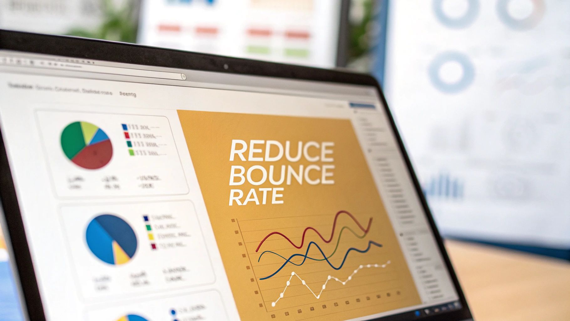
Why Visitors Leave and How to Fix It
A high bounce rate is a loud and clear signal that your page’s first impression fell flat. It’s a sign of a disconnect—what they thought they were getting isn't what you delivered. Think of it as a user voting with their "back" button. They landed, didn’t like what they saw or couldn't find what they needed, and left without a single click.
This isn’t just a vanity metric. It’s a direct reflection of your user experience, and the reasons people leave are almost always straightforward and fixable.
The Core Reasons for a High Bounce Rate
People will leave your site in a heartbeat for a few common reasons. A slow-loading page is probably the biggest offender; nobody has the patience to wait around anymore. Confusing navigation is another major culprit. If someone can't figure out where to go next, they'll just go somewhere else.
Other key factors that drive people away include:
- Content Mismatch: The page content doesn’t deliver on the promise of the headline or meta description that brought them in.
- Poor Mobile Experience: The site is a pain to use on a phone, with tiny text or buttons that are impossible to tap.
- Overwhelming Ads or Pop-ups: Aggressive pop-ups or a wall of ads can frustrate users before they even have a chance to see your content.
This infographic really captures the frustration a user feels when they hit a slow or poorly designed website, which is a huge driver of high bounce rates.
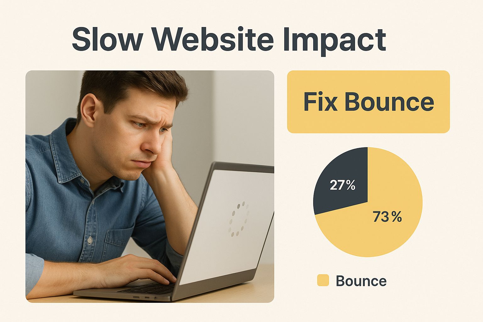
The image drives home an important point: the technical performance and usability of your site are the first hurdles you have to clear to keep visitors engaged.
Before you dive deep into fixes, it helps to have a quick reference for what might be going wrong. This table breaks down the most common issues I see and where to start looking for a solution.
Common Causes of High Bounce Rates and Initial Fixes
| Common Issue | Primary Cause | Quick Fix Suggestion |
|---|---|---|
| Slow Page Load Speed | Large, unoptimized images or heavy scripts. | Compress all images and enable browser caching. Use a tool like Google PageSpeed Insights to find the biggest culprits. |
| Confusing Navigation | Unclear menu labels or a cluttered site structure. | Simplify your main navigation menu. Make sure your most important pages are no more than two clicks away from the homepage. |
| Content Doesn't Match User Intent | Misleading title tags or meta descriptions. | Review your page titles and descriptions to ensure they accurately reflect the content on the page. Be direct and honest. |
| Poor Mobile Usability | A design that isn't responsive and breaks on small screens. | Use Google's Mobile-Friendly Test to identify specific issues. Focus on creating large, tappable buttons and readable text. |
| Aggressive Pop-ups or Ads | Intrusive interstitials that appear immediately on load. | Delay pop-ups to appear after a user has been on the page for at least 10-15 seconds or trigger them on exit intent. |
This table isn't exhaustive, but it's a solid starting point for diagnosing the most frequent problems. Tackle these first, and you'll likely see some immediate improvements.
Understanding Industry Benchmarks
It’s important to remember that a "good" bounce rate isn't a universal number; it can vary wildly depending on your industry. Knowing the benchmarks for your specific sector gives you a much better sense of how you're actually doing.
For example, finance websites often see an average bounce rate of around 51.71%, while automotive sites are slightly higher at 51.96%. Travel sites, another highly competitive area, hover around 50.65%. These numbers show that user behavior is different everywhere, and comparing yourself to an unrelated industry won't give you a useful picture.
To really get to the bottom of what's happening on your site, you need solid data. That's why one of the first and most critical steps is choosing the right ecommerce analytics software to track exactly how users are interacting with your pages. Without that data, you're just guessing.
Make Your Website Faster to Keep Visitors
In a world of instant gratification, a slow website is one of the fastest ways to kill a conversion. Nothing sends a visitor scrambling for the "back" button faster than a page that takes an eternity to appear. Site speed isn't just a technical metric; it's a core part of the user experience and has a huge impact on your bounce rate.

The link between page load time and people leaving your site is startling. When a page's load time goes from just one second to ten, the probability of a mobile visitor bouncing skyrockets by a staggering 123%. That data highlights a non-negotiable truth: users expect and demand speed.
Shrink Your Images Without Losing Quality
One of the most common culprits behind a slow site? Large, unoptimized images. A beautiful, high-resolution photo can weigh down your page, making it sluggish and frustrating for visitors, especially if they're on a phone.
The solution here is image compression. This process shrinks the file size of your images, often without any noticeable drop in visual quality.
- Lossy Compression: This method dramatically reduces file size by removing some data from the image file. For most web uses, you'd never be able to tell the difference.
- Lossless Compression: This technique reduces file size without removing any data, which means the file is a bit larger but the quality is perfect.
Using tools or plugins to automatically compress images and convert them to modern formats like WebP can make a massive difference.
Give Returning Visitors a Fast Pass
Browser caching is like giving a returning visitor a VIP pass to your website. The first time someone visits, their browser has to download everything—images, scripts, and stylesheets. Caching tells the browser to store these files right on the user’s device.
When that person comes back, their browser doesn't need to re-download all that stuff. It just loads the files it already saved, making the page appear almost instantly. This simple tweak provides a much better experience for repeat visitors.
What is a Content Delivery Network (CDN)?
Imagine your website is hosted on a server in New York. When someone from Tokyo tries to visit, the data has to travel across the globe, causing delays. A Content Delivery Network (CDN) solves this problem by creating a global network of servers.
A CDN stores copies of your website's static files (like images and code) in multiple locations worldwide. So, when that visitor from Tokyo accesses your site, the CDN delivers the content from the closest server—maybe one in Japan—instead of the original one in New York. This geographical shortcut significantly cuts down loading times for a global audience.
There are many practical strategies to improve website loading speed that can make a real difference. For an even deeper dive, check out our comprehensive guide for more in-depth website performance optimization tips.
Create a Content Journey People Want to Follow
Having a fantastic piece of content that solves a user's problem is great, but if it's just sitting there on an island, you're missing a huge opportunity. You've failed to show them what else you've got. The single best way to slash your bounce rate is to give every visitor a clear, compelling reason to click deeper into your site.
It's all about turning a single page view into an intentional journey. This goes way beyond just sprinkling a few internal links here and there. You need to strategically guide each visitor to their next logical step. Think of your website as a helpful guide, always one step ahead, anticipating their next question and pointing them to the answer before they even think to ask.
Make Your Content Easy to Scan
Before anyone decides to commit, they scan. It's just human nature. If they land on your page and are met with a dense wall of text, their brain immediately signals "too much work," and they're gone. Simple formatting is your most powerful weapon here.
Your goal is to make the page feel effortless to read. You can pull this off with a few simple tweaks:
- Use Short Paragraphs: Seriously, keep paragraphs to three sentences, max. This creates welcome white space and makes the whole page feel less intimidating.
- Leverage Subheadings: Break up long-form content with clear, descriptive H3 and H4 headings. This acts like a table of contents, helping users jump right to the info they care about most.
- Incorporate Bullet Points: Lists are your best friend for breaking down complex ideas or steps into a digestible, scannable format.
These small changes make your content far more approachable. They encourage people to stick around long enough to actually find a reason to click through to another page.
Guide Users with Strategic Linking
Once your content is scannable, the next job is to build clear pathways for people to follow. You want every click to feel like a natural, helpful progression in their search for information.
A smart internal linking strategy is the foundation for keeping users engaged. Anytime you mention a related concept, link out to another article on your site that explores it in more detail. This doesn't just keep them on your site longer; it also cements your authority on the topic.
The connection between a low bounce rate and a high number of pages per visit is undeniable. You're not just trying to answer one question; you're trying to create a resource so valuable that users can't help but explore further.
This isn't just a theory; it's backed by data. A detailed analysis from Reboot Online looked at major global websites and found a clear inverse correlation between bounce rate and average pages per visit. Sites with the lowest bounce rates—some as low as 20.8%—consistently saw visitors browse 7-8 pages on average. At the other end of the spectrum, high-bounce-rate sites often lose visitors after just one or two pages.
Create Compelling Calls to Action
Finally, every single page on your site should have a clear purpose, communicated through a compelling call-to-action (CTA). A good CTA removes all the guesswork and tells the visitor exactly what to do next.
Ditch the generic "Click Here." Instead, use action-oriented language that spells out the value of taking that next step. Think "Download the Free Checklist" or "Explore Our Services." A well-crafted CTA turns a passive reader into an active participant, guiding them deeper into your site and doing a ton of heavy lifting to reduce your bounce rate.
Design an Experience That Feels Intuitive
Ever landed on a website and just known what to do? That’s good design. It’s often invisible because it just works, guiding you without you even realizing it. When a visitor hits your page, they shouldn't have to think about how to use it.
An intuitive, clean design makes the whole experience feel effortless. If people get confused or overwhelmed, they're gone. Simple as that.

This all starts with your navigation menu. I’ve seen so many overloaded, complicated menus that are a one-way ticket to a sky-high bounce rate. You have to remember, people spend an average of just 6.44 seconds looking at a site's main navigation. Your job is to make their next click obvious.
Simplify Your Navigation
Think of your navigation as the primary roadmap for your site. A cluttered, hard-to-read map will get your visitors lost, and they’ll just give up. The key is simplicity.
Here’s how to get it right:
- Limit Your Menu Items: Seriously, stick to five to seven top-level items. Anything more causes decision fatigue and pulls focus from your most important pages.
- Use Clear Language: Ditch the clever jargon. Use straightforward terms like "Services," "About," and "Contact" that everyone understands instantly.
- Prioritize Important Pages: Place your most critical pages—like "Products" or "Contact"—at the beginning or end of the menu. That's where people’s eyes naturally fall.
A streamlined menu doesn’t leave people guessing; it guides them confidently toward their next click.
An intuitive website doesn't make users think. It anticipates their needs and presents a clear, logical path forward, turning a potential bounce into a deeper engagement.
Embrace Mobile-Responsive Design
These days, mobile responsiveness isn't just a feature—it's non-negotiable. With more than half of all web traffic coming from mobile devices, a clunky mobile experience is just devastating for your bounce rate.
In fact, a whopping 73.1% of users will ditch a site if it doesn't display well on their device. A responsive design automatically adjusts your layout to fit any screen, from a huge desktop monitor down to a smartphone. Text is readable without pinching and zooming, buttons are easy to tap, and images don't break the layout. This isn't just a best practice; it's absolutely essential for keeping mobile visitors on your site. For a deeper look, check out these core user experience design best practices.
Use White Space and Visual Hierarchy
Finally, let's talk about how you arrange things on the page. It matters. A lot. White space, or negative space, is the empty area around your text and images. It’s not wasted space—it’s actually a powerful design tool that cuts down on clutter and makes everything easier to read.
When you use white space correctly, you create a clean, uncluttered layout that helps users focus on your most important content. This goes hand-in-hand with a strong visual hierarchy, where you use size, color, and placement to draw the eye to key elements like headlines and call-to-action buttons. Together, these principles create a visually calming and logical experience that encourages visitors to stick around and explore.
Here's a quick checklist you can use to audit your site's UX elements. Think of it as a starting point to spot any problem areas that might be causing people to bounce.
UX Element Checklist for Lower Bounce Rates
| UX Element | Best Practice | Impact on Bounce Rate |
|---|---|---|
| Navigation Menu | Limit to 5-7 clear, concise items. Prioritize key pages. | High: Confusing navigation is a top reason for immediate bounces. |
| Mobile Responsiveness | Ensure the layout adapts seamlessly to all screen sizes. | High: A poor mobile experience alienates over half of your potential audience. |
| White Space | Use ample empty space around text and images to reduce clutter. | Medium: Improves readability and focus, making content less intimidating. |
| Visual Hierarchy | Use size, color, and placement to guide the eye to important elements. | Medium: Helps users find what they're looking for faster, reducing frustration. |
| Call-to-Action (CTA) | Make CTAs visually distinct and easy to find. | High: Unclear CTAs leave users wondering what to do next, often leading them to leave. |
| Font Readability | Choose a clean, legible font with adequate size and line spacing. | Medium: Hard-to-read text causes eye strain and encourages abandonment. |
Running through this list is a great way to put yourself in your visitors' shoes. When you make the experience easy and intuitive, they have every reason to stay.
Match Your Landing Pages to User Intent
At its core, a high bounce rate is almost always the result of a broken promise. It’s a simple story: a user sees an ad, a search result, or a social media post. They form an expectation, they click, and then… disappointment. If your landing page doesn’t instantly deliver on what they were promised, they feel tricked and hit the back button.
This mismatch between expectation and reality is an absolute bounce rate killer.
The fix is to become obsessed with user intent. You have to get inside your visitor's head and figure out what they were actually looking for. Was their search informational ("how to fix a leaky faucet"), commercial ("best plumber near me"), or transactional ("emergency plumbing service")? Each one demands a completely different experience.
Align Your Message From Start to Finish
The user's journey doesn't start when they hit your page. It starts with the very first thing they saw—the ad, headline, or link that brought them there. That initial touchpoint creates a promise, and your landing page’s "above-the-fold" content has to fulfill it the second the page loads.
This alignment builds instant trust. If your Google Ad screams "50% Off Spring Sale," your landing page headline had better be shouting "Spring Sale: 50% Off!" Anything else feels like a bait-and-switch.
A great way to get this right is to dig into the keywords sending traffic to that page. What questions are people asking Google? What problems are they trying to solve? That’s your roadmap for creating content that resonates.
Decode the Three Types of User Intent
Most searches boil down to one of three motivations. If you can figure out which bucket your visitor falls into, you can serve them the right content and give them a reason to stick around.
-
Informational Intent: These people want to learn something. They're hunting for answers, guides, and explanations. A detailed blog post or a how-to guide is perfect here. Trying to shove a product in their face is a guaranteed way to make them bounce.
-
Commercial Intent: This user is in research mode. They're comparing products, reading reviews, and looking for the "best" option before they buy. Pages with comparison charts, detailed feature lists, and customer reviews are your best bet.
-
Transactional Intent: This person is ready to pull the trigger. They have their wallet out and are looking for a product page or a sign-up form. Your only job is to make it as easy as possible with a crystal-clear call-to-action and a simple checkout process.
A landing page that tries to be everything to everyone will fail. Clarity and focus are what convince a user they've landed in the right place.
To really nail this, you need a deep understanding of your audience. This is where building out detailed customer profiles becomes a total game-changer. If you need a hand with that, check out our guide on how to create buyer personas.
By meticulously matching your landing page's message and layout to the visitor's specific intent, you aren't just creating a better experience—you're fulfilling the promise that brought them there in the first place. This is one of the most powerful ways you can reduce bounce rate and turn fleeting visitors into engaged customers.
Common Questions About Reducing Bounce Rate
As you start chipping away at your bounce rate, you’re bound to run into a few tricky questions. Getting your head around the nuances behind the numbers is the only way to make smart decisions and set goals that actually make sense.
Let's clear up some of the most common uncertainties we see all the time.
What Is a Good Bounce Rate Anyway?
This is, without a doubt, the question I hear most often. And the answer is always the same: it depends. There’s no universal magic number for a "good" bounce rate because it changes so much depending on your industry, the type of page, and where your traffic is coming from.
For instance, a content-heavy blog could have a bounce rate between 65-90%, and that might be totally fine. Someone lands on your page, gets the answer they were looking for, and leaves happy. Mission accomplished. But an e-commerce site? They’d be aiming for something much lower, probably in the 20-45% range, because their whole goal is to get people to stick around, browse products, and make a purchase.
A "good" bounce rate isn't some fixed target; it's all relative. The best way to think about it is to benchmark against your own site's history and aim for steady, incremental improvements over time.
How Long Until I See Results?
When you’re working on SEO and user experience, patience is your best friend. After you’ve rolled out changes like speeding up your pages or beefing up your internal linking, don't expect your bounce rate to nosedive overnight. It just doesn't work that way.
As a rule of thumb, you should give it at least two to four weeks to collect enough data to see what's really happening. This buffer period is crucial because it lets you:
- Account for the normal ups and downs in your daily traffic.
- Give search engines enough time to swing by, re-crawl your site, and notice the updates.
- Gather enough user behavior data to see if your changes are actually making a difference.
Trying to draw conclusions from just a few days of data is a classic mistake. Let your strategy breathe a little before you decide if it’s working.
Is a High Bounce Rate Ever a Good Thing?
Surprisingly, yes. A high bounce rate isn't always the boogeyman it's made out to be. Sometimes, it means your page is doing its job perfectly. The secret is to look at the page’s purpose and the context of the visit.
Think about these scenarios where a high bounce is actually a sign of success:
- Contact Pages: A visitor lands, finds your phone number or address, and bounces. Why? Because they're about to call you or drive to your office. The page did its job.
- Confirmation Pages: Someone signs up for your newsletter, lands on the "Thank You" page, and then leaves. That's exactly what you wanted them to do.
- Single-Purpose Landing Pages: If your landing page is designed to send a user to an affiliate partner, a high bounce rate is exactly what you’d expect. They clicked the link and left your site—that's a win.
In all these cases, the user found what they needed instantly and didn't need to click anywhere else. The bounce signals a successful visit, not a failure. Understanding this difference is key to analyzing your data correctly and knowing where to focus your efforts to reduce bounce rate where it truly matters.
Ready to turn those bounces into conversions? Up North Media offers data-driven SEO marketing and expert web development to create experiences that keep visitors engaged. Let's build a website that not only attracts traffic but keeps it. Start with a free consultation today!