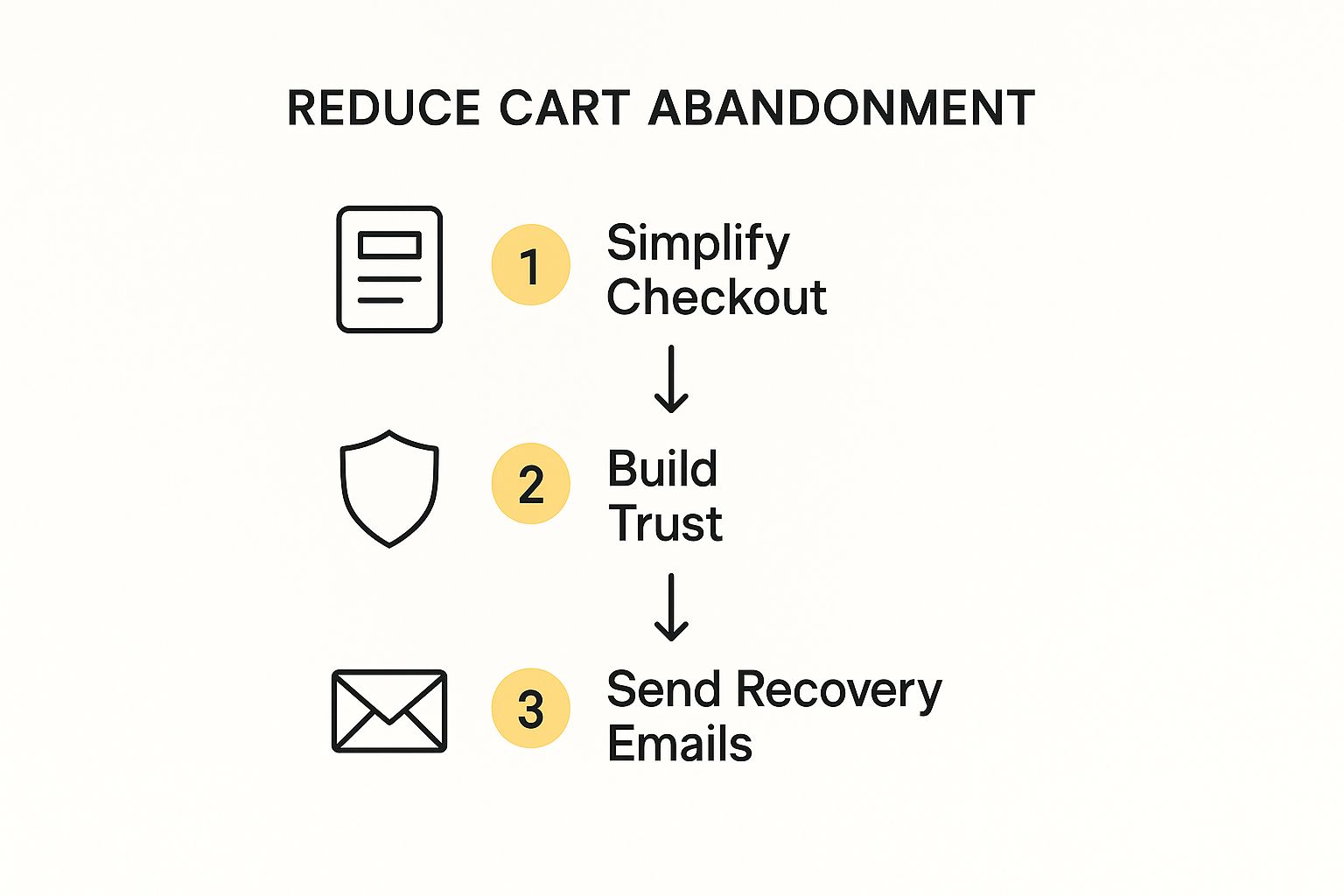
To get a handle on cart abandonment, you have to find and fix the real friction points in your customer's experience. It usually boils down to three big things: killing surprise costs, making checkout dead simple, and building trust with clear, honest communication. These are the core strategies that tackle the most common reasons shoppers bail, turning what would have been a lost sale into a win.
The Hidden Costs of Abandoned Carts
An abandoned cart feels like a near miss, but its impact is way bigger than just one lost sale. It’s a bright, flashing sign that something in your customer journey is broken.
Think about it: a shopper finds a product they want, adds it to their cart, and even starts the checkout process. They’re this close to buying. Losing them at the final hurdle isn't just a missed opportunity; it’s a clear signal that you failed to meet their expectations right when it mattered most.

This isn’t a small problem—it's huge and it's everywhere. The global average cart abandonment rate for e-commerce is stubbornly high, hitting 70.19% in 2024. That means for every ten potential customers who add something to their cart, seven of them walk away before paying. The problem gets even worse in some places, with Asia seeing rates as high as 84%. You can learn more about the latest cart abandonment statistics and see how your own store stacks up.
Why Do Customers Leave Without Buying?
Getting to the "why" behind these numbers is the first real step toward fixing the problem. Today's online shoppers expect convenience, transparency, and security. Any little bit of friction can be enough to make them second-guess their purchase and click away.
The reasons people leave are often surprisingly simple, but they carry a lot of weight. They aren't just browsing and changing their minds; they're actively being pushed away by issues you can actually prevent.
An abandoned cart is more than just lost revenue. It's a direct piece of customer feedback telling you exactly where your user experience needs work. Fixing these friction points is one of the fastest ways to improve your bottom line.
To diagnose the problem, you need to know what's causing the pain. This quick-glance table breaks down the most common reasons shoppers leave, which should help you pinpoint the biggest issues in your own checkout process.
Why Your Customers Really Abandon Carts
| Abandonment Trigger | Impact on Customer | Potential Solution |
|---|---|---|
| Unexpected Costs | Feels like a bait-and-switch. Destroys trust instantly. | Display all costs (shipping, taxes) upfront on product/cart pages. Offer free shipping thresholds. |
| Forced Account Creation | Creates an unnecessary barrier. Feels like a hassle. | Offer a guest checkout option. Make account creation optional and simple. |
| Complex Checkout Form | Overwhelming and time-consuming. Increases chance of errors. | Use a single-page checkout. Autofill address information. Only ask for essential details. |
| Lack of Trust / Security | Makes them hesitant to enter credit card details. | Prominently display trust seals (SSL, security badges). Show customer reviews and testimonials. |
| Limited Payment Options | They can't pay the way they want to. | Integrate popular digital wallets (Apple Pay, Google Pay) and BNPL options like Klarna or Afterpay. |
| Poor Mobile Experience | Frustrating to navigate on a small screen. | Ensure your entire checkout process is mobile-responsive and easy to use with touch controls. |
| Slow Site Speed | Page loads are too slow, causing impatience and doubt. | Optimize images and scripts to improve page load times, especially on the cart and checkout pages. |
Once you see the patterns, you can start making targeted changes instead of just guessing what might work.
The True Financial Impact
Every abandoned cart is a direct hit to your profitability. You’ve already paid to get that visitor to your site through ads, SEO, or social media. They’ve shown real interest in what you’re selling. When you lose them at the last second, your customer acquisition cost for that person yields a big fat zero.
Here’s a simple way to look at it: if your store gets 100 carts a day with an average order value of $50, a 70% abandonment rate means you're leaving $3,500 in potential revenue on the table. Every single day.
Even a small improvement makes a huge difference. Shaving that rate from 70% down to 65% would recapture hundreds of dollars daily. This is why figuring out how to reduce cart abandonment isn't just a minor tweak—it's a core strategy for growing your business and boosting your profits.
Finding the Friction Points in Your Funnel
To slash your cart abandonment rate, you have to stop guessing and start investigating. The clues you need are already there, sitting in your analytics, just waiting to show you exactly where shoppers are getting stuck. It's time to become a detective in your own sales funnel.
High-level dashboards are fine for a quick glance, but the real answers are buried deeper. This means going beyond simply knowing your abandonment rate and pinpointing the exact step where the drop-off happens. Is it the shipping page? The moment they have to pull out their credit card?
This is where your analytics tools become your secret weapon. Setting up a conversion funnel visualization is the first, most critical move.
Setting Up Your Checkout Funnel
A checkout funnel, whether in Google Analytics or another platform, tracks users as they move through each stage of your checkout. Think of it as a map showing the path from cart to the final "thank you" page.
It visually flags where your funnel is leaking the most.
This kind of report tells a story instantly. For example, you might see that 90% of users get from the cart to the shipping page, but only 40% make it from shipping to payment. That massive drop-off is a glaring red flag. It points directly to a problem with your shipping costs, delivery times, or even a confusing form.
These data-driven insights are the backbone of smart conversion rate optimization strategies. You're no longer shooting in the dark; you have a clear target.
Once you know where the problem is, the next step is figuring out why.
Uncovering the "Why" with User Behavior Tools
While analytics tells you what is happening, user behavior tools like heatmaps and session recordings show you the why. They give you a front-row seat to your user's experience, revealing their clicks, scrolls, and hesitations as they happen.
- Heatmaps show you where people are clicking (or aren't). You might find out that a crucial "Continue to Payment" button is being completely ignored because it’s below the fold or just doesn't look like a button.
- Session Recordings are like watching a replay of someone’s visit. You can see their frustration firsthand as they repeatedly try to enter a coupon code that isn't working or struggle with a clunky form field on their phone.
Honestly, watching a few session recordings of users abandoning your checkout is one of the most eye-opening things you can do. You’ll spot patterns you’d never catch in a spreadsheet, like someone rage-clicking a broken link or hovering indecisively over shipping options for a full minute.
By combining the hard numbers from your funnel analysis with this qualitative feedback, you get the complete picture. You might see that 50% of users are dropping off on the shipping page, and then watch recordings to discover it's because your address auto-fill feature is buggy on mobile.
Suddenly, you've turned a vague problem ("high abandonment") into a specific, actionable task ("fix the mobile address auto-fill"). This diagnostic approach allows you to make targeted, impactful improvements instead of just guessing what might work.
How to Design a Frictionless Checkout Experience
Your checkout page is the make-or-break moment. You’ve done all the hard work to get a visitor to your site, help them find a product they love, and convince them to add it to their cart. This is the final step where the sale is won or lost. Even the smallest bit of friction here can be enough to make a committed buyer think twice and walk away.
Creating a frictionless checkout isn't about flashy design; it’s about making things simple, fast, and trustworthy. The goal is to make paying feel like a natural, easy conclusion to a great shopping experience—not a chore. That means stripping out unnecessary steps, making information crystal clear, and reassuring the customer that their purchase is secure.

For example, modern payment gateways like Stripe offer pre-built, optimized checkout experiences that are clean and mobile-friendly right out of the box. Notice the clear fields, multiple payment options (including digital wallets), and minimal distractions. It’s all designed to guide the user straight to completion.
Streamline the Path to Purchase
Complexity is the enemy of conversion. If your checkout process feels like filling out a tax form, you’re practically begging people to leave. Your number one job here should be to eliminate as many fields and clicks as humanly possible.
One of the biggest offenders I see is forced account creation. Demanding that a new customer create an account before they can buy adds a massive barrier. In fact, research shows that 24% of shoppers abandon their carts because a site wanted them to create an account.
The solution is dead simple: always offer a guest checkout option. Let customers buy with just their email and shipping info. You can always give them the option to save their details and create an account after the sale is complete. At that point, it feels like a helpful suggestion rather than a frustrating requirement.
Build Unshakeable Trust at the Critical Moment
The second a customer pulls out their credit card, their trust in your brand is on the line. This is the moment to double down on signals that their information is safe and their purchase is protected. Small visual cues can make a huge difference here.
Placing trust signals right inside the checkout flow builds confidence exactly where it’s needed most.
- Security Badges: Display SSL certificates (like Norton or McAfee) and payment logos (Visa, Mastercard, PayPal) prominently near the payment fields.
- Clear Policies: Make your return policy and shipping info easy to find without making them leave the checkout page. A simple link can prevent a user from navigating away to search for it and never coming back.
- Customer Support Access: Provide an obvious way to get help, like a live chat bubble or a visible phone number, in case they hit a snag.
The most effective checkout pages feel both simple and secure. When you remove obstacles while adding reassurance, you create an environment where customers feel confident clicking that "Complete Purchase" button. Finding that balance is the key to designing a checkout that actively helps you learn https://upnorthmedia.co/blog/how-to-improve-website-conversion-rates.
Optimize Forms for Speed and Accuracy
Every single form field is a potential friction point. Reducing the amount of manual typing is a huge win, especially for mobile users who now make up the majority of e-commerce traffic.
Use tools like address auto-fill that suggest addresses as the user types. This not only makes things faster but also cuts down on typos that lead to shipping errors and frustrated customers later on.
Finally, think about visual momentum. If your checkout has multiple steps (like shipping, payment, and review), use a progress bar. This simple element manages expectations by showing customers exactly where they are in the process and how close they are to being done. It turns what could be a daunting task into a series of small, manageable steps, encouraging them to see it through.
For a complete playbook on optimizing every stage, you can review these 10 actionable ways to reduce cart abandonment and recover lost sales.
Your Checkout Optimization Checklist
Ready to put this into practice? This checklist will help you audit your current checkout process and prioritize the changes that will have the biggest impact. Start at the top and work your way down.
| Optimization Tactic | Why It Works | Implementation Priority |
|---|---|---|
| Offer Guest Checkout | Removes the #1 friction point: forced account creation. | High |
| Add Trust Badges | Visually reassures customers their payment info is secure. | High |
| Enable Address Autofill | Speeds up form completion and reduces shipping errors. | High |
| Show a Progress Bar | Manages expectations and reduces anxiety in multi-step checkouts. | Medium |
| Provide Multiple Payment Options | Allows customers to pay with their preferred method (e.g., PayPal, Apple Pay). | Medium |
| Make Policies Easily Accessible | Prevents users from leaving the checkout to find return or shipping info. | Medium |
| Optimize for Mobile | Ensures a smooth experience for the majority of shoppers. | High |
| Offer Live Chat/Support | Provides instant help for users who have questions or run into issues. | Low |
By systematically working through these tactics, you can transform your checkout from a conversion killer into a smooth, confidence-inspiring final step that secures the sale.
Getting Rid of Surprise Costs and Shipping Shock
Let's get straight to the point: the single biggest reason people ditch their online shopping carts is because of unexpected costs. It’s not a complicated problem, but it’s a powerful one. A customer can be moments away from clicking "buy," totally sold on their purchase, only to get slammed with a high shipping fee or an unexpected tax calculation at the last possible second.
That experience feels less like a smooth transaction and more like a bait-and-switch. It instantly destroys the trust you’ve been trying to build. That feeling of being misled is often all it takes for even the most excited buyer to close the tab and never come back. The fix isn't just about lowering your prices—it's about being radically transparent from the very beginning.
Show All Your Cards Upfront
The best way to prevent this kind of "sticker shock" is to make sure there's no surprise in the first place. Stop hiding shipping fees and taxes until the final checkout page. You need to get that information in front of your customers much, much earlier. The goal is to give them a clear, all-in cost before they even think about starting the checkout process.
A simple way to do this is by adding a shipping calculator right on the product or cart page. Just ask for a postal code, and you can give a pretty accurate shipping estimate long before they have to hand over personal details. This small feature gives the shopper control and clarity, turning a major point of friction into a moment of trust.
I once worked with a small e-commerce store that saw a 15% drop in cart abandonment in a single month. The only thing they changed? They moved their shipping and tax estimator from the final payment screen to the main shopping cart page. It’s that powerful.
Pick Your Shipping Model and Stick to It
How you structure your shipping costs is just as important as when you show them. There's no single "best" model here; what's right for you depends on your products, margins, and who you're selling to. The key is to choose one and then shout it from the rooftops across your site.
Here are a few solid approaches you can test out:
- Free Shipping Threshold: This is a classic for a reason. Offer free shipping on orders over a certain amount (e.g., "Free Shipping on Orders Over $75"). It's a fantastic way to not only squash abandonment but also nudge your average order value higher. A recent study found that 93% of shoppers will add more to their cart just to qualify for free shipping.
- Flat-Rate Shipping: Charge one single, predictable rate for every order. Customers love this model because it's incredibly simple to understand. It works best when your products are all around the same size and weight, making it easy to find a fair rate that covers your costs without being a deal-breaker.
- Live Carrier Rates: Integrate a real-time shipping calculator that pulls live rates directly from carriers like USPS, FedEx, or UPS. This is the most transparent option out there, as customers pay the exact cost to ship. It's a great fit for stores that sell a wide variety of items with different weights and dimensions.
Use Banners and Site-Wide Messaging
Don't make people dig through your FAQ to find your shipping policy. Use prominent announcement bars and banners to broadcast your shipping offers loud and clear. A simple message like "Fast, Flat-Rate Shipping for $5.99 on All Orders" at the top of every page sets expectations the moment someone lands on your site.
You can even get creative with it. A clothing retailer, for example, could use a banner that updates as a customer adds items to their cart: "You're only $12 away from free shipping!" This turns the shipping threshold into a fun, gamified experience instead of a final roadblock. By being upfront and totally transparent about every possible cost, you take away the number one reason for abandonment and build a smoother, more trustworthy path to purchase.
Winning the Sale on Mobile Devices
If your e-commerce strategy isn’t mobile-first, you're leaving a staggering amount of money on the table. It’s a simple fact. The majority of your customers aren't just browsing on their phones anymore—they're trying to buy.
A clunky, frustrating mobile checkout is no longer a minor inconvenience. It’s a direct path to a lost sale and a huge reason why figuring out how to reduce cart abandonment is so critical.
Optimizing for mobile goes way beyond a simple responsive design that just shrinks your desktop site. You have to completely rethink the user's context. They’re often multitasking, staring at a small screen, and using their thumbs to get everything done. Every extra field, every tiny button, and every slow-loading page adds another layer of friction that can easily make them give up.
The data tells a clear story here. Globally, mobile phones see the highest cart abandonment rates, hovering around a painful 78-80%, while desktops are significantly lower. That gap highlights a massive opportunity.
It also gets more interesting when you look at what's being sold. Abandonment rates fluctuate wildly depending on the product; luxury items can see abandonment as high as 81%, whereas essentials like groceries are much lower at 50%. You can discover more insights about these shopping cart abandonment statistics to see just how different sectors are impacted.
Design for Thumbs, Not Cursors
The first rule of mobile checkout design is to think about the physical reality of how people hold their phones. Key interactive elements—like "Add to Cart," "Continue to Payment," and form fields—need to be large, easily tappable, and placed within the "thumb zone."
This is the area of the screen a user can comfortably reach with their thumb without shifting their grip. Forcing users to pinch and zoom just to fill out their address is a guaranteed way to send them packing. Your mobile checkout should feel native to the device, not like a shrunken-down website.
A few things to get right:
- Large Tap Targets: All buttons and links must be big enough to be tapped easily without accidentally hitting something else.
- Vertical Layouts: Design forms and content to flow vertically. This minimizes the need for awkward horizontal scrolling.
- Minimalist Headers: Keep your header and navigation simple during checkout to maximize screen space for the important stuff.
Radically Simplify Your Mobile Forms
On a desktop, a long form is annoying. On a mobile device, it can be a deal-breaker. Typing on a small virtual keyboard is tedious and prone to errors. Your goal should be to slash as many fields as humanly possible and make the remaining ones effortless to complete.
You can leverage device-native features to make this way easier. For instance, when a user needs to enter a phone number, the keyboard should automatically switch to the numeric keypad. When they need to enter an email, the "@" symbol should be front and center. These small details make a huge difference in reducing the effort required to buy something.
A great mobile checkout feels invisible. The user moves from one step to the next without having to think, concentrating on their purchase, not on navigating your interface. The less they notice the process, the better you've designed it.
Embrace Mobile-Native Payments
This is arguably the single most impactful change you can make to your mobile checkout. Integrating digital wallets like Apple Pay, Google Pay, and PayPal One Touch transforms a multi-step typing exercise into a single, secure tap or glance.
Think about it. These payment methods pull the user's verified shipping and payment information directly from their device, letting them bypass your forms entirely. This is the closest you can get to a true one-click purchase, and it’s an absolute game-changer for mobile conversion rates.
By removing the need to manually punch in a 16-digit credit card number and a full shipping address, you eliminate the biggest point of friction in the entire process. It’s that simple. Get the payment part right, and you're well on your way to turning your mobile store from a source of frustration into your most powerful conversion tool.
Bringing Customers Back with Smart Recovery Campaigns
Even with a flawless checkout process, some shoppers are still going to wander off. But here's the thing: an abandoned cart isn't a lost sale. It's a warm lead. It's someone telling you they were this close to buying. This is exactly where a smart recovery campaign can turn a potential miss into a big win.
Email remarketing is your best friend here. We're talking about a tool that gets a staggering 39.07% open rate when targeting abandoned carts. Better yet, campaigns that send a sequence of three emails don't just perform a little better—they generate massively more revenue than a single-email blast. You can see the full breakdown in these cart abandonment statistics and trends.
The secret is to build a multi-step sequence that feels timely, personal, and genuinely helpful—not like you're chasing them down.
Crafting the Perfect Multi-Email Sequence
A single "you forgot something" email is a decent start, but a strategic three-part sequence is the gold standard for pulling those sales back from the brink. Each email has a specific job to do, gently nudging the customer back to their cart without feeling aggressive.
Here’s a framework I've seen work time and time again:
-
The Gentle Reminder (Send within 1 hour): This first email is just a simple, helpful nudge. Life happens. Maybe their kid started crying, their boss walked in, or the wifi cut out. This email should have a friendly, low-pressure tone. Show them the items they left behind and give them a crystal-clear, one-click link right back to their pre-filled cart. Make it easy.
-
The Follow-Up (Send after 24 hours): Now it's time to introduce a little bit of urgency or social proof. You could mention that their items are popular and might sell out. Or, even better, include a couple of glowing customer reviews for the specific products they were looking at. The goal is to remind them what they're missing out on.
-
The Final Offer (Send after 48-72 hours): If they still haven't come back, it's often about the price. This is where you can sweeten the deal. A small, strategic incentive like 10% off or free shipping can be the final push a hesitant shopper needs to click "buy."
Your recovery emails should never feel like a hard sell. Think of them as a customer service touchpoint. Use subject lines like, "Did you have trouble checking out?" or "We've saved your items for you." This frames the email as a helpful reminder, not a demand for their money.
Personalization and a Powerful Call-to-Action
Generic, templated emails are the fastest way to get ignored. The real magic in a recovery campaign happens with personalization. At the very least, your emails need to dynamically pull in the customer's name and, most importantly, images of the exact items they left in their cart. That visual cue is a powerful trigger.
Your call-to-action (CTA) is just as critical. It has to be impossible to miss and ridiculously simple to use.
- Use action-oriented text: "Return to Your Cart," "Complete My Order," or "Take Me Back to My Items" all work well.
- Design a prominent button: Use a color that pops and stands out from the rest of the email's design.
- Link directly to a pre-filled cart: This is non-negotiable. Don't force them to start the whole process over. One click should land them exactly where they left off, with everything ready to go.
This kind of detailed follow-up is a core piece of any solid remarketing plan. For a deeper dive into re-engaging interested leads, check out our complete guide on building a B2B remarketing strategy. By treating an abandoned cart as the beginning of a new conversation, you can successfully bring a huge number of customers back to finish what they started.
At Up North Media, we specialize in building conversion-optimized e-commerce platforms and data-driven marketing strategies that turn abandoned carts into loyal customers. Let's talk about how we can accelerate your online growth. Schedule your free consultation today.