
How many H2 tags per page? For most pages, the practical answer is one H2 for each major topic section, which usually lands at roughly one H2 per 250 to 500 words of content. There isn't a strict cap, though, so the right number is the one that creates a clear outline your visitors can follow.
That's the standard to use when a page feels too long, too thin, or too hard to scan. If you've ever opened a blog post, product page, or landing page and felt lost after the first screen, the problem usually isn't word count. It's structure.
Why H2 Tags Matter for Users and SEO
Think of your page like a book. The H1 is the title, H2s are the chapter titles, and H3s are the smaller sections inside those chapters. When that hierarchy is clear, people can skim it, screen readers can traverse it, and search engines can understand what each part covers.
That's why H2s are not just an SEO detail. They're a readability tool first. Google's guidance from multiple sources points in the same direction, headings should mark real topic shifts, not decorate the page or act like a keyword dump. Hello Digital recommends 2 to 3 H2s on shorter pages, BlogPros says posts under 1,000 words usually need 2 to 3 H2s, and W3Era notes a typical 1,500-word post has 5 to 8 H2s. Taken together, the pattern is simple, H2 count scales with content length rather than following a fixed limit, as explained in Hello Digital's H2 guidance.
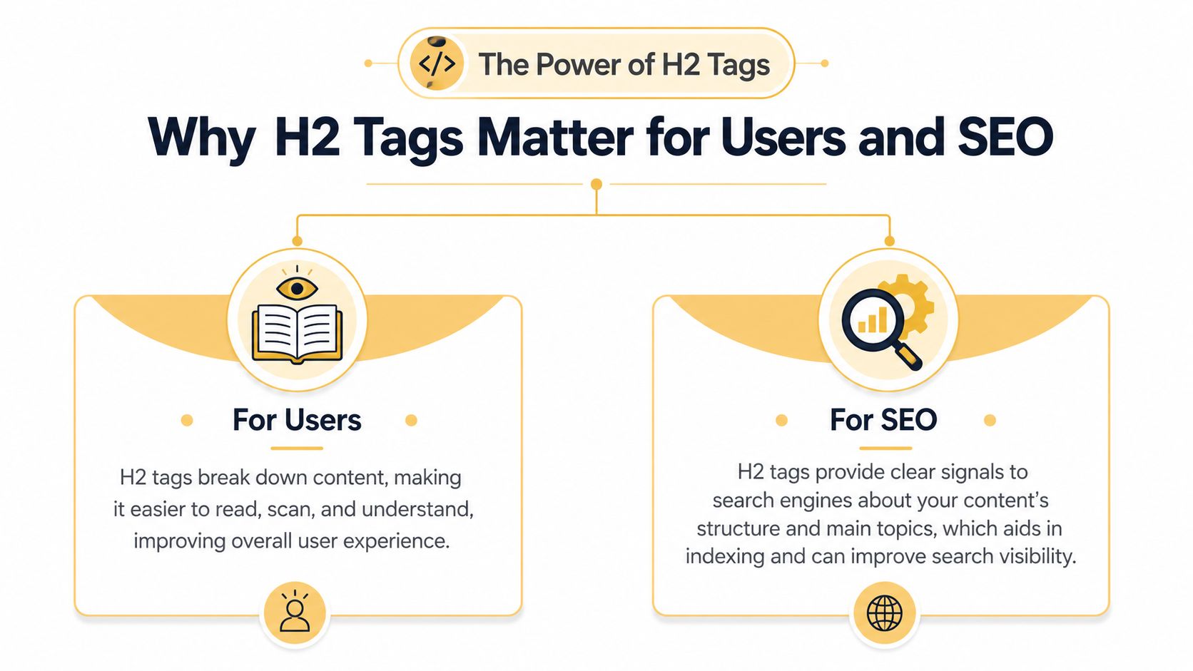
For users
Busy readers don't read every line. They scan for the section that answers their question, and H2s give them those signposts. Good headings break a long page into understandable chunks, which makes the content feel easier to trust and easier to finish.
That also matters for accessibility. Screen reader users often move through a page by heading level, so a logical H2 structure helps them jump directly to the right section instead of listening to everything in order. If you want a deeper technical primer on the HTML side, the guide on HTML header SEO best practices is a useful companion read.
For search engines
Search engines use headings to interpret structure and context. A strong H2 tells Google, in plain language, what the section is about and how it relates to the main topic on the page. That doesn't mean stuffing keywords into every heading, it means writing headings that sound natural and clearly describe the section below them.
Practical rule: if a heading doesn't help a human reader navigate the page, it probably doesn't help search engines much either.
For book-related content, this structure is especially useful. If you're trying to improve book discoverability, the same principle applies, clear sectioning makes the page easier to understand, easier to scan, and easier to index. This is the primary value of H2s, they organize information for people, and that organization becomes a search signal.
How Many H2s to Use on Different Page Types
A practical way to answer how many H2 tags per page is to start with the content type. Incremys' 2026 guide says an 800 to 1,500 word page usually uses 3 to 6 H2s, a 1,500 to 2,500 word page uses 5 to 10 H2s, and a 2,500 to 4,000 word guide can use 8 to 14 H2s. That works out to about one H2 per 250 to 500 words, depending on depth and granularity, as noted in Incremys' heading guide.
Blog posts
Blog posts usually need the most obvious H2 structure because readers often arrive with one question and scan for the answer. Use H2s to divide the article into thematic chunks, such as problem, process, examples, mistakes, or next steps. If a section starts getting long or starts covering a new subtopic, that's usually the signal to add another H2.
The best test is simple. Read only the H2s in order. If they form a useful outline on their own, the page is probably structured well. If they feel repetitive, vague, or scattered, the page needs cleanup.
Product pages
Product pages need H2s for clarity, not fluff. Use them to separate key features, specifications, benefits, shipping or delivery details, and FAQs. That helps shoppers compare faster and reduces the feeling that they need to hunt for practical information.
If you manage category pages or product-led landing pages, the page should still feel like a guided path, not a pile of sales copy. A useful benchmark is the structure of a well-built product page, where every H2 answers a buyer question at the right moment. For a deeper look at layout decisions, the page on landing page design best practices is a good reference point.
Landing pages
Landing pages need fewer H2s than blogs, but each one has to work harder. Use them to support the value proposition, highlight benefits, reduce objections, and lead users toward the call to action. A landing page with too many sections can feel distracted, while one with too few can feel vague.
A good rule here is to use only the H2s that effectively move the visitor forward. If a heading doesn't clarify the offer or remove friction, it probably doesn't belong. That same discipline matters when you're writing concise promotional copy, which is why resources on ideal headline character counts can be helpful when you're refining page-level messaging.
Keep the structure lean on landing pages, because every extra section asks the visitor to do more work before they convert.
Examples of Good and Bad Heading Hierarchies
The easiest way to spot a heading problem is to compare a clean outline with a messy one. A good hierarchy lets the reader move from big idea to supporting detail without friction. A bad one feels like a page written by someone who formatted text visually before thinking about structure.
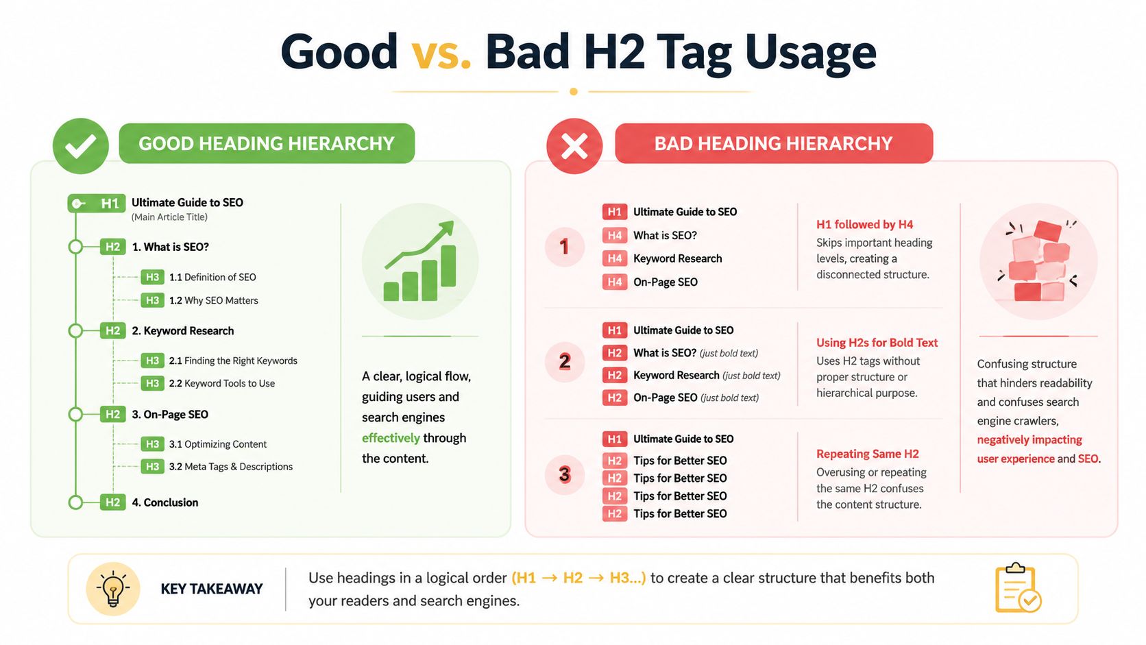
Good heading hierarchy
A clean blog post might look like this.
H1 Main article title
H2 Why the topic matters
H3 User benefits
H3 SEO benefits
H2 How to apply it
H3 Blog posts
H3 Product pages
H3 Landing pages
This structure works because each H2 introduces a major section, and each H3 sits neatly underneath it. The reader can skim it, and the crawler can map it.
Bad heading hierarchy
A messy version might jump from H1 to H4, use H2s as design elements, or repeat the same heading over and over. That creates a broken outline, and it confuses both users and assistive technology. It also makes the page feel harder to move through, even if the words themselves are good.
The key difference is intent. In the good version, the headings describe the page's logic. In the bad version, the headings are just decoration.
A simple way to judge your own page is to ask whether someone could understand the whole outline by reading only the headings. If the answer is no, the hierarchy needs work.
Common H2 Tag Mistakes That Hurt Your Website
The most common mistakes with H2s aren't technical failures, they're clarity failures. People either overuse headings, misuse them for styling, or write them in a way that makes the page feel noisy. None of that helps the reader.
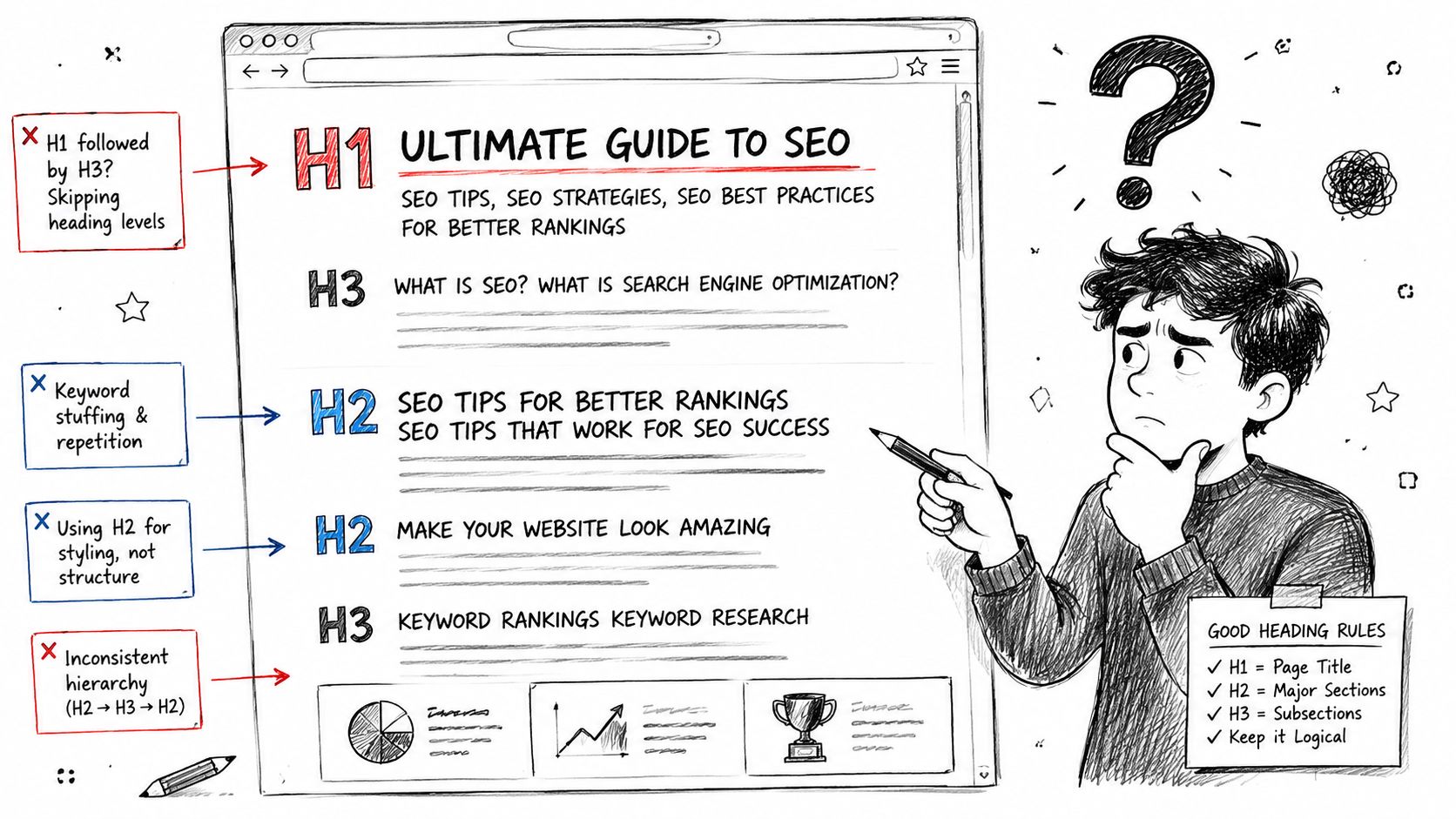
Keyword stuffing
An H2 should sound like a real heading, not a list of search terms. If every section repeats the exact same phrase, the page starts to feel mechanical and harder to read. The fix is to write for the section first, then add a relevant keyword only where it fits naturally.
Using headings for style
H2 tags are structural, not visual. If you only want bigger text, use CSS. When teams use headings just to make words bold or large, they strip away the HTML meaning and break the outline.
Skipping levels
Jumping from H1 to H3, or from H2 straight to H4, creates confusion. It tells users and screen readers that the document outline doesn't matter, and that's exactly the opposite of what you want. Keep the levels in order so the page reads like a clean hierarchy.
Orphan headings
An orphan H2 is a heading with almost no useful content underneath it. That can make a page feel chopped up and thin, especially if the section doesn't earn its place. The fix is to either expand the section or remove the heading entirely.
If a heading doesn't introduce a real section, it's better to delete it than to force the page into a fake structure.
A Quick Guide to Auditing Your H2 Tags
You don't need a full SEO suite to check your headings. Start with your browser's Inspect tool, then open the document outline and look at the heading order. If you want a faster visual pass, extensions like SEO Minion or Detailed SEO Extension can surface the heading tree quickly.
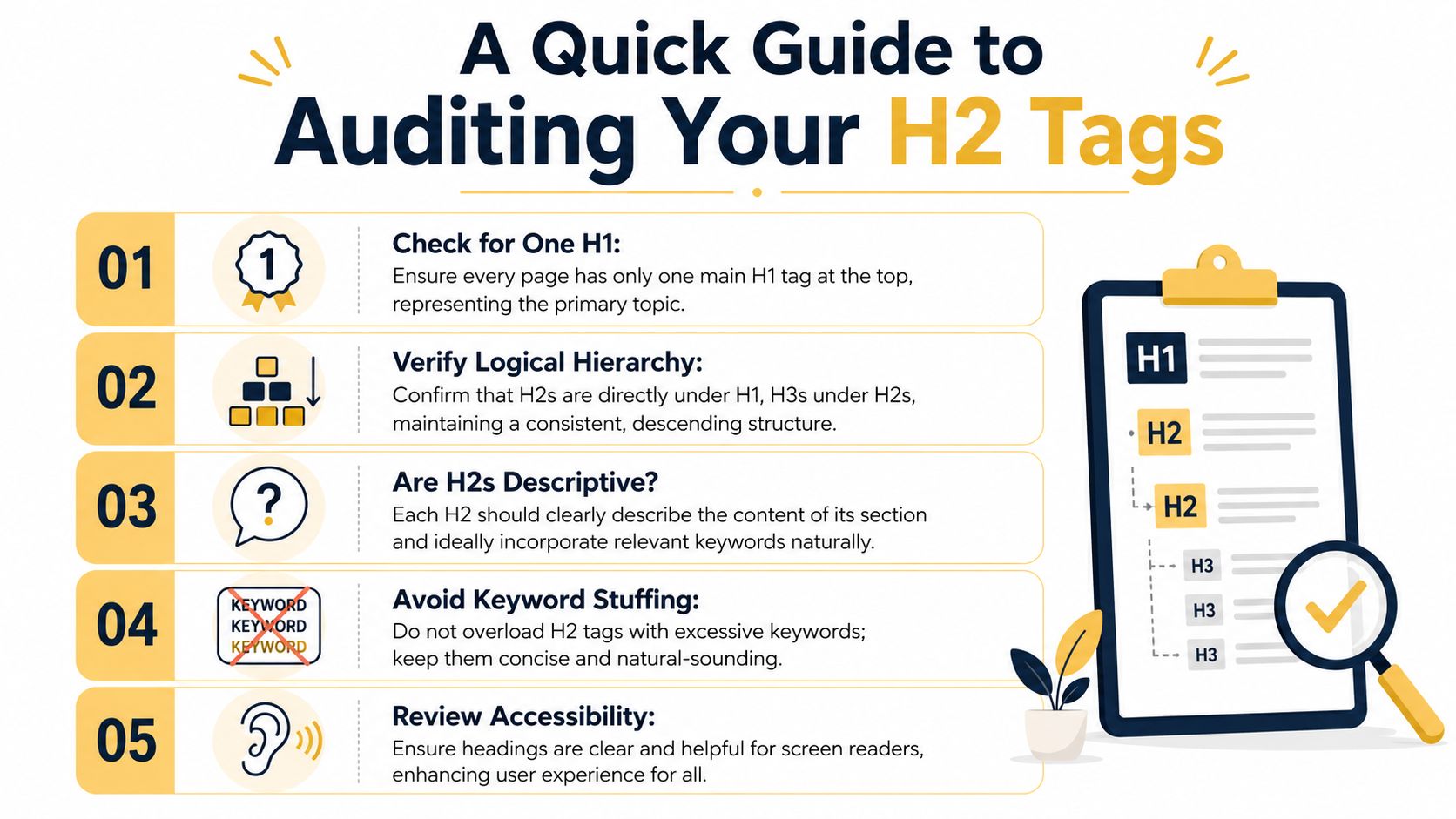
- Check for one H1. Every page should have one main topic at the top, not several competing titles.
- Verify logical hierarchy. H2s should sit under the H1, and H3s should sit under the H2s.
- Read the H2s on their own. If the outline is clear without the paragraphs, the structure is probably working.
- Watch for keyword stuffing. Headings should sound natural when spoken out loud.
- Check accessibility. Screen-reader users need headings that make navigation easier, not harder.
The fastest way to catch problems is to read the page like a visitor, not like the person who wrote it. If the headings feel repetitive, vague, or out of order, the page needs a structural edit before it needs more copy. For a practical checklist you can use alongside this audit, see SEO best practices for content checks.
Conclusion Let Structure Guide Your Content
The right number of H2s isn't a magic formula, it's the number needed to make the page easy to follow. For most pages, that means using H2s to mark each major section and letting the word count and complexity guide the rest. The more useful your outline is for a real person, the more useful it tends to be for SEO.
A strong heading structure does three jobs at once. It helps users scan, it supports accessibility, and it gives search engines a cleaner read on your content. That's why the question isn't really “how many H2 tags per page?” The better question is whether your headings tell the story clearly.
Use H2s to guide the reader through the page. If you do that well, the SEO value follows.
A CTA for Up North Media.