
You're staring at the heading dropdown in your CMS, the draft is already wordy, and one small choice suddenly feels expensive. Should this line be H2 or H3. The answer isn't just about how the page looks, it's about how the page works for readers, screen readers, and search engines that rely on semantic structure to understand what's on the page.
| Attribute | H2 | H3 |
|---|---|---|
| Semantic role | Main section heading in the document outline | Subsection heading nested under an H2 |
| Visual weight | Usually more prominent | Usually lighter and smaller |
| Typical placement | Opens a major topic or chapter | Breaks a major topic into smaller parts |
| Reader scan path | Helps readers jump to the big ideas | Helps readers scan details inside a section |
What H2 and H3 Actually Are in HTML
The quickest way to understand this is to stop thinking about formatting first and think about structure first. In HTML, H2 is the second-level heading element, and H3 is the third-level heading element nested beneath it. They sit inside the broader H1 to H6 hierarchy that web publishers have used for decades, which is why heading levels still matter in modern content systems and SEO workflows as explained in this HTML heading guide.
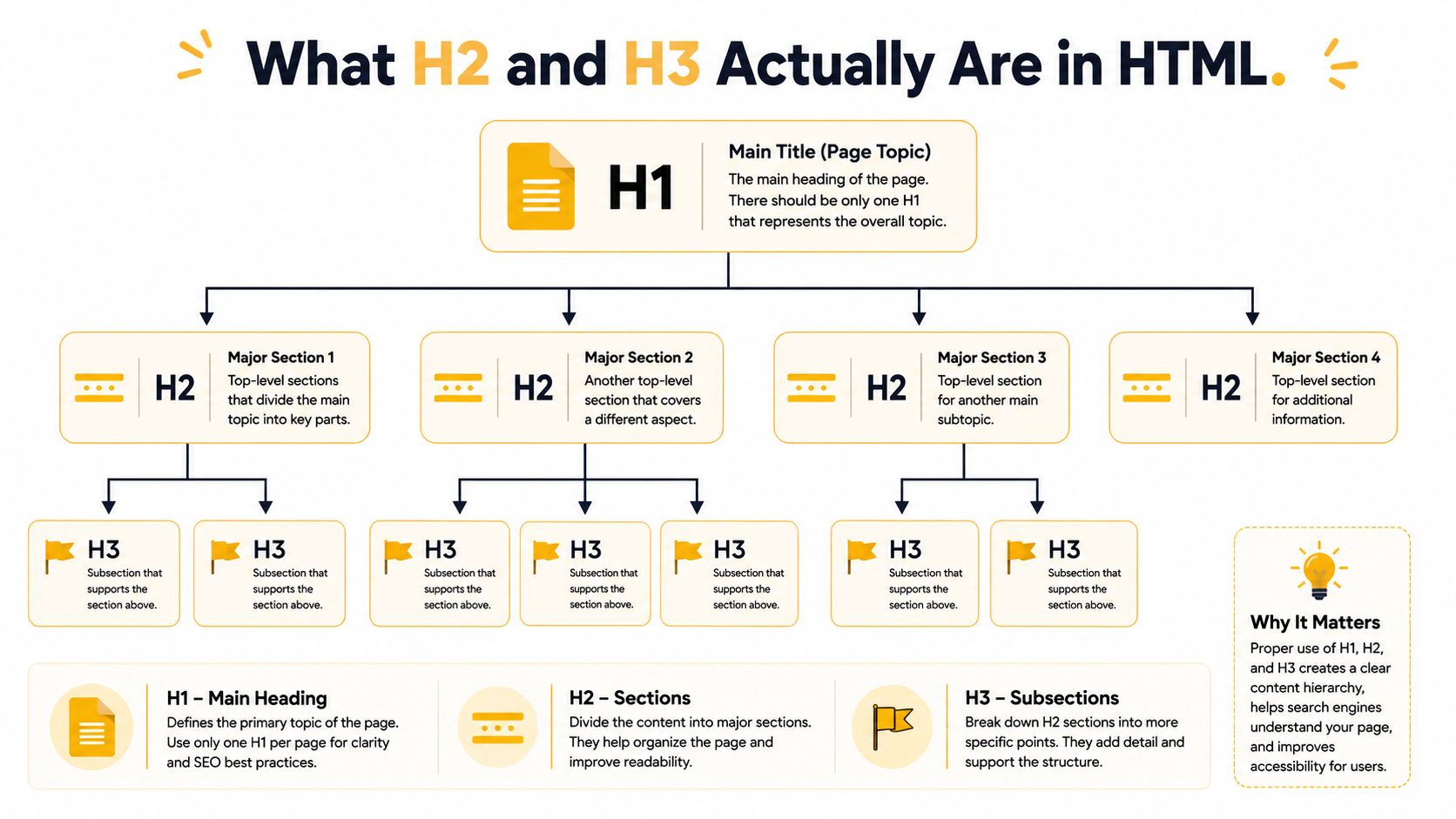
If your CMS shows “Heading 2” or “Heading 3,” it's not just changing font size. It's writing a tag into the page's underlying code, and that tag tells browsers, assistive tech, and crawlers where a section begins and how it relates to the rest of the document. That's why a styled bold line is not the same thing as a heading.
A simple way to test your understanding is to ask one question. Does this line open a new major section, or does it only break down a section that already exists. If it opens a new major section, it earns H2. If it belongs inside that section as a smaller idea, it earns H3.
Practical rule: If the text still makes sense when you read only the headings, the hierarchy is doing its job.
For teams publishing in WordPress, the same logic applies whether you're in the block editor, Classic Editor, or a custom theme. If you want a deeper look at how the markup maps to page structure, this practical guide on HTML header SEO is a useful companion.
The important shift is mental. H2 and H3 aren't decoration choices. They're labels in a document outline, and the outline should mirror the way a human would explain the topic out loud.
H2 vs H3 at a Glance
Most confusion comes from treating H2 vs H3 as a design preference. It isn't. It's a hierarchy decision, and the hierarchy should match the way your article is organized.
| Attribute | H2 | H3 |
|---|---|---|
| Semantic role | Broad section divider | Narrower point inside a section |
| Visual weight | Typically larger and more prominent | Typically smaller and less dominant |
| Typical placement | After the intro, before each major topic | Under an H2 when the topic needs another layer |
| Scanning behavior | Helps a reader map the page fast | Helps a reader find a detail inside a topic |
The clearest way to think about it is this. H2s are the chapter titles, and H3s are the subheads inside the chapter. A comparison post might use H2s for the big categories and H3s for individual features, while a how-to guide might use H2s for stages and H3s for supporting notes or edge cases.
The big mistake is assuming the tags are interchangeable because both can look similar in a theme. Once a theme styles them, the browser may show a visual hierarchy that feels flexible, but the document outline still matters. A page can look polished and still be structurally messy.
That's why readers often get lost on content that has too many headings with no real hierarchy. They see a page that feels broken into pieces, but the pieces don't tell a coherent story. The article becomes harder to scan, and the reader has to work to figure out which ideas are major and which are supporting.
Core idea: Choose H2 when the idea deserves its own major stop. Choose H3 when the idea belongs under that stop.
This also helps you edit more ruthlessly. If a subheading reads like a full topic on its own, it may need to move up to H2. If it only adds one layer of detail, keep it as H3. That one decision often separates a page that feels calm from a page that feels crowded.
SEO and Accessibility Impact of Heading Levels
Google has been clear that headings help organize content for users, but they do not directly improve rankings on their own, so the win is structure, not magic. The better the heading hierarchy, the easier it is for search engines and readers to understand what each section is doing according to this explanation of Google's guidance. That's why heading choices matter, even when they aren't a standalone ranking signal.
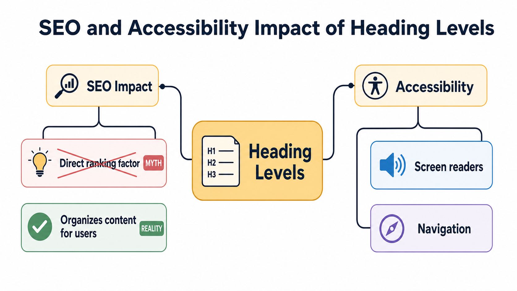
The accessibility side is where the impact becomes very concrete. Screen readers use heading levels to let users jump from section to section, so a clean outline makes a page far easier to use. When you skip levels, you break that outline and make the page less predictable for people relying on assistive tech. For a deeper compliance angle, this internal guide on website accessibility compliance is worth keeping nearby.
There's also a practical content-quality angle. Clear headings force the writer to define each section before filling it with text, which usually leads to tighter, more readable pages. If you're working with a larger content process, that discipline supports efforts to improve content quality for SEO because the page becomes easier to scan, outline, and revise.
A few things matter here more than people expect:
- Clear section labels help readers know where they are on the page.
- Sequential levels help assistive tech preserve the outline.
- Specific headings help crawlers and users understand topic boundaries.
- Consistent structure makes long pages feel organized instead of chaotic.
You don't need to chase headings as if they were a direct ranking lever. You do need to respect them as a readability and accessibility system. That's the part that keeps the page usable for humans, and usability is what search engines are trying to reward indirectly.
HTML, WordPress, and Markdown Examples
The same article can be written three different ways depending on the tool, but the logic stays the same. A major section gets H2, and a subsection inside it gets H3. That's true whether you're editing raw HTML, clicking in WordPress, or drafting in Markdown.
In raw HTML, the structure looks like this:
<h2>Content Strategy Basics</h2>
<p>Introductory text goes here.</p>

<h3>Choosing the Right Format</h3>
<p>Supporting detail goes here.</p>

<h3>Common Mistakes</h3>
<p>Another supporting detail goes here.</p>
In WordPress Gutenberg, you usually click a Heading block, then choose Heading 2 for the main section and Heading 3 for the nested point. The visual appearance depends on the theme, but the editor is still writing the hierarchy into the page.
In Markdown, the same structure is shorter:
## Content Strategy Basics

### Choosing the Right Format

### Common Mistakes
That syntax matters in static-site generators, documentation tools, and AI-assisted drafting tools, because the hashes map to the heading level. If you write the same outline consistently, moving between platforms gets much easier.
If a line is only there to look big, it probably doesn't belong in the heading structure.
One place where teams often overthink this is plugin selection and theme styling. A plugin can help with SEO settings, but it won't fix a confused outline for you. If you're comparing tools in WordPress, this overview of best WordPress SEO plugins can help you separate technical add-ons from structural decisions.
The simplest habit is to draft the outline first, then write into it. When you do that, the HTML, WordPress block, or Markdown syntax becomes a translation step, not a guessing game.
Matching Heading Depth to Article Length and Intent
Heading depth should follow the job the page has to do. A short listicle doesn't need the same nesting as a 4,000-word pillar page, because the reader's scanning needs are different. The goal is not to collect headings. The goal is to help the page do its job faster.
Recent guidance from 2026-era SEO sources suggests roughly 3 to 5 H2s for a 1,500-word post and 1 to 3 H3s under each H2, while longer pillar pages may use 6 to 12 H2s as noted in this heading-structure guide. Treat that as a planning range, not a rigid rule. The page intent still decides whether a subsection deserves its own place.
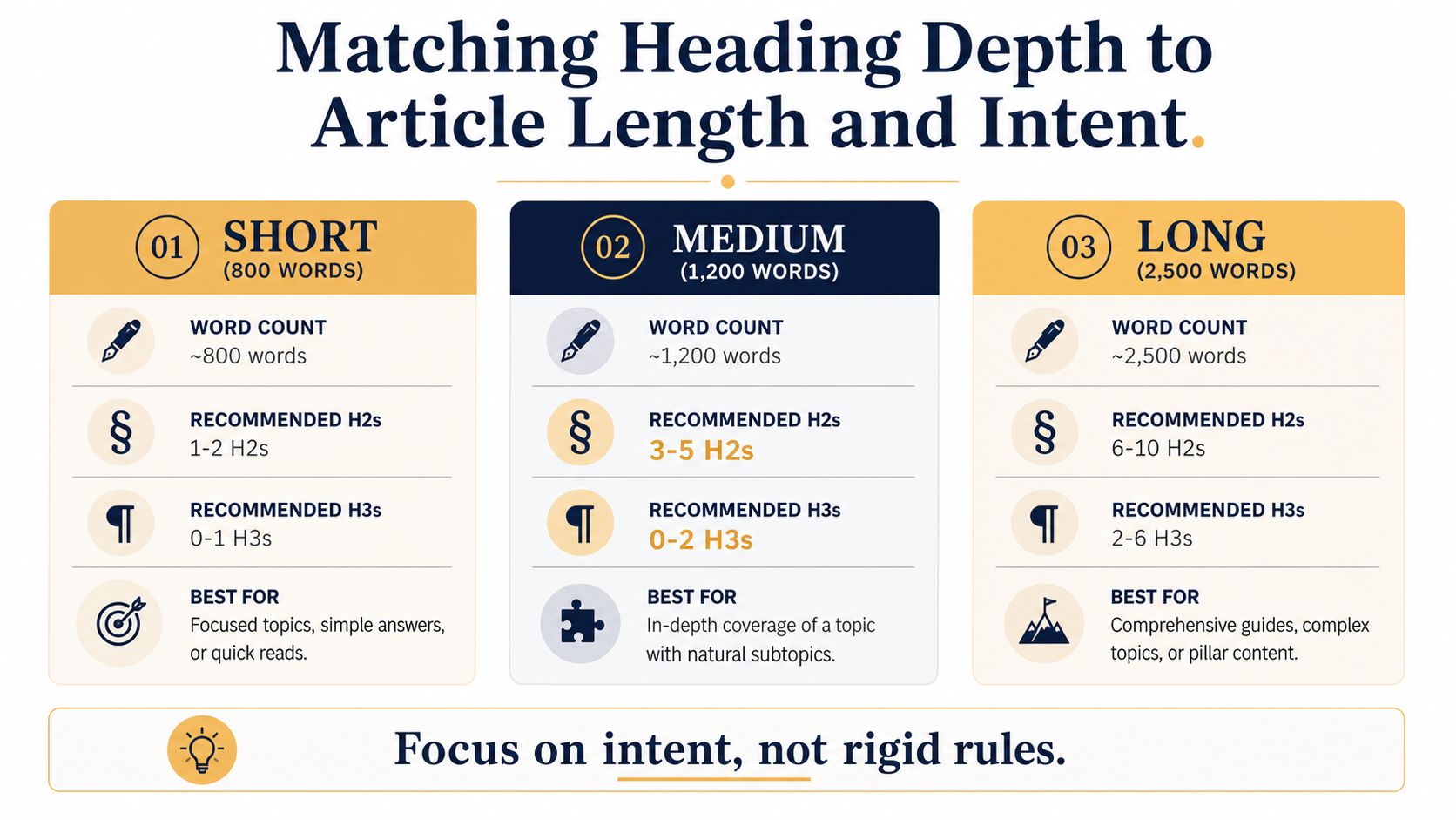
For a short listicle, a few H2s usually carry the whole piece because readers want fast answers, not layered explanation. A how-to guide often needs a little more depth, so H3s become useful when one step needs examples, warnings, or alternatives. A comparison post usually benefits from separate H2s for each category, then H3s for the details inside each one.
A pillar resource is different again. The page has more jobs to do, more reader questions to answer, and more chances to drift into clutter if the outline is weak. That's where a deeper H2 tree makes sense, because the page needs visible waypoints.
Here's a simple planning frame:
- Short listicle: Keep the outline lean, and avoid nesting unless a section clearly splits in two.
- How-to guide: Use H2s for stages, then H3s for exceptions, examples, or sub-steps.
- Comparison post: Give each option or category a distinct H2, then use H3s for features or subpoints.
- Pillar page: Build a broader H2 map, then add H3s where the reader needs deeper detail.
A useful question to ask during drafting is this. What job is the subheading doing for the reader. If it's only repeating what the H2 already says, it probably doesn't need to exist. If it answers a new reader question or opens a new layer of detail, it probably does.
The best heading depth feels almost invisible to the reader. They don't notice the structure because the structure makes the page easy to move through.
Common Heading Mistakes and How to Avoid Them
The most common mistake is skipping levels because a heading “looked better” in the theme. That usually means someone jumped from H2 to H4 or used H3 for styling only. The outline breaks, and the page becomes harder to move through for both readers and screen readers.
Rule to keep: H2 and H3 describe structure, not appearance.
Another mistake is stuffing keywords into every heading. That turns a page into a search-term list instead of a readable document, and readers feel that immediately. A heading should sound like a real sentence fragment a person would say, not a pile of terms arranged for a crawler.
A third problem is using H3 when the line isn't really a subsection. If the text is just a visual callout, a stronger bold lead or a styled paragraph is often better. Headings should do structural work. If they aren't doing that work, they're in the wrong format.
A quick cleanup checklist helps:
- Keep levels sequential. Move from H2 to H3, not H2 to H4.
- Write for the scan. Each heading should describe what's under it.
- Use styling tools for styling. If you want emphasis only, use bold text or a class.
- Don't force keywords. Natural language reads better and usually performs better.
If a page already has bad heading hierarchy, fix the outline before you polish the prose. The content will be easier to edit, and the reader will move through it with less friction. That's a small structural choice with a big practical payoff.
Pre-Publish Checklist and Frequently Asked Questions
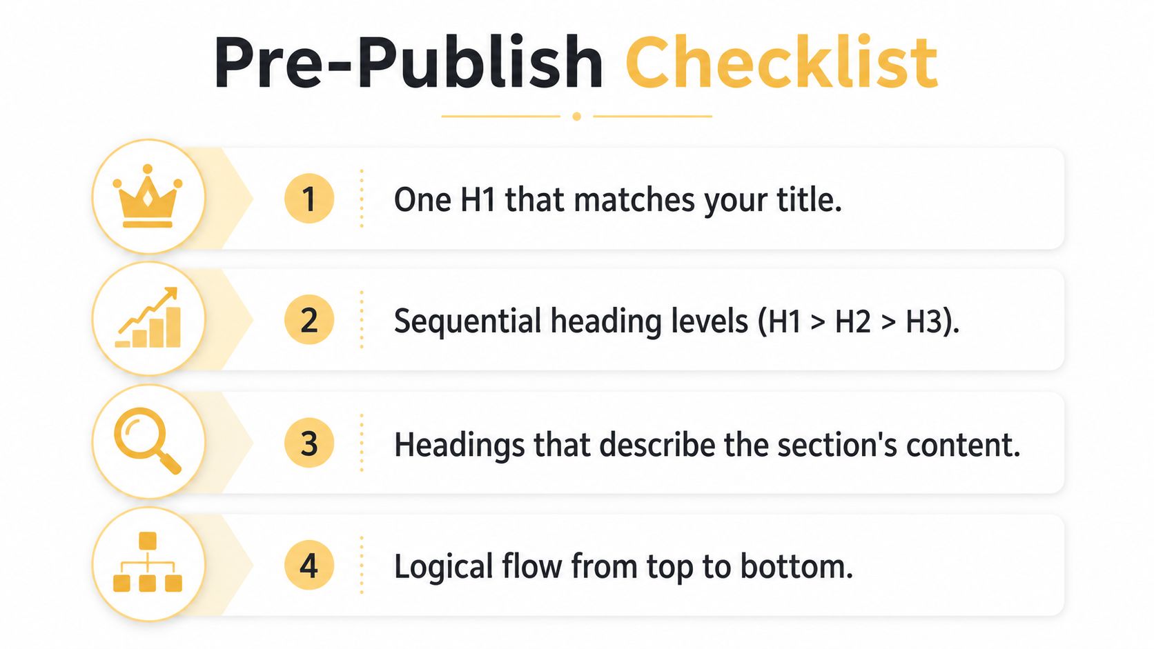
Before you hit publish, run the page through four checks. You want one H1, heading levels that move in order, headings that describe the section clearly, and a quick outline review in the browser or screen reader. The checklist below keeps the process short.
FAQ
Do H3 tags still matter for SEO? Yes, because they help organize the page clearly, even though they aren't a direct ranking boost on their own.
Can a page have multiple H1s in HTML5? Some layouts can technically support that, but most editorial pages are cleaner with one clear H1.
Can I style an H3 to look like an H2? You can, but style shouldn't decide hierarchy. If it functions like an H2, mark it up like one.
What about headings inside FAQ accordions? Use real heading tags when they're part of the document outline, not just visual labels.
If you want your headings to do more than just break up a page, Up North Media can help you plan the structure behind the content, not just the words on top. Their team works on SEO and web design, which makes them a practical fit when you need heading hierarchy, page layout, and search visibility to work together. Visit Up North Media if you want a content and technical review that ties structure to real publishing goals.