
To get your images ready for the web, you have to shrink their file size without making them look terrible. This means picking the right format (like WebP), resizing them to the correct dimensions, and applying a bit of compression. It’s a straightforward process that makes your website load faster, which keeps users happy and improves your search engine rankings.
Why Image Optimization Is Your Competitive Edge
Slow-loading images aren't just a minor annoyance; they're a direct threat to your traffic and your revenue. In a world where attention spans are getting shorter by the second, every moment your site spends loading is another chance for a potential customer to click away. This isn't just a theory—it's a measurable reality that hits your bottom line.
When someone lands on your site, they expect things to happen instantly. If they're met with a blank screen while heavy images slowly render, they get frustrated. Fast. Research shows that 39% of users will abandon a website if images take too long to load, a statistic that really drives home the critical link between image speed and keeping people on your page.
The Financial Cost of Slow Images
This user impatience translates directly into lost sales. For online retailers, sluggish performance caused by large, unoptimized images contributes to an estimated $2.6 billion in lost revenue every single year. The connection is crystal clear: faster images lead to better engagement, which in turn drives conversions. This is especially critical for e-commerce stores. For a deep dive into how this plays out on Shopify, check out this complete guide to image optimization for Shopify.
This infographic really puts the high stakes of web performance into perspective.
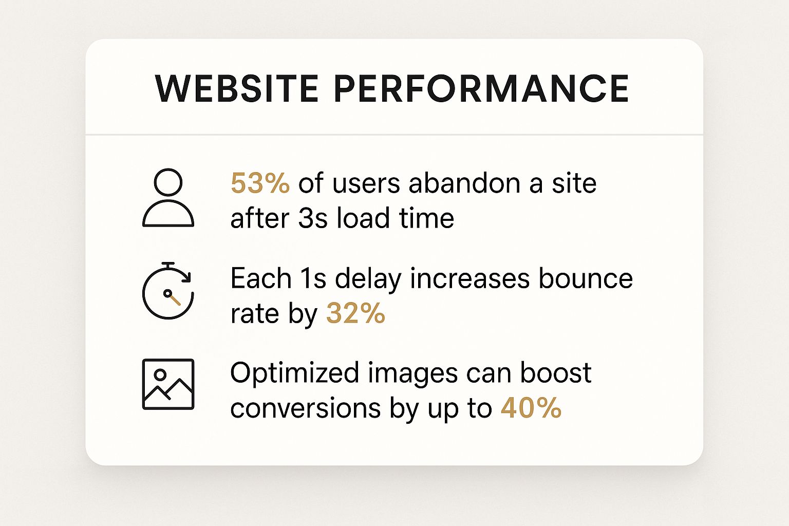
The data doesn't lie. Even a one-second delay can send bounce rates soaring, while properly optimized images have a direct, positive correlation with higher conversion rates.
Optimization as a Business Strategy
It’s a mistake to view image optimization as just another technical chore on your to-do list. Think of it as a foundational business strategy that strengthens your entire digital presence. A fast, visually appealing website doesn't just keep visitors engaged; it also signals quality and professionalism to search engines like Google.
Optimizing your visuals is one of the most effective ways to improve user experience, boost SEO, and increase conversions. It's a high-impact activity that pays dividends across your entire marketing funnel.
Ultimately, learning how to optimize images for the web is about more than just trimming a few kilobytes. It’s about creating a seamless experience that respects your audience's time and encourages them to stick around, explore, and hopefully, convert. If you're looking for more ways to speed things up, we've got plenty of other website performance optimization tips for you.
Choosing the Right Image Format for the Job
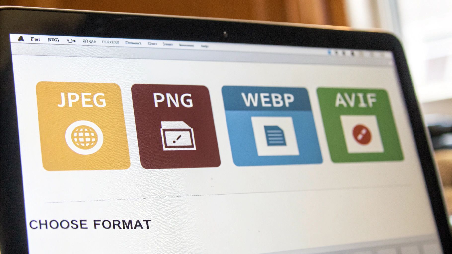
Before you even think about resizing or compressing an image, you have to make one critical decision: what format should it be? This isn't just a technical detail—it's the foundation of web image optimization. Picking the right format directly impacts file size, visual quality, and how fast your page loads.
Think of image formats like different types of shipping containers. You wouldn't use a massive steel crate to ship a feather, right? It’s inefficient and wastes resources. Your goal is to choose the container that protects your image's quality while being as light as possible.
The Classic Formats: JPEG and PNG
For years, JPEG and PNG have been the workhorses of the web. They’re reliable and universally supported, but they serve very different purposes.
JPEG (or JPG) is your go-to for photographs and complex images with millions of colors and smooth gradients. It uses what’s called lossy compression, which sounds a bit scary but is actually brilliant. It intelligently discards tiny bits of image data that the human eye can't perceive, drastically shrinking the file size. It's all about finding that perfect balance between quality and size.
PNG, on the other hand, uses lossless compression. No data is thrown away, so the image remains perfectly crisp, pixel for pixel. Its real superpower, though, is its support for transparency. If you have a logo that needs to sit on a colored background or a product photo with the background removed, PNG is the only reliable choice among the old guard.
The Next-Gen Formats: WebP and AVIF
The game has completely changed with modern formats like WebP and AVIF. These were designed specifically for the web, offering significantly better compression than their older counterparts.
WebP images are typically 25-34% smaller than comparable JPEGs and 26% smaller than similar PNGs, all while maintaining the same level of quality. AVIF can shrink file sizes even more.
These formats are true game-changers for site speed. They can handle both lossy and lossless compression, support transparency, and even animation. For almost everything—from hero images to blog post photos—switching to WebP or AVIF is the single most effective way to cut down page weight without sacrificing an ounce of visual appeal. With broad browser support today, they're a safe and powerful choice.
Image Format Comparison Guide
Choosing between these options can feel overwhelming, so I've put together a quick cheat sheet to help you decide which format to use and when.
| Format | Best For | Compression | Transparency | Key Advantage |
|---|---|---|---|---|
| JPEG | Photographs, complex images with gradients | Lossy | No | Great balance of quality and size for photos. |
| PNG | Logos, graphics with sharp lines, transparency | Lossless | Yes | Perfect quality with transparent backgrounds. |
| WebP | All-purpose replacement for JPEG & PNG | Both | Yes | Excellent compression, versatile, great support. |
| AVIF | When smallest file size is critical | Both | Yes | Superior compression, even smaller than WebP. |
| SVG | Logos, icons, simple illustrations | Vector | Yes | Infinitely scalable, tiny file size. |
This table simplifies the decision-making process. For most modern websites, a combination of WebP for raster images and SVG for vector graphics is the winning formula.
The Vector Format: SVG
Finally, there's SVG (Scalable Vector Graphics). This one is different. While all the other formats are raster-based (made of a grid of pixels), SVGs are vector-based. They’re drawn using mathematical equations, not pixels.
This makes them the perfect choice for things like:
- Logos
- Icons
- Simple illustrations and charts
Because SVGs aren't tied to a pixel grid, they are infinitely scalable. You can stretch one to the size of a billboard or shrink it to a tiny favicon, and it will remain perfectly sharp. No blurriness, no pixelation. Ever. Plus, their file sizes are often minuscule, making them fantastic for performance.
Mastering Image Compression and Sizing
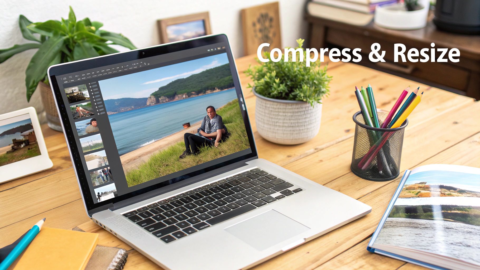
This is where you'll see the biggest wins in page speed, hands down. Getting a handle on resizing and compression is the core of smart image optimization, and it can make a night-and-day difference in your site's performance.
It all boils down to one simple rule I've learned over the years: never, ever upload an image that's bigger than it needs to be.
I see this all the time—someone uploads a massive 4000-pixel wide photo straight from their camera for a blog post where it will only ever show up at 800 pixels. It's such a common mistake, but it's a costly one. The browser is forced to download that entire oversized file and then shrink it down, which wastes a ton of bandwidth and slows everything to a crawl.
Your first step, always, should be to resize your image to its final display dimensions before you even think about uploading it.
Finding the Right Dimensions
So, what are the "right" dimensions? It just takes a quick look at your website's layout. If your main content area is 900 pixels wide, then any image inside that section shouldn't be wider than 900 pixels. Easy enough.
A full-width hero image might need to be 1920 pixels wide to look crisp on big monitors, but a little thumbnail in a sidebar could be just 150 pixels. It's all about context.
If you want to get into the nitty-gritty of this, I'd recommend checking out this excellent guide to sizing images for websites. Sizing isn't just about speed, either; it's a big deal across different platforms. For anyone juggling social media accounts, our guide on social media image sizes for 2025 is a lifesaver.
Understanding Lossy vs. Lossless Compression
Once your image is the right size, it's time to compress it. This is just the process of making the file size smaller by stripping out unnecessary data. You've got two main ways to do this:
-
Lossless Compression: This method shrinks the file size without sacrificing a single pixel of quality. It removes extra metadata but keeps the image data perfectly intact. It's great for technical diagrams or logos where absolute clarity is a must, but the file size reduction is usually pretty modest.
-
Lossy Compression: This is where the real magic happens for most web images. Lossy compression cleverly removes bits of data that the human eye is least likely to notice. The result? A much smaller file with a minimal, often unnoticeable, drop in visual quality. You can often slash a file size by 70% or more with this approach.
For pretty much every photograph and complex graphic you use, a bit of lossy compression is the way to go. It gives you the most significant performance boost.
Pro Tip: I always aim to keep my most important images, like hero banners and key product photos, under 200KB. For smaller, in-content images, a target of 100KB or less is perfect. Sticking to these benchmarks strikes a fantastic balance between quality and speed.
Image compression is just fundamental to web performance. It directly impacts your page load times and, by extension, your search engine rankings. Think about it: a background image should be around 1920x1080 pixels but capped at 200KB to balance quality and speed.
When you consider that a page load delay from just 1 to 3 seconds can increase your bounce rate by a whopping 32%, getting your images right isn't just a good idea—it's essential.
Turning Images into SEO Assets
Properly optimized images do way more than just make your site load faster—they’re hardworking SEO assets that can pull in a whole new stream of organic traffic. While speed is definitely a huge ranking factor, the information you attach to your images gives search engines like Google vital context about your content.
This process starts long before you even think about hitting the "upload" button. It begins with the file name itself. I’ve seen countless sites use generic names like IMG_8432.jpg, and it’s a massive missed opportunity. A name like that tells search engines absolutely nothing.
A simple switch to a descriptive, keyword-rich file name makes a world of difference. For instance, instead of that generic name, use something like custom-built-red-oak-dining-table.webp. This immediately signals the image's subject matter to search crawlers, connecting it to relevant searches people are actually making.
Writing Alt Text That Works
Once your image is on your site, the next crucial step is crafting effective alt text (or alternative text). This is the text that shows up if an image fails to load and, more importantly, is what screen readers read aloud for visually impaired users. It's a fundamental piece of web accessibility.
From an SEO perspective, alt text provides another powerful signal to search engines. It’s your chance to describe what's in the image and, when it feels natural, include your target keyword. Your goal is to be descriptive and genuinely helpful.
- Bad Alt Text: "table"
- Good Alt Text: "A custom-built red oak dining table with a glossy finish in a modern dining room."
The "good" example paints a clear picture for both users and search engines. It's concise yet descriptive, which boosts accessibility and your chances of showing up in image searches.
Your image alt text should be a clear, concise description of the image. Think of how you would describe the image to someone who can't see it—that's the perfect approach for both accessibility and SEO.
Going Further with Sitemaps and Structured Data
If you want to give your images the best possible chance of ranking, there are a couple more advanced steps you can take. An image sitemap is a specific file that lists out all the images on your site, making it incredibly easy for Google to discover and index them. This is especially useful for sites with thousands of product photos or huge galleries.
On top of that, using structured data, or schema markup, can help your images stand out in the search results. By adding a bit of specific code, you can tell Google that an image belongs to a product, a recipe, or an article. This can lead to those eye-catching "rich results," like badges appearing on your image thumbnails in a Google search.
These SEO-focused habits transform your images from simple page decorations into active contributors to your site's visibility. This approach fits right in with broader strategies to optimize your website for search engines, creating a more powerful and well-rounded digital presence.
Advanced Image Delivery Techniques
 Once you've nailed down sizing, compression, and the right formats, it's time to shift your focus to how those images get to your user's browser. This is where the fastest sites on the web really pull ahead. Getting your delivery strategy right can dramatically speed things up and improve the user experience, especially if you have a global audience.
The Power of a Content Delivery Network
The single biggest weapon in your delivery arsenal is a Content Delivery Network (CDN). Think of a CDN as a worldwide network of servers, each holding a copy of your website's static files, including all your optimized images.
Normally, when someone in another country visits your site, their browser has to request images all the way from your one single server. With a CDN, it just grabs them from the server closest to them. This simple change slashes latency—the time it takes for data to travel—and is one of the most effective ways to optimize images for web performance on an international scale.
The impact isn't just theoretical. Using a CDN can improve website load times by an average of 50% and cut bounce rates by 15%. That's a huge win. Caching images closer to your users shrinks the physical distance data has to travel, which is a massive factor in page speed. As search engines lean more on AI to judge page quality, fast images served through a CDN give you a direct leg up in crawlability and rankings. If you're looking for other ways to streamline your process, check out this breakdown of the best image optimization tools for 2025.
Implement Lazy Loading for Instant Wins
Another incredibly effective technique is lazy loading. By default, web browsers try to download every single image on a page the moment it loads—even the ones way down at the bottom that the user can't even see yet. This eats up bandwidth and makes the initial page load feel sluggish.
Lazy loading completely flips that script. It tells the browser to only load an image when the user actually scrolls it into view.
By implementing lazy loading, you can significantly improve your Largest Contentful Paint (LCP) score—a key Core Web Vital. The user perceives the page as loading much faster because the content they see first appears almost instantly.
Modern platforms like WordPress have native lazy loading built right in, but it’s also easy to implement yourself with a little JavaScript or a plugin. It’s a quick change that makes a big difference.
Serve the Right Image with Responsive Images
Finally, you absolutely have to serve different image sizes to different devices. It just doesn't make sense to force someone on a smartphone with a spotty connection to download a massive, high-resolution image designed for a 27-inch desktop monitor.
This is where responsive images come into play, specifically by using the srcset attribute in your HTML. This attribute lets you give the browser a whole menu of different-sized versions of the same image. The browser then intelligently picks the best one based on the user's screen size and resolution.
This ensures every visitor gets a perfectly sized, lightweight image, creating a fast and efficient experience no matter what device they're on. It's a small detail that shows you've thought about every aspect of their journey.
Common Image Optimization Questions Answered
Even after you get the hang of the basics, some very specific questions always seem to pop up right in the middle of a project. Getting straight answers to these is the key to building a workflow that just works. This is where I'll tackle some of the most frequent queries I hear from other developers and clients.
Think of this as your go-to cheat sheet for those "what if" moments. The goal here is practical advice you can use immediately to get past whatever's holding you up.
What Is a Good Target File Size for Web Images?
This is probably the number one question, and the honest answer is: it depends entirely on what the image is doing. There’s no single magic number, but there are some excellent guidelines that I stick to for balancing visual quality with load speed.
Here are the targets I aim for in my own projects:
- Full-Width Hero Images: These are the big, impactful visuals at the top of a page. I try to keep them under 250KB, and I absolutely never let them go over 500KB.
- In-Content Blog Images: For the standard images you sprinkle throughout an article or on a service page, a target of 100-150KB is the sweet spot.
- Product Photos & Thumbnails: These smaller, often numerous, images need to be as light as possible. I aim for under 80KB for the main product shots and try to get thumbnails down under 50KB.
Sticking to these benchmarks will keep your pages feeling snappy and responsive without turning your visuals into a pixelated mess. It’s all about finding that balance.
How Should I Handle High-Resolution Retina Displays?
Retina displays, with their crazy high pixel density, can make standard-resolution images look fuzzy or soft. For a while, the common fix was to just upload images at twice their display size—for example, using a 1600px wide image for a container that's only 800px wide. This works, but it also forces every single user, regardless of their screen, to download a much larger file.
A much better, more modern approach is to use the srcset attribute in your HTML. This attribute lets you provide the browser with a list of different image sizes. The browser then does the heavy lifting, automatically picking the best one for the user's specific screen.
Using
srcsetis the best of both worlds. You get to serve a beautiful, high-resolution image to users on retina screens while still delivering a smaller, faster version to everyone else. It’s how you get sharp visuals for those who can appreciate them and fast load times for everybody.
This method is hands-down the current best practice for handling responsive images efficiently.
Can I Automate the Image Optimization Process?
Absolutely! Manually optimizing every single image you upload is a massive time sink and, frankly, it’s easy to make mistakes. Automating this part of your workflow isn't just a "nice-to-have"; for any serious website, it's essential.
You've got a few great options for setting up automation:
- Image Optimization Plugins: If you're on a CMS like WordPress, plugins like ShortPixel or Imagify are lifesavers. They can automatically compress and resize every image the moment you upload it.
- CDN Services: Many modern CDNs, like Cloudflare or ImageKit, offer real-time image optimization. They can automatically resize, compress, and even convert images to next-gen formats like WebP on the fly, without you touching a thing.
- Build Process Tools: For developers, build tools like Gulp or Webpack can be set up to run through all your project's images and optimize them automatically every time you build your site.
Putting one of these systems in place saves countless hours and gives you peace of mind that every image on your site is perfectly optimized, without you having to even think about it.
At Up North Media, we build high-performance web applications where every detail, including image optimization, is meticulously handled to drive growth and revenue for your business. Discover how our data-driven web development and SEO services can elevate your online presence at https://upnorthmedia.co.