A website redesign is a major undertaking. It's not just about slapping on a fresh coat of paint; it's a strategic overhaul aimed at boosting your business. The entire point is to improve the user experience and hit measurable business goals.
Setting the Stage for a Successful Redesign
It’s tempting to jump straight into picking new colors and fonts. I’ve seen it happen time and time again, and it almost always leads to a disappointing result. Before you even think about design, you need to build a solid strategic foundation.
This early phase is all about understanding why you're doing this. A redesign is your chance to fix what's broken, double down on what works, and make sure every decision is backed by data, not just a gut feeling.
First things first: a thorough audit of your current site. This isn't a quick glance. You need to dive deep into your analytics to see how people are actually using your website. Where’s the traffic coming from? Which pages are people leaving from immediately? What are your most effective conversion paths? Tools like Google Analytics and heatmap software are indispensable here—they'll show you the real story your data is telling.
Define Your Redesign Goals
Once you have a handle on your current performance, you can start setting real, tangible goals. Vague objectives like "make the website better" are useless. You need to connect your redesign efforts directly to your business objectives.
Think in specifics:
- Boost Lead Generation: Increase form submissions on key service pages by 20% within three months of launch.
- Improve User Engagement: Get the overall bounce rate down from 80% to 60% and increase the average time on page by 30 seconds.
- Drive E-commerce Sales: Lift the add-to-cart rate by 15% and slash shopping cart abandonment by 25% in the next quarter.
Your redesign goals become the North Star for the entire project. Every decision—from the navigation layout to the color of a button—should be measured against these objectives. This is how you build a site that doesn't just look better, but actually performs better.
This simple visual breaks down the flow: audit your site, define your goals, and then create a concrete plan.
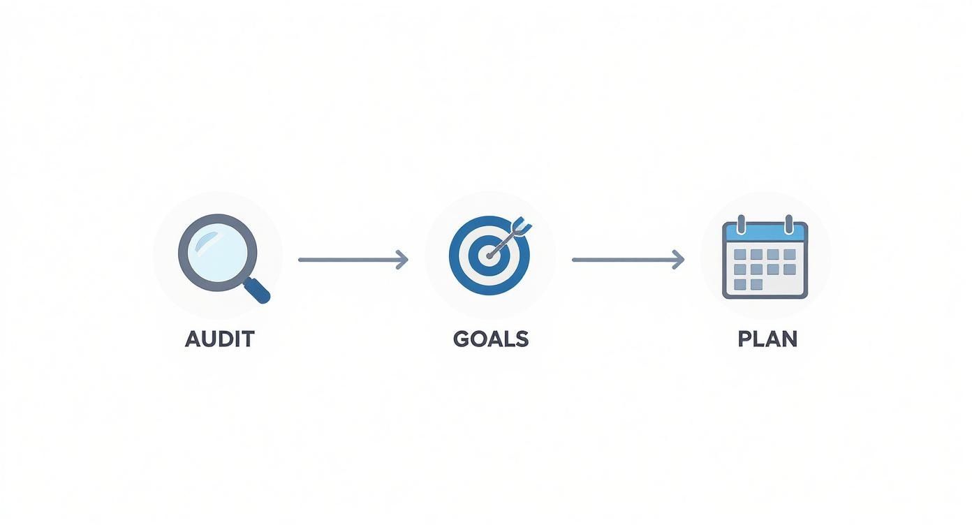
Following this process ensures your redesign is grounded in reality and focused on results you can actually measure.
Website Redesign Goal-Setting Framework
Use this framework to connect your business objectives to tangible redesign goals and measurable KPIs, ensuring your project stays focused on results.
| Business Objective | Redesign Goal | Key Performance Indicator (KPI) | Example Target |
|---|---|---|---|
| Increase sales revenue | Improve conversion rate | E-commerce Conversion Rate | Increase from 2% to 3.5% |
| Generate more qualified leads | Increase form submissions | Lead Form Completion Rate | Boost submissions by 20% |
| Improve customer support efficiency | Reduce support ticket volume | Bounce Rate on FAQ/Help Pages | Decrease bounce rate by 15% |
| Enhance brand authority | Increase organic traffic | Organic Search Rankings | Achieve top 3 ranking for 5 new keywords |
This table helps turn broad business needs into a focused, actionable plan for your website.
Establish a Realistic Budget and Timeline
With clear goals in hand, it’s time to talk about the practical stuff: money and time. You have to be realistic here. Redesign costs can be all over the map, typically running anywhere from $3,000 to $75,000 depending on the project's complexity.
Interestingly, improving a clunky user experience is the primary driver behind 61.5% of website redesigns. That tells you just how critical it is for hitting business targets like lower bounce rates.
A detailed project plan is non-negotiable. This document should map out every single phase, from initial research to post-launch monitoring, with clear responsibilities and deadlines. A solid plan is your best defense against scope creep—the notorious killer of budgets and timelines.
To keep you on track, we’ve put together a comprehensive website redesign checklist that breaks down every step you need to think about. This foundational work is what makes sure your investment pays off, turning your website from a simple online brochure into a powerful engine for growth.
Understanding Your Audience and Competitors

Jumping into a redesign without knowing your users is like building a house with no blueprint. When you build a site based on assumptions, you're pretty much guaranteeing mediocre results. If you want to redesign your website for real impact, you have to start with the people who will actually be using it.
This research phase is absolutely non-negotiable. It's where you dig in and find the real pain points, motivations, and desires of your audience. This process turns your abstract goals into a concrete, user-centric action plan, replacing guesswork with data so every design choice has a clear purpose.
Getting Inside Your Users' Heads
So, how do you figure out what your audience really wants? It’s simpler than you think: just ask them. Direct feedback is pure gold, giving you insights you’d never find buried in analytics reports alone. You don't need to overcomplicate it; a few smart methods can give you all the clarity you need.
Start with simple tools like on-site surveys. A small pop-up asking, "What was the one thing you hoped to find on our site today?" can be incredibly revealing. You might find out a critical piece of information is buried three clicks deep or that your navigation labels just aren't clicking with people.
For deeper insights, nothing beats one-on-one user interviews. Seriously, talking to just five to eight of your ideal customers for 20 minutes can uncover frustrations and opportunities you never knew existed. Ask open-ended questions like, "Walk me through how you'd find our pricing," and then just listen.
A deep understanding of your target audience, often solidified through the process of creating effective buyer personas, is essential for a successful redesign. These aren't just fictional profiles; they are research-backed representations of your key audience segments.
This whole process ensures your redesign solves real problems, not just the ones you think you have.
Crafting Your User Personas and Journey Maps
Once you've collected all this great qualitative data, it's time to give it some structure. That’s where user personas and journey maps come in. They take all your raw research and turn it into practical tools your entire team can rally behind.
A user persona is a semi-fictional character that represents a key segment of your audience. Give them a name, a job, goals, and frustrations that relate to your business. For a SaaS company, you might create "Marketing Manager Mike," who's overwhelmed by complex software and just needs a solution that's easy to implement. To really nail this, check out our complete guide on how to create buyer personas that truly resonate.
With your personas defined, you can start mapping out their journey. A customer journey map is a visual outline of a user's experience with your site, from their very first interaction to the moment they become a customer. It highlights their actions, thoughts, and feelings at each stage, pinpointing moments of delight and—more importantly—areas of friction that your redesign absolutely must fix.
Sizing Up the Competition
Understanding your users is half the battle. The other half is knowing exactly where you stand in the market. A competitor analysis isn't about copying what everyone else is doing; it’s about finding gaps and opportunities to make your own website experience way better.
Start by picking three to five of your top direct and indirect competitors. Then, go through their websites with a critical eye, focusing on a few key areas:
- User Experience (UX): How easy is their site to navigate? Is the information laid out logically? Where do they make things simple, and where do they create confusion?
- Key Features: What cool functionalities do they offer that you don't? Maybe they have a killer lead-capture tool or a checkout process that’s smooth as butter.
- Content and Messaging: How do they talk about their products? What's their unique value proposition, and how well do they get it across?
- Visual Design: What’s the overall aesthetic? Does it feel modern and trustworthy, or is it dated and cluttered?
This analysis helps you benchmark your own site and spot strategic openings. For example, if all your competitors have clunky, multi-step contact forms, a slick one-click form on your redesigned site could become a huge competitive advantage. This research gives you the intel to build a website that not only meets user expectations but completely blows them away.
Building the Blueprint with Wireframes and Prototypes
Okay, you’ve done your homework on your audience and sized up the competition. Now it's time to stop talking and start building. This is where your redesign strategy starts to look less like a document and more like a website. Think of it as drawing up the architectural blueprints before anyone even thinks about pouring a foundation.
Trust me, jumping straight into colors and fonts without this step is a classic mistake. It almost always leads to a jumbled layout and a user experience that feels like an afterthought.
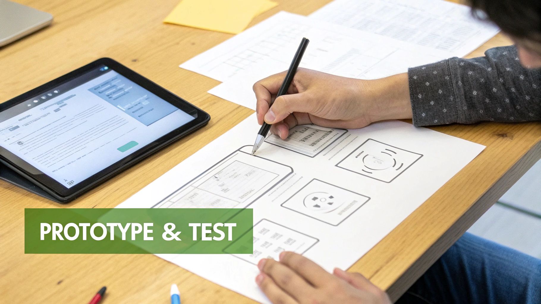
First up, we create wireframes. These are intentionally simple, black-and-white outlines of your website. Their only job is to map out the structure, figure out the information hierarchy, and decide where key elements go on each page. By stripping away all the visual flair, we’re forced to focus entirely on function and user flow. It’s the quickest, cleanest way to get the skeleton of your site right.
From Low-Fidelity Sketches to Interactive Prototypes
Once that basic structure feels solid, we move on to a prototype. A prototype breathes life into your static wireframe by adding interactivity and a bit more visual detail. This is where you can finally click around and simulate what it will actually feel like to use the site—think clickable buttons, functional menus, and page transitions.
We usually tackle this in two stages:
- Low-Fidelity Prototypes: These are basically interactive wireframes. We use tools like Figma or Balsamiq to link screens together. They're perfect for quickly testing the core navigation and making sure the user flow makes sense, all without getting bogged down in visual design.
- High-Fidelity Prototypes: These are the showstoppers. They look and feel almost identical to the final website, complete with brand colors, typography, and polished imagery. High-fi prototypes are invaluable for getting final buy-in from stakeholders and for running detailed user tests before a single line of code is written.
By starting simple and layering on detail, you can spot major usability problems when they're still easy and cheap to fix. Moving a box in a wireframe is a ten-second job; recoding a fully developed page is a nightmare.
Designing Intuitive Information Architecture
A huge piece of this blueprint phase is nailing your information architecture (IA). Put simply, IA is just organizing and labeling everything on your website so that people can find what they’re looking for without having to think. A confusing structure is one of the top reasons users get frustrated and leave.
Your goal is to create a clear, logical path for every type of visitor. If a user has to think too hard about where to click next, your IA has failed. The best navigation feels effortless and intuitive.
A sitemap is a great way to map this out visually. It's a hierarchical chart of all your pages, which helps you see how different sections connect and ensures no important content gets buried. From there, you can design a navigation menu that’s straightforward and gives users a clear path to the most important parts of your site. To really nail this, you should explore these user experience design best practices and bake them into your structure from the very beginning.
Aligning Content Strategy with Your New Layout
With your wireframes defining the layout, you have to make sure your content strategy lines up perfectly. Every page template has a purpose, and the content is what fulfills that purpose. A stunning design is useless if the content is weak or in the wrong place.
Now's the perfect time to audit your existing content. Figure out what to keep, what needs a refresh, and what can be tossed out completely. For any new pages, you should have a content plan that details the headline, body copy, calls-to-action (CTAs), and media for each block in your wireframe.
This structure-first approach ensures your message is not only powerful but also perfectly formatted for the user-friendly design you’ve planned. This foundation is especially critical for creating a responsive site—which is non-negotiable today. Good UX design can boost conversion rates by up to 400%, and a mobile-first approach is key. By 2025, it's expected that 90% of all websites globally will feature responsive design, adapting to the devices used by your visitors.
Executing the Visual Design and Technical Build
With a solid blueprint in hand, the project shifts from abstract plans to something you can actually see and touch. This is the exciting part—where your brand’s personality gets infused into the wireframes, and clean, efficient code turns that static prototype into a living, breathing website.
It’s a phase that demands serious attention to detail. You need to nail both the visual appeal and the technical foundation to get this right.
First up is translating your brand identity into a compelling user interface (UI). This goes way beyond just picking colors you like; it’s about creating a visual language that communicates your brand’s values and instinctively guides the user. Every choice—from the weight of your typography to the style of your icons—shapes how people feel about your brand.
A strong visual design system is your best friend here. Think of it not just as a style guide, but as a complete library of reusable components and clear rules. It locks in your color palette, typography scales, button styles, and spacing, which makes the whole process faster and ensures the final product feels cohesive, not cobbled together.
Choosing Your Technology Stack
While the visual design is taking shape, the technical build starts in parallel. One of the first big calls you'll make is selecting the right technology stack and Content Management System (CMS). This decision has long-term consequences for your site's performance, scalability, and how easily your team can manage content down the road.
Your specific needs should drive this decision. An e-commerce business might thrive on a platform like Shopify, while a content-heavy publisher could find a headless CMS paired with a modern front-end framework offers more flexibility. For a lot of businesses, a versatile CMS like WordPress remains a powerful and scalable option.
The key is to pick technology that doesn't just solve today's problems but can also grow with you. It’s also wise to explore strategies to reduce software development costs without cutting corners. A well-planned development process avoids expensive rework and future technical debt.
Preserving Your SEO Hard Work
Let's be blunt: one of the biggest risks in any website redesign is torching your search engine rankings. A beautiful new site is useless if no one can find it. That’s why a robust SEO preservation plan isn’t a "nice-to-have"—it's a core part of the technical build.
A catastrophic drop in organic traffic after launch is completely avoidable with proper planning.
Your absolute top priority is implementing 301 redirects. This is a permanent redirect that tells search engines a page has moved, passing most of its link equity (ranking power) to the new URL. You need to create a comprehensive map of every single old URL to its new counterpart. Skipping this step is like changing your business address without telling the post office—people just won't find you anymore.
A website redesign should be an SEO opportunity, not a liability. By improving site speed, mobile-friendliness, and user experience, your new site has the potential to rank even higher than the old one—but only if you protect the authority you've already built.
This whole process involves several key actions that have to be handled before you flip the switch on the new site.
Your Redesign SEO Checklist
Don't leave your search rankings to chance. Follow this checklist to protect your traffic and ensure a smooth SEO transition during your website redesign project.
Redesign SEO Checklist Key Actions
| Phase | SEO Task | Purpose |
|---|---|---|
| Pre-Launch | Crawl Current Site | Create a complete list of all existing URLs to ensure none are forgotten during the migration. |
| Pre-Launch | Map 301 Redirects | Match every old URL to its new destination to preserve link equity and prevent 404 errors. |
| Pre-Launch | Benchmark Analytics | Record key performance metrics (traffic, rankings, conversions) to measure post-launch success. |
| Launch Day | Implement Redirects | Ensure all 301 redirects are active the moment the new site goes live. |
| Post-Launch | Submit New Sitemap | Tell search engines about your new site structure so they can crawl and index it quickly. |
| Post-Launch | Monitor 404 Errors | Use Google Search Console to find and fix any broken links that were missed. |
Sticking to a systematic approach like this is the best way to safeguard your traffic.
On the efficiency front, AI-assisted design tools are becoming more common, with 48% of agencies using them to speed up workflows. The average project turnaround time for a full website redesign is about 6.4 weeks, and some startups allocate roughly 12% of their seed funding just for their web presence. By pairing a smart visual strategy with a technically sound and SEO-aware build, you set the stage for a successful launch that delivers from day one.
Launching and Optimizing for Continuous Growth

The big day is here. After all the planning, designing, and late-night coding sessions, it's finally time to push your redesigned website live. It’s a huge milestone, but it's a classic rookie mistake to see it as the finish line.
Honestly, the launch is just the beginning. A successful launch isn't about flipping a switch and crossing your fingers. It’s a carefully managed process meant to be invisible to your users and protective of your hard-won SEO. After that, the real work begins—turning your new site into a dynamic asset that evolves with your audience and consistently delivers results.
The Pre-Launch Checklist Your Sanity Will Thank You For
Before your new site sees the light of day, a thorough quality assurance (QA) process is non-negotiable. This is where you catch the small bugs that kill user trust and the big issues that can absolutely tank your rankings. I've seen teams rush this step, and it always leads to a chaotic, stressful launch day.
Your team should be running through a comprehensive checklist that covers every possible angle. We're not just talking about spell-checking; we're talking about pressure-testing the entire experience.
Here’s what your final checks should absolutely cover:
- Cross-Browser Compatibility: Open the site on Chrome, Firefox, Safari, and Edge. Elements can render weirdly, and what looks pixel-perfect on one browser might be a hot mess on another.
- Mobile and Tablet Responsiveness: Don't just resize your desktop window—that's a shortcut to failure. Test on actual devices. A staggering 59% of website traffic now comes from mobile phones, so a flawless mobile experience is table stakes.
- Functionality Testing: Click every single button, link, and form. Does the contact form actually send a notification? Does the e-commerce checkout flow smoothly without any weird glitches?
- Performance and Speed: Use tools like Google PageSpeed Insights to get a hard look at your load times. Even a one-second delay can torpedo your conversion rates and SEO.
A smooth deployment sets the tone for everything that follows. The goal is for your users to experience a seamless transition, noticing only the vast improvements in design and usability, not the technical hiccups of the launch itself.
From Deployment to Data-Driven Decisions
Once the site is live and stable, your focus immediately pivots from building to monitoring. Remember those specific, measurable KPIs you defined way back at the beginning of this whole process? Now’s the time to see how the redesign is actually stacking up against them.
Your analytics platform is your new best friend. For the first week, you should be tracking your key metrics daily, then shifting to weekly check-ins. Watch for any significant changes in your core KPIs—things like conversion rates, bounce rates, and average session duration. Is user engagement up? Are people clicking around and exploring more pages?
This initial data tells a story. For instance, if you redesigned a service page to have a clearer call-to-action and you see a 15% lift in form submissions, you’ve got clear evidence the change worked. On the flip side, if a key page’s bounce rate suddenly spikes, that’s an immediate red flag that something in the new design isn't clicking with your audience.
The Power of Post-Launch Feedback and A/B Testing
Analytics data tells you what is happening, but it rarely tells you why. To get the full picture, you have to pair that quantitative data with qualitative feedback from actual, living, breathing users.
Getting this feedback doesn't have to be complicated:
- On-Site Surveys: Use a simple pop-up tool to ask visitors, "What do you think of the new design?" or "Was it easy to find what you were looking for today?"
- Heatmaps and Session Recordings: Tools like Hotjar or Crazy Egg are gold. They show you exactly where users are clicking, how far they're scrolling, and where they get stuck, providing visual proof of friction points.
- Customer Service Channels: Your support team is on the front lines. Talk to them. Ask what kind of comments they're hearing from customers about the new site.
This feedback becomes the fuel for your optimization engine. When you spot an area for improvement—say, heatmaps show users are completely ignoring your shiny new primary navigation—you can form a hypothesis. Something like: "We believe changing the menu labels to be more direct will increase clicks by 10%."
This is where A/B testing comes into play. Instead of just rolling out a change and hoping for the best, you test your new version (Variation B) against the current one (Variation A). By showing each version to a different segment of your audience, you get definitive data on which one truly performs better.
This cycle—monitor data, gather feedback, form a hypothesis, and test—is the heart of continuous optimization. It's how you make sure your investment in a redesign continues to pay off long after the launch. Your website stops being a static project and becomes a living tool, constantly being refined to better serve your audience and crush your business goals.
Frequently Asked Questions About Website Redesigns
Taking on a website redesign can feel like a massive undertaking, and it's natural for a lot of questions to pop up. Getting the right answers from the start is the key to keeping the project on track and hitting your goals. We hear a lot of the same questions from clients, so let's tackle the most common ones right now.
How Often Should I Redesign My Website?
Honestly, there’s no magic number here. Forget the old "every two to three years" rule. It’s not about how old your site is; it's about how well it's performing.
You should start thinking about a redesign when you see specific business triggers.
- Are your conversion rates dropping for no clear reason?
- Has your branding evolved, but your website hasn't?
- Have your business goals shifted, leaving your site feeling misaligned?
- Is the technology behind your site so old that it's slow, insecure, or just a pain to update?
If your site feels like a dinosaur compared to your competitors or it's actively holding back your marketing efforts, it's time to start the conversation.
Will a Redesign Hurt My SEO Rankings?
This is a big one, and the answer is: it can, but it absolutely shouldn't. A sloppy redesign can tank your SEO. The biggest culprits are broken URLs, lost content, and a new site that's slower than the old one. Any of these can send your organic traffic into a nosedive.
To prevent this disaster, a solid SEO plan needs to be baked into the redesign process from day one. This means meticulously mapping every single old URL to its new home using 301 redirects. It also means ensuring your most valuable content makes the move and gets even better, all while optimizing the new site for blazing-fast performance.
Done right, a redesign is one of the biggest opportunities you'll ever have to boost your SEO. A better user experience, improved mobile-friendliness, and faster load times are all huge green flags for search engines, often leading to better rankings than you had before.
What Is the Difference Between a Refresh and a Redesign?
Knowing the difference here is crucial because it completely changes the scope, budget, and timeline of your project. They are not the same thing.
A website refresh is basically a facelift. Think of it as a new coat of paint and some new furniture. You're updating the visual stuff—colors, fonts, images—to make it feel more modern without touching the underlying structure, code, or core functionality.
A website redesign, on the other hand, is a complete overhaul. You’re gutting the house down to the studs. It starts with rethinking the entire strategy, information architecture, and user experience (UX). A redesign often means rebuilding the site from the ground up, maybe even on a completely new platform, to solve fundamental problems and meet new business goals.
How Much Does It Cost to Redesign a Website?
This is the ultimate "it depends" question. The cost of a redesign can swing wildly based on how big and complex the project is. A simple brochure site for a local service business might be a few thousand dollars. A massive e-commerce site or a corporate portal with custom integrations could easily run $75,000 or more.
A few key things drive the final price tag:
- The number of unique pages and templates that have to be designed and built from scratch.
- Custom features and integrations, like an e-commerce checkout, a pricing calculator, or connecting to third-party software.
- The depth of UX research and strategy required before any design even starts.
- Who you hire. A freelancer, a mid-sized agency, and a big-name firm all have very different price points.
Always, always ask for a detailed proposal. It should break down every single deliverable so you know exactly where your money is going.
Ready to transform your online presence with a strategic, data-driven website redesign? The team at Up North Media specializes in creating custom web applications and SEO-focused sites that accelerate growth and boost revenue. Schedule your free consultation today and let's build a website that works as hard as you do.