
A website redesign isn't just a fresh coat of paint. It's a strategic overhaul—a multi-stage project that starts with auditing your current site, setting rock-solid goals, designing a new user experience, building it, testing it relentlessly, and finally, launching it. The whole point is to end up with a data-driven business asset, not just a visual makeover.
Building the Foundation for Your Redesign
It’s easy to get swept up in the excitement of new colors and slick layouts when you decide to redesign your website. But the projects that actually move the needle for a business always start with a deep, analytical look at what you already have. We need to get past the aesthetics and lock in on real business objectives first.
This whole foundational stage is about asking one simple question: "Why?" Why are we really doing this? Is the current site failing to bring in leads? Is the user experience a confusing mess that sends bounce rates through the roof? Or has the brand just plain outgrown its digital home? To get to the bottom of it, you have to dig into the data.
Conducting a Comprehensive Site Audit
The first real step is a full-blown audit of your current website. This isn’t a quick look-around. It’s more like a forensic investigation to figure out exactly what’s working and what’s falling flat. You need to put on your detective hat and examine every clue your site's performance has left behind.
I always recommend breaking the audit down into a few key areas:
- User Behavior Analysis: Jump into a tool like Google Analytics and see how people actually navigate your site. Pinpoint your most popular pages, find out where visitors are dropping off, and trace the paths they take.
- Technical SEO Health: Fire up Google Search Console or Ahrefs to hunt for technical gremlins. You're looking for things like broken links, slow page speeds, crawl errors, or poor mobile usability that could be tanking your search rankings.
- Content Performance Review: Take a hard look at your content. Which blog posts, case studies, or service pages are driving the most traffic and conversions? More importantly, which ones are just taking up space?
This initial audit, combined with goal-setting and planning, lays the groundwork for the entire project. Get this part right, and everything else flows much more smoothly.
Before you go any further, it's super helpful to organize your findings. A simple checklist can turn a messy audit into a clear action plan.
Initial Website Audit Checklist
Use this checklist to perform a baseline audit of your current site and identify critical areas for improvement.
| Audit Area | Key Metrics to Analyze | Common Pain Points |
|---|---|---|
| User Experience (UX) | Bounce Rate, Time on Page, Conversion Rate, User Flow Reports | Confusing navigation, hard-to-find CTAs, non-responsive design, slow-loading pages |
| Technical SEO | Page Speed Insights Score, Mobile-Friendly Test Results, Crawl Errors, Broken Links (404s) | Poor mobile experience, duplicate content issues, missing meta descriptions, no XML sitemap |
| Content Performance | Top Landing Pages by Traffic, Pages with High Exit Rates, Keyword Rankings, Backlink Profile | Outdated or irrelevant content, low organic traffic, content not aligned with user intent |
| Conversion Funnel | Form Submission Rates, Cart Abandonment Rate (for e-commerce), Lead Quality | Complicated checkout process, forms with too many fields, unclear value proposition on pages |
Completing this checklist gives you a tangible snapshot of where your site stands today, making it much easier to define what success will look like tomorrow.
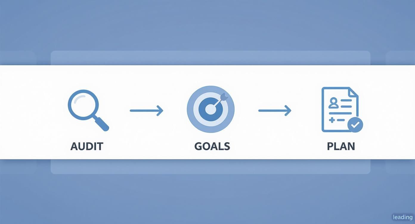
As you can see, a thorough audit naturally leads to clear goals. Those goals then shape your project plan, creating a logical flow that sets you up for success from the very beginning.
Setting Data-Driven Goals
Once your audit is done, you can finally set clear, measurable goals. Vague objectives like "make the site look better" are a recipe for disaster. You need to focus on specific key performance indicators (KPIs) that actually mean something to the business.
A successful website redesign process is rooted in data, not just design trends. Your goals should be specific, measurable, achievable, relevant, and time-bound (SMART) to guide every decision and prove ROI.
For example, a solid goal might be, "Increase lead form submissions by 20% within six months of launch" or "Reduce the mobile bounce rate on product pages by 15% in Q3." These data-backed goals are absolutely essential for getting stakeholders on board and keeping the project from veering off course.
Don't underestimate the power of a great user experience. Some studies show that a well-executed UX design can boost conversion rates by as much as 400%. That number alone shows why a strategic, data-first approach is non-negotiable. You can dive deeper into Netguru's research on the connection between UX and business performance to see just how big the impact can be.
Defining Your Redesign Scope and Strategy
Alright, you've done your homework. The audit is complete, you have real data, and you know why you're doing this redesign. Now it's time to shift gears from the "why" to the "what." This part of the process is all about hammering out the details and turning your big ideas into a concrete plan.
Frankly, this is where most redesigns go off the rails. Without a rock-solid scope and a clear strategy, projects have a nasty habit of ballooning in cost and blowing past deadlines. Think of this as the architectural blueprint for your new site. You wouldn't start building a house without one, and your website is no different. This blueprint gets everyone—from designers to developers to the C-suite—on the same page.
Turning Goals into Functional Requirements
Your goals point you in the right direction, but functional requirements are the turn-by-turn instructions. If your goal is to "get higher quality leads," a functional requirement might be to "build a multi-step form with conditional logic that sorts prospects by industry and company size."
This is all about breaking down every single business objective into specific features and functions the website must have.
- E-commerce site trying to fix cart abandonment? Your requirements might be to implement a one-page checkout or add a guest checkout option.
- Content site wanting to boost engagement? This could mean adding a "related articles" section, building an interactive resource filter, or designing a better search function.
- Service business aiming to simplify bookings? You’d be looking at requirements like integrating a real-time scheduling calendar or building a secure client portal.
Mapping these out eliminates guesswork and gives your dev team an actual to-do list. For a more exhaustive rundown, our website redesign checklist is a lifesaver for making sure nothing important falls through the cracks.
Mapping User Journeys and Site Architecture
Before you build a single page, you have to get inside the heads of the people who will actually be using the site. This is where user personas are so valuable. Create a few semi-fictional profiles of your ideal customers based on real data you've gathered. Give them names, jobs, goals, and frustrations.
With your personas in hand, you can start mapping out their user journeys. Trace the exact path "Marketing Mary" would take to find a case study in her industry. Figure out how "Small Business Steve" would compare your pricing plans.
This simple exercise is the foundation of your new site architecture and sitemap. It helps you organize everything logically so that your most important content is never more than a few clicks away.
A well-defined scope is your best defense against 'scope creep'—that slow, painful process of adding "just one more thing" until your timeline is shot and your budget is gone. Get it in writing and get everyone to sign off before a single pixel is designed.
Setting a Realistic Timeline and Budget
Let's be honest: this is one of the hardest parts of any redesign. It’s also one of the most important. The data doesn't lie—projects almost always take longer and cost more than people think.
A survey of 3,500 companies found that over 54% of website redesigns take longer than six months, and only 49% of projects actually launch on time. When it comes to cost, you could be looking at anything from a few thousand dollars for a simple site to $15,000-$30,000 or more for a professional agency build. These stats from Agency Handy show just how critical it is to plan carefully from the start.
To get a more accurate forecast, break the entire project down into major phases:
- Discovery & Strategy: All the initial audits, research, and scope definition.
- Design: Wireframing, mockups, and building out the prototype.
- Development: The actual coding and construction of the site.
- Content Migration: The often-underestimated task of moving all your content over.
- Testing & QA: Kicking the tires and finding all the bugs.
- Launch & Post-Launch: Pushing the site live and monitoring its initial performance.
When you assign time and resources to each of these phases, you create a project roadmap. This document becomes your single source of truth, keeping everyone aligned and accountable. It’s the tool that lets you manage expectations and, ultimately, deliver a successful project.
Designing a User-Centric Experience
Alright, this is where the magic starts to happen. All that strategic groundwork you did? It’s about to become something you can actually see and interact with. The design phase is a delicate dance between two critical elements: User Experience (UX) and User Interface (UI). Nail this, and you’ll have a site that not only looks fantastic but feels completely natural for your visitors to use.
Think of UX as the invisible architecture of your site. It’s the logic and flow that gets a visitor from point A to point B without a second thought. UI, on the other hand, is what you see—the colors, fonts, and images that give your brand its personality. You can’t have one without the other. A beautiful UI on a confusing site is worthless, and a perfectly logical site with a terrible design will never connect with anyone.

Building the Blueprint with Wireframes and Prototypes
Before you even think about picking a color palette, you have to build the skeleton. This is where wireframing comes in. A wireframe is just a low-fidelity, black-and-white blueprint for each key page. The whole point is to force you to focus on function, not aesthetics.
You're answering the big questions here:
- Layout: Where does the main navigation live?
- Hierarchy: What's the most important thing on the homepage?
- Functionality: How does someone get from a product page to the checkout?
These stripped-down schematics let you solve major usability problems before you've invested a dime in design. Once the wireframes are solid, you move on to an interactive prototype. Using tools like Figma or Adobe XD, you can link these wireframes together into a clickable, semi-functional model of the new site.
This prototype is your first real chance to test the user journey. Can people find what they're looking for? Are your calls-to-action clear? Getting this feedback now is exponentially cheaper and faster than rebuilding pages later.
A wireframe is about planning the user’s path. A prototype is about letting them walk it. Don't skip these steps; they are your best insurance against costly rework and a frustrating user experience.
To really ground your design decisions in proven principles, it’s worth exploring essential website user experience best practices. This helps ensure you're not just guessing what works.
Crafting the Visual Identity with UI Design
With a solid UX blueprint in place, it’s time to breathe some life into the site with UI design. This is where you inject your brand’s personality into the functional structure you’ve built. The goal is to create a consistent visual language that feels familiar on every single page.
This process starts with a comprehensive style guide—basically a rulebook for your site's visuals. A good style guide should nail down:
- Color Palette: Primary, secondary, and accent colors with their specific hex codes.
- Typography: The exact fonts, sizes, and weights for headings, body text, and links.
- Iconography: The style and usage rules for every icon.
- Imagery: Guidelines on the tone and style of photos or illustrations.
- Component Design: How buttons, forms, and other interactive elements should look and act.
A detailed style guide is your single source of truth. It ensures consistency, whether you have one designer or a dozen, which is absolutely critical for building brand recognition and trust. If you want to dig deeper, our guide on user interface design best practices offers more specific tips for creating a visually compelling site.
Adopting a Mobile-First Design Philosophy
Finally, designing for mobile first isn't just a good idea anymore; it's non-negotiable. It might feel backward to start with the smallest screen, but this approach forces you to prioritize what's truly essential. With over 58% of all website traffic now coming from mobile phones, a clunky mobile experience is a deal-breaker.
Mobile-first means you nail down the core content and functionality for a phone, then progressively enhance the design as you move to larger screens like tablets and desktops. This approach guarantees your site will be fast, accessible, and easy to use for the majority of your visitors—a solid foundation for the entire user experience.
Bringing Your New Website to Life
Once the design blueprint gets the green light, it’s time to move from static mockups to actual, functioning code. This is the development phase—where your new site gets built, piece by piece. For a lot of people, this is the most "technical" part of a redesign, but it’s a lot less intimidating when you understand what’s happening behind the curtain.

Think of this stage like building a car. You have two teams working at the same time. The front-end team is crafting the sleek body, the interactive dashboard, and the comfy seats—everything the driver actually sees and touches. Meanwhile, the back-end team is building the powerful engine, the transmission, and all the complex electronics under the hood that make the car go.
Building the User-Facing Experience
Front-end development is all about translating those beautiful UI designs into a living, breathing website. Developers use languages like HTML to create the structure, CSS to handle the styling, and JavaScript to make everything interactive. Every button click, every smooth animation, and every form you fill out is the work of a front-end developer.
A huge piece of this puzzle is responsive design. The code has to be smart enough to make the site look and work perfectly, whether it’s on a giant desktop monitor or a tiny smartphone screen. With most web traffic now coming from mobile devices, this isn’t just a nice-to-have feature. It’s absolutely essential.
Powering the Site from Behind the Scenes
While the front-end team is focused on what users see, the back-end team builds the powerful systems that make it all work. This is the server-side logic that does all the heavy lifting, and its complexity really depends on what your site needs to do.
Common back-end tasks include:
- Content Management System (CMS) Setup: This involves configuring a platform like WordPress or Shopify (or even a custom-built system) so your team can update content without ever touching a line of code.
- Database Integration: This is where all your important information lives—product details, user accounts, blog posts, you name it. The back-end team creates and manages these databases.
- Server Logic: They write the code that processes e-commerce sales, handles contact form submissions, or manages user logins and passwords.
This is the invisible foundation holding up the entire user experience. A slow or buggy back-end will sink your site, no matter how slick the front-end design is.
Strategically Migrating Your Content
Let's talk about one of the most critical—and most frequently botched—parts of any redesign: content migration. This is the process of carefully moving all your valuable blog posts, case studies, and product pages from the old site to the new one. Mess this up, and you’re looking at an SEO nightmare.
You can't just copy and paste. You need a rock-solid plan. Start by creating a spreadsheet that maps every single URL from your old site to its new home. This document becomes the blueprint for your 301 redirect strategy.
A 301 redirect is a permanent instruction that tells search engines and browsers that a page has moved for good. Getting these right is the single most important thing you can do to preserve the SEO authority you’ve spent years building. Skipping this step is like throwing away your hard-earned rankings.
Your migration plan needs to cover everything—text, images, videos, and even metadata like page titles and descriptions. For huge sites, this can sometimes be automated with scripts, but it always requires a meticulous manual review to catch what the machines miss. Rushing content migration is a costly mistake that can set your SEO back for months.
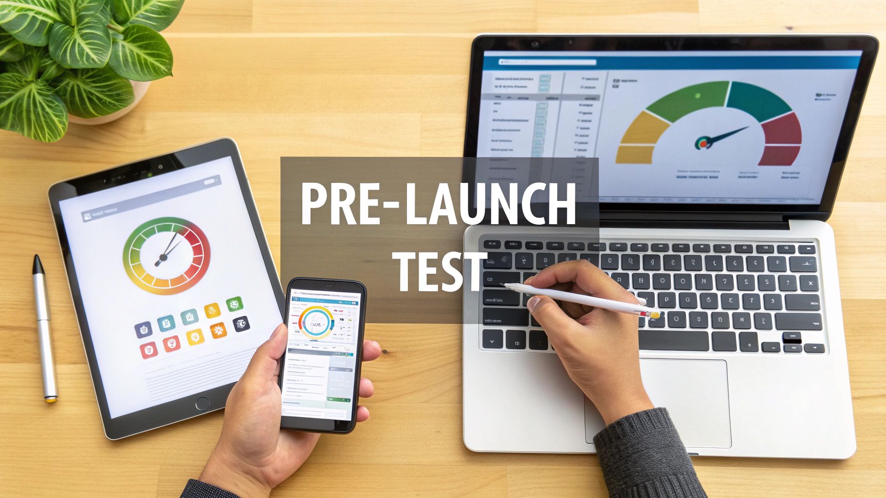
Executing a Rigorous Pre-Launch Test Plan
After weeks, maybe even months, of design and development, your new website is finally alive on a staging server. It’s so tempting to just push it live and cross the finish line. But hold on. This is probably the most critical part of the entire redesign. A buggy launch can tank all your hard work, ding your brand's reputation, and tick off users from the get-go. A solid pre-launch testing plan is your last line of defense.
Think of it like the final walkthrough before you get the keys to a new house. You wouldn't move in without checking the plumbing, electrical, and foundation, right? Same deal here. Your Quality Assurance (QA) process is a systematic sweep to find every bug, broken link, and usability snag before your audience does.
Core Functionality and Compatibility Checks
The first thing to test is the basics. Does everything actually work? This means methodically clicking every link, filling out every form, and prodding every interactive element on the site. The goal is simple: confirm the site’s core functions are stable for everyone, no matter how they’re viewing it.
Here’s what you need to validate:
- Navigational Links: Go through all main navigation menus, footer links, and in-text links. Make sure they all point to the right place and don’t throw up any 404 errors.
- Forms and CTAs: Test every single contact form, newsletter signup, and checkout process. Does the submission go through? Does the right thank-you page pop up?
- Cross-Device Responsiveness: This is a big one. Manually load the site on different devices—desktops with various screen sizes, tablets (in both portrait and landscape mode), and a few different smartphones. You need to be sure all the elements look right and are fully usable everywhere.
- Cross-Browser Compatibility: Open the site on the latest versions of Chrome, Firefox, Safari, and Edge. What looks pixel-perfect in one browser can sometimes look completely broken in another.
This foundational testing is what guarantees a consistent, functional experience for most of your visitors.
Don't make the classic mistake of assuming that because a feature works on your machine, it works for everyone. The sheer diversity of devices and browsers out there is staggering, and comprehensive testing is the only way to cover your bases.
Measuring and Optimizing Performance
In a world of shrinking attention spans, speed is everything. A slow website is a conversion killer. In fact, studies show that 39% of users will just leave if images take too long to load or don't load at all. Performance testing isn’t just for bragging rights—it has a direct impact on your bottom line and your SEO.
Fire up tools like Google's PageSpeed Insights to get a bead on your site's load times and pinpoint what’s slowing things down. Are your images massive? Is there clunky code blocking the rendering process? It’s way easier to fix this stuff now than to scramble after launch. For a deeper dive, our complete guide to website performance optimization tips has plenty of actionable steps you can take.
User Acceptance Testing: The Final Review
Okay, so your internal team has given the site a technical thumbs-up. Now it's time for the most important check of all: User Acceptance Testing (UAT). This is where you bring in real people—ideally, folks who actually represent your target audience—and ask them to use the site like they normally would.
Unlike your team, which knows the site inside and out, these testers bring a fresh pair of eyes. They’ll stumble on usability issues you’ve become blind to, like a confusing navigation label or a checkout process that just feels awkward. Give them specific tasks to complete (like, "Find the pricing page and sign up for a demo") and just watch where they get stuck. This real-world feedback is pure gold for ironing out those last few wrinkles that separate a good site from a great one.
To truly guarantee the quality of your redesigned site, implementing a solid automated testing strategy is key. You can explore some great automated testing best practices to get started.
Managing a Seamless Launch and Beyond
Alright, this is it. After all the planning, designing, and coding, your new website is ready to see the world. It’s tempting to just flip the switch and pop the champagne, but the moments right before and after you go live are what separate a smooth launch from a total nightmare.
This final phase is all about being methodical. A successful launch isn't an accident; it's the result of a ridiculously thorough pre-flight check. The week before you go live should be a lockdown—no new features, just triple-checking everything you've already built.
The Pre-Launch Final Checks
Your first move is to have your team run one last, comprehensive SEO audit on the staging site. Make sure every meta title, description, and alt tag is in its right place.
But here's the most important part: your 301 redirect map. This needs to be uploaded and ready to deploy the second the new site goes live. I can't stress this enough—this map is your single most critical tool for preserving years of search engine authority you’ve worked so hard to build. Don't mess this up.
Next up, get your analytics tools squared away before the launch.
- Google Analytics: Is the tracking code installed correctly on every single page? Have you configured goal tracking for form submissions, purchases, or whatever else matters to your business?
- Google Search Console: Get the new site verified. The moment it’s live, submit your new XML sitemap to give Google a heads-up and encourage faster indexing.
Getting these tools set up ahead of time means you'll capture clean, accurate data from day one, which is absolutely essential for what comes next.
A launch is so much more than flipping a switch. It's a carefully orchestrated event where what you do before is just as important as what you watch after. Skipping a step here can undo months of great work.
Deployment and Immediate Post-Launch Monitoring
On launch day, once the site is live, the real work begins. The first few hours are your golden window to catch any glaring, catastrophic errors that somehow slipped through testing. Your team needs to do a rapid-fire check of all the core functions on the live environment. Can users log in? Does the checkout process actually work? Are the contact forms sending emails?
The days and weeks that follow are all about monitoring. You need to be watching your key performance indicators (KPIs) like a hawk to see how the redesign is actually performing in the wild.
Pay close attention to your analytics, specifically organic traffic, bounce rates, conversion rates, and page load times. It's pretty normal to see a temporary dip in some metrics while search engines figure things out, but you have to be ready to jump on any sustained nosedives.
This post-launch data is your report card. It’s the raw, unfiltered truth about whether the new design is hitting the business goals you defined way back at the start. By comparing this new data against your pre-launch benchmarks, you can definitively measure your success and find the next opportunities for optimization.
Frequently Asked Questions About Website Redesigns
When you’re thinking about a website redesign, a lot of questions pop up. It’s a big project, after all. Here are some of the most common ones we get, with straightforward answers to help you plan.
How Long Does a Redesign Take?
Honestly, it depends entirely on how complex your project is. If you're a small local business that just needs a simple brochure site, we could be looking at 2-3 months.
But for a bigger e-commerce site with custom features, tricky integrations, and a ton of content to move over? That timeline can easily stretch to 6-12 months. The phases that usually soak up the most time are the initial deep-dive planning, the back-and-forth on design feedback, and making sure everything is rigorously tested before it sees the light of day.
Will a Redesign Hurt My SEO?
It’s possible to see a temporary dip in rankings right after launch, but a well-executed redesign should ultimately improve your SEO. The whole point is to make the site better for users and search engines, right?
The secret is proactive planning. You can't just wing it. A thorough SEO audit before you start, a complete map of every old URL to its new home (using 301 redirects), and making sure all your metadata comes along for the ride are absolutely non-negotiable. If the new site is fast, works great on mobile, and is technically sound, you’re not just minimizing risk—you're setting yourself up for long-term growth.
What Should I Budget for a Redesign?
This is the million-dollar question, and the costs can vary wildly. You could spend a few thousand dollars on a straightforward site built from a template. On the other end of the spectrum, a custom, enterprise-level build can climb to over $75,000.
The main things that drive the cost are the sheer size of the site, the need for custom design work and unique functionality, and the kind of team you bring on board.
Ready to transform your digital presence with a data-driven website redesign? The team at Up North Media specializes in creating custom web applications and SEO strategies that deliver measurable results. Schedule your free consultation with us today!