
Diving into a website redesign without a plan is like starting a road trip with no map. Sure, you might end up somewhere interesting, but it probably won't be where you intended to go. Before you even think about colors, fonts, or flashy animations, you need a solid blueprint. This is the part where you figure out why you're redesigning in the first place.
Building Your Redesign Blueprint for Success

A successful redesign begins with a brutally honest look at your current site. Jumping straight into mockups without this critical analysis is a recipe for disaster—it's expensive, frustrating, and rarely delivers the results you need. The goal here is to get past vague wishes like "I want a modern look" and build a data-driven case for every single decision.
This means rolling up your sleeves and digging into your analytics. You need to understand what’s working, what’s broken, and why. Don't just skim the surface-level traffic stats; you're looking for the story the user behavior data is trying to tell you.
Auditing Your Current Website Performance
Your analytics platform—whether it's Google Analytics 4 or something else—is a goldmine of insights. A good audit pinpoints the exact pages and user pathways that are either costing you money or making you money.
Start with your most critical pages. What's the bounce rate on your key service or product category pages? A high bounce rate is a huge red flag, often pointing to a mismatch between what users expected and what they found, a clunky design, or painfully slow load times. On the flip side, find your rockstar pages—the ones with long session times and low exit rates—and figure out what makes them so compelling.
Next, you have to trace your conversion funnels. If you run an e-commerce store, where are people abandoning their carts? For a service business, how many users start your contact form but never hit "submit"? Identifying these drop-off points gives you a clear list of problems to solve. For instance, if you discover that 70% of users bail on the shipping page, you've just found a massive UX issue that the redesign absolutely must fix.
A website redesign should be treated as a business solution, not just a cosmetic update. Every design choice must be justifiable with data and tied directly to a specific, measurable business outcome.
Setting SMART Goals for a Measurable Impact
With a clear picture of your site's current performance, you can finally set goals that actually mean something. Vague objectives like "improve the user experience" are impossible to measure and lead to fuzzy results. This is where the SMART framework comes in: Specific, Measurable, Achievable, Relevant, and Time-bound.
This framework is your best friend for turning abstract ideas into concrete targets.
Here’s how it works in practice:
-
Vague: "I want more leads."
-
SMART: "Increase qualified lead form submissions from organic traffic by 20% within six months post-launch."
-
Vague: "Make the site better for mobile users."
-
SMART: "Reduce the bounce rate on mobile devices for our top 10 landing pages by 15% in Q3."
Here’s a simple framework to help you translate your big-picture business objectives into tangible website goals.
Website Redesign Goal-Setting Framework
| Business Objective | Vague Goal | SMART Redesign Goal | Key Performance Indicator (KPI) |
|---|---|---|---|
| Increase Sales Revenue | "Sell more products online." | "Increase e-commerce conversion rate from 2.5% to 3.5% within 4 months of launch." | Conversion Rate, Average Order Value |
| Generate More Leads | "Get more form fills." | "Increase marketing qualified lead (MQL) submissions by 30% in Q1 post-launch." | MQLs, Cost Per Lead |
| Improve Customer Support | "Make the help section better." | "Reduce support ticket submissions related to 'how-to' questions by 25% within 60 days." | Support Ticket Volume, Time to Resolution |
| Enhance Brand Authority | "Be seen as an expert." | "Increase organic traffic to blog content by 40% and newsletter sign-ups by 15% in 6 months." | Organic Sessions, Newsletter Subscribers |
These precise goals become the North Star for your entire project. They guide design decisions, help prioritize features, and give you undeniable benchmarks to measure success after you go live. Using a comprehensive website redesign checklist is a great way to make sure you cover all your bases, from this initial audit all the way to post-launch monitoring.
This strategic foundation is non-negotiable. It stops scope creep in its tracks, gets your team (or agency) pulling in the same direction, and ensures your investment delivers a real return. By starting with a clear blueprint, you're setting yourself up for a redesign that doesn't just look better—it performs better.
Designing an Experience That Actually Converts

Let's be honest: a beautiful website that doesn't actually guide users toward your goals is little more than a fancy digital business card. The real heart of a successful redesign isn't about chasing the latest design trends; it's about crafting an intuitive experience that feels effortless for your visitors and nudges them to take action. This work starts long before you even think about picking a color palette.
It all begins with a deep, almost obsessive, understanding of who you're designing for. You have to get past generic demographic data and really dig in to create detailed user personas. These aren't just made-up characters; they are composites of your ideal customers, grounded in real data and actual insights.
Defining Your Audience with User Personas
A user persona is a semi-fictional profile of your ideal customer. Its whole purpose is to force you to step out of your own shoes and make decisions based on their needs, not your own gut feelings.
Give your persona a name, a job, maybe even a backstory. What are their goals when they hit your site? What are their biggest frustrations with technology or your industry in general? A huge part of any redesign is to improve ecommerce conversion rate, and personas are ground zero for making that happen.
For example, a persona for a SaaS company might be "Marketing Manager Maria." She's 34, tech-savvy but completely swamped, and needs a tool that integrates smoothly with her existing marketing stack. Every single design choice, from button placement to navigation labels, should be filtered through the lens of what would make Maria’s job easier.
Mapping Intuitive User Journeys
Once you know who you're designing for, you can start mapping out how they will actually interact with your site. A user journey map is just a visual breakdown of the path a visitor takes to achieve a goal, from their very first click to the final conversion.
This is almost never a single, straight line. A potential customer might land on a blog post from a Google search, poke around a bit, sign up for your newsletter, and then come back a week later through an email link to finally make a purchase. Mapping these different pathways is how you spot friction points and hidden opportunities.
Your job is to make this journey feel as smooth and natural as possible. At every single step, you should be asking:
- What information does the user need right now?
- What's the most logical next step for them to take?
- Are there any unnecessary clicks or confusing elements getting in the way?
When you anticipate their needs, you create an experience that feels genuinely helpful. That's the foundation of a website that actually converts.
Building the Blueprint with Sitemaps and Wireframes
With a solid grasp of your users and their journeys, you can finally start building the structural blueprint of the new website. This is where sitemaps and wireframes come in, translating all that strategy into a tangible plan before a single pixel of visual design is created.
A sitemap is basically a hierarchical diagram of every page on your website, showing how they all connect. Think of it as the architectural plan, ensuring a logical flow and making sure nothing gets lost.
Next up, you create wireframes. These are low-fidelity, black-and-white layouts that focus purely on structure, content hierarchy, and function. They are the skeletal framework of each page. Wireframing forces you to concentrate on usability without getting distracted by colors, fonts, or images.
Wireframing is arguably the most critical step in the design process. It separates the "how it looks" from the "how it works," ensuring your site's foundation is solid before you start painting the walls.
Crafting a Compelling Visual Identity
Finally, with a solid blueprint in hand, it’s time to bring your brand to life visually. This is where you define the look and feel that will connect with your audience on an emotional level. I always recommend starting with a mood board—a collage of images, colors, textures, and typography that captures the exact vibe you're going for.
From that mood board, you’ll develop a style guide. This document becomes the single source of truth for your site's visual design, keeping everything consistent. It should clearly define all the key elements:
- Color Palette: Your primary, secondary, and accent colors with their HEX codes.
- Typography: The specific fonts, sizes, and weights for headings, body text, and links.
- Imagery Style: Clear guidelines on the type of photos or illustrations to use.
- Iconography: The exact icon set that will be used across the site.
This structured approach ensures your design is not only good-looking but also strategic, functional, and completely focused on turning visitors into customers.
Time to Build: Turning Designs Into a Real Website
Alright, this is where the magic happens. All those strategy meetings, wireframes, and beautiful mockups are about to become a living, breathing website. Moving from design files to functional code is a huge step, and it involves some critical technical decisions and a rock-solid plan for your content.
Get this phase right, and you'll have a site that doesn’t just look good but actually works flawlessly from the moment it goes live.
Choosing Your Tech Stack or CMS
First things first: what's going to power this new site? The Content Management System (CMS) is the engine under the hood. For most small and medium-sized businesses, this usually boils down to a few key players: WordPress, Shopify, or Squarespace. Each one has its own personality, and the right choice really depends on your business and how comfortable your team is with tech.
WordPress, for example, runs a staggering 43% of all websites, and for good reason—it’s incredibly flexible. You can build almost anything on it. But that freedom comes with a trade-off: it needs more technical TLC to keep it running smoothly. On the other hand, Shopify is the king of e-commerce. It’s a secure, all-in-one package, but you sacrifice some of that design freedom.
When you're weighing your options, think about these three things:
- Scalability: Will this platform still work for you in two years? A simple brochure site today might need a full-blown e-commerce store next year. Make sure your choice can grow with you.
- Team Expertise: Do you have a developer on hand, or do you need something your marketing manager can update without breaking a sweat? Be honest about your team's skills.
- Total Cost of Ownership: Don't just look at the upfront price. You need to factor in hosting costs, must-have plugins or apps, ongoing maintenance, and any developer help you might need down the line.
Once you’ve picked your platform, the real development work kicks off. This usually splits into two tracks: front-end and back-end. Your front-end developers are the ones who take the visual designs and turn them into the interactive parts of the site people see and click on, using languages like HTML, CSS, and JavaScript. At the same time, the back-end developers are building the "behind-the-scenes" logic—things like making your contact forms work or managing customer accounts.
Auditing and Moving Your Content
I can't stress this enough: don't underestimate your content. It’s the soul of your website, but moving it is one of the most overlooked parts of a redesign. You can’t just copy and paste everything from the old site and call it a day. A redesign is the perfect chance to do some serious spring cleaning.
The process kicks off with a content audit. Seriously, make a spreadsheet. List every single page on your current site, and then decide its fate. For each page, you'll choose one of four paths:
- Keep: The content is great. It's accurate, valuable, and bringing in traffic. Move it over as-is.
- Improve: The content is still relevant, but it’s a little dusty. Maybe the stats are old, or the writing just isn't very sharp. Flag it for an update.
- Consolidate: Got three different blog posts about the same topic? Combine them into one comprehensive, powerhouse article. It's way better for SEO.
- Delete: This page is irrelevant, outdated, or gets zero traffic. It's time to let it go (just make sure you set up a redirect so you don't break any links!).
A content audit isn't just about tidying up; it's a massive strategic win for SEO. When you trim the dead weight and beef up your best content, you're telling Google that your new site is a high-quality, authoritative resource.
Once you know what’s coming with you, the actual migration can start. This is a painstaking process of moving text, images, and other files into your new CMS. If you’re also switching web hosts, the technical side gets even more involved. For a closer look at that specific process, our guide on how to migrate a website to a new host walks you through a detailed checklist.
Putting in the effort to plan the build and content migration is non-negotiable. It’s what separates a pretty-but-useless website from a powerful business asset built on a solid foundation.
Executing a Flawless SEO Migration
Ignoring SEO during a website redesign is like building a beautiful new retail store but forgetting to put a door on it. You can have the most stunning design in the world, but if search engines can’t find your pages, your organic traffic will absolutely plummet. This migration process is your single most important defense against a catastrophic drop in rankings.
The whole concept is simple, but the execution has to be meticulous. You must tell search engines exactly where every single piece of old content now lives on your new site. This isn't optional—failing to do this is the #1 reason redesigns destroy years of hard-earned SEO progress.
Benchmarking Your Current SEO Performance
Before you can measure success, you need a clear starting line. Think of a pre-launch benchmark as a snapshot of where your SEO stands right now. This data is going to be invaluable for spotting any issues after launch and, just as importantly, proving the redesign's ROI to your boss or client.
Your benchmark should be a comprehensive export of a few key things:
- Keyword Rankings: Document where you stand for your top 50-100 target keywords. Don't guess; pull the data.
- Organic Traffic: Capture your current sessions, users, and especially your top-performing pages from organic search.
- Backlink Profile: Use a tool like Ahrefs or Semrush to get a full list of every domain linking to your site. You'll need this.
- Indexed Pages: Do a quick "site:yourdomain.com" search on Google to see roughly how many pages are in its index.
This gives you a tangible "before" picture to compare against your "after." Without it, you're flying blind.
The Non-Negotiable 301 Redirect Map
A 301 redirect is just a permanent change-of-address notice for a webpage. It automatically sends users and search engine bots from an old URL to its new home, passing along the vast majority of its ranking power—what we call "link equity." Without it, visitors hit a dead end, and Google assumes the page is gone forever.
Your most critical task here is creating a redirect map. It's usually a simple spreadsheet with two columns: "Old URL" and "New URL." You need to crawl your entire existing site to list every single URL, then map each one to its direct counterpart on the new site.
A single broken backlink from a high-authority site can have a measurable negative impact. A redirect map ensures that every ounce of authority you've earned over the years is successfully transferred to your new domain structure.
Even a small site can have hundreds of URLs, so this is a detailed, painstaking process. It's the grunt work that separates a smooth transition from an SEO disaster. Botching your redirects can also lead to a flood of errors that confuse search engines. It's wise to learn how to handle specific issues, like identifying and fixing https://upnorthmedia.co/blog/soft-404-errors, to keep your site's health in top shape.
This visual shows the basic flow for a successful technical build and migration.
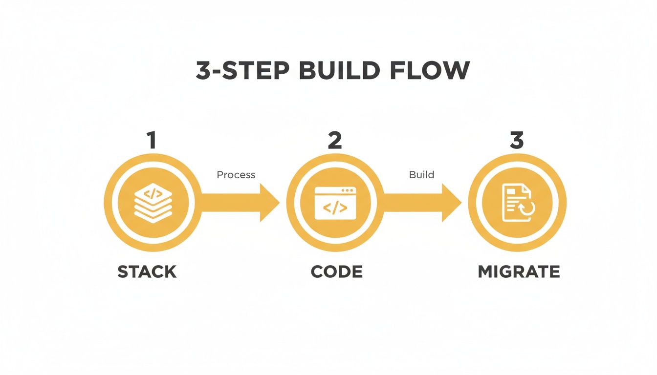
As you can see, the migration is that final, crucial step that makes your new code and tech stack visible to both the world and the search engines.
To stay organized, a simple checklist table can be a lifesaver. It keeps everyone on the same page and makes sure nothing gets missed in the pre-launch chaos.
Pre-Launch SEO Migration Checklist
Here are the essential SEO tasks to complete before your new website goes live.
| Task | Purpose | Status |
|---|---|---|
| Benchmark Current SEO | Create a "before" snapshot of rankings, traffic, and links. | |
| Crawl Existing Site | Generate a complete list of all current URLs. | |
| Create 301 Redirect Map | Map every old URL to its new equivalent. | |
| Implement Redirects | Add the redirect rules to your server or CMS. | |
| Update XML Sitemap | Create a new sitemap with only the new site's URLs. | |
| Check Canonical Tags | Ensure canonical tags point to the correct "master" pages. | |
| Verify Tracking Codes | Confirm Google Analytics, GTM, and other tags are installed. | |
Review robots.txt | Make sure you aren't accidentally blocking search engines. | |
| Final Staging Site Review | Do one last check for broken links and redirect errors. |
This isn't just busywork; it's your final line of defense before you flip the switch.
Final Technical SEO Checks Before Launch
With your redirect map built and tested, a few final technical checks will ensure a clean handoff. This is your last chance to catch any gremlins before they cause real damage.
- Update Your XML Sitemap: Your new sitemap should contain only the URLs of your new website. This is the official roadmap you'll hand to Google.
- Verify Tracking Codes: Don't lose your data. Double-check that all analytics and marketing tags (Google Analytics, Google Tag Manager, Meta Pixel, etc.) are correctly installed on the new site.
- Check Canonical Tags: Make sure canonical tags on the new site point to the correct, final version of each page to head off any duplicate content problems.
A flawless migration is complex and the stakes are high. To ensure your website redesign doesn't torpedo your search rankings, it's often smart to bring in professional expert SEO services that live and breathe this stuff.
Once you go live, immediately submit your new XML sitemap to Google Search Console and start monitoring for any crawl errors. The first 48 hours are critical.
Your Guide to Launch and Continuous Improvement
You’ve been heads-down on this project for months, and now the big day is here. Launching a redesigned website is a huge accomplishment, but it's tempting to think of it as the finish line. I've learned from experience that it's actually the starting line for the most important phase: making your website better and better over time.
A smooth launch all comes down to what you do in those final hours. Your only goal should be to squash any last-minute bugs and make sure the switchover is completely invisible to your users. They should just wake up to a great new experience, exactly as you planned.
The Final Pre-Launch Quality Assurance Checklist
Before you even think about flipping the switch, the site needs a final, rigorous shakedown on its staging server—a private, password-protected clone of your new site. This is your last chance to catch anything that could derail the launch and hurt your business.
Don't go it alone. Grab your team and methodically work through a comprehensive QA checklist. You need to be exhaustive here.
Essential QA Testing Areas:
- Cross-Browser Compatibility: Open the site on the latest versions of Chrome, Firefox, Safari, and Edge. What looks pixel-perfect in one browser can be a complete mess in another.
- Device and Screen Size Responsiveness: This is where you need to get your hands on physical devices. Check the site on a big desktop monitor, a laptop, a few different smartphones, and a tablet. Browser developer tools are helpful, but they don't replace real-world testing.
- Functionality Checks: Click everything. Every button, every link, every call-to-action. Fill out every form and make sure the submissions are actually coming through. If you run an e-commerce store, place a test order from start to finish—add to cart, checkout, confirmation page, the whole nine yards.
- Proofreading and Content Review: Do one last read-through of all your main pages. It’s amazing what a fresh set of eyes can catch—typos, grammatical weirdness, or a broken image you’ve looked at a hundred times.
This final check is non-negotiable. A tiny bug, like a broken checkout button, could bring your sales to a dead stop and sour the entire launch.
Measuring Impact by Monitoring Your KPIs
Okay, the new site is live. Pop the champagne, but don't kick your feet up just yet. It’s time to go back to those SMART goals and key performance indicators (KPIs) you set way back in the planning phase. Now you finally get to see how the redesign is actually performing.
Dive straight back into your analytics. You're looking for any movement—good or bad—in the core metrics you benchmarked before the launch.
Your analytics dashboard is the ultimate source of truth. It cuts through opinions and tells you exactly how real users are responding to the new design, providing a clear, data-backed verdict on your redesign's success.
Keep a close eye on your conversion rates, bounce rates for key pages, average time on site, and pages per session. Are you seeing that 20% bump in lead form submissions you were aiming for? Did the cart abandonment rate drop by the 15% you targeted? Answering these questions gives you immediate feedback and helps you start proving the project's ROI.
Using Qualitative Data to Understand User Behavior
Numbers tell you what is happening, but they rarely tell you why. To get the complete picture, you have to pair your quantitative analytics with qualitative insights into user behavior. This is where you get to see how people actually use your new site.
Two of the most powerful tools for this are:
- Heatmaps: These tools from providers like Hotjar or Crazy Egg create a visual overlay on your pages, showing you where people click, move their mouse, and how far they scroll. A heatmap might show that no one is even noticing your shiny new call-to-action button, maybe because its color blends in too much.
- Session Recordings: These are like watching over a user's shoulder as they browse your site (don't worry, it's all anonymous). Watching a few recordings can be an absolute goldmine. You might see people rage-clicking on something that isn't a link or getting completely lost trying to find a specific page.
This kind of feedback is invaluable. We know that great UX design can increase conversion rates by up to 400%. With typical e-commerce conversion rates hovering around 2.5–3%, even small UX improvements can have a massive impact on revenue. For example, lifting a 3% conversion rate to 6% literally doubles your revenue from the same amount of traffic. You can find more data on how design influences sales in these web design statistics.
This cycle—launching, measuring with data, and then refining based on what you see—is what turns a website from a static brochure into a powerful business tool that constantly evolves to serve your customers and grow your bottom line.
Alright, let's talk about the two questions that are on every business owner's mind before a redesign: “How much is this going to cost?” and “How long will it take?”
Getting a straight answer on both is crucial. Without it, you're planning in the dark, and that’s how projects spiral out of control.
Nailing Down a Realistic Budget
Here's the honest truth: the cost of a website redesign is all over the map. It’s a spectrum, and where you land depends almost entirely on how complex your project is and who you hire to build it. A simple refresh from a freelancer is on a completely different planet, financially, than a custom e-commerce build from a top-tier agency.
The team you assemble has the single biggest impact on your budget. You really have three paths, and each comes with its own price tag.
- Freelancers: This is often the most budget-friendly route, and it’s a great fit for smaller sites with crystal-clear goals. The trick is finding a freelancer with a proven track record in your specific industry or the tech you want to use.
- In-House Team: If you’re lucky enough to have designers and developers on staff, you can sidestep direct project fees. But don't forget to account for their salaries and the opportunity cost—pulling them off other critical work isn't "free."
- Agencies: This is the premium option. You get a full crew of strategists, designers, developers, and project managers who handle everything. An agency brings a managed, comprehensive process to the table, but it definitely comes with a higher price.
For most businesses looking for a professional, strategic overhaul, working with an agency is the most common path. Based on what we see in the industry, agency-led redesigns typically run anywhere from $15,000 to $75,000, and sometimes more if the site's size and technical needs are particularly complex. You can get a better sense of what goes into those numbers by exploring the factors behind website design costs.
Planning Your Project Timeline
Just like with cost, the timeline for a redesign can vary wildly. One of the biggest mistakes I see people make is underestimating how long a proper process actually takes. Rushing through critical phases like strategy and user testing is a surefire way to end up with a finished product that completely misses the mark.
A well-executed website redesign is a marathon, not a sprint. Trying to rush it almost always leads to costly mistakes, missed opportunities, and a final product that just doesn't deliver on your business goals.
So, what should you realistically expect? For a standard small-to-medium business website, a timeline of three to six months is very common. This gives everyone enough breathing room for all the essential steps we’ve talked about—from discovery and goal-setting to design, development, content migration, and thorough testing.
Historically, about 54% of companies have reported that their redesigns took longer than six months. This usually happens when projects get bogged down with complex integrations, heavy custom development, or huge amounts of content that need to be created or moved over.
If you go into it understanding that a redesign is a multi-month commitment from the get-go, you can set realistic expectations with your team and stakeholders. It ensures everyone is aligned and ready for the journey ahead.
Common Website Redesign Questions
When you're staring down the barrel of a website redesign, a lot of questions pop up. It's a big investment of time and money, so that's completely normal. Let's tackle some of the most common ones we hear from business owners and marketing teams to clear the air and help you move forward.
Redesign vs. Refresh: What’s the Real Difference?
So, how do you know if you need to tear it all down or just slap on a new coat of paint? Think of a refresh as a cosmetic update. You're keeping the same underlying structure—the same house, same foundation—but you're updating the colors, imagery, and maybe some fonts to look more current.
A full redesign is a much bigger undertaking. You're gutting the house. This is what you need when the core technology is creaking at the seams, the user experience is a tangled mess, or your site just flat-out doesn't support your business goals anymore. If your problems are more than skin-deep, a redesign is the only real path forward.
Will I lose all my SEO? Only if you don't plan for it. A proper SEO migration is non-negotiable. The absolute most critical piece of this is setting up 301 redirects, which map every single old URL to its new home. This tells Google where to find the new page and passes along its hard-earned authority.
How Long Is This Going to Take?
Ah, the million-dollar question. The honest answer is: it depends on the complexity. But for a professional project for a small business, you should be skeptical of anyone promising a timeline shorter than 3-4 months. It just takes time to do it right.
For larger, more complex e-commerce or corporate sites, it's not uncommon for a project to take 6-12 months. A solid project timeline usually breaks down like this:
- Strategy & Discovery: 4-6 weeks
- Design & UX: 4-8 weeks
- Development & Coding: 6-12 weeks
- Testing & QA: 2-4 weeks
Ready to transform your digital presence with a strategic, data-driven redesign? Up North Media specializes in custom web development and SEO that delivers measurable results. Contact us for a free consultation at https://upnorthmedia.co.