
Let's be honest: redesigning a website feels like a massive undertaking, and it’s easy to get sticker shock. But thinking of it as just a cosmetic update—a digital facelift—is where most businesses go wrong. A truly strategic redesign is so much more than that. It's about digging into the data, listening to your users, and fixing the core problems that are holding your business back.
Why a Strategic Redesign Is More Than a Facelift
If you’re seeing a high bounce rate or visitors are constantly abandoning their shopping carts, a prettier homepage isn't the answer. Those are symptoms of a deeper issue. A well-planned redesign tackles these pain points head-on by focusing on the user experience (UX) and building an intuitive path that guides people exactly where you want them to go.
It’s a shift from "this looks old" to "this isn't working."
Connecting Design to Business Goals
Every single decision in your redesign, from the color of a button to the layout of a page, should trace back to a measurable business goal. Instead of saying, "We need a new look," you should be asking, "How can this new design increase our qualified leads by 20%?"
That simple shift in perspective moves the entire project from an expense to an investment. You're no longer just spending money on aesthetics; you're engineering a high-performance asset designed for growth.
To help you frame your own goals, think about the common business challenges that a redesign is uniquely positioned to solve.
Common Business Problems a Redesign Can Solve
This table highlights key business challenges that a strategic website redesign directly addresses, helping you define your primary objectives.
| Problem Area | Business Impact | Strategic Redesign Solution |
|---|---|---|
| Low Conversion Rates | Lost sales, poor lead quality, high cost-per-acquisition. | Optimize calls-to-action (CTAs), simplify checkout, and improve page speed to directly boost sales and leads. |
| Poor User Engagement | High bounce rates, low time-on-page, visitors don't explore. | Improve site structure, create a clear content hierarchy, and use intuitive navigation to keep visitors on-site longer. |
| Negative Brand Perception | An outdated or clunky site makes you look unprofessional. | A modern, seamless experience builds trust and credibility, reinforcing your brand as an authority in its space. |
| Not Mobile-Friendly | Alienating over half of your potential audience and hurting SEO. | Implement a responsive design that provides a flawless experience on smartphones, tablets, and desktops. |
| Difficult to Update | Content becomes stale because your CMS is a nightmare to use. | Migrate to a user-friendly CMS that empowers your team to make quick updates without needing a developer. |
By identifying your biggest pain points from a list like this, you can build a redesign strategy that delivers real, tangible results.
The Power of Data-Driven Decisions
Guesswork has no place in a high-stakes redesign. The projects that succeed are the ones built on a solid foundation of data. When Staples overhauled its website based on actual user feedback, the results were staggering: visitor numbers jumped by 80%, drop-off rates fell by 45%, and the number of repeat customers shot up by 67%.
The numbers speak for themselves: agencies report that 61.5% of redesigns stem from poor UX, yet businesses that invest in conversion-focused design can see returns up to 100 times their initial spend.
With over 80% of redesign projects aiming to fix low conversion rates, a strategic, data-backed approach is no longer optional—it's essential. This isn't just about redesigning a website; it's about re-engineering your most important business asset for peak performance. As you get started, a comprehensive website redesign checklist is a great resource to keep your efforts organized. You can also explore more about these powerful web design statistics to see just how much of an impact this can have.
Building Your Foundation with Discovery and Strategy
It’s tempting to jump straight into mockups and design concepts. I get it. That’s the fun part. But diving in without a solid plan is one of the fastest ways to derail a redesign project, sending budgets and timelines spiraling.
Before a single pixel gets placed, a successful redesign has to start with a strong strategic foundation. This is the discovery phase—it’s where you align your business goals with the project's direction, making sure every single decision serves a real purpose. This early work is what saves you from costly scope creep and those endless, soul-crushing revision cycles down the road.
Defining Your Primary Objectives
First things first: you need to define what success actually looks like in clear, measurable terms. Vague goals like "improve the website" are useless. They don't give you anything to aim for. Instead, you need specific key performance indicators (KPIs) that tie directly to your business's bottom line.
Think about what you're really trying to achieve. Is it about generating more qualified leads? Boosting e-commerce sales? Keeping readers on your site longer?
- For Lead Generation: A concrete goal might be to "Increase marketing qualified lead (MQL) submissions through our contact form by 25% within six months of launch."
- For E-commerce: You could aim to "Decrease shopping cart abandonment rates from 70% to 55% and increase the average order value by 15%."
- For Publishers: A sharp target would be to "Increase the average session duration by 45 seconds and reduce the bounce rate on key article pages by 20%."
See the difference? These kinds of quantifiable goals turn a subjective "makeover" into a data-driven business initiative.
Aligning Key Stakeholders
Once you know your goals, it’s critical to get buy-in from all the key players. This means pulling in leaders from sales, marketing, customer support, and operations. Each department uses the website differently and has unique—and often invaluable—insights into what’s currently broken and what’s desperately needed.
The best way to get this information is through structured stakeholder interviews. Ask targeted questions to uncover their biggest pain points and top priorities. Your sales team, for example, might tell you that the leads coming from the website are consistently unqualified. Meanwhile, customer support might be fielding constant complaints about a confusing help section that a redesign could fix.
This isn't just about collecting a laundry list of complaints. It's about building a shared vision for the project. When everyone feels heard and aligned from the get-go, you create a united front that protects the project from conflicting demands later on.
This simple diagram illustrates how identifying a core problem leads to a strategic solution and, ultimately, a successful outcome.
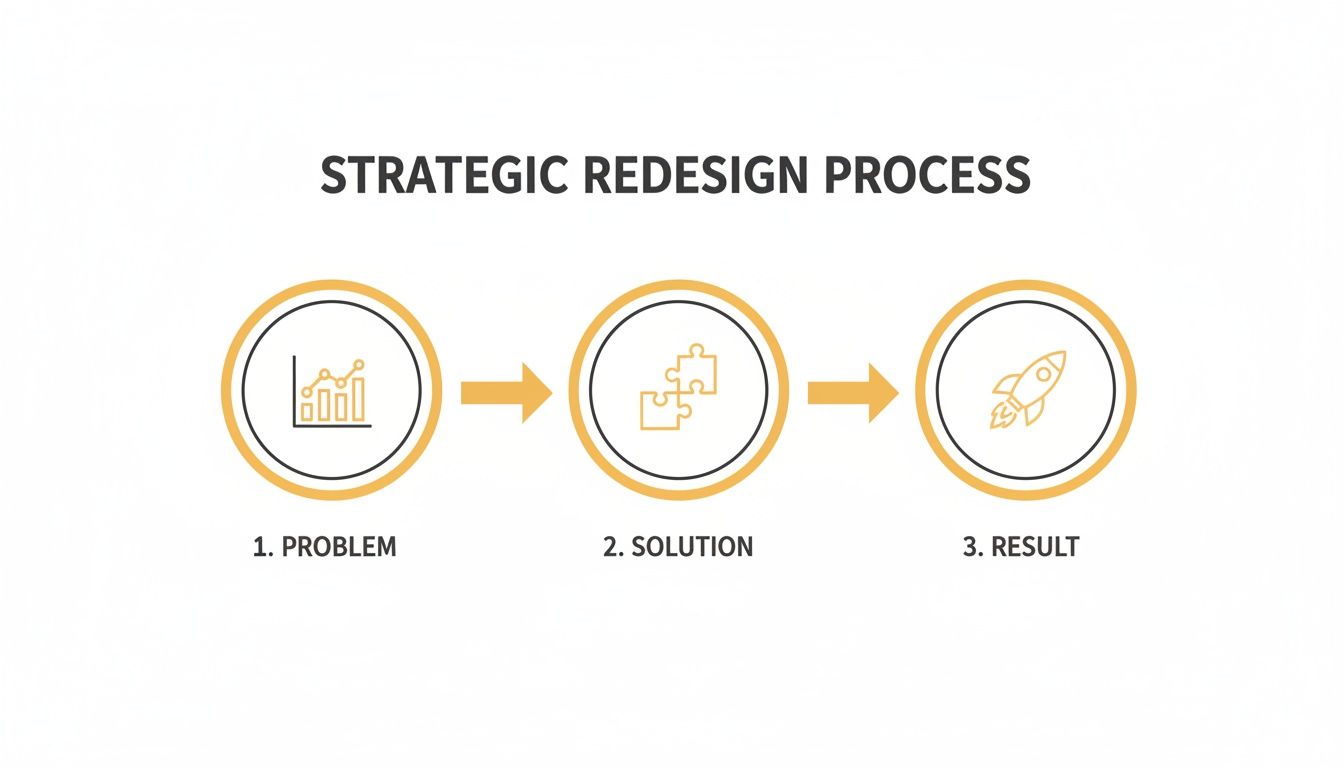
It’s a great reminder of why a structured approach is so important—a clear understanding of the "why" directly informs the "how."
Auditing Your Current Website
With your goals set and stakeholder insights gathered, it’s time for a deep dive into your existing site's performance. This audit is part quantitative data, part qualitative feedback. You need both to get the full picture of what needs to be fixed.
Quantitative Analysis (The What): This is where you get into the hard numbers. Fire up tools like Google Analytics to uncover objective data. You're looking for pages with unusually high exit rates, user flows that hit dead ends, and technical gremlins like slow page load speeds that are killing your conversions.
Qualitative Analysis (The Why): Data tells you what is happening, but user feedback tells you why. Use tools like heatmaps, session recordings, and simple user surveys to understand what’s actually frustrating people. You might discover that your main call-to-action is buried below the fold or that your navigation menu is totally unintuitive on a phone.
This is also a good time to look at your technical foundation. Your hosting, for instance, has a massive impact on performance. It's worth reviewing the key factors to consider when choosing web hosting services because a slow site can undermine even the best design.
By combining the hard data with real human feedback, you move beyond guesswork and start basing your redesign strategy on solid evidence. All of these findings—from the audit, stakeholder interviews, and goal-setting—should come together in a strategic brief. This document becomes your roadmap, guiding the entire project from wireframes all the way to launch day.
Auditing Your Content and SEO for a Seamless Transition
A beautiful new design is only half the battle. All that visual appeal means very little if your core content fails to connect with users or—even worse—if your hard-earned search engine rankings vanish overnight after launch. This is where the real groundwork begins.
You have to audit your existing assets to ensure a smooth, strategic transition. This process is what prevents the catastrophic loss of SEO equity you hear horror stories about. Without a careful audit, you're essentially throwing away years of authority you've built with search engines. It’s the digital equivalent of moving to a new house without telling anyone your new address.

Conducting a Thorough Content Audit
Your first job is to perform a comprehensive content audit. This means creating an inventory of every single page on your current site and analyzing its performance. A simple spreadsheet is your best friend here.
Get in there and start cataloging URLs alongside key metrics like page views, time on page, bounce rate, and conversion data from Google Analytics.
Once you have this data, you can start making informed decisions. Every piece of content should be sorted into one of three buckets. I call it the "Keep, Refresh, Remove" framework.
- Keep: This is your high-performing content. These pages attract significant organic traffic, generate leads, or are cornerstone pieces of your brand's story. They are non-negotiable assets to protect and migrate.
- Refresh: These pages have potential but are underperforming. Maybe it's a blog post with outdated stats, a service page with a weak call-to-action, or content that targets the right topic but just isn't ranking. These are prime candidates for rewriting, expanding, or optimizing.
- Remove: This category is for thin, low-quality, or redundant content. Pages with zero traffic and no strategic value only bloat your site and can even hurt your SEO. These pages should be cut, and their URLs redirected to a relevant new page.
A ruthless content audit is often the most impactful part of a redesign. It's not uncommon for a business to cut 30-50% of its old, underperforming pages and see a significant increase in organic traffic because Google starts prioritizing its high-quality content.
Mapping Content to a New Information Architecture
With your content decisions made, the next task is to organize everything into a new, improved sitemap. This isn't just a list of pages; it's the blueprint for your site's navigation and structure, also known as information architecture. A logical structure makes it easy for users to find what they need and for search engines to crawl and understand your site's hierarchy.
For example, an e-commerce store might restructure its navigation from a generic "Products" dropdown to more specific, user-focused categories like "Men's Running Shoes" and "Women's Trail Running." This seemingly small change drastically improves the user journey and aligns with how people actually search. You can map your "Keep" and "Refresh" content directly to this new sitemap, ensuring every valuable page has a logical home in the new design.
The Critical SEO Migration Checklist
This is where the technical details become absolutely critical. An SEO migration ensures that search engines understand the changes you've made and transfer all the authority from your old URLs to your new ones. Ignoring this step is the single biggest mistake you can make.
A well-executed plan is fundamental, as you can see in this detailed guide on how to redesign a website without tanking your SEO.
Your migration checklist must include a few core components to be effective.
-
Crawl Your Existing Site: Use a tool like Screaming Frog to crawl every single URL on your current website. This creates a complete inventory and serves as the foundation for your redirect map. You can't redirect what you don't know exists.
-
Create a 301 Redirect Map: This is the most crucial document in your SEO migration. It's a spreadsheet that maps every old URL to its corresponding new URL. A 301 redirect is a permanent redirect that tells search engines the page has moved, passing along the vast majority of its link equity and ranking power.
-
Preserve On-Page SEO Elements: Make sure you migrate important on-page elements like title tags, meta descriptions, and H1 tags. While you should take this opportunity to optimize them, you don't want to lose the keyword relevance they've already built up.
-
Perform Fresh Keyword Research: A redesign is the perfect time to identify new ranking opportunities. Use keyword research tools to find valuable terms your competitors are ranking for but you aren't. This research can inform your "Refresh" content strategy and help you create entirely new pages that target untapped search demand.
By methodically working through your content audit and SEO migration checklist, you do more than just prevent disaster. You set the stage for your new website to launch with even stronger performance than the old one ever had.
Designing for Conversions and User Experience
Alright, this is where your strategy starts to feel real—where all that research turns into something your visitors can actually see and touch. A great redesign doesn’t just look sharper; it works smarter. It’s all about creating a path for users that feels completely natural, guiding them right where you want them to go.
You’re not just building pretty pages here. You're taking your user personas, analytics, and business goals and turning them into a structural blueprint for a seamless experience.
From Wireframes to Prototypes
First up are the wireframes. Think of these as the architectural drawings for your website. They're simple, black-and-white layouts that focus purely on structure, where elements go, and how a user moves from one place to another. We intentionally leave out colors, fonts, and images at this stage.
Why? Because a wireframe is all about answering one critical question: "Does this layout make sense?" By stripping away the visual noise, you can get honest feedback on functionality and hierarchy without anyone getting distracted by a color they don't like.
Once the wireframes get the green light, we move on to prototypes. These are interactive, clickable mockups that actually simulate how the final site will feel. People can click through menus, test out buttons, and get a real sense of the navigational flow. Prototypes are a lifesaver because they let you spot usability problems before a single line of code gets written, which saves a ton of time and money down the road.
Mastering Conversion-Centered Design Principles
A website that converts well doesn't happen by accident. It’s built on proven design principles that gently influence user behavior. When you’re in the middle of a redesign, these elements are non-negotiable if you want to drive action.
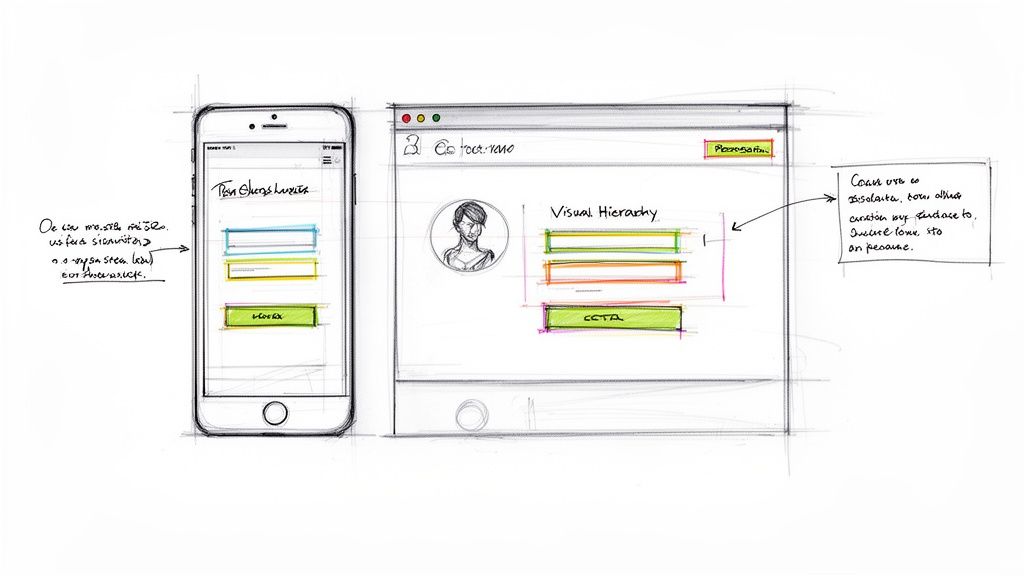
- Visual Hierarchy: This is the art of arranging things to show what’s most important. Big headlines, bright colors, and putting key buttons in prominent spots naturally draw the eye and create a clear path for the user to follow. Without it, people get lost and bounce.
- Clear Calls-to-Action (CTAs): Your CTAs need to be impossible to miss and dead simple to understand. Use action-focused words ("Get Your Free Quote," "Shop the Collection") and pick a contrasting color that makes the button pop off the page. Vague CTAs like "Submit" are conversion killers.
- Trust Signals: Things like customer testimonials, security badges on e-commerce sites, and logos of clients you've worked with are huge for building credibility. In a world where everyone is a bit skeptical online, showing this kind of social proof reassures visitors they're making a smart, safe choice.
When you're redesigning, don't just think about where a button goes. Think about the entire psychological journey someone takes on that page. What question is in their head? What do they need to know next? Every element should anticipate and answer these questions, guiding them smoothly toward that final click.
The Mobile-First and Accessibility Imperative
Designing for the desktop and then shrinking it down for mobile is a recipe for disaster these days. With more than half of all web traffic coming from mobile devices, a mobile-first approach isn't just a good idea—it's essential. This means you design the mobile experience first and then adapt it for bigger screens. It forces you to prioritize what's truly important, leading to a cleaner, more focused design for everyone.
Just as crucial is web accessibility. Your site has to be usable by people with disabilities. This isn't just a "nice-to-have"; it's a legal and ethical responsibility.
Here are a few accessibility must-haves:
- High-Contrast Text: Make sure there's enough contrast between your text and background colors. If it's hard to read, it's bad design.
- Alt Text for Images: Every meaningful image needs descriptive alt text. This is what screen readers use to describe the image to visually impaired users.
- Keyboard Navigation: Can you get to every link, button, and form field using only your keyboard? You should be able to.
Finally, don't forget page speed. It's a massive factor for both user experience and SEO. People expect pages to load in under two seconds. A slow site frustrates visitors and tells Google your site offers a poor experience, which can tank your rankings. Optimizing images, using browser caching, and cleaning up your code are critical steps. If your main goal is a single, focused conversion, brushing up on landing page design best practices will give you even more insight into creating effective, action-driven layouts.
Putting It All Together: Development, Testing, and a Flawless Launch
Okay, the designs are approved and the prototypes have been poked and prodded. Now comes the fun part: turning those beautiful, static visuals into a living, breathing website. This is where the project shifts from concepts to clean, scalable code.
Front-end developers get to work building the interface—everything your visitors will see and interact with. At the same time, back-end developers are engineering the powerhouse behind the scenes, handling everything from simple form submissions to complex e-commerce checkouts.
Precision is everything here. The goal isn't just to build a site that looks like the mockups. We need to create an experience that’s fast, reliable, and built on a foundation that can actually grow with your business. Clean code isn't just some developer jargon; it has a direct impact on your site's performance, security, and how easily you can add new features down the road.
Before you even think about flipping the switch, a tough, thorough testing process is absolutely non-negotiable. This is your final quality check to hunt down any bugs that could torpedo the user experience or ding your brand's credibility right out of the gate.
Your Pre-Launch Testing Gauntlet
Think of this phase as a series of stress tests for every single component of your new site. You have to verify that everything works exactly as it should, across every imaginable environment and for every type of user. Don't cut corners here—a single overlooked bug can cause massive headaches later.
Your testing should hit several key areas:
- Cross-Browser and Device Compatibility: Your site needs to look and function perfectly on Chrome, Safari, Firefox, and Edge. Just as important, it has to be flawlessly responsive on everything from a huge desktop monitor down to the smallest smartphone.
- Functionality Checks: Click every button. Fill out every form. Go through the entire e-commerce checkout flow, from adding a product to the cart all the way to getting that confirmation email. Test everything.
- Performance and Speed: Fire up tools like Google PageSpeed Insights to see how fast your site loads. If a page takes more than a few seconds, people will leave. Slow performance is an absolute conversion killer.
A classic mistake is only testing the "happy path"—the ideal way a user moves through the site. The real gold is in testing the edge cases. What happens if someone types in an invalid credit card number? Or hits the browser's back button mid-checkout? These are the moments that define a great user experience versus a frustrating one.
Lock Down Your SEO with Redirect Testing
One of the most critical pre-launch tasks is checking your 301 redirect map. We talked about this earlier, but it’s worth repeating: this map tells search engines where all your old pages have moved. A single broken redirect means lost traffic and wasted link equity. It's like throwing away free marketing.
You need to test this map on a staging server before the site goes live. This means systematically spot-checking your most important old URLs to make sure they land on the correct new pages. Automated tools can help speed this up, but manually checking your highest-traffic pages is essential for peace of mind.
Getting this right is fundamental to protecting your hard-earned SEO authority. For a deeper look at creating a structured testing process, our guide on quality assurance best practices offers a solid framework.
Crafting a Smooth Launch Day Plan
A successful launch is the result of careful planning, not luck. Launch day shouldn't be a chaotic scramble; it should feel like a methodical execution of a pre-written checklist. This plan ensures no critical steps get missed in the heat of the moment.
Your launch plan should cover these key actions:
- Schedule a Low-Traffic Window: Plan the launch for a time when your site traffic is at its lowest, like late at night or over a weekend. This minimizes potential disruption for any active users.
- Install New Analytics Tracking: Make sure your Google Analytics (or other tracking) codes are installed on the new site before you push it live. You want to capture data from the very first visitor.
- Submit Your New Sitemap: As soon as the site is live, submit your new XML sitemap to Google Search Console. This prompts Google to discover and index your new pages and site structure more quickly.
- Monitor for Immediate Issues: In the first few hours and days, keep a close eye on your analytics. Watch for any unusual dips in traffic or spikes in 404 "not found" errors. Set up monitoring to alert you to downtime or performance slowdowns. This vigilance lets you catch and fix any surprises before they impact a lot of visitors, making sure your redesign starts off on the right foot.
Measuring Success and Planning for Continuous Improvement
Popping the champagne on launch day feels great, but that’s not the finish line. It’s actually the starting line for the real work. The days of launching a site and leaving it untouched for years are over. Now, it's all about data-driven iteration, which is exactly how you’ll prove the ROI of this whole project.
Your first move? Go back to the specific, measurable goals you set during the discovery phase. Did you aim for a 25% boost in qualified leads? Or maybe a 15% drop in cart abandonment? It's time to pull up your analytics and start tracking those key performance indicators (KPIs) like a hawk.
Pinpointing What Truly Matters
It's way too easy to get lost in a sea of data. Don't drown in vanity metrics—focus on the numbers that actually show whether the redesign is working.
- Conversion Rate: This is the big one. Are more people taking the actions you want them to take (buying, signing up, etc.) than before? This is your ultimate measure of success.
- Bounce Rate and Engagement Rate: A lower bounce rate and a higher engagement rate are strong signs that your new design and content are resonating with visitors and holding their attention.
- Organic Traffic and Keyword Rankings: Keep a close eye on Google Search Console. After the dust settles from the launch, your rankings should stabilize or—ideally—climb for your target keywords. If you see a sharp, sustained drop, it might be a red flag for a technical SEO problem.
Remember, data tells you what is happening, but it doesn't always tell you why. A high exit rate on a shiny new landing page is a clear signal, but it doesn't explain the root cause of the problem. That's where you need to dig a little deeper.
Gaining Deeper User Insights
To figure out the "why" behind the numbers, you have to watch how real people interact with your new site. This is where user behavior analytics tools become your best friend, turning abstract data into concrete, actionable insights.
For instance, tools like heatmaps visually show you where users are clicking, moving their mouse, and how far they're scrolling down a page. You might discover that a critical call-to-action button is getting completely ignored simply because it’s placed just below where most people stop scrolling.
Session recordings give you another powerful layer of insight. These are like watching anonymized over-the-shoulder videos of real user sessions. You can see firsthand as people navigate your site, run into frustrating roadblocks, or give up on a process. Watching someone repeatedly struggle to find a key piece of information in your new navigation menu is a much stronger motivator for change than just looking at a number on a dashboard.
This continuous feedback loop—analyzing the hard numbers and then enriching that data with qualitative user insights—is what drives long-term growth. By making small, informed tweaks every month, you ensure the investment in your website redesign continues to pay off long after launch day.
Common Questions About Redesigning a Website
Jumping into a website redesign always kicks up a few big questions. Getting straight answers upfront is the best way to set the right expectations for your timeline, budget, and what you’ll actually get out of the whole process.
How Long Does a Website Redesign Typically Take?
For most small and medium-sized businesses, you should plan for about 12 to 16 weeks from start to finish. Of course, that can change depending on how complex the project is, how many pages you have, and if you need any custom features built from scratch.
It usually breaks down into a few key stages:
- Discovery and Strategy: 2–3 weeks to figure out what we're building and why.
- Design and UX: 3–4 weeks to map out the user experience and create the visuals.
- Development: 5–6 weeks where the actual coding and building happens.
- Testing and Launch: 1–2 weeks to iron out bugs and go live.
The secret to staying on track? Solid communication and sticking to a clear plan. When everyone knows what’s happening next, things just move a lot smoother.
Will a Redesign Hurt My SEO Rankings?
This is a big one, and the short answer is: it shouldn't. While you might see a small, temporary dip in rankings right after you launch, a redesign done right should actually boost your SEO performance in the long run.
The make-or-break factor here is a rock-solid SEO migration plan. You can’t just launch a new site and hope for the best.
A successful migration means carefully mapping every old URL to its new home with a 301 redirect. It also means preserving all your important on-page SEO data, making sure the new site is lightning-fast, and keeping your content quality high. This is how you avoid losing traffic and protect the authority you've worked so hard to build.
At Up North Media, we live and breathe data-driven redesigns that protect your SEO and deliver real growth. If you want to build a site that works as hard as you do, schedule your free consultation with our team today.