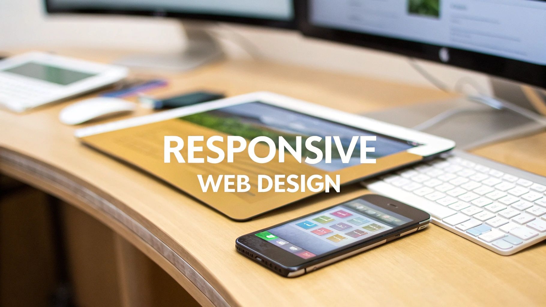
In a multi-device world, a website that doesn't adapt is a website that fails. Responsive web design is no longer just a best practice; it's a fundamental requirement for user engagement, search engine optimization, and conversions. But what separates a merely functional responsive site from one that truly excels? The difference lies in the strategic use of fluid grids, flexible images, and intelligent breakpoints that create a seamless experience on any screen.
This article moves beyond theory, dissecting 7 stellar responsive web design examples to uncover the specific strategies, tactical insights, and replicable methods that make them work. We will analyze how platforms like Webflow Showcase and Awwwards feature designs that masterfully adjust content hierarchy and navigation from desktop to mobile. You will see how digital agencies like Up North Media implement responsive principles that you can apply directly to your own projects for measurable results. Each example includes screenshots, direct links, and a deep dive into its unique approach to layout, interaction, and performance across devices.
We'll break down the "how" and "why" behind each design choice, providing actionable takeaways for developers, designers, and business owners. For a broader understanding of essential principles that contribute to a successful user experience, including responsiveness, consider these 10 Website Design Best Practices for 2025. This curated list is your practical guide to understanding and implementing high-performing responsive design that captures attention and drives growth.
1. Up North Media
Up North Media secures its position as a premier example of responsive web design by masterfully blending technical prowess with a conversion-focused user experience. As a digital agency specializing in web application development, SEO, and AI consulting, its own website serves as a powerful testament to its capabilities. The design immediately communicates professionalism and expertise, using a clean layout, strategic use of white space, and a cohesive brand identity that adapts flawlessly across all devices.
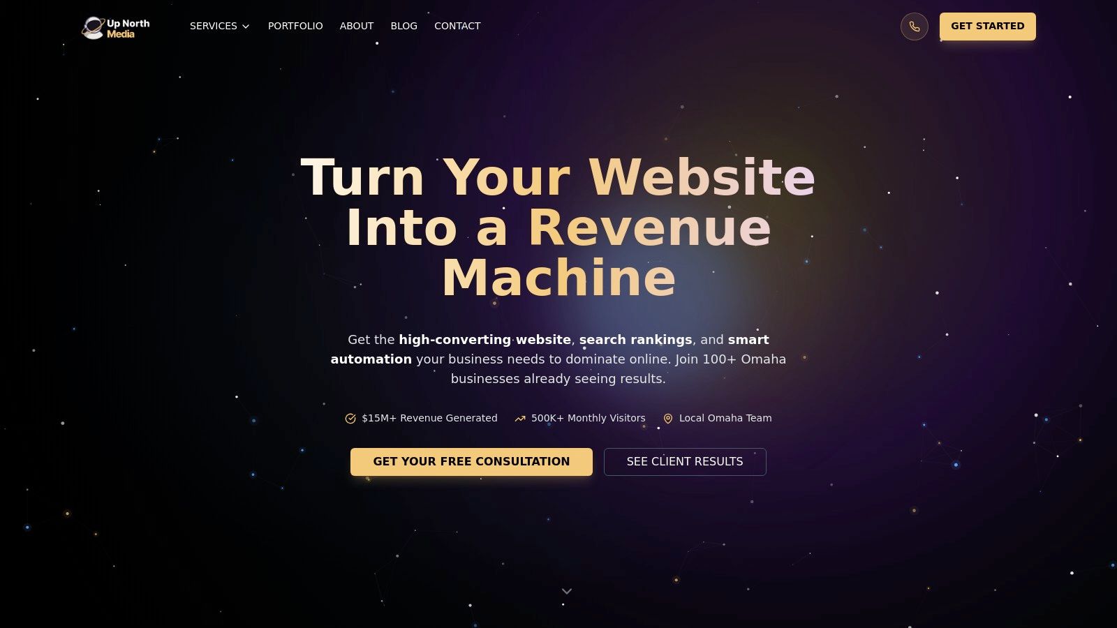
This platform excels not just in aesthetics but in demonstrating the core principles of effective responsive design. It provides an intuitive and seamless journey for its target audience, which includes Omaha-based businesses, e-commerce retailers, and tech startups, ensuring that key information is always accessible and visually compelling, regardless of the screen size.
Strategic Breakdown: How Up North Media Implements Responsive Design
Up North Media’s site is a case study in strategic element stacking and content prioritization for mobile-first engagement. The desktop version features a multi-column layout showcasing client results, service offerings, and testimonials side-by-side. As the viewport shrinks, these columns elegantly collapse into a single, digestible vertical flow.
- Fluid Grid System: The layout is built on a fluid grid that allows content blocks to resize proportionally. This prevents awkward element cropping or horizontal scrolling on smaller screens.
- Flexible Media: All images and embedded media, such as client logos and testimonial graphics, scale dynamically. This ensures they remain crisp and correctly proportioned on both high-resolution desktop monitors and compact smartphone screens.
- Intelligent Navigation: The primary navigation menu on desktop is a clean, horizontal bar. On mobile, it transforms into a streamlined hamburger menu, preserving valuable screen real estate while keeping all site sections easily accessible.
Key Takeaway: The design proves that a complex service offering doesn't require a cluttered interface. By prioritizing a mobile-first approach, Up North Media ensures its value proposition is clear and impactful on any device, making it one of the most effective responsive web design examples available.
Actionable Insights and Replicable Tactics
For designers and developers, Up North Media's website offers several replicable strategies for creating a superior responsive experience.
- Prioritize Above-the-Fold Content: On mobile, the headline, a concise value proposition, and a prominent "Get Your Free Proposal" call-to-action are immediately visible. This strategy captures user attention instantly and drives conversions without requiring scrolling.
- Touch-Friendly Design: All interactive elements, including buttons and form fields, are sized appropriately for touch input. This small but critical detail significantly improves mobile usability and reduces user frustration.
- Performance Optimization: The site loads exceptionally fast across devices. This is achieved through optimized images, efficient code, and leveraged browser caching, directly impacting user engagement and SEO rankings.
The site, available at https://upnorthmedia.co, stands out by not only offering comprehensive digital services but by embodying the very principles of excellence it provides to its clients. While pricing is available only through direct consultation, the agency's proven results and strong testimonials highlight a clear return on investment. Its focus on the Omaha market is a strength for local businesses, though it may require remote collaboration for national clients. This platform is a definitive example of how responsive design can serve as a powerful business development tool.
2. Awwwards
Awwwards isn't a single responsive web design example; it's an indispensable resource for discovering thousands of them. It operates as a professional web design and development competition, curating a gallery of the most innovative, visually stunning, and technically proficient websites from around the globe. For businesses and designers, it serves as a living library of what's currently possible and celebrated in digital design.
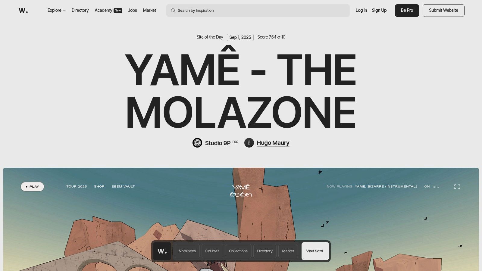
The platform’s core value lies in its rigorous curation process. Each submitted site is evaluated by a jury of leading industry experts on a set of criteria including design, usability, creativity, and content. This ensures that the examples featured are not just aesthetically pleasing but also technically sound and user-friendly, providing a benchmark for excellence.
Strategic Analysis: Using Awwwards as a Research Tool
Awwwards excels as a strategic tool for project planning and inspiration. Its powerful filtering system allows users to find specific responsive web design examples based on technology, style, color, industry, or country. This granular control turns a potentially overwhelming gallery into a targeted research database.
Key Insight: Awwwards validates design directions. Presenting an award-winning site from a similar industry to stakeholders can effectively demonstrate the value and feasibility of a proposed design approach, accelerating buy-in and decision-making.
Actionable Takeaways and Usage Tips
To leverage Awwwards effectively, businesses and designers should adopt a focused research strategy.
- Define Your Goal: Before browsing, identify what you need. Are you looking for innovative mobile navigation patterns, unique e-commerce product page layouts, or examples of effective micro-interactions?
- Filter with Precision: Use the search filters to narrow down the results. For instance, an e-commerce retailer could filter for "Shopify," "Minimal," and "E-commerce" to find relevant, high-quality benchmarks.
- Analyze the Nominees: Don't just look at the "Site of the Day." The nominee section contains a wealth of high-caliber work that showcases emerging trends and diverse approaches to responsive design.
Platform Access and Offerings
While browsing the gallery is free, Awwwards offers "Pro" memberships (starting around $200/year) that unlock deeper features like detailed case studies, professional directories, and online courses. The platform also includes a marketplace for premium digital assets, though quality can vary between creators. The true value for most users remains the free-to-access, expertly curated gallery of top-tier responsive design.
Website: https://www.awwwards.com
3. Webflow Showcase (Made in Webflow)
Webflow Showcase, also known as Made in Webflow, is more than an inspiration gallery; it's an interactive, educational ecosystem. It features thousands of real websites and components built by the Webflow community, offering a transparent look into how modern, complex responsive layouts are constructed. For developers and designers, it’s a hands-on resource for deconstructing and learning from the work of others.
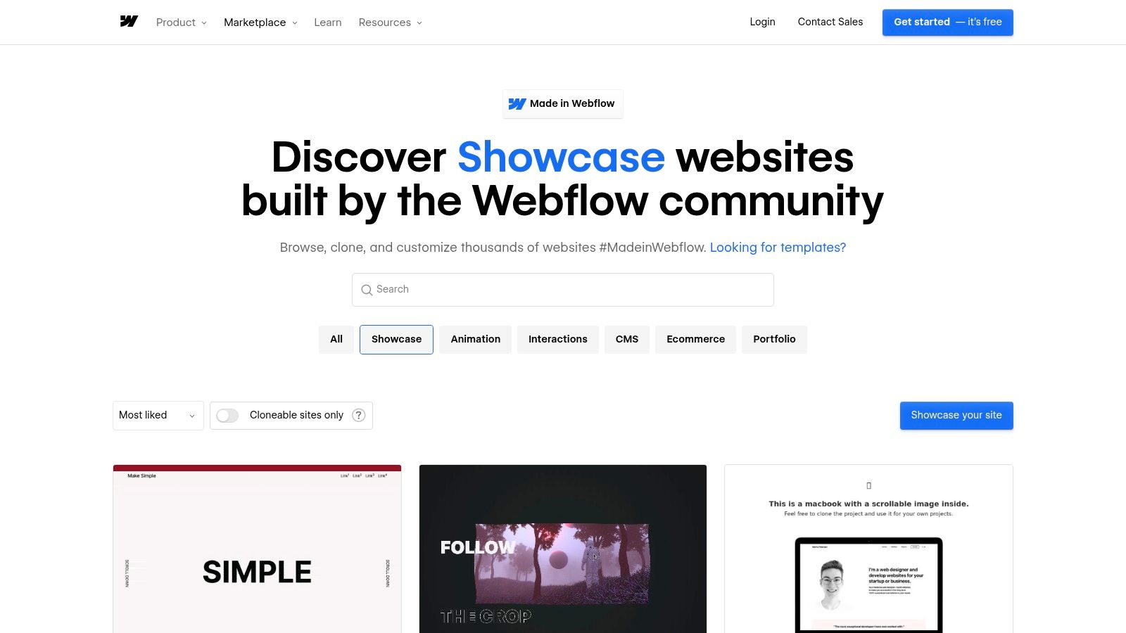
The platform's standout feature is its "cloneable" functionality. Many creators allow users to copy an entire project, including its responsive settings, interactions, and CMS structure, directly into their own Webflow account. This transforms passive viewing into an active learning experience, allowing you to reverse-engineer sophisticated designs and understand the underlying logic firsthand.
Strategic Analysis: Using Webflow Showcase for Rapid Prototyping
Webflow Showcase excels as a tool for accelerating the web development process, moving from concept to functional prototype with incredible speed. Its library of cloneable assets allows teams to skip the foundational build and focus immediately on customization and content. You can find everything from complete e-commerce sites to intricate navigation menus and interactive sliders.
Key Insight: Webflow Showcase de-risks experimentation. By cloning a complex layout or interaction, you can test its feasibility and adapt it to your brand's needs in a live environment without committing extensive development resources from the start.
Actionable Takeaways and Usage Tips
To maximize the value of the Showcase, focus on its interactive and educational capabilities.
- Filter for Cloneables: When searching, immediately apply the "Cloneable" filter. This ensures you're only browsing projects you can directly inspect and use.
- Study the Navigator Panel: Once you clone a project, open Webflow's Designer and spend time in the Navigator panel. This reveals the precise element structure, class naming conventions, and nesting used to achieve the responsive behavior.
- Deconstruct Interactions: Use the Interactions panel on cloned projects to see how animations and micro-interactions are built. This is invaluable for learning how to create engaging user experiences that adapt across devices.
Platform Access and Offerings
Browsing and cloning projects from the Webflow Showcase is completely free, though you need a free Webflow account to save cloned projects. To publish a cloned site on a custom domain or unlock advanced features like custom code and increased CMS items, a paid Webflow site plan is required (starting around $14/month, billed annually). The quality of projects varies, but the community voting system helps highlight the most popular and well-crafted examples.
Website: https://webflow.com/made-in-webflow/showcase
4. CodePen
CodePen is not a single website but a vast online community and development environment for front-end designers and developers. It functions as a social playground where users can create and share user-interface code snippets, known as "Pens." For those seeking responsive web design examples, it offers an unparalleled, granular look into the building blocks of responsive UIs, from complex grid layouts to interactive mobile menus.
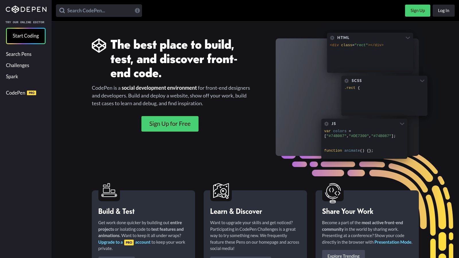
The platform's primary value is its "show, don't tell" approach. Instead of just viewing a static image of a responsive component, you get immediate access to the live HTML, CSS, and JavaScript that powers it. This live editor allows for instant experimentation, making it an exceptional tool for learning, debugging, and rapidly prototyping specific responsive behaviors without setting up a full development environment.
Strategic Analysis: Using CodePen for Component-Level Prototyping
CodePen excels as a strategic tool for isolating and perfecting individual responsive components before integrating them into a larger project. Its powerful search and "Collections" features allow developers to find thousands of examples of specific UI patterns, such as fluid typography, container queries, or accessible navigation toggles. This component-level focus accelerates the development cycle significantly.
Key Insight: CodePen de-risks implementation. By building and testing a complex responsive component in an isolated Pen, developers can identify and solve potential cross-browser issues and performance bottlenecks early, saving significant time and resources during the main project build.
Actionable Takeaways and Usage Tips
To leverage CodePen effectively, developers and designers should treat it as a technical sketchbook and a community-driven library.
- Isolate the Problem: When facing a specific responsive challenge, such as a tricky flexbox layout, search for that exact term on CodePen. Analyze how others have solved similar problems.
- Fork and Experiment: Don't just copy and paste. Use the "Fork" feature to create your own version of an existing Pen. Modify the code to fit your project's needs, change breakpoints, and test edge cases in real-time.
- Build Collections: Create curated collections of Pens for different projects or UI patterns (e.g., "Responsive Forms," "Mobile Navigations"). This builds a personal library of vetted, reusable solutions. By following the best practices for web development, you can ensure these snippets are high-quality.
Platform Access and Offerings
Using CodePen to browse, create, and share public Pens is completely free. For enhanced functionality, CodePen offers "Pro" plans (starting around $8/month) that include features like private Pens, asset hosting, collaborative modes, and an embeddable "Professor Mode" for teaching. However, for the primary purpose of finding and learning from responsive design examples, the free version is exceptionally robust and sufficient for most users.
Website: https://codepen.io
5. ThemeForest (Envato Market)
ThemeForest is the world's largest marketplace for website themes and templates, offering a vast repository of pre-built responsive designs. Rather than a single example, it provides tens of thousands of functional responsive web design examples that can be purchased and deployed, dramatically accelerating development for platforms like WordPress, Shopify, and static HTML sites. It serves as a practical resource for businesses needing a high-quality design on a limited timeline or budget.
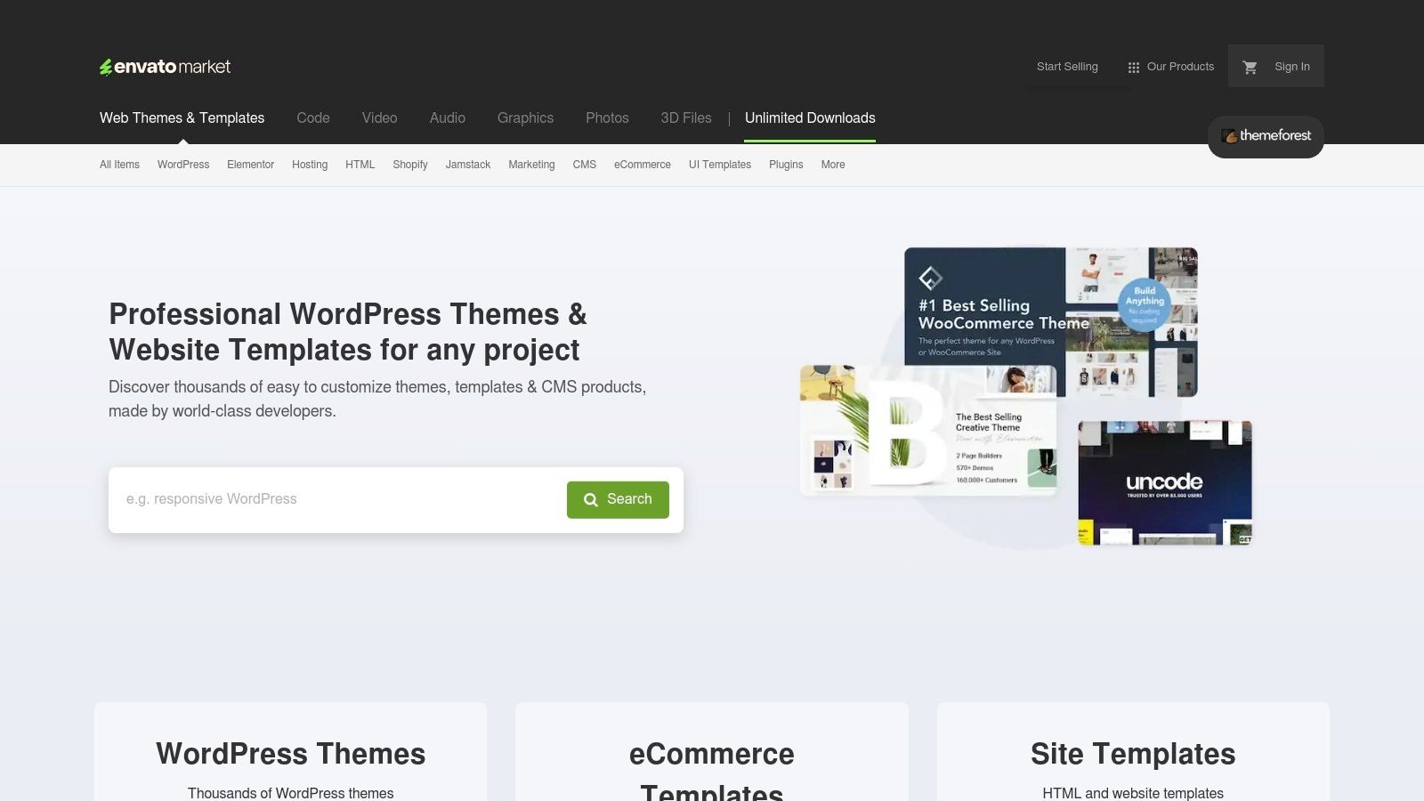
The platform's primary value is its sheer volume and diversity. Developers and agencies from around the globe contribute themes, resulting in a catalog that covers virtually every industry, aesthetic, and functional requirement. Each product includes live demos, allowing users to interact with the responsive design across different viewport sizes before making a purchase. Buyer ratings and comments provide crucial social proof regarding quality, performance, and author support.
Strategic Analysis: Using ThemeForest for Rapid Prototyping and Deployment
ThemeForest excels as a strategic asset for rapid project execution. The ability to acquire a fully-featured, professionally designed responsive theme allows teams to bypass much of the initial design and front-end development phases. This is particularly useful for validating a business idea, launching a minimum viable product (MVP), or meeting tight client deadlines.
Key Insight: ThemeForest allows businesses to test market fit with minimal investment. By using a premium theme, a startup can launch a professional-looking e-commerce store or marketing site in days, not months, to gauge customer interest before committing to a full custom build.
Actionable Takeaways and Usage Tips
To effectively utilize ThemeForest, a careful selection process is critical to avoid performance issues and ensure long-term viability.
- Prioritize Performance and Updates: Look beyond aesthetics. Check the theme's last update date, read recent comments about performance, and use tools like Google PageSpeed Insights on the live demo to assess its baseline load times.
- Evaluate Author Reputation: Investigate the theme author. A reputable author with a history of consistent updates and positive support ratings is a much safer investment than an unknown entity.
- Scrutinize the Feature List: Avoid "multipurpose" themes bloated with unnecessary features that can slow down your site. Choose a theme that specifically matches your core requirements to maintain a lean and efficient codebase.
Platform Access and Offerings
ThemeForest operates primarily on a per-item licensing model, with one-time purchase costs for themes typically ranging from $20 to $80. This fee usually includes six months of author support. For users needing a wider range of assets, Envato also offers the Envato Elements subscription (starting around $16.50/month), which provides unlimited downloads from a large library of themes, plugins, and creative assets. However, the selection on Elements is different from the main ThemeForest marketplace.
Website: https://themeforest.net
6. Creative Market
Creative Market functions as a vast digital marketplace where independent creators sell ready-to-use design assets, including a massive library of website templates. For businesses and developers looking to accelerate a project, it provides thousands of pre-built, responsive web design examples that can be purchased and customized. It’s a practical resource for acquiring foundational designs for platforms like Webflow, WordPress, Shopify, and even design tools like Figma.
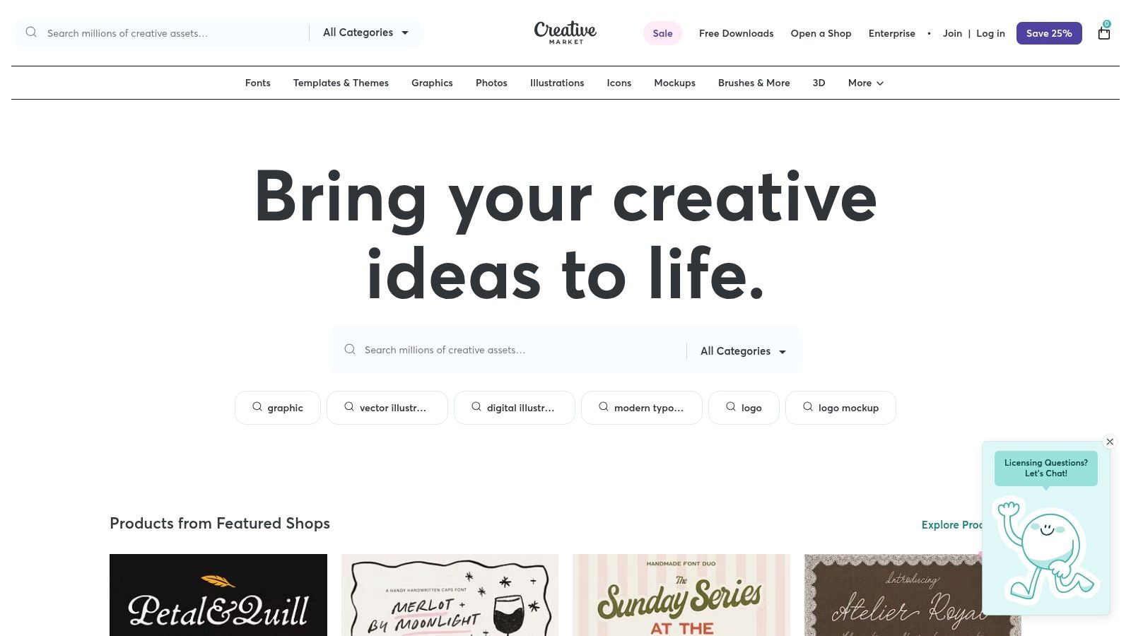
Unlike curated galleries, Creative Market’s value is in its sheer volume and diversity. It’s a direct-to-creator marketplace, which means you can find niche templates and unique design styles that aren't available on larger, more standardized platforms. This makes it an ideal starting point for projects that need a distinct visual identity without the cost of a fully custom build.
Strategic Analysis: Using Creative Market for Project Scaffolding
Creative Market is best utilized as a tool for rapid project scaffolding and market testing. Its extensive library allows businesses to find a template that is 80% of the way to their final vision, significantly reducing initial development time and costs. The platform’s search filters, particularly the ability to filter by "Layout Responsive" and specific platforms, are essential for finding viable starting points.
Key Insight: The platform allows for low-cost validation of a design concept. By purchasing a high-quality responsive template for a few hundred dollars, a business can deploy a functional prototype or minimum viable product (MVP) to test with real users before committing to a larger development budget.
Actionable Takeaways and Usage Tips
To get the most out of Creative Market, approach it with a clear implementation plan.
- Verify Responsiveness: Always use the "Live Preview" or "Demo" feature on multiple devices (or by resizing your browser window) to personally verify the template's responsive behavior before purchasing.
- Check Creator Credentials: Review the seller’s profile, ratings, comments, and the date of the last update. An active creator is more likely to provide support and keep the template compatible with platform updates.
- Understand Licensing: Pay close attention to the license type (Personal, Commercial, or Extended Commercial) to ensure it aligns with your project's needs. Licensing dictates how and where you can use the template.
Platform Access and Offerings
Creative Market operates on a per-item pricing model, with templates ranging from under $50 to over $200, depending on complexity and license. The platform is free to browse, and frequent sales and bundles offer significant discounts. However, it's crucial to remember that support comes from individual creators, not Creative Market itself. This means the quality of documentation and post-purchase assistance can vary. Businesses should also factor in the ongoing work needed for website updates and maintenance, as this responsibility falls on the user after purchase.
Website: https://creativemarket.com
7. One Page Love (Responsive Design tag)
One Page Love is a highly focused and long-running resource dedicated to the art of single-page websites. Its specific "responsive design" tag filters its extensive gallery to showcase over 2,600 examples, making it an invaluable niche resource. For businesses needing inspiration for landing pages, campaign microsites, or portfolio pages, this platform provides a concentrated dose of concise, scannable, and mobile-first layout ideas.
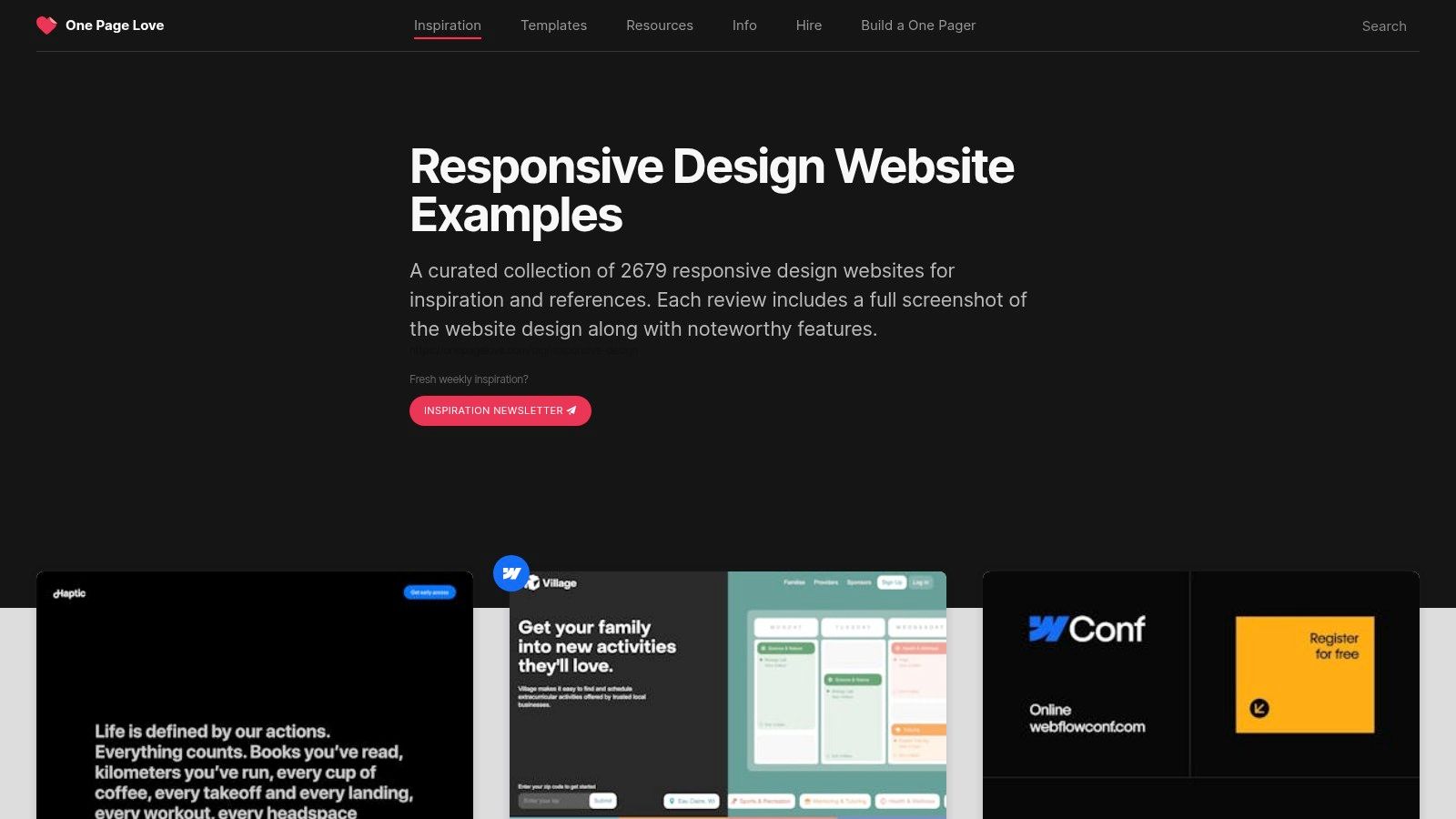
The platform's strength is its simplicity and specialization. Unlike massive galleries covering all website types, One Page Love zeroes in on the unique challenges and opportunities of containing a complete narrative within a single, scrolling experience. This focus makes it an excellent tool for understanding how to structure information, guide user flow, and create engaging interactions without relying on a multi-page architecture.
Strategic Analysis: Mastering Concise Mobile-First Layouts
One Page Love is a masterclass in information hierarchy and mobile-first design. By studying its curated examples, designers can learn how to distill complex messages into a linear, compelling narrative that works seamlessly on any device. The single-page format forces designers to be ruthless with content, prioritizing only what is essential for the user journey.
Key Insight: The constraints of a single-page design are a powerful training ground for responsive thinking. They teach you to prioritize content and create a fluid narrative that translates perfectly to the narrow viewport of a mobile device, a skill applicable to all web projects.
Actionable Takeaways and Usage Tips
To extract maximum value from One Page Love, approach it as a library of structural patterns rather than just visual inspiration.
- Focus on Flow: Analyze how different sites handle navigation within a single page. Look for clever uses of anchor links, sticky headers, and visual cues that guide users down the page without disorientation.
- Study Content Chunking: Pay attention to how content is broken into digestible sections. These responsive web design examples are excellent for learning how to use whitespace, typography, and background changes to create distinct "pages" within a single scroll.
- Explore Template Roundups: The site often features curated lists of paid templates. These are useful for quick-turnaround projects, providing a vetted starting point with pricing and platform details clearly listed.
Platform Access and Offerings
Accessing the inspiration gallery on One Page Love is completely free. The platform generates revenue through affiliate links to templates and resources it recommends. This model allows users to browse thousands of live sites and reviews without a subscription. While the primary focus is on inspiration, the site links out to both free and paid templates from various vendors, offering a practical path from idea to implementation. However, be aware that some older entries may link to sites that are no longer active.
Website: https://onepagelove.com/tag/responsive-design
Top 7 Responsive Web Design Examples Comparison
| Service | Implementation Complexity 🔄 | Resource Requirements ⚡ | Expected Outcomes 📊 | Ideal Use Cases 💡 | Key Advantages ⭐ |
|---|---|---|---|---|---|
| Up North Media | High - custom development and AI integration | High - skilled team for web apps, SEO, AI | Strong business growth, increased traffic and sales | Businesses needing tailored digital solutions | Comprehensive services, proven revenue, ROI |
| Awwwards | Low - curation and showcasing only | Medium - editorial and membership management | Inspiration, industry recognition, stakeholder buy-in | Agencies/designers seeking best practice examples | Award-winning sites, marketplace, industry jury |
| Webflow Showcase | Medium - cloning and customizing projects | Low to Medium - Webflow account needed | Rapid prototyping, hands-on responsive design | Designers wanting to learn and reuse real projects | Large variety, cloneable sites, hands-on access |
| CodePen | Low - snippet-level, isolated testing | Low - web-based editor, free and paid plans | Fast experimentation, UI component exploration | Developers testing CSS/JS or learning snippets | Instant preview, widely adopted, community-rich |
| ThemeForest (Envato Market) | Low to Medium - template customization | Low to Medium - purchasing pre-built themes | Faster build times with premium templates | Developers/designers needing ready-made themes | Huge catalog, buyer ratings, detailed demos |
| Creative Market | Low to Medium - template purchase and usage | Low to Medium - varied by seller | Broad selection of responsive templates | No-code and multi-platform projects | Wide platform support, frequent sales |
| One Page Love (Responsive Tag) | Low - curated gallery of single-page sites | Low - browsing and selecting inspiration | Quick inspiration for mobile-first, single-page sites | Landing pages, campaign sites | Large curated examples, mix of free and paid |
From Inspiration to Implementation: Your Next Steps
We've explored a dynamic range of responsive web design examples, journeying from the curated excellence of Awwwards to the practical, market-ready templates on ThemeForest. Each platform, from Webflow's creative showcase to the hyper-focused single-page layouts on One Page Love, offers a unique perspective on solving the multi-device puzzle.
The common thread woven through these diverse examples is not merely aesthetic flexibility. True responsive design is a strategic discipline. It's about making deliberate choices to enhance usability, prioritize content, and drive conversions, regardless of screen size. The best designs don't just shrink; they transform.
Distilling the Core Principles
Across all the examples we analyzed, a few fundamental principles emerged as non-negotiable for success. These are the strategic pillars you should build your own responsive strategy upon.
- Content Hierarchy is King: On smaller screens, what you don't show is as important as what you do. Successful responsive designs, like those seen in many agency portfolios, ruthlessly prioritize the most critical information, moving secondary elements to less prominent positions or behind user-initiated actions like a "hamburger" menu.
- Navigation Must Adapt, Not Just Collapse: A simple collapsed menu isn't always the answer. We saw examples that transitioned to tab bars for mobile e-commerce or simplified to a single primary call-to-action on landing pages. The goal is to reduce friction and guide the user to their destination with minimal taps.
- Performance is a Feature: A beautiful design that takes ten seconds to load on a mobile connection is a failed design. Optimizing images, leveraging modern CSS for layouts (like Grid and Flexbox), and minimizing code are crucial steps observed in top-tier examples. This directly impacts user retention and SEO.
- Interaction and Touch Targets Matter: Elements must be designed for fingers, not just cursors. This means larger buttons, adequate spacing between clickable links, and intuitive gestures. The examples on CodePen are particularly useful for dissecting these micro-interactions at a granular level.
Turning Analysis into Action
Inspiration is valuable, but implementation is what generates results. Use the insights from this article as a tactical playbook for your own digital assets. Here’s how to start putting these ideas into practice.
- Conduct a Multi-Device Audit: Open your website on a desktop, a tablet, and a smartphone. Better yet, use your browser's developer tools to simulate various screen sizes. Go beyond a simple visual check. Critically assess the user journey for a primary conversion goal (e.g., making a purchase, filling out a form) on each device. Where does the experience break down?
- Map Your Breakpoints to Content, Not Devices: Instead of designing for "the iPhone" or "the iPad," analyze where your content and layout naturally start to look strained. This content-first approach to breakpoints creates a more fluid and future-proof design that will adapt to new devices as they emerge.
- Choose Your Tools Wisely: Your technology stack directly influences your responsive capabilities. Platforms like Webflow offer immense visual control without deep coding knowledge. For developers, a framework like CodePen provides an environment to rapidly prototype and test complex CSS and JavaScript interactions. For Omaha businesses looking for a robust, market-tested solution, platforms like ThemeForest can offer a cost-effective starting point.
- Prioritize and Iterate: You don't need to fix everything at once. Identify the most significant point of friction in your mobile experience and address it first. Small, incremental improvements, guided by analytics and user feedback, often lead to the most substantial long-term gains.
Ultimately, the best responsive web design examples teach us that user context is everything. A user on a phone in a coffee shop has different needs and a shorter attention span than someone at a desk. Acknowledging this reality and designing for it is the hallmark of a truly effective, modern web presence.
Ready to move beyond inspiration and build a responsive web application that drives real business results? The team at Up North Media specializes in crafting custom, conversion-optimized digital experiences tailored to the needs of businesses in Omaha and beyond. We transform the principles seen in these top-tier examples into a tangible asset for your brand. Contact Up North Media for a free consultation and let's build something exceptional together.