
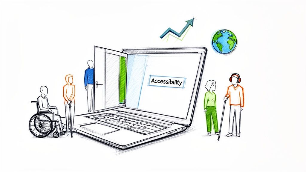
Website accessibility compliance is about building a digital experience that genuinely works for everyone. That includes the over one billion people worldwide living with disabilities. This isn't just a box-ticking exercise anymore; it's a core business requirement, driven by both legal standards and what customers have come to expect.
Why Website Accessibility Is Now a Business Essential
A lot of businesses still see accessibility as a niche problem or just another expense. The reality couldn't be more different. Creating an inclusive website is one of the smartest moves you can make. It’s about opening your digital front door to a huge—and often ignored—part of the market.
This isn’t just a hunch; the numbers are pretty shocking. The WebAIM Million report found that an incredible 94.8% of the world's top homepages had clear accessibility failures. They uncovered over 50 million distinct errors, averaging 51 per page. For businesses, this means you're actively turning away customers. In fact, 71% of users with disabilities will just leave a site they can't use.
The Real-World Risks of Non-Compliance
Putting accessibility on the back burner exposes your business to some very real, and very avoidable, risks. The most obvious threat is legal trouble. In the U.S., the Americans with Disabilities Act (ADA) is being applied to websites more and more, leading to a flood of lawsuits against non-compliant businesses of all sizes.
But even without a lawsuit, the financial hit is direct. When a potential customer using a screen reader can't get through your checkout, or someone with a motor impairment can't physically click your "buy" button, you’ve lost a sale. Those lost opportunities add up, quietly chipping away at your revenue.
Turning Compliance into a Strategic Advantage
If you shift your perspective, you’ll see that accessibility compliance is actually a massive opportunity. An accessible website is simply a better website for everyone, not just users with disabilities. Things like clear navigation, readable text, and a logical layout are just good design principles that benefit all your visitors. Focusing on inclusivity has a direct, positive impact on what is user experience design as a whole, which means better engagement and happier customers.
An accessible website is a more usable website. By prioritizing inclusivity, you naturally improve key business metrics like session duration, bounce rates, and conversion rates, giving you a distinct competitive edge.
The benefits bleed right into your marketing, too. Search engines like Google love websites that provide a great user experience, and many accessibility practices are also SEO best practices.
- Descriptive Alt Text: This helps visually impaired users understand images, but it also gives search engines critical context for ranking your content.
- Logical Heading Structure: A clean heading structure lets screen readers navigate a page, and it helps search engine crawlers understand the hierarchy and importance of your information.
- Video Transcripts: Transcripts provide an alternative for users with hearing impairments while creating a ton of indexable text content that can boost your SEO.
Ultimately, embracing website accessibility isn't about dodging penalties. It's about building a better, more effective, and more profitable business. You strengthen your brand, expand your market, and build a digital presence that’s ready for the future.
Trying to make sense of website accessibility laws can feel like you've been handed a map written in a different language. But here's the good news: once you get the hang of the core ideas, the path forward gets a lot clearer. It really boils down to this: digital spaces, just like physical ones, have rules to ensure everyone gets equal access.
And the legal pressure is definitely ramping up. In the US, the first half of one recent year saw 2,014 ADA website accessibility lawsuits hit the courts—that’s a 37% jump from the year before. The trend is global, too, with filings up 68% worldwide. This spike is partly driven by new regulations like Europe's European Accessibility Act (EAA), which kicked into gear on June 28 of its implementation year. Suddenly, over 500,000 EU businesses are on the hook, showing this is a serious risk for anyone operating in major markets. You can find more details about these legal shifts over at DarrowEverett.com.
This isn’t just a headache for giant corporations, either. Courts are increasingly saying that laws like the Americans with Disabilities Act (ADA) apply to websites, treating them as "places of public accommodation." What that means for you is that your e-commerce shop, your service-based site, or your blog has to be usable for people with disabilities. Getting a handle on what the ADA expects is a critical first step, and a professional independent ADA review can give you a brutally honest look at where you currently stand.
Understanding WCAG: The Global Standard
While laws like the ADA tell you what you need to do (provide equal access), they don't give you a technical checklist on how to do it. That's where the Web Content Accessibility Guidelines (WCAG) come in. Think of WCAG as the detailed, internationally recognized instruction manual for building an accessible website. Legal cases and official guidance all point to it as the benchmark.
WCAG is broken down into three different "conformance levels." Getting to know these levels is the key to setting a compliance goal that's both realistic and effective for your business.
It can be a little confusing at first, so here’s a quick breakdown to help you figure out where to aim.
WCAG Conformance Levels Explained
| Level | What It Means | Who It's For |
|---|---|---|
| Level A | This is the absolute minimum. It tackles the most critical, show-stopping barriers that would completely block someone from using your site. It's a starting point, not the finish line. | Every website should meet this, but it's not enough to be considered truly accessible or legally safe. |
| Level AA | This is the industry standard and the level most laws and legal cases reference. It covers the most common and significant barriers, making your site usable for the vast majority of people with disabilities. | This is the target for almost all businesses. It offers strong legal protection and a genuinely good user experience. |
| Level AAA | The gold standard. This level includes more specialized criteria that provide an even higher degree of accessibility. It's fantastic but can be very difficult (and sometimes impossible) to meet for all types of content. | Usually reserved for government sites or specialized services catering specifically to disabled audiences. |
Essentially, you need to know which level is the right fit for your organization. For most businesses, the answer is straightforward.
Reaching Level AA conformance is the goal. It means your website is not only legally defensible but also provides a genuinely positive and usable experience for most people with disabilities. It strikes the perfect balance between robust accessibility and practical, real-world implementation.
What Level AA Means in Practice
So, what does aiming for Level AA actually look like on a real website? It’s all about making sure your site works seamlessly for people who use assistive technologies.
Think about an e-commerce store. For a site at Level AA, a customer using a screen reader can independently find a product, pop it in their cart, and sail through the checkout process. Or on a blog, someone with low vision can bump up the text size without the whole page design falling apart, and every image has a descriptive "alt text" so they know what's being shown.
Getting to this point isn't just about dodging lawsuits. It’s about making sure your digital front door is wide open to every single potential customer, client, or reader out there. That’s how you build a stronger, more inclusive brand.
How to Conduct a Practical Accessibility Audit
Jumping into a website accessibility audit can feel a little technical, but it doesn't have to be intimidating. The whole point is to get a clear, honest look at where your site stands right now. From my experience, the best audits are a smart mix of fast, automated tools and the kind of irreplaceable insight you only get from manual, human-led testing.
Think of automated tools as your first pass. They're incredibly good at scanning your entire site to catch common, code-level mistakes. These checkers will quickly flag things like missing alt text on images, text with poor color contrast, or forms missing the right labels. It's a great way to get a high-level overview of potential problems without a ton of effort.
But these tools can only see so much. An automated checker knows if an image has alt text, but it has no idea if that text is actually helpful ("a golden retriever catching a red frisbee in a park") or just keyboard-mashing nonsense. That's exactly where manual testing becomes so critical.
Blending Automated Tools with Manual Checks
For an audit that actually leads to improvements, you really need both perspectives. I always start with an automated tool to get a quick win and identify widespread issues. Then, I follow up with manual checks to understand what the real user experience is like. This hybrid approach saves a ton of time while ensuring you catch the subtle but critical problems that automated scans always miss.
You can get started with plenty of free, user-friendly tools:
- WAVE (Web Accessibility Evaluation Tool): This is a popular browser extension that overlays icons and tags right onto your page, visually flagging potential errors. It’s great for getting a quick, visual sense of things.
- Axe DevTools: Another excellent browser extension that provides a more developer-focused list of issues. It does a fantastic job of explaining what the problem is and how to fix it.
- Lighthouse: This one is built right into Google Chrome's developer tools. It gives you an accessibility score and a report as part of its broader site performance analysis.
Running any of these tools will probably give you a list of issues to tackle. This data is valuable, for sure, but it’s only half the story. The next part of your audit requires you to step into the shoes of a user with a disability.
Your Manual Testing Checklist
This is where you uncover the most significant barriers. Manual testing is less about code and more about function. Can someone actually use your site without a mouse or without being able to see the screen? I recommend focusing your efforts on these three high-impact areas first.
1. Keyboard-Only Navigation Seriously, unplug your mouse and try to navigate your website. Use the Tab key to move between links, buttons, and form fields, and use the Enter key to activate them. As you go, ask yourself:
- Can I clearly see which element is currently selected? There should be a visible outline, often called a "focus indicator."
- Can I get to everything? This includes the main navigation, dropdown menus, and all the buttons on the page.
- Do I ever get "trapped" in one section, unable to tab my way out? This is a common and incredibly frustrating issue known as a "keyboard trap."
2. Screen Reader Compatibility A screen reader is software that reads the content of a webpage out loud. Testing with one gives you a completely different perspective on your site. Both Windows (Narrator) and macOS (VoiceOver) have free, built-in screen readers. Turn one on, close your eyes, and listen as it reads a few of your key pages.
Pay attention to:
- Logical Reading Order: Does the screen reader announce things in an order that makes sense, or is it jumping all over the place?
- Descriptive Links: When it gets to a link, is the text clear on its own? "Click here" is confusing out of context, but "Read our guide on quality assurance best practices" is crystal clear. Our article on quality assurance best practices actually dives deeper into why this matters.
- Image Descriptions: When the screen reader encounters an image, does it read a useful alt text description, or is it silent?
This flowchart gives you a simple visual guide to the WCAG conformance levels, which are the benchmarks your audit is measured against.
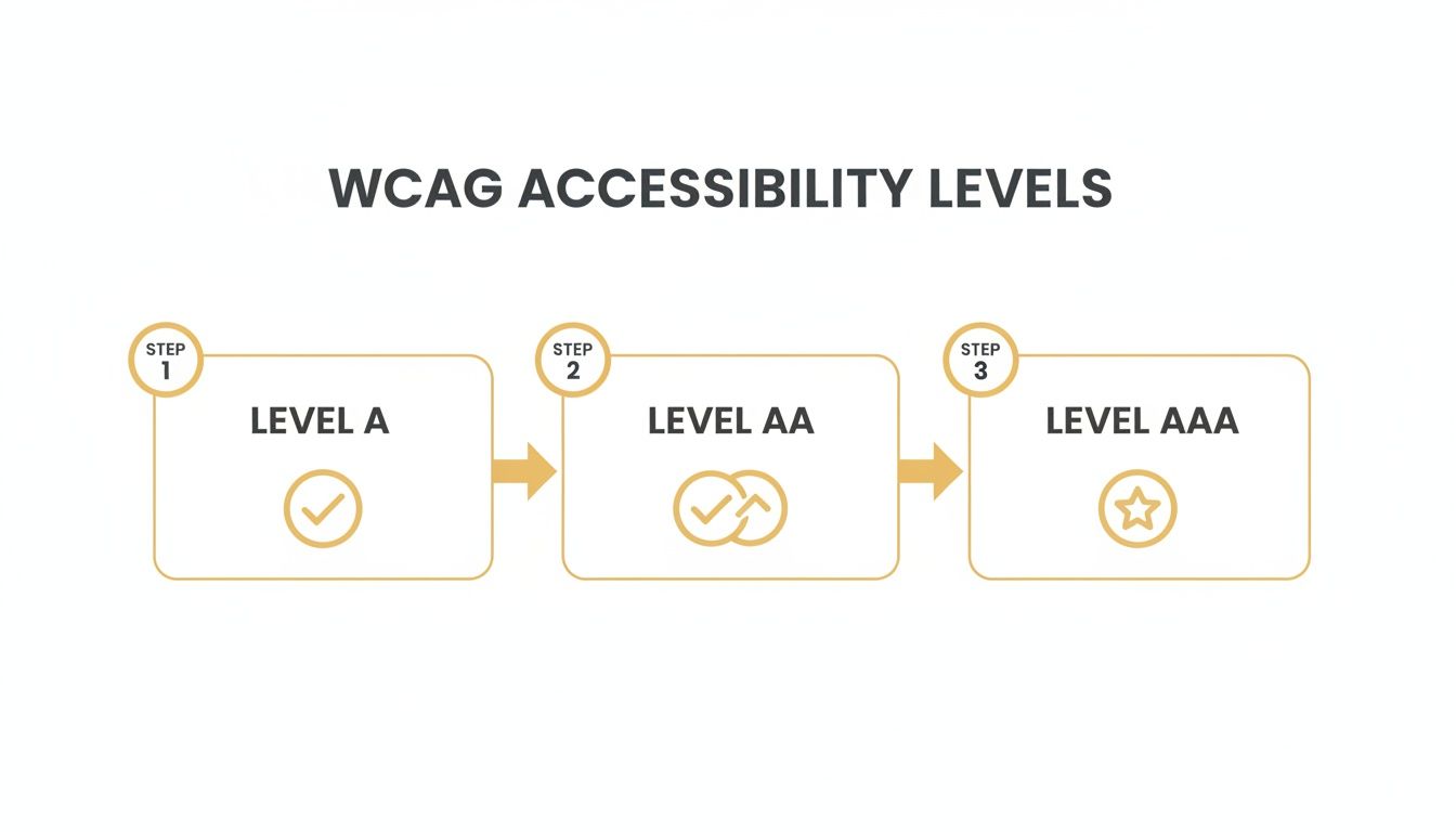
As you can see, Level A is the most basic foundation. Level AA is the widely accepted standard for legal compliance, and Level AAA represents the gold standard for accessibility.
3. Clear and Logical Content Structure This final check is all about making sure your content is easy to follow. Take a look at your page headings (H1, H2, H3, etc.). Do they create a logical outline of the page's content? Someone using a screen reader will often navigate a page by jumping between these headings, so a clean, logical structure is vital.
An accessibility audit isn’t about finding every single error on day one. It’s about identifying the biggest barriers that prevent people from using your site and creating a prioritized plan to fix them.
The scale of hidden issues might surprise you. For instance, AudioEye's Digital Accessibility Index recently found an average of 297 detectable WCAG issues per page in a single quarter. And for e-commerce stores, a staggering 94% were found to have inaccessible checkout journeys, which directly blocks sales. It just goes to show how many barriers can exist on a typical website.
By combining quick automated scans with these focused manual tests, you can perform a really powerful preliminary audit. This process will give you a much clearer understanding of your site's accessibility gaps and empower you to start making meaningful improvements.
Fixing the Most Common Accessibility Barriers
Alright, you've done an audit and now you have a list of accessibility issues staring back at you. This is where the real work begins—and honestly, where you'll see the biggest impact. The good news? You don't need to rebuild your site from scratch.
A handful of targeted fixes can knock out a huge chunk of the most common and frustrating barriers that users run into. We're talking about high-impact improvements that make a real difference for your visitors and even give your SEO a nice little boost.
Let's dig into the most frequent problems and how to solve them, without needing a computer science degree.
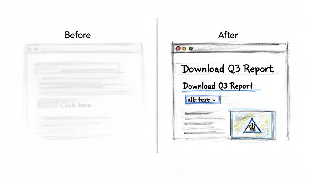
Clarifying Vague and Ambiguous Link Text
This is one of the fastest wins you can get. For someone using a screen reader, links that just say "Click Here" or "Learn More" are completely useless out of context. The software reads the links on a page, and all the user hears is a meaningless list: "Click here... click here... read more." It’s a dead end.
That kind of experience is incredibly frustrating and can stop someone from finding what they need on your site.
The fix is simple: use descriptive link text. Make it obvious where the link is going to take them. This gives everyone, including search engine crawlers, the context they need.
Example: Before and After
- Vague (Before): To download our latest report, click here.
- Descriptive (After): Download our latest Q3 Financial Performance Report.
See the difference? It's a small change that pays off big in usability.
Providing Meaningful Alt Text for Images
Alternative text, or alt text, is just a short description of an image that you add to the back end. Screen readers announce this text out loud, so users with visual impairments can understand what an image is all about. If an image is purely for decoration, you should leave the alt text empty (alt="") so screen readers can just skip over it.
But for any image that actually conveys information, descriptive alt text is non-negotiable. A common mistake is to just stuff keywords in there for SEO. Don't do that. The goal is to describe what the image shows.
Good alt text paints a picture with words. It should be concise but descriptive enough for someone to grasp the image's purpose without seeing it. As a bonus, it gives search engines a much clearer signal about your visual content, which helps your SEO.
A good rule of thumb is to imagine you're describing the image to someone over the phone.
- Bad Alt Text: "shoes"
- Good Alt Text: "A pair of red running shoes with white laces on a wooden floor."
Ensuring Sufficient Color Contrast
Low contrast between text and its background is probably the single most common issue that automated accessibility checkers flag. It’s a problem for people with low vision, color blindness, and even users just trying to read your site on their phone in bright sunlight.
If people can't read your content, nothing else matters.
The WCAG AA standard requires a contrast ratio of at least 4.5:1 for normal-sized text and 3:1 for large text (that’s 18pt regular or 14pt bold).
You don't have to guess at this. Free tools like the WebAIM Contrast Checker let you pop in your hex codes for text and background colors and tell you instantly if you pass. Often, a tiny tweak to a color is all it takes to get compliant.
Structuring Content with Proper Headings
Headings (H1, H2, H3, and so on) aren't just for making your text look pretty and organized. They create a logical, navigable structure for your entire page, which is absolutely critical for anyone using assistive tech. Screen reader users can actually skip from heading to heading to find the section they need.
A huge mistake I see all the time is when people just bold some text or make the font bigger to create a visual heading. A screen reader can't see that styling; it needs the proper HTML tag to understand the structure.
- H1: Use this only once per page. It’s for your main page title.
- H2: Use these for the major sections of your content.
- H3: Use these for sub-sections that fall under an H2.
This hierarchy creates a clear outline of your page, which makes it easier for everyone to read and helps search engines understand what your content is about. For a deeper look at how structure affects user experience, check out our guide on user interface design best practices.
Top 5 Accessibility Fixes and Their Impact
To make this even more practical, I've put together a quick-reference table. These are the fixes that will give you the most bang for your buck when you're just getting started.
| Common Issue | Simple Fix | User & SEO Benefit |
|---|---|---|
| Vague Links | Change "Click Here" to descriptive text like "View Our Pricing Plans." | Users know where they're going. Search engines understand link context. |
| Missing Alt Text | Add a short, descriptive sentence for every meaningful image. | Visually impaired users understand the content. Boosts image SEO. |
| Low Color Contrast | Use a contrast checker to adjust text and background colors to meet a 4.5:1 ratio. | Content is readable for more people in more situations. Reduces bounce rate. |
| No Heading Structure | Use proper H1, H2, and H3 tags to create a logical outline. | Screen reader users can navigate easily. Search engines better understand content hierarchy. |
| Unlabeled Form Fields | Make sure every input field has a corresponding <label> tag. | Users know what information to enter. Reduces form abandonment and errors. |
By tackling these five areas—links, images, contrast, structure, and forms—you'll be making massive strides toward a more inclusive and effective website. It's not about perfection overnight; it's about making steady, meaningful progress.
Maintaining Accessibility for Long-Term Success
Getting your website compliant isn't a finish line you cross; it's more like adopting a new fitness routine. A one-time audit and fix is a fantastic start, but websites are living things. They change with every new blog post, product update, or design refresh.
Without a solid plan for maintenance, even the most accessible site can drift back out of compliance. The real goal is to shift from a reactive, "fix-it" mindset to a proactive culture of inclusivity. This is about weaving accessibility into the very fabric of your daily operations, making it less about checking boxes and more about a fundamental way of working.
Weaving Accessibility into Your Daily Workflow
Lasting compliance happens when accessibility is part of everyone's job, not just a task you hand off to a developer. You need to embed accessible practices directly into your content creation and site management processes. This is how you stop new barriers from popping up as your website evolves.
A simple yet powerful starting point is training your content team on the basics. For instance, every time a new blog post goes live, the process should automatically include:
- Writing descriptive alt text for every single image that isn't purely decorative.
- Structuring content logically with proper H1, H2, and H3 tags—not just faking headings with bold text.
- Ensuring all links use clear, descriptive anchor text that tells a user where they're going.
These small, consistent actions really compound over time. They make a massive difference in the user experience and keep your compliance efforts from going off the rails.
True website accessibility compliance is a cultural shift. When inclusivity becomes a shared responsibility across your marketing, content, and development teams, you build a sustainable foundation for long-term success.
Why You Need an Accessibility Statement
One of the most valuable assets you can add to your site is a public accessibility statement. This is a dedicated page that clearly communicates your commitment to inclusivity. Think of it as a sign of good faith—it builds trust and shows everyone that you take this responsibility seriously.
Your statement should be easy to find and written in plain language, not legalese. It's the perfect place to:
- Declare your commitment to a specific standard, like WCAG 2.1 Level AA.
- Detail the steps you’ve already taken and are continuing to take to improve your site.
- Provide a clear contact method for users to report any accessibility barriers they run into.
That last point is absolutely crucial. Offering a direct line for feedback not only helps you spot and fix issues faster but is also viewed very favorably in legal contexts. It demonstrates a good-faith effort to serve all of your users.
Using Monitoring Tools to Stay Ahead of the Curve
As your site grows and changes, manual checks alone can become completely overwhelming. This is where automated monitoring tools come into play. These services can regularly scan your website for new accessibility errors, acting as a critical safety net.
Think of them like a smoke detector for your compliance. They can alert you to new issues—like a missing form label on a new landing page or a color contrast failure after a branding update—before they become major problems. While they don't replace the need for manual testing, these tools are essential for maintaining a high standard of accessibility over the long haul.
By combining integrated team workflows, a transparent accessibility statement, and consistent monitoring, you create a robust system. This approach ensures your website remains open and usable for everyone, solidifying your commitment to lasting website accessibility compliance.
Your Top Accessibility Questions, Answered
Once you start digging into website accessibility, a lot of questions pop up. It’s a field with its own technical language and legal quirks, so it's totally normal to feel a bit lost at first. Let's cut through the confusion and tackle the big questions we hear from business owners all the time.
My goal here is to give you straight, practical answers. Getting a handle on these key points will help you move forward with confidence and make the right calls for your website and your customers.
How Much Does It Cost to Make a Website Accessible?
This is usually the first thing people ask, and the honest-to-goodness answer is: it really depends. The cost to get your site accessible can swing wildly depending on its current shape, its size, and how complicated it is. A simple five-page brochure site with a handful of issues might just need a small investment to get right.
On the other hand, a huge e-commerce store with thousands of products and a multi-step checkout is a much bigger project. The single biggest factor is whether accessibility was baked in from the start or needs to be bolted on later. Thinking about it from day one is always cheaper.
The smartest way to get a handle on costs is to start with a professional audit. That gives you a clear, prioritized list of what needs fixing. More importantly, don't forget the cost of doing nothing. When you factor in potential lawsuits, damage to your brand, and losing out on an entire slice of the market, the investment in accessibility almost always pays for itself.
Is Website Accessibility a Legal Requirement for My Business?
For most businesses in the U.S. and Europe, the answer is a firm "yes." In the United States, laws like the Americans with Disabilities Act (ADA) have been consistently interpreted by the courts to cover commercial websites. They're seen as "places of public accommodation," just like a physical storefront. This applies to everyone, from the local coffee shop to a national retailer.
While the ADA doesn't hand you a technical checklist, the Department of Justice (DOJ) and a long line of legal cases all point to one standard: the Web Content Accessibility Guidelines (WCAG) 2.1 Level AA. This is the benchmark everyone is held to. Ignoring your site's accessibility isn't just bad for business; it's a genuine legal risk.
Will Making My Website Accessible Hurt My Design or SEO?
This is a huge myth, and the truth is the complete opposite. Good accessibility practices almost always give your Search Engine Optimization (SEO) a serious boost. The two go hand-in-hand because they’re both trying to do the same thing: make content easy for people and technology to understand.
Think about it this way:
- Descriptive Alt Text: It's a lifeline for screen reader users to understand images, but it also tells Google exactly what your images are about, helping you rank in image searches.
- Logical Heading Structure: Using H1, H2, and H3 tags correctly gives your page a clean outline. This is critical for screen reader navigation, and it helps search engine crawlers grasp your content's hierarchy.
- Clean, Semantic Code: Accessible sites are built with clean code. That means they tend to load faster and work better on all devices—both are things Google loves to see.
An accessible site is an inherently user-friendly site. When you focus on accessibility, you naturally improve things like bounce rate and how long people stay on your page. Search engines notice that, and it leads to better rankings over time.
Can I Use an Accessibility Plugin or Overlay to Become Compliant?
You've probably seen ads for plugins and overlays that promise a one-click fix for compliance. It sounds great, but these tools are incredibly controversial and are not a real solution for website accessibility.
Experts and disability advocates have been clear: these tools just don't work well. They often fail to fix the deep-seated code issues and can sometimes make things worse for people using assistive tech. Worse, they won't protect you from a lawsuit. Hundreds of companies have been sued while using an overlay, thinking they were covered.
A plugin might catch a few surface-level things, like bad color contrast, but it can't replace a real audit and manual fixes. True accessibility means digging into your site's structure to make sure it works for everyone. An automated overlay just can't do that.
Ready to build a website that's accessible, user-friendly, and optimized for growth? The team at Up North Media specializes in custom web development and data-driven SEO that puts inclusivity at the core of your digital strategy. Let's create an online experience that works for everyone and drives real results for your business. Schedule your free consultation today!