A website redesign is so much more than a fresh coat of paint. It's a major strategic project that touches every part of your business. It starts with a ton of conversations and planning and ends with meticulously tracking how the new site is actually performing. The whole point is to build something that drives real, measurable growth.
Laying the Groundwork for a Winning Redesign
Before you even think about wireframes or code, the most important work happens. This is the discovery phase, and honestly, it’s the bedrock of the entire project. Getting this part right aligns every single decision you make later with your core business goals.
Skipping this step? It’s like trying to build a house without a blueprint. You're just setting yourself up for expensive mistakes and a final product that doesn't really help anyone. A solid plan starts with mastering the project discovery process. This isn't just about asking the marketing team what color they want the buttons to be. It's about having deep, meaningful conversations with the C-suite, sales leaders, and customer service managers to figure out what the business truly needs to accomplish.
Defining Your Audience and Objectives
Vague goals like "get more traffic" just won't cut it. You need to get specific. Are you trying to generate 20% more qualified leads for your sales team? Or maybe you need to cut down on customer support tickets by 30% with a smarter, better-organized help center. These are the kinds of concrete targets that will guide every choice you make.
Just as important is knowing who you're actually building this for. Generic personas are a decent starting point, but profiles built on real data are far more powerful. Dive deep into your analytics to see what users are actually doing, then back that up with real customer interviews. For a deeper dive, check out our guide on https://upnorthmedia.co/blog/how-to-create-buyer-personas that truly reflect your customer base.
From Stakeholder Goals to Project Scope
Once you have a crystal-clear picture of your business goals and what your audience needs, you can start translating that into a tangible project scope. This is where you define the core features, functionality, and timeline for the redesign.
The whole process flows from one step to the next: you establish clear goals, use those to define the project's scope, and then set the KPIs that will tell you if you succeeded.
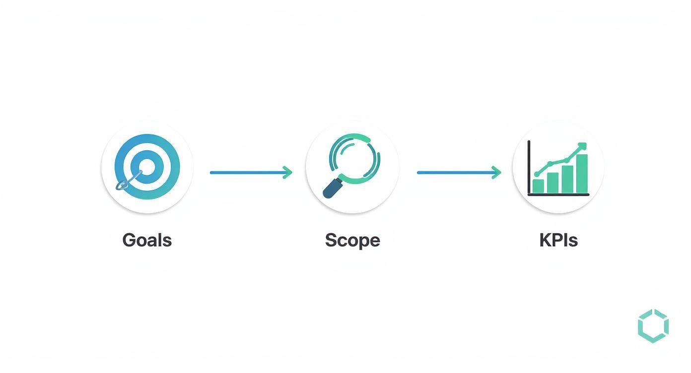
This structured approach makes sure every part of the redesign has a purpose and is tied directly to a measurable business outcome. It’s your best defense against scope creep and keeps the whole project on track. Think of a well-defined scope document as your North Star, keeping everyone from designers to developers perfectly aligned.
To make sure nothing gets missed, a checklist is your best friend. It forces everyone to agree on the critical business, user, and technical requirements before a single dollar is spent on development.
Key Stakeholder Alignment Checklist
| Alignment Area | Key Question to Answer | Status (Defined/Pending) |
|---|---|---|
| Business Goals | What are the top 3 measurable business outcomes we need to achieve? | |
| Target Audience | Who are the primary and secondary user personas for this site? | |
| Brand Identity | Have we defined the brand voice, tone, and visual guidelines? | |
| Technical Stack | Is the CMS and hosting environment decided and approved? | |
| Core Functionality | What are the must-have features for launch (MVP)? | |
| Success Metrics | Which specific KPIs will we use to measure success post-launch? | |
| Budget & Timeline | Is the project budget and timeline realistic and approved by all? |
Running through this checklist ensures you have buy-in on the fundamentals, which prevents massive headaches down the road.
Setting Benchmarks for Success
So, how will you know if the redesign actually worked? By setting clear KPIs before you start. These metrics are your benchmarks for measuring the project's return on investment.
Your KPIs should be a direct reflection of your initial goals.
- For Lead Generation: Track conversion rates on forms, marketing qualified leads (MQLs), and your cost per acquisition.
- For E-commerce: Monitor average order value, cart abandonment rate, and customer lifetime value.
- For User Engagement: Measure bounce rate, average time on page, and pages per session.
A classic mistake is waiting until after the launch to think about measurement. If you set these benchmarks early, you create a clear "before" picture. That makes it incredibly easy to show the "after" impact and prove the value of your investment to everyone involved.
The results of a data-driven approach speak for themselves. For example, Continental Office saw a 103% jump in website traffic after a redesign focused on customer needs. Staples redesigned based on user research and saw an 80% increase in visitors and a 45% reduction in drop-off rates. These aren't just vanity metrics; they show how a properly executed redesign directly boosts engagement and business performance.
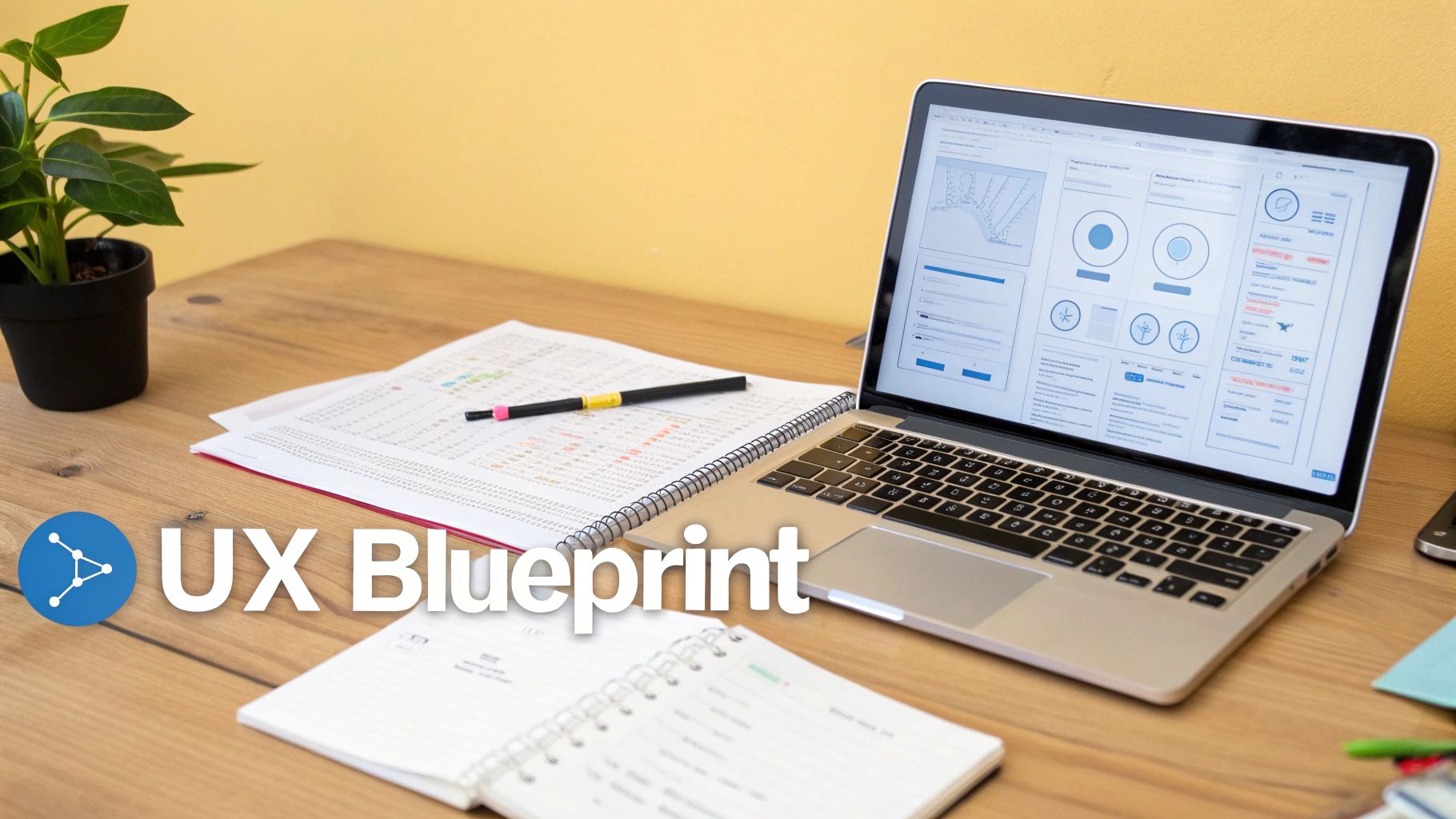
Building Your Content and UX Blueprint
Once your strategy is locked in, it’s time to stop talking about abstract goals and start building the tangible structure of your new site. This is where we architect the user’s journey and map out the actual substance—your content. Think of it as creating the architectural blueprint that ensures every click feels intuitive and every page has a clear purpose.
This whole process kicks off with a ruthless audit of what you already have. You can't build a better website without first understanding what worked (and what flopped) in the past. That means a dual-pronged content and SEO audit is your first real move.
Auditing Your Existing Digital Assets
The key here is to be brutally objective. You need to comb through every single page on your current site and decide its fate based on cold, hard data—not just what you think is important.
I recommend using a simple spreadsheet to track your URLs alongside their key metrics. Your audit should sort every page into one of three buckets:
- Keep and Improve: These are your all-stars. They rank for valuable keywords, pull in significant traffic, or have strong conversion rates. The goal is to make them even better, not start from scratch.
- Consolidate or Rewrite: This is the home for pages with thin content, outdated info, or those targeting keywords that are no longer relevant. You can often merge several of these weaker pages into a single, powerhouse resource that carries more authority.
- Remove and Redirect: Some content just isn't pulling its weight anymore. It gets zero traffic, has no valuable backlinks, and doesn't align with where you're headed. These pages need to go, but never without a plan.
This brings us to what is arguably the most critical part of the audit: your 301 redirect map. This is non-negotiable. For every single URL you plan to change or delete, you must map it to the most relevant new page. Skipping this step is one of the most catastrophic—and common—mistakes in a redesign. It can instantly vaporize years of hard-earned SEO value. Don't do it.
Designing an Intuitive User Journey
Okay, you know what content is staying. Now, how do you organize it all? This is the work of Information Architecture (IA), which is just a fancy way of saying you’re structuring your content so it feels completely natural for users to find what they need.
This usually involves creating two core documents:
- Sitemap: A top-down, hierarchical diagram of your new site. It shows the relationship between your homepage, main navigation categories, and all the sub-pages.
- User Flow Diagrams: These are visual maps that trace the specific paths a user might take to get something done, like completing a purchase or filling out a contact form.
These documents aren't just technical busywork for developers; they’re essential for sketching out the initial layouts of your site. If you're new to this, there are some great guides on how to create wireframes that can walk you through the basics.
And while you're structuring everything, it's a smart move to reference a proven CRO playbook to increase website conversions. Building those conversion-focused principles directly into your site's architecture from the get-go will pay off massively down the road.
Using Data to Eliminate Friction
Guesswork is the enemy of good web design. The best blueprints are built on evidence, which means digging into the user behavior data from your existing site to pinpoint exactly where people are struggling. Tools that provide heatmaps and session recordings are absolute gold here.

A heatmap, for instance, visually shows you where users are clicking, moving their mouse, and scrolling. The "hot" red areas signal high engagement, while the "cold" blue spots are being completely ignored. This kind of insight tells you which calls-to-action are hitting the mark and which design elements are dead weight.
By analyzing this data, you can answer critical questions: Where are users abandoning the checkout process? Which navigation links do they never touch? Are they rage-clicking on a logo that isn't actually clickable? The answers you find will directly inform your new design, ensuring you’re solving real, documented user problems instead of just making things look different.
Bringing Your Digital Experience to Life
This is where the rubber meets the road. All that strategy, all those stakeholder interviews, and all those wireframes finally start to look like a real website. The design and prototyping phase is easily one of the most exciting parts of any web redesign process. It’s where you take the blueprint and breathe life into it, transforming abstract concepts into something your users can actually see and interact with, long before a single line of code gets written.
First up, you need a cohesive visual design system. I'm not just talking about picking a few colors you like; this is your brand's digital rulebook. It’s a comprehensive guide that defines every single visual element, ensuring consistency across the entire site.
- Typography: Lock in your fonts for headings and body text. Define the sizes and weights to build a clear visual hierarchy that guides the user's eye.
- Color Palette: Establish the primary, secondary, and accent colors that not only match your brand but are also accessible to all users.
- UI Elements: Standardize what your buttons, forms, icons, and other interactive bits look and feel like. Consistency here builds trust and makes the site intuitive.
Think of it this way: a solid design system means that six months down the line when you add a new landing page, it will look like it belongs, not like it was tacked on as an afterthought.
Prioritizing a Mobile-First Approach
If you take one thing away from this section, let it be this: design for the smallest screen first. This isn't just some trendy design philosophy; it's a straight-up business necessity. Starting with the mobile layout forces you to be ruthless about what's truly important. You have to prioritize the most essential content and features, which naturally leads to a cleaner, more focused experience that you can then scale up for tablets and desktops.
The data doesn't lie. As of 2025, a staggering 63.15% of all website visits happened on a mobile device. On top of that, users are five times more likely to ditch a task if a site isn't mobile-friendly. That’s a direct hit to your bottom line. And let's not forget Google, which heavily favors mobile-friendly sites in its search rankings. If you want to dig deeper, you should definitely explore the web design statistics and their impact.
From Static Mockups to Interactive Prototypes
With your design system in place, the next step is to create high-fidelity mockups. These are pixel-perfect, static images of what each page will look like. But here's where the real magic happens: you take those static mockups and stitch them together into an interactive prototype using a tool like Figma or Adobe XD.
This isn't a website yet, but it feels like one. A user can click through the navigation, fill out a form, and interact with calls-to-action just as they would on the finished product. This is an absolute game-changer for getting meaningful feedback.
By putting a clickable prototype in front of real users before development begins, you can validate your design assumptions and uncover usability issues early. This feedback loop is invaluable; fixing a design flaw in Figma is exponentially cheaper and faster than rewriting code after the site has already been built.
The Power of Early User Testing
User testing at this stage isn't about asking people if they "like" the color blue. It's about giving them specific tasks and watching them try to complete them. For an e-commerce client, we might ask a user to find a specific pair of shoes and go through the entire checkout process.
Then, we just watch. We look for every little hesitation, every confused click, every moment of frustration. Those are the friction points you need to solve now.
- Navigation Clarity: Can people find the "Contact Us" page easily, or do they get lost?
- CTA Effectiveness: Is that "Add to Cart" button obvious and compelling?
- Form Usability: Is the checkout form simple, or are people getting tripped up on the address fields?
This kind of qualitative feedback is gold. It allows you to refine the user experience based on actual human behavior, not just your team's internal opinions. This step ensures that the beautiful site you've designed is also brutally effective at helping users do what they came to do—setting you up perfectly for a smooth handoff to development.
From Pixels to Code: Development and Testing
Once the interactive prototype gets the green light, we officially move from ideas and visuals into the world of code. This is the development phase—it’s where your website is actually built, tested, and made bulletproof. Think of it as shifting from creative brainstorming to disciplined, heads-down execution. Our goal here is to build something stable, secure, and that performs exactly as we planned.
This is the part where static images transform into a living, breathing website. To keep things organized and on track, most modern teams I work with use an agile, sprint-based workflow. Instead of tackling the entire build in one massive, months-long effort, the work is broken down into small, digestible two-week "sprints." Each sprint focuses on building out specific features and getting them to a "done" state.

A non-negotiable part of this process is the staging environment. This is a private, password-protected clone of your future website. It's a sandbox where developers can build, tweak, and fix things without ever touching your live, public-facing site. Having this separation is absolutely critical for a professional redesign.
The Two Sides of the Development Coin
Development work is generally split into two key areas that have to work together perfectly to create a seamless website. Both are equally important.
- Front-End Development: This is everything your visitors see and interact with—the "client-side." Developers use HTML, CSS, and JavaScript to bring the approved designs to life, making sure every button, animation, and form field looks and feels right on every device.
- Back-End Development: This is the engine under the hood—the "server-side" logic. It covers the database, server, and application code that handles user accounts, form submissions, e-commerce transactions, and all the other heavy lifting.
These two sides are in constant communication. For instance, when a customer fills out your contact form (front-end), the back-end code securely processes that data and routes it to the right person on your team.
Building a Bulletproof Quality Assurance Plan
Coding is only half the job. The other half is making sure it all works. That’s where Quality Assurance (QA) comes in—a systematic process for hunting down and fixing bugs before your customers ever see them. Rushing through QA is a surefire way to have a disastrous launch day.
Quality Assurance isn't just about catching typos. It’s a deep audit of your site's functionality, performance, accessibility, and security. A solid QA plan is your last line of defense against a poor user experience that could seriously damage your brand's reputation.
A good QA plan should be treated like a pre-flight checklist. To make sure you've got all your bases covered, you can use these quality assurance best practices as a starting point for your own strategy. The idea is to methodically comb through every piece of the new site, leaving nothing to chance.
Your testing should cover a few key areas to be truly effective.
A Practical QA Testing Checklist
| Testing Category | Key Checks to Perform | Why It's Critical |
|---|---|---|
| Cross-Browser & Device | Test on Chrome, Firefox, Safari, and Edge on desktop, iOS, and Android. | You need to guarantee a consistent, functional experience for everyone, no matter how they access your site. |
| Functionality Testing | Check that all links, forms, buttons, and checkout processes work perfectly. | Broken forms or links are direct roadblocks to conversion and a massive source of user frustration. |
| Performance & Speed | Analyze page load times with tools like Google PageSpeed Insights. | Slow sites kill conversions. In fact, 47% of users expect a page to load in two seconds or less. |
| Accessibility (WCAG) | Use an accessibility checker for screen reader compatibility and color contrast. | This ensures your site is usable for people with disabilities and helps you steer clear of potential legal trouble. |
| Security Scans | Run checks for common vulnerabilities like cross-site scripting (XSS). | This protects your business and customer data from hackers and is fundamental to building trust. |
By working through this checklist meticulously on your staging environment, you can catch and squash issues before they ever see the light of day. This disciplined approach to development and QA is what separates a smooth, successful launch from a chaotic, stressful one. It’s the final technical hurdle to clear before you start preparing for go-live.
Executing a Flawless Launch and Post-Launch Plan
Popping the champagne when your new site goes live is a great feeling, but it’s not the finish line. Not even close. A successful launch is really just the starting gun for the next critical phase: making sure all that hard work actually pays off in the real world. This is where you shift from building and designing to monitoring, measuring, and optimizing.
The final push before you flip the switch demands an almost obsessive attention to detail. I’ve seen months of incredible work get undermined by one missed step, especially when it comes to SEO. Think of a pre-launch checklist as your best defense against a chaotic go-live day. It’s what ensures a smooth handoff for your users and for search engines.
Your Final Pre-Launch Checklist
Before you dream of hitting that "Go Live" button, your team needs to comb through a final, exhaustive series of checks on the staging site. This is your last chance to catch any show-stopping bugs in a safe, private environment where a mistake won't cost you customers or rankings.
Here are the absolute non-negotiables for that checklist:
- Final SEO Verification: Manually spot-check your key pages. Are the title tags, meta descriptions, and header tags all in place? Is the XML sitemap generated and ready to submit to Google Search Console?
- 301 Redirect Implementation: This is a big one. You need to triple-check that every single URL from your old site is properly mapped to its new home. A tool like Screaming Frog is your friend here—use it to crawl the old sitemap and confirm every link returns a clean 301 status code, not a dreaded 404.
- Analytics and Tracking Setup: Is your Google Analytics 4 tag firing correctly? More importantly, are your key conversion events—like a lead form submission or an e-commerce purchase—actually being tracked? You can't improve what you don't measure.
- Content and Copy Review: Do one last sweep for placeholder text ("lorem ipsum," anyone?), typos, or funky formatting. It’s amazing what a fresh set of eyes can catch at the eleventh hour.
The moment you launch is when your new website is officially live for the world to see. It’s an exciting, high-stakes moment that should be followed by a period of intense monitoring, not immediate celebration.
The First 48 Hours: Eyes on Everything
The two days after you launch are all about being hyper-vigilant. Your mission is to spot and squash any technical glitches before they can seriously mess with your user experience or search rankings. Keep a close watch on these areas:
- 404 Errors: Jump into Google Search Console and monitor for any spike in "Not Found" errors. This is the first sign you might have missed a few redirects or have some broken internal links.
- Server Response Time: Keep an eye on your server load. A sudden flood of real-world traffic can sometimes expose performance bottlenecks that your pre-launch testing didn't catch.
- Core Engagement Metrics: Watch your bounce rate, time on page, and conversion rates in GA4 like a hawk. Any dramatic, negative swing could point to a major usability problem with the new design that needs immediate attention.
Catching these problems early is everything. A quick fix in the first few hours can stop a small hiccup from snowballing into a major setback. This period isn't for deep analysis; it’s for rapid response and making sure the site is stable.
Your 90-Day Post-Launch Optimization Roadmap
Once the dust settles and your new site is stable, the real work begins. The next three months are your golden opportunity to gather data, listen to your users, and make smart, iterative improvements that prove the redesign’s ROI.
Without a structured plan, it's easy for projects to lose steam. One survey found that 54% of companies said their redesigns took over six months, with a bad user experience being the main driver for 61.5% of those projects. A focused post-launch plan keeps the momentum going and ensures your new site delivers on its promise to fix that experience. You can discover more insights about web redesign project timelines and see why this is so common.
To keep things on track, I recommend breaking your 90-day plan into three distinct phases:
- Month 1: Gather Feedback. Don't just rely on analytics. Actively ask your users what they think. Use simple tools like pop-up surveys or feedback widgets to ask direct questions. What do they love? What’s confusing? What's broken? This qualitative data is gold.
- Month 2: Analyze and Hypothesize. Now it’s time to dive deep into your analytics. Compare your post-launch KPIs against the benchmarks you set way back in the discovery phase. Find your highest-impact pages and start forming educated guesses for how to improve them. For example: "I bet changing the button color on our main CTA from blue to orange will increase clicks by 10%."
- Month 3: Test and Iterate. Based on those hypotheses, start running A/B tests. Pit different headlines, calls-to-action, layouts, and images against each other on your most important pages. Let the data tell you what actually works, then roll out the winning variations.
This cycle of feedback, analysis, and testing transforms your website from a static, one-and-done project into a living, breathing tool for business growth. It ensures the value of your redesign continues to compound long after launch day.
Essential Post-Launch Monitoring KPIs
To make sense of all the data coming in during that first month, you need to focus on the right metrics. This table breaks down the key performance indicators (KPIs) you should be tracking to measure success and quickly spot any trouble.
| KPI Category | Metric to Track | Why It Matters |
|---|---|---|
| User Engagement | Bounce Rate & Time on Page | A sudden spike in bounce rate or drop in time on page can signal that users are confused or frustrated by the new layout. |
| Conversion | Goal Conversion Rate | Are users completing key actions (e.g., purchases, form fills) more or less often? This is the ultimate measure of ROI. |
| Technical SEO | Crawl Errors (404s) | A high number of 404s means users and search bots are hitting dead ends, which can tank your search rankings. |
| Site Performance | Page Load Speed | Slower speeds frustrate users and hurt SEO. Monitor this to ensure the new design is as fast as it is beautiful. |
| Organic Traffic | Keyword Rankings | Are your most important keywords holding steady, climbing, or dropping? This tells you how search engines are reacting. |
| User Feedback | Survey Responses / Support Tickets | Qualitative data from real users often points to usability issues that analytics alone can't explain. |
Tracking these specific metrics in the first 30 days will give you a clear, data-backed picture of how your redesign is performing and point you exactly where you need to focus your optimization efforts next.
Common Web Redesign Process Questions
Jumping into a web redesign brings up a ton of questions. It's a huge project, and it’s completely normal to feel like you’re staring up at a mountain. Getting a handle on the usual bumps in the road is the best way to steer your project with confidence.
I've guided a lot of businesses through this exact process, so I've heard every question in the book. Here are the most common ones that come up, with some straight-up answers to help you sidestep the typical traps and keep everything on track.
How Long Does a Redesign Take?
There's no single magic number, but for most small-to-medium business sites, a realistic web redesign process lands somewhere in the 4-6 month range. That timeline gives you enough breathing room for proper discovery, design, development, and testing without rushing.
But that can easily stretch to 9-12 months or more if you're dealing with a large, complex website. Think custom features, deep e-commerce integrations, or migrating a massive amount of content.
Several things can really move the needle on your timeline:
- Project Scope: The more pages, unique templates, and special features you need, the longer it’s going to take. Simple as that.
- Content Readiness: This is a big one. If your copy, images, and videos are all buttoned up and ready to go, the project will fly. If not, expect delays.
- Stakeholder Feedback: How quickly your team can provide feedback and sign off on approvals can either be a major accelerator or a project bottleneck.
One way to get value faster is to take a phased approach. Instead of a massive "big bang" launch, you can roll out an initial, essential version of the site and then build on it over time.
What Are the Biggest Project Risks?
Every project has its landmines, but in a website redesign, I see three specific dangers pop up again and again. Knowing what they are is half the battle.
The most famous one is scope creep. This is when new features and "wouldn't it be cool if" ideas keep getting tacked on without adjusting the timeline or budget. The second is just plain poor communication. When stakeholders and the project team aren't in sync, you get expensive misunderstandings and frustrating delays.
But the real silent killer? Failing to protect your SEO equity. I've seen it happen. A team forgets to map out a thorough 301 redirect plan, and their search engine rankings get decimated almost overnight. It can wipe out years of hard work. A sharp project manager and a detailed launch plan are your only real defense here.
Should I Do a Full Redesign or Growth-Driven Design?
This is a big strategic fork in the road, and the right answer depends entirely on your business goals, budget, and how much risk you're comfortable with. Neither one is universally "better"—they just solve different problems.
A traditional redesign is that big, one-time project. It’s the right move when you’re doing a complete brand overhaul, or your site's tech is so ancient it's actively holding you back. It’s a major upfront investment, but the payoff can be a dramatic, game-changing transformation.
Growth-Driven Design (GDD), on the other hand, is all about iteration. You launch a streamlined "launch pad" site fast, then you continuously tweak and improve it every month based on what real user data tells you. GDD is often a much better fit for businesses that want to minimize risk, learn what works faster, and tie every single website change to a measurable goal. Your choice here should really echo your bigger business strategy.
Ready to start a web redesign process that drives real business growth? Up North Media specializes in creating data-driven websites and custom web applications that boost revenue and engagement. Schedule your free consultation today and let's build your digital future.