Creating a wireframe is a lot like drawing up the blueprint for a house before anyone even thinks about pouring the foundation. It’s a simple, visual guide that maps out the structure, layout, and functionality of your website or app. Essentially, you're using basic shapes and lines to figure out what goes on each screen and how users will interact with it, long before any real design work begins.
Why Wireframes Are Your Project’s Secret Weapon
Before you write a single line of code or pick a color palette, there's a critical step that often separates successful projects from costly failures: wireframing. Think of it as an architect's blueprint. You wouldn't build a house without one, and you shouldn't build a digital product without a solid plan, either.
Wireframes force everyone—from developers to stakeholders—to agree on the core structure first.

This structure-first approach is incredibly efficient. It turns abstract ideas into a tangible, black-and-white plan that focuses the conversation on what really matters at the start: functionality and user flow.
Aligning Teams and Managing Expectations
One of the biggest wins with wireframing is just getting everyone on the same page. When a client sees a wireframe, they're focused on the user journey and whether the features make sense—not debating shades of blue. This early alignment prevents hugely expensive changes down the line, saving countless hours and dollars.
This process is a cornerstone of good project management and is tightly linked to the bigger picture of creating a great user experience. If you want to dive deeper, we have a detailed guide on what user experience design is and why it's so important.
By spotting potential usability issues and structural problems at the blueprint stage, teams can iterate quickly and cheaply. It’s far easier to move a box on a diagram than to rebuild a feature that’s already been coded.
A Solid Foundation for Development
For developers, a clear wireframe is a roadmap. It cuts through any ambiguity about functionality, layout, and user flow, letting them build with confidence from day one. This clarity sets the stage for a much smoother design and development journey.
And it’s not just a nice-to-have anymore; it's a fundamental part of modern development. The global wireframing software market was valued at USD 5.55 billion in 2024 and is projected to hit USD 17.08 billion by 2033. This growth shows just how essential this step has become for mapping out interfaces cost-effectively before making major investments. You can read more in the full research on the wireframing software market.
Wireframing vs Mockups vs Prototypes At a Glance
It's easy to get these terms mixed up, but they each play a very different role in the design process. Think of it as a progression from a simple sketch to a fully interactive model.
Here’s a quick breakdown to clear things up:
| Stage | Focus | Fidelity | Primary Goal |
|---|---|---|---|
| Wireframe | Structure & Functionality | Low (grayscale) | Establish layout and user flow. |
| Mockup | Visual Design | Medium (static) | Define the look and feel (colors, fonts). |
| Prototype | Interactivity & User Testing | High (clickable) | Simulate the final user experience. |
In short, wireframes are about the "bones," mockups add the "skin," and prototypes bring it all to "life." Starting with a solid wireframe makes the next two stages infinitely easier.
Laying the Groundwork Before You Draw a Line
It's tempting to jump straight into your favorite design tool and start dragging boxes around. But honestly, great wireframes aren't born from a sudden stroke of artistic genius. They're built on a solid foundation of research and a clear strategy.
Skipping this part is like trying to build a house without knowing who will live there or what rooms they even need. You might end up with something that looks nice, but it won't actually work for anyone. This early discovery phase is what makes sure every layout decision is informed and focused on the user from the get-go.
The first step is always to understand the user's world. A great way to start is by learning how to create effective user stories, which frame the entire project from their perspective. It’s not about writing a massive research paper; it’s about gathering just enough insight to design with purpose.

Define Your Audience and Their Goals
So, who are you actually designing for? Answering this question is the single most important part of the entire process. I like to start by creating simple user personas—quick, fictional sketches of the people in your target audience. Give them a name, a job, and, most importantly, a goal they need to achieve.
Let's say we're designing an e-commerce site. A persona might be "Busy Brian," a 35-year-old professional who needs to buy a gift, and fast. His goal isn't to casually browse; it's to find, purchase, and ship something in under 10 minutes before his next meeting.
This simple context immediately shapes the wireframe. The search bar has to be front and center. The checkout process needs to be ruthlessly efficient. Product filters must be dead simple to use.
Your wireframe is a visual answer to a user's problem. If you haven't clearly defined the user and their problem, you’re just arranging boxes on a screen.
Map the User Flow
Okay, so you know who your user is. Now, how will they actually get what they want? This is where a user flow comes in. It's basically a simple diagram tracing a user's path from their entry point to a final action, like making a purchase.
Think of it as a step-by-step map for a specific task, not a massive, complex sitemap.
For "Busy Brian," the flow might look something like this:
- Lands on the homepage.
- Uses the search bar to find "men's watches."
- Filters results by "under $200."
- Clicks on a product.
- Adds it to his cart.
- Sails through a one-page checkout.
Mapping this path forces you to think about every single screen you need to design. It also makes sure the journey feels logical and seamless from one step to the next. The layout has to work everywhere, too, a concept you can see in action with these responsive web design examples.
This isn't just theory; it's a proven method we use all the time. User research helps align the design with real business goals, and having a "cheat sheet" of personas and user flows keeps the whole team focused. By getting this groundwork done first, you're setting yourself up to create wireframes that actually solve real problems for real people.
Choosing Your Wireframing Toolkit
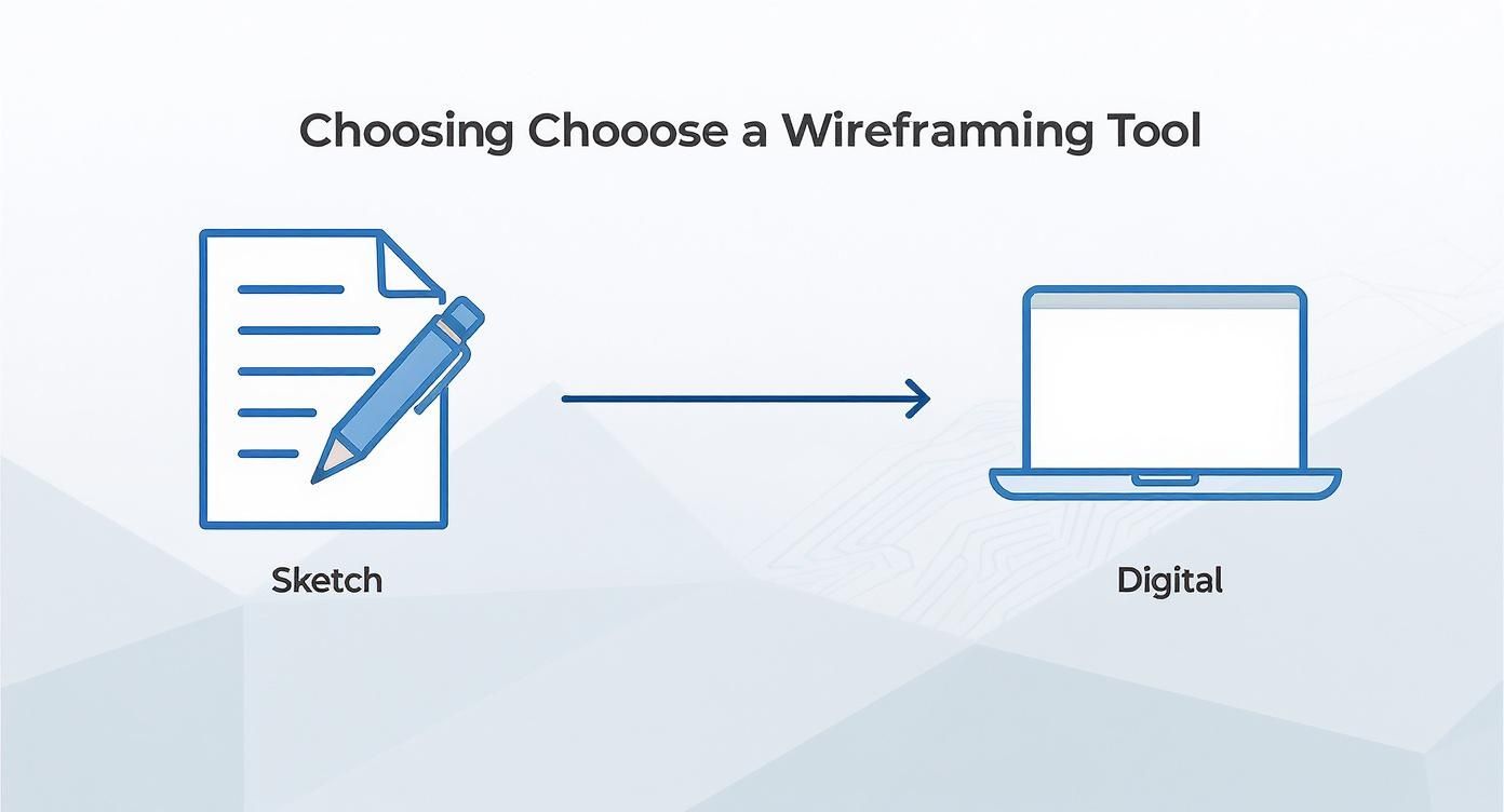
One of the first questions I always hear is, "What tool should I use?" Honestly, the best tool is the one that fits where you are in the process. Don't feel like you have to jump straight into some complex software. Sometimes, the simplest option is the most powerful.
The journey often starts far away from a screen. Kicking things off with a simple pen and paper is usually the fastest way to blast through a dozen layout ideas. This low-fidelity approach frees you from software constraints, letting you focus entirely on structure and flow without getting bogged down by menus, alignment grids, or pixel-perfect details.
Starting with Analog Sketches
There’s a good reason seasoned designers still reach for a notebook first. Sketching is immediate, messy, and disposable. You can generate a handful of concepts in minutes, get instant feedback from a teammate, and toss out the bad ideas without feeling like you’ve wasted hours of work.
This tactile process helps you really nail down your thinking before you even think about digitizing it. It’s all about rapid-fire iteration.
My workflow always starts in a sketchbook. It lets me solve the big, messy structural problems first. I only move to a digital tool once I have a confident, hand-drawn solution to the user's core problem.
Transitioning to Digital Tools
Once you've got a solid direction from your sketches, it's time to move into a digital tool for refinement, collaboration, and creating something you can actually share. The one you pick will really depend on your specific needs, your budget, and how your team works together.
Here are a few popular options and what they're really good for:
- Figma: This is the all-in-one powerhouse for teams. Its real-time collaboration is second to none, making it perfect for everything from quick, low-fi wireframes to high-fidelity, interactive prototypes.
- Balsamiq: This tool was built specifically for rapid, low-fidelity wireframing. Its intentionally "sketchy" look is a feature, not a bug—it keeps the focus squarely on structure and stops stakeholders from getting hung up on visual design details too early.
- Adobe XD: A really strong contender, especially if your team is already living in the Adobe ecosystem. It offers a super smooth path from wireframing to prototyping and final visual design, all inside one app.
Methods for wireframing are all over the map, from these quick paper prototypes all the way to detailed digital versions with interactive elements. By 2025, wireframing tools have become a core part of design software suites, with major players like Adobe XD and Balsamiq offering different pricing models for everyone from solo designers to huge enterprise teams. You can get more background on the evolution of wireframing tools.
Picking the right software is a big decision, so let's break down some of the top contenders to see how they stack up.
Popular Wireframing Tool Comparison
| Tool | Best For | Learning Curve | Collaboration Features | Pricing Model |
|---|---|---|---|---|
| Figma | All-in-one design, prototyping, and team collaboration. | Moderate | Real-time editing, comments, shareable prototypes, dev handoff. | Freemium, with paid tiers for teams. |
| Balsamiq | Rapid, low-fidelity wireframing and idea generation. | Low | Cloud-based sharing, comments, and version history. | Subscription or one-time license. |
| Adobe XD | Designers already in the Adobe Creative Cloud ecosystem. | Moderate | Coediting, shareable links, design specs, and comments. | Part of Adobe CC subscription; free starter plan. |
| Sketch | UI/UX designers on macOS looking for a polished tool. | Moderate | Real-time collaboration via subscription; robust plugin ecosystem. | macOS app purchase + optional subscription. |
| Miro | Remote teams needing a collaborative whiteboarding space. | Low | Real-time collaboration, templates, comments, integrations. | Freemium, with paid tiers for advanced features. |
Ultimately, there isn't one "best" tool that works for everyone. The key is understanding how analog and digital methods work together. Start on paper to think freely and explore broadly. Then, jump into a digital tool to refine, share, and get your layouts ready for the next stage of the design process.
Bringing Your First Wireframe to Life
Alright, this is where the magic happens. All that research and planning you did is about to take on a tangible shape. Creating your first wireframe isn't an art project; it’s an exercise in logical problem-solving. We're going to walk through a classic example: a product page for an e-commerce site. This will show you exactly how to translate user needs into a functional layout.
Let's work with our user persona, "Quick-Gift Gina." She's busy, needs to find a good present, and wants to check out fast. Her goal is simple: understand the product quickly and decide if it's right. Every single thing we put on this page has to help her do that. Forget about making it pretty for now—clarity is king.
Establishing a Clear Visual Hierarchy
Visual hierarchy is just a fancy way of saying "put the most important stuff first." So, what does Gina need to see right away on a product page? The product. The product image should be the biggest, most dominant thing on the screen. Next up are the product name and price. Those need to be big, bold, and impossible to miss.
After that, the most critical action we want her to take is adding the item to her cart. That "Add to Cart" button needs to pop. It’s the primary call-to-action (CTA). Less urgent info, like the nitty-gritty product specs or customer reviews, can live further down the page. This deliberate arrangement guides the user’s eye and makes the page scannable in seconds.
Building a Simple Grid System
You don't need a crazy, complex design system for a wireframe. A simple grid is all it takes to bring structure and alignment to your layout, making it look organized instead of chaotic. Think of it as the invisible scaffolding holding everything together. For our product page, a basic two-column layout will work perfectly.
- Left Column: This will be the wider of the two. It’s the ideal spot for our hero element—the big product image. It’s the first thing that will grab a user's attention.
- Right Column: This is where all the decision-making happens. We'll place the product title, price, any size or color options, and, of course, that all-important "Add to Cart" button here.
This straightforward structure creates a clean, balanced design that’s incredibly easy for people to follow. It stops elements from just floating around and builds a logical path from seeing the product to taking action.
One of the first decisions you'll make is whether to start with pen and paper or jump straight into a digital tool. Each has its place in the workflow.
There’s a reason so many designers start with sketching. It lets you explore a ton of ideas quickly without getting bogged down by software features. Once you have a direction you like, you can then move to a digital tool to refine it.
Placing Essential Elements Strategically
Now that we have our hierarchy and grid, it's time to start dropping in the key components. We'll use simple boxes and text labels to map out where everything should go. The navigation bar gets its standard spot at the top, giving users a consistent way to get around the site. Below our main two-column section, we can add blocks for the detailed product description, technical specs, and customer reviews.
Every placement is a deliberate choice. We put reviews toward the bottom because people usually look at them after they've made an initial decision, not before. This creates a natural flow from awareness (the image), to action (the CTA), to validation (the reviews), which makes for a much better user experience. If you want to go deeper on making interfaces feel intuitive, check out our guide on user interface design best practices.
Remember, every box on your wireframe represents a piece of content that solves a user need. If an element doesn't help "Quick-Gift Gina" achieve her goal, it probably doesn't belong on the page.
Once your wireframes start to feel solid, the next logical step is often creating a product prototype to see how these blueprints feel in action. Getting the wireframe right is the foundational step that makes the entire product development process smoother and more focused on what the user actually needs.
Wireframing Mistakes to Avoid
Knowing what not to do when creating wireframes is just as important as knowing what to do. A few common missteps can easily derail a project, turning what should be a clear blueprint into a source of total confusion. This isn't just about following rules; it's about sidestepping the pitfalls that waste time and trap you in frustrating feedback loops.
The most common mistake? Adding way too much detail, way too soon. Designers get excited and jump right into picking colors and fonts. It seems harmless, but it immediately distracts everyone from the actual purpose of a wireframe: evaluating structure and user flow.
Suddenly, the feedback you're getting isn't about the user journey; it's a 20-minute debate over a specific shade of gray. Keep your wireframes in grayscale and stick to a single, simple font. This forces the conversation to stay focused on what really matters at this stage.
Forgetting Key Explanations
Another frequent oversight is creating a wireframe that looks clean but is impossible to understand unless the designer is there to explain every little thing. Not all functionality is obvious from a bunch of static boxes and lines. This is where annotations become your best friend.
Annotations are just small, contextual notes that explain interactive elements or complex logic. For example:
- "Clicking this icon opens a filtering modal."
- "This section will dynamically load content based on user selection."
- "Error message appears here if the form field is left blank."
These brief explanations make your wireframes self-sufficient. They allow team members and clients to review them on their own time, without needing a guided tour for every detail.
A wireframe without annotations is like a map with no legend. It shows the layout but fails to explain how to navigate the terrain, leading to guesswork and misinterpretation.
Designing for a Single Screen Size
In a world where most traffic is mobile, designing only for a desktop view is a critical error. Starting with a mobile-first approach forces you to prioritize the most essential content and features right from the get-go. Trust me, it’s much easier to scale a design up from mobile to desktop than it is to cram a complex desktop layout onto a tiny screen.
This approach saves massive headaches later. You solve for the biggest constraints first, ensuring the core user experience is solid on every single device. Neglecting this almost always leads to a clunky, compromised mobile version that feels like a total afterthought.
Finally, relying on generic "Lorem Ipsum" placeholder text is a huge missed opportunity. Using real or at least realistic content—even if it's just a rough draft—provides essential context. It shows you how much space your text actually needs and makes the layout feel much more tangible, which leads to better, more informed feedback from your team.
Common Questions We Hear About Wireframing
When you're first getting into wireframing, a few questions always seem to pop up. It makes sense—you want to make sure you're getting it right from the start. Let's tackle some of the most common ones we run into.
How Much Detail Should I Actually Put in a Wireframe?
This is a big one. The golden rule here is to focus on structure, layout, and function—not the final visual design. Keep it simple. Think grayscale, basic shapes, and placeholder text like "lorem ipsum."
Your goal is to figure out what an element does and where it's going to live on the page, not what specific font or color it will have. If you include just enough detail to show the user flow and how information is organized, you're on the right track. Getting bogged down in brand colors or specific imagery this early will only distract from the core purpose: nailing the user journey.
A great trick is to use annotations for anything that isn't obvious. A simple note like, "Clicking this button reveals a dropdown menu," can clear up a ton of confusion and keep feedback focused.
Low-Fidelity vs. High-Fidelity: What’s the Real Difference?
It’s easy to get these two mixed up, but they serve very different purposes. Think of them as distinct steps in the design process, not interchangeable options.
- Low-Fidelity Wireframes: These are your quick and dirty sketches. We're talking pen and paper, a whiteboard, or a super basic digital tool. The whole point is to brainstorm and explore different layouts fast, without getting attached to any single idea.
- High-Fidelity Wireframes: Once you've settled on a general direction, you move to digital tools. These are more polished and detailed, with specific button labels and more realistic content placement. They look a lot closer to the final product and are perfect for getting detailed feedback before designers start adding color and style.
How Do I Get Feedback That’s Actually Useful?
Sharing your work is essential, but how you ask for feedback changes everything. Don't just show someone your wireframe and ask, "So, what do you think?" That's a recipe for subjective opinions on aesthetics.
Instead, frame the conversation around the user's goals. Ask specific, function-focused questions that guide the feedback.
Try asking things like:
- "Does this flow for making a purchase feel intuitive to you?"
- "Is any information missing on this page that you'd expect to see here?"
- "Can you tell me what you think would happen if you clicked this button?"
Steering the conversation this way keeps everyone focused on functionality and structure. Catching a confusing user flow at this stage is way cheaper and easier than fixing it after the code has been written.
At Up North Media, we take these foundational blueprints and turn them into powerful, user-friendly web applications that drive real business growth. From the first wireframe to the final launch, our expert team is here to guide your project to success.
Ready to build something amazing? Get your free consultation today!