
2.35% is the global average website conversion rate, and the top landing pages convert at 5.31% or higher according to the benchmark set in the brief. That gap is the whole reason conversion focused web design exists as a discipline, not a style choice. If a page is meant to generate leads or sales, it has to be built around a clear action, low friction, and proof that lands fast.
Why Conversion Focused Web Design Matters More Than Aesthetics
Pretty websites don't pay the bills if visitors hesitate, bounce, or get lost. A conversion-focused site treats design as a revenue system, where layout, copy, trust signals, and page flow all push toward one measurable outcome. That's why the benchmark gap between average pages and top performers matters so much. The best landing pages convert at more than 2x the global average, which means the difference between “looks good” and “works hard” is often a major revenue swing, not a minor optimization.
For Omaha SMBs, that usually shows up in the simplest places. A roofing company with a gorgeous homepage can still lose leads if the contact path is buried. An e-commerce store can have polished product photography and still underperform if the page doesn't make the next step obvious, fast, and believable.
What conversion focused design really means
Conversion focused web design is about reducing decision friction. That includes clearer messaging, tighter page hierarchy, and stronger calls to action, but it also includes the unglamorous work of making pages load quickly and behave predictably on mobile.
A good starting point is a UX lens, because if visitors can't find what they need, the rest of the funnel never gets a chance. The internal guide on user experience design is useful here because UX is not decoration, it's the structure that makes action possible.
Practical rule: if a visitor has to think too hard about what to click, the page is already leaking value.
For anyone working in Shopify or product-led commerce, Carti's CRO playbook is a helpful companion resource because it keeps the focus on user flow, trust, and testing rather than visual novelty. That's the right mindset. Design choices should earn their place by improving outcomes, not by looking impressive in a portfolio.
Core Principles That Drive Conversions on Every Page
The pages that convert consistently usually share the same backbone, even when the business model changes. A home service lead form, a SaaS landing page, and a retail product detail page all need different language, but they still depend on the same four things. The site has to feel usable, persuasive, fast, and measurable.
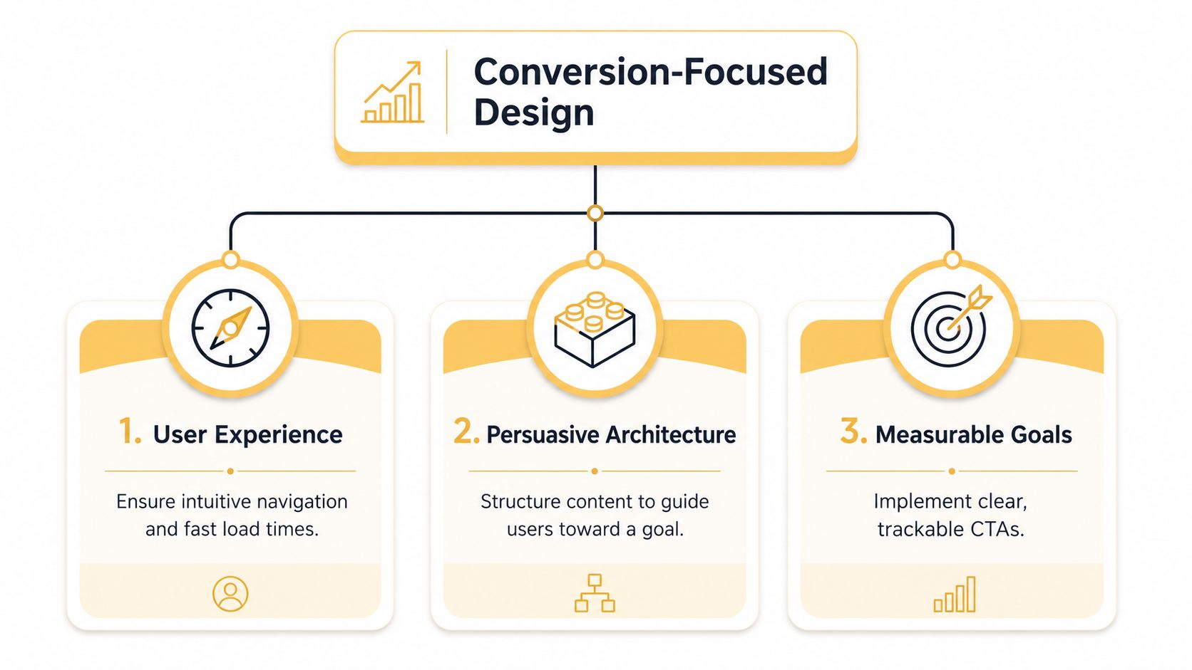
User experience comes first
If navigation is confusing, visitors don't explore, they exit. A local service business can often gain more from making the phone number obvious and the contact form shorter than from adding another homepage feature block. An e-commerce retailer can do the same by making filters, shipping details, and return information easy to find without forcing users through extra clicks.
Persuasive architecture does the heavy lifting
Design isn't just visual spacing. It's the order in which information appears, the way objections are answered, and the point where a page asks for action. That's why a strong page usually starts with the problem, quickly shows the offer, then proves credibility before asking for the conversion.
Measurable goals keep the page honest
A page without a defined action is just content. The CTA should be clear enough that the team can track it, compare it, and improve it over time. For an Omaha contractor, that might be a quote request. For a retailer, it might be add-to-cart, checkout initiation, or a saved product path.
A beautiful page with no measurable goal is just a brochure that loads in a browser.
CodeDesign.ai's landing page best practices are worth reviewing alongside this because trust and clarity matter as much as visual polish. The internal reference landing page design best practices fits the same principle. Good landing pages don't ask visitors to admire them, they guide visitors to act.
When One Primary CTA Is Not Enough for Complex Decisions
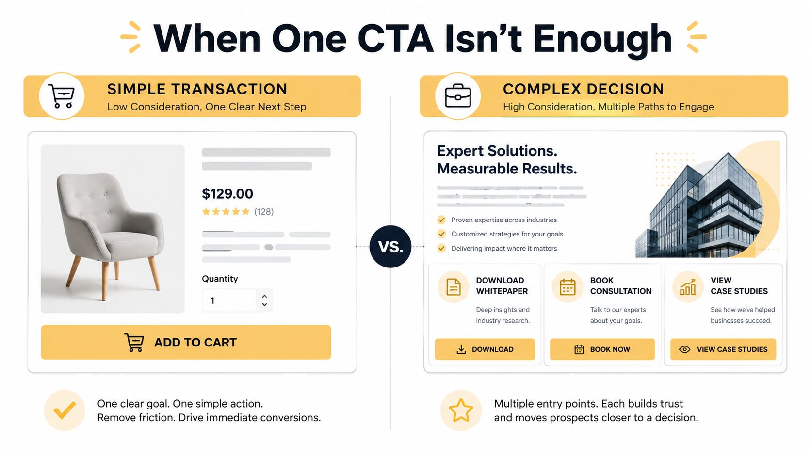
The advice to keep one dominant CTA is useful, but only in the right context. It works well for a simple offer, like buying a single product or booking a basic service. It starts to break down when the buyer needs pricing context, technical validation, implementation details, or internal buy-in before moving forward.
Simplicity helps, until it hides what buyers need
A straightforward product page can get by with one clear action. A custom software company in Omaha can't. Decision-makers may need a demo, a technical overview, proof of implementation, and a comparison against their current process before they'll ever fill out a form.
That's where progressive disclosure beats minimalism. Instead of forcing every question into one page block, the design reveals details in layers. The main CTA can still be primary, but secondary actions like case studies, pricing pages, spec sheets, and consultation requests give different stakeholders a way to move at their own pace.
Match the CTA set to the buying committee
If one person can make the purchase, one CTA may be enough. If three or four people have to approve it, the page needs more than a single button and a generic reassurance line. It needs decision support.
For higher-consideration e-commerce, that can mean showing compatibility, setup steps, or comparison content before the cart. For service businesses, it can mean offering a quote request alongside a call booking option and a clear path to learn more. The goal is not clutter. The goal is to prevent the page from asking for commitment before the buyer feels ready.
Useful test: if the buyer still has credible questions after five seconds on the page, don't strip the page down further. Add the next best answer.
Conversion focused web design becomes judgment, not dogma. Minimalism is a tool. It is not the strategy itself.
Page Speed and Core Web Vitals as Conversion Levers
Speed changed web design because it put money behind milliseconds. A widely cited benchmark tied to Portent and Akamai findings says a 1-second delay in page load time reduces conversions by 7%, and a 0.1-second improvement in site speed can increase retail conversions by 8% and customer spending by 10%. The same research also says about 40% of visitors leave when a page takes more than 3 seconds to load, which is why slow pages don't just feel worse, they perform worse. design force statistics summary
That old lesson still matters, but the current standard is more specific. Google's good Core Web Vitals targets are LCP under 2.5 seconds, INP under 200 ms, and CLS under 0.1. Sites that optimize for those numbers usually do it with server-side rendering for above-the-fold content, modern image formats like AVIF and WebP, font preloading, edge hosting, and aggressive third-party script reduction. Each external script can add roughly 50 to 200 ms of latency, so the performance cost stacks up fast. Core Web Vitals for conversions
Why this matters to revenue, not just SEO
A fast page buys attention. A slow page spends it. Visitors arrive with less patience than they did a few years ago, and every extra stall between click and interaction makes the page feel riskier.
For Omaha businesses, the technical ask is simple. Don't ask your developer only whether the site “looks responsive.” Ask whether the above-the-fold content is rendered quickly, whether scripts are trimmed, and whether the mobile experience is stable enough to support the intended action.
Up North Media's Core Web Vitals primer is a solid internal reference if you need to brief a client or internal team without getting buried in jargon. The point is straightforward. Performance is part of persuasion.
Implementation Roadmap for Omaha Businesses
A local e-commerce retailer or service company usually doesn't need a dramatic redesign first. It needs a sharper process. The fastest wins usually come from auditing the current site, then rebuilding only the pages that already have traffic, intent, and clear business value.
Start with research, not mood boards
The first step is a real audit. Look at analytics, heatmaps, form starts, call clicks, and device breakdowns. If mobile traffic is driving visits but not leads, the issue may be the layout, the form, or the speed profile rather than the offer itself.
Competitor reviews help too, but not because you should copy their visuals. The useful question is what they explain early, what proof they show, and what friction they remove before asking for contact. That tells you what buyers in your market expect to see.
Design the path before you design the page
Wireframes should map the conversion path, not just the page sections. On a service site, that might mean a top-level promise, a short proof block, a service summary, a trust section, and then a short form. On a product site, it might mean the benefit summary, pricing clarity, reassurance, and purchase support.
Good wireframes answer one question early, what should the visitor do next, and why now?
This is also the point where device-specific layouts matter. Mobile isn't a shrunken desktop view. It needs its own hierarchy, its own button spacing, and its own decisions about what gets compressed versus what gets surfaced.
Test before you declare victory
Soft-launching to a subset of traffic is safer than flipping the whole site at once. Validate the page on key devices, confirm the CTA clicks, and check whether the speed profile still holds after scripts, pixels, and embeds go live.
Keep the loop running after launch
Optimization doesn't end when the design ships. Review behavior, isolate weak pages, and test the next highest-friction step. If the homepage gets traffic but the contact page underperforms, the fix may live lower in the funnel.
In practice, the best teams treat conversion focused web design as a continuous operating model. For businesses that want an outside partner, Up North Media is one option for conversion-first web development, SEO, and AI-supported workflow work, especially when the site has to support both traffic growth and revenue outcomes.
Designing for AI-Assisted and Zero-Click Search Behavior
Search traffic is changing before the click happens. Google says AI Overviews now reach more than a billion people and continue to expand search experiences, while SparkToro's U.S. clickstream research found that 58.5% of Google searches in 2024 ended without a click. That means many visitors arrive after they've already seen a summary, a comparison, or a short answer elsewhere, and they come in with more context and less patience than a cold searcher would. AI-assisted discovery and zero-click behavior
Message match matters more now
When visitors land after using AI summaries, they're not looking for a general explanation. They're checking whether your page matches the answer they already formed. The headline, subhead, and first proof block need to confirm quickly that they're in the right place.
That changes the job of the landing page. It's no longer just convincing a first-time visitor. It's reducing doubt for a pre-qualified one.
Faster proof wins the first scroll
Social proof, process clarity, and comparison language need to appear earlier than they used to. If the user already compared three options in an AI summary, the page has to move past generic promises and into specifics. This is especially true for Omaha businesses selling to buyers who've already done research before reaching out.
The practical move is to make the next step unmistakable. Don't rely on a single vague “Learn More” button. Tie the CTA to the decision stage, whether that means a demo, estimate, comparison, or consultation.
Design for lower patience, not just lower intent
AI-assisted visitors aren't necessarily less valuable. They're often more informed. The page just has to respect that context by getting to proof, fit, and next action faster than a traditional homepage would.
That's the conversion challenge now. The best pages don't just attract clicks. They finish the conversation the search engine started.
Actionable Checklists and Measurement Templates
A conversion audit should start with what a visitor can do, what they can see, and what gets in the way. Before launch, check whether the page has one unmistakable next step, whether the mobile layout makes that step easy to complete, and whether trust signals show up near the point of decision. If the form feels long or awkward, fix that before you spend money on more traffic.
Pre-launch checklist
- Speed and stability: confirm the page meets current performance targets, especially on the mobile experience.
- CTA clarity: make sure the primary action reads like a real next step, not a generic placeholder.
- Trust placement: show reviews, case studies, guarantees, or proof near the decision point.
- Form friction: remove fields that don't materially improve lead quality.
- Device behavior: test the page on phones, tablets, and desktop sizes, not just in a browser preview.
Measurement template
| Metric | Benchmark | Top Performer Target |
|---|---|---|
| Overall conversion rate | 2.35% global average web conversion benchmark | 5.31% or higher on top landing pages web conversion benchmark |
| Desktop conversion rate | 4.3% device benchmark | Higher than desktop average |
| Mobile conversion rate | 2.2% device benchmark | Closer to desktop performance |
| Page speed impact | 1-second delay reduces conversions by 7% speed benchmark | Reduce delay exposure as much as possible |
For teams that want to test changes properly, Keywordme's guide to landing page A/B testing is a useful reference point because it keeps the focus on structured comparison rather than guesswork. Test one meaningful change at a time. Otherwise, you won't know what moved the metric.
Quarterly, prioritize pages with the most traffic and the highest revenue potential. That usually means homepage, top service pages, top product pages, and any landing page already tied to paid traffic or organic intent. The smartest optimization work usually starts where the traffic already is.
If you want a conversion focused website that supports revenue, Up North Media can help you map the user journey, tighten the page structure, and improve the technical foundation behind it. Visit Up North Media to start a conversation about web design, SEO, or a redesign that's built to convert.