
You've paid for the click, the visitor arrives, and then the landing page goes quiet. Analytics shows traffic, but the form stays empty, the CTA gets ignored, and the team starts debating button colors instead of asking where the visitor's decision process broke down.
A strong conversion rate optimization landing page program looks beyond isolated design elements. It connects traffic quality, message match, readability, page behavior, form friction, and testing discipline into one measurable path from arrival to action.
Why Your Landing Page Traffic Is Not Converting
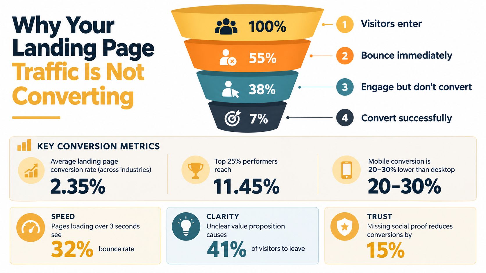
Traffic volume can hide a weak visitor experience. A page may attract people who aren't ready for the offer, promise something the ad doesn't deliver, or place the right information too late in the journey. A blended conversion rate won't tell you which problem you have unless you segment performance by source, device, audience, and page intent.
Unbounce's Q4 2024 benchmark analyzed 41,000 landing pages and 464 million pageviews. Across industries, the median landing page conversion rate was 6.6%, but the industry spread was substantial: SaaS reached 3.8%, ecommerce 4.2%, commercial and professional services 6.1%, financial services and education 8.4%, and events and entertainment 12.3%. Those figures come from the Unbounce conversion benchmark report, and they show why one universal target creates bad decisions.
Start with the right baseline
A SaaS demo page shouldn't be judged by the same expectation as an event registration page. Compare your page with the closest industry and offer context, then break that result down by acquisition channel. In the same benchmark data, email traffic averaged 19.3%, paid search 10.9%, paid social 12.0%, and display 4.1%. These figures are documented in MarketingProfs' summary of the benchmark data.
That difference changes the diagnosis. A low blended rate may reflect weak display targeting rather than poor page design. Conversely, a paid search page with strong intent can still underperform when its headline, offer, or form fails to answer the query immediately.
Diagnose the path, not the symptom
Look at where visitors stop:
- Arrival: Does the headline confirm the promise made by the ad, email, or search result?
- Engagement: Do visitors reach the proof, pricing, benefits, or form?
- Interaction: Do they click the CTA, begin the form, and complete each field?
- Exit: Do they leave after encountering uncertainty, effort, or an irrelevant message?
This approach keeps your team from applying generic fixes to a channel-specific problem. If visitors never reach the CTA, redesigning the button won't help. If they begin the form but abandon one field, adding more testimonials may miss the actual obstruction.
Practical rule: Benchmark first, segment second, observe behavior third, and test only after you can explain the likely friction.
Designing Layouts That Reduce Friction Instantly
A landing page layout should answer three questions without making visitors work: What is this, why should I care, and what should I do next? The page doesn't need to be visually elaborate. It needs a clear hierarchy that directs attention from promise to proof to action.

Build the first screen around one decision
Put the primary value proposition, supporting explanation, and main CTA in the opening view. Remove navigation links that send visitors toward unrelated pages, especially when the campaign has one defined conversion goal. A B2B service page might lead with the business problem, a specific outcome, and a consultation CTA. An ecommerce page might lead with the product benefit, price or offer context, and a purchase action.
Use visual hierarchy deliberately:
- Headline: State the outcome in language that matches the visitor's intent.
- Subhead: Clarify who the offer is for and how it works.
- Proof: Place a relevant testimonial, credential, review, or demonstration near the point of uncertainty.
- Action: Make the next step visually distinct and easy to understand.
A useful layout audit can follow the principles in Up North Media's landing page design best practices. Review the page at actual mobile widths, not only on a desktop monitor. Check whether the CTA remains visible, whether text wraps awkwardly, and whether the form is comfortable to complete with one hand.
Fix speed and mobile friction before polishing
Mobile visitors often experience the page differently from desktop visitors. The 2024 benchmark found that 82.9% of landing page visitors came from mobile devices, while desktop visitors converted at 12.1% compared with 11.2% for mobile, according to the MarketingProfs benchmark analysis. The gap is modest in the aggregate, but a poor mobile layout can still create avoidable abandonment for your specific audience.
Compress heavy assets, remove unnecessary scripts, test tap targets, and inspect every form error on a phone. Don't assume a responsive template solves the problem. Watch how users scroll, tap, zoom, and return to earlier fields.
For competitive research, the AdManage.ai competitor landing page guide can help your team identify how competing campaigns structure their pages. Use that research to find messaging patterns, not to copy layouts without validating them against your own traffic.
This video offers another practical visual reference for landing page structure and user experience:
Writing Copy That Matches Readability Benchmarks
Clever copy often asks visitors to interpret the message before they can evaluate the offer. That delay matters on paid campaigns, mobile screens, and unfamiliar brands. Plain language doesn't weaken positioning. It reduces the mental effort required to understand the value.
The benchmark data gives a clear reason to simplify. Pages written at a fifth-to-seventh grade reading level had an 11.1% median conversion rate, compared with 5.3% for college-level copy, according to MarketingProfs' report on landing page readability and traffic factors. Treat those figures as a useful directional benchmark, not a promise that every page will reproduce the result.
Replace interpretation with meaning
Start by comparing the source message with the landing page. If the ad says “Book a same-week HVAC estimate,” the page shouldn't open with “Integrated residential climate solutions.” The second phrase may sound polished, but it doesn't confirm the visitor's intent.
Use this rewrite process:
- Remove jargon: Replace internal terminology with words customers use in search queries, sales calls, and support conversations.
- Shorten sentences: Give each sentence one job. Separate the problem, benefit, and next step.
- Name the outcome: “Track inventory across locations” is clearer than “Reveal operational visibility.”
- Add boundaries: Explain who the offer suits, what happens next, and what the visitor isn't committing to.
- Make proof concrete: Use verifiable details from your business rather than broad claims about quality or excellence.
Write for scanning, not literary admiration
Visitors usually scan before they read. Use descriptive subheads, short paragraphs, benefit-led bullets, and captions that explain why an image matters. Put the most decision-critical information near the action it supports.
A good test is to remove the logo and ask someone unfamiliar with the business to summarize the offer from the first screen. If they can't identify the audience, benefit, and next step, the copy needs work before you test visual treatments.
Simplicity also supports message match. Email subscribers may need a reminder of an existing relationship, while search visitors need immediate confirmation that the page answers their query. The words can change by segment, but the promise must remain accurate.
Choosing CTAs That Align With Traffic Source
A CTA is not just a button label. It sets the visitor's expectation about effort, value, and commitment. “Submit” describes the action from the company's perspective. “Get my estimate” describes what the visitor receives.
Channel intent should determine the CTA strategy. Email traffic often arrives with prior context, so the CTA can reinforce an offer or relationship. Paid search visitors are comparing relevance quickly. Social traffic may need more education and trust before a direct request feels appropriate. Display traffic often requires stronger message continuity because the audience may have less immediate intent.
CTA Strategy by Traffic Source
| Traffic Source | Primary Goal | Recommended CTA Approach |
|---|---|---|
| Continue an existing relationship | Use specific benefit language that reflects the email promise, such as accessing the resource or claiming the offer | |
| Paid search | Confirm relevance and capture intent | Repeat the searched problem or desired outcome, then make the next step explicit |
| Paid social | Build confidence and interest | Pair a low-friction action with concise proof, education, or a preview of the offer |
| Display | Create recognition and reduce uncertainty | Match the ad's visual and verbal promise, then use a clear action supported by trust signals |
Match commitment to readiness
A visitor who wants a quote can handle a direct form CTA. A visitor who has just encountered an unfamiliar B2B product may respond better to a product tour, comparison guide, or short demo preview. The right CTA isn't always the most aggressive one. It's the one that asks for an action proportional to the visitor's confidence.
Keep one primary action per page. Secondary actions should support the same decision, not compete with it. For example, a “See how it works” link can support a demo CTA, while a link to a completely unrelated service page dilutes attention.
Test CTA changes as hypotheses. Change the label, placement, or supporting text in isolation when possible, then segment the result by source and device. A button can produce a positive aggregate result while failing for the audience that matters most.
Setting Up Analytics to Track the Full Friction Path
A final conversion event tells you that someone completed the journey. It doesn't tell you whether other visitors misunderstood the offer, missed the CTA, encountered a broken field, or abandoned after reading the price.
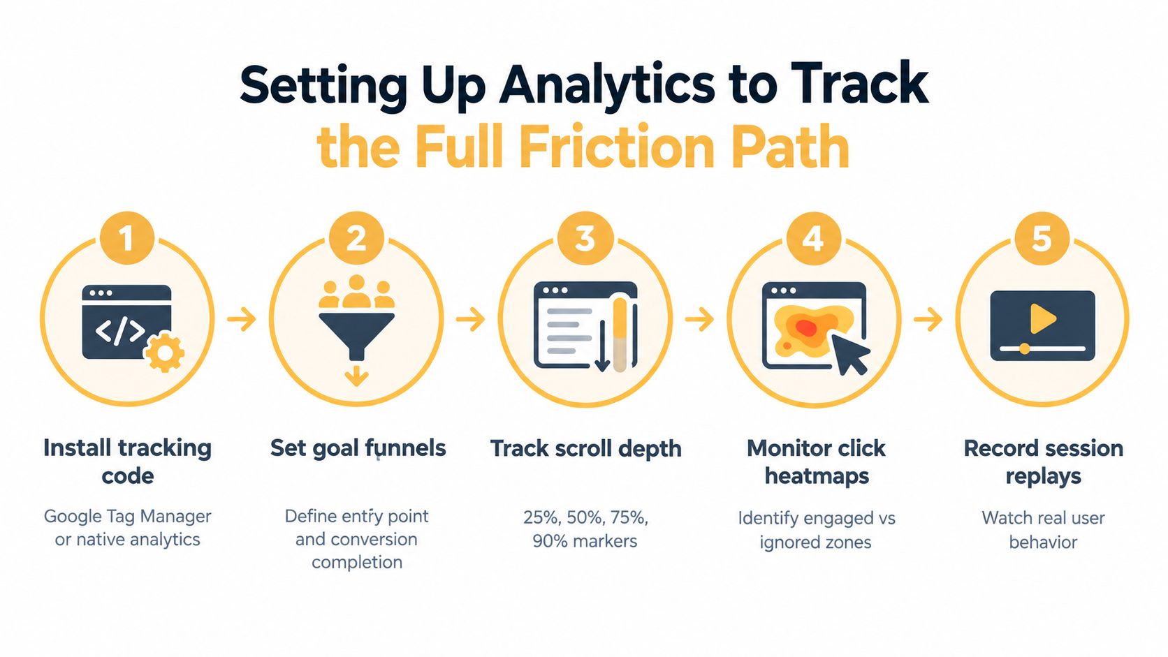
Instrument the intermediate path before proposing a redesign. Track scroll depth, time on page, click patterns, form-field interactions, and exit points so your team can connect behavior with outcomes. This behavioral approach is recommended in the Kissmetrics landing page conversion guide.
Create an event map
Start with the page entry and define each meaningful interaction:
- Landing page view, including campaign and source details.
- Scroll milestones that show whether visitors reach key sections.
- CTA clicks, including which instance of the CTA received attention.
- Form start, field focus, validation error, and form abandonment.
- Successful submission or another defined conversion event.
Google Analytics can hold the quantitative layer, while Google Tag Manager can help manage event implementation. Heatmaps and session recordings add context, but protect user privacy and avoid capturing sensitive form values.
The useful question isn't “What's the average time on page?” It's “Do converters and non-converters behave differently before the decision?” A long time on page can indicate interest, confusion, or both. Pair the metric with scroll position, clicks, field activity, and conversion status.
Turn observations into hypotheses
Use a simple friction log with four columns: signal, affected segment, likely cause, proposed test. If mobile visitors repeatedly focus a field, trigger an error, and exit, the hypothesis might concern input formatting or unclear instructions. If visitors click a headline that looks interactive, the layout may be creating a false expectation.
Build dashboards around decisions, not vanity metrics. A useful report shows source, device, landing page, CTA interaction, form progression, and completed conversion together. The Up North Media analytics implementation guide provides a practical reference for organizing that measurement foundation.
The strongest CRO teams don't ask only whether a page converted. They ask which friction prevented the next visitor from converting.
Running Statistically Valid A/B Tests
A/B testing becomes unreliable when teams stop at the first encouraging signal. A small early difference can reflect audience mix, timing, or random variation rather than a durable improvement.
Start with one hypothesis tied to observed behavior. “Changing the CTA copy will improve conversions” is too broad. “Replacing a generic form label with a benefit-led label will reduce hesitation among paid search visitors who reach the form” gives the team a defined change, audience, and outcome.
Set a credible evidence threshold
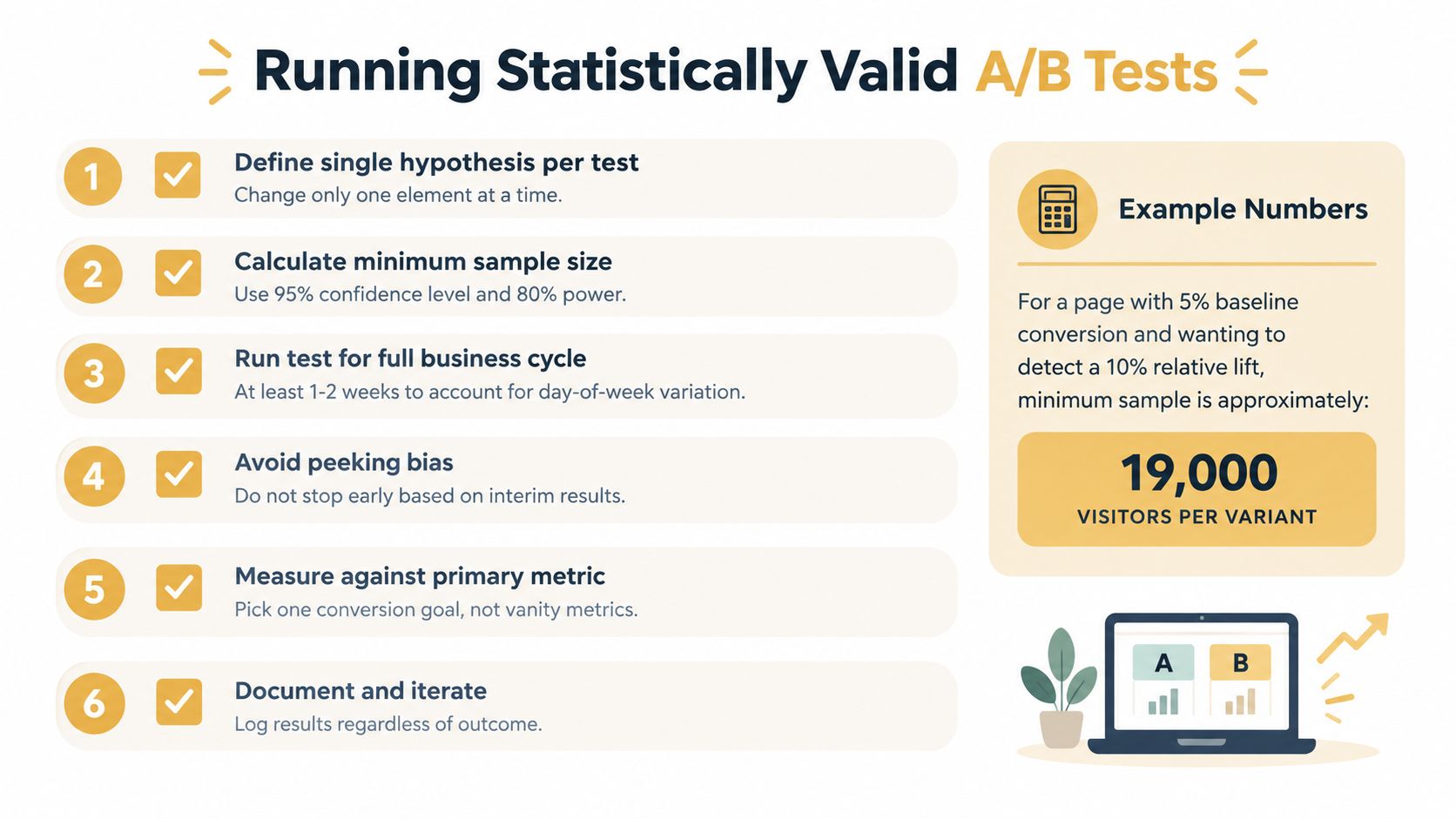
Expert guidance recommends roughly 250 conversions per variation as a preferred target, with 150 conversions per variation as an absolute minimum and 95% confidence as the threshold for declaring a winner. Those requirements and the finding that only about 14% of A/B tests produce a statistically significant improvement are summarized in CXL's landing page testing case study.
That doesn't mean every test must wait indefinitely. It means your team should understand whether the page can generate enough conversions to support a reliable comparison. If it can't, prioritize larger experience changes, use qualitative evidence, or treat the experiment as exploratory rather than conclusive.
Protect the test from common errors
- Predefine the primary metric: Choose the conversion event that reflects business value, not a convenient click metric.
- Change one major variable: If you alter the headline, form, and CTA simultaneously, you may learn that the page changed, but not why.
- Avoid repeated peeking: Don't stop when the result briefly crosses a preferred threshold.
- Segment after the main result: Check source, device, and audience patterns, but don't turn every subgroup into a separate winning claim.
- Document the outcome: Record the hypothesis, implementation, audience, result, and next question, including inconclusive tests.
The aim is not a constant stream of winners. A failed test can expose a false assumption about visitor motivation and improve the next hypothesis. Treat each result as evidence that sharpens the system.
For teams building a testing vocabulary, Up North Media's guide to A/B testing offers a useful starting point. The discipline matters more than the testing platform.
Putting It All Together Into a Repeatable System
CRO works best as an operating cycle, not a redesign brief. The cycle begins with a benchmark and ends with a documented decision, then starts again with the next friction point.
Use this order:
- Classify performance: Compare the page with the relevant industry benchmark, offer type, traffic source, and device mix.
- Map the path: Define arrival, engagement, CTA interaction, form progression, and conversion events.
- Fix obvious blockers: Resolve broken interactions, unclear hierarchy, distracting navigation, slow assets, and mobile usability problems before experimentation.
- Align the message: Make the headline, supporting copy, proof, and CTA reflect the visitor's source and intent.
- Prioritize friction: Use behavioral evidence to identify the point where the largest valuable audience loses momentum.
- Form one hypothesis: State the observed problem, proposed change, target segment, and primary metric.
- Run a defensible test: Set the evidence threshold before launch and avoid calling a winner from an early fluctuation.
- Apply and monitor: Roll out validated changes carefully, then check whether the result holds across meaningful segments.
A practical scenario
Suppose a paid search page attracts qualified visitors, but the majority leave before reaching the form. A CTA rewrite is unlikely to solve the initial issue. The team should inspect message match, opening-screen clarity, page speed, and scroll behavior first.
If visitors reach the form but abandon after focusing one field, the priority changes. The team can inspect validation, instructions, field necessity, and mobile input behavior, then test one targeted improvement. If the form performs well but the source sends low-intent traffic, the answer may belong in campaign targeting and offer positioning rather than page design.
Make the learning transferable
Document which audiences responded, which objections appeared, and which claims improved understanding. Feed those insights back into ads, email, sales enablement, product pages, and future landing pages. Behavioral data becomes more valuable than a checklist at this point. It helps the team improve the entire acquisition experience instead of polishing one isolated URL.
Use tools that fit the workflow. Google Analytics and Google Tag Manager can support event measurement, heatmaps and session recordings can reveal interaction problems, and an agency such as Up North Media can support landing page optimization, analytics implementation, and ongoing experimentation as part of a broader digital strategy.
A high-performing landing page isn't defined by a fashionable layout. It earns attention from the right traffic, communicates the offer without unnecessary effort, and gives the visitor a clear next step. The teams that sustain improvement keep instrumenting, analyzing, testing, and applying what they learn.
Up North Media helps businesses improve landing pages through message alignment, conversion-focused web development, analytics implementation, and ongoing A/B testing. If your traffic is healthy but the friction path is unclear, visit Up North Media to discuss a practical CRO plan for your site.