
You've decided the current store has to go. Maybe the cart breaks on iPhones, maybe the agency that built it stopped answering, maybe you're selling into Europe now and the checkout only takes one card processor. Three quotes come back and none of them describe the same project. One is a theme install with a plugin list. Another is a six month custom build with a discovery phase nobody explained to you.
That gap isn't a sales problem. It's a requirements problem. A build only fails in the ways the brief allowed it to fail, and most briefs say what the store should sell without saying how fast, how secure, how accessible or how recoverable it has to be. Vendors then compete on price against the vaguest possible scope, and you find out what nobody costed somewhere around week ten.
What follows is the list I'd hand a founder before the first vendor call. It keeps the functional work and the quality targets in the same place, then covers the areas where projects slip.
The Core Requirements Every Ecommerce Site Needs
Ecommerce website requirements fall into twelve areas, and each area has two halves: what the site must do, and how well it must do it. The table below is the version you can hand to a developer without needing a translator in the room.
| Requirement area | Functional need | Non-functional need | Check before launch |
|---|---|---|---|
| Catalog | Products, variants, categories and filters | Fast filtering as the catalog grows | Variant stock shows correctly on product pages |
| Cart and checkout | Guest checkout, editable cart, saved addresses | Short default form with few required fields | Total cost shown before payment step |
| Payments | Cards and wallets chosen for the target market | Card data handled by a PCI DSS compliant provider | Failed payment recovery tested end to end |
| Accounts | Registration, login, order history, returns | Strong password rules and secure sessions | Account deletion request path works |
| Search and navigation | Site search, sorting, breadcrumbs | Results return quickly under normal load | Keyboard-only navigation works |
| Order management | Order status, refunds, returns, notifications | Reliable transactional email and SMS | Refund reconciles with the payment provider |
| Integrations | ERP, CRM, shipping, tax, email, accounting | Retries and logging for failed syncs | Inventory sync checked for mismatches |
| Security | Admin roles, audit logs, HTTPS | Patching, encrypted backups, rate limiting | Vulnerability scan completed |
| Performance | Pages and checkout respond as designed | Core Web Vitals within targets | Tested on a mid-range mobile phone over 4G |
| Accessibility | Labels, focus states, error messages | WCAG 2.2 AA target | Keyboard and screen-reader test passed |
| SEO | Crawlable category and product URLs | Clean URLs and fast rendering | Indexation checked in Google Search Console |
| Scalability | Handles sales, promotions and multi-currency | Tested at expected peak traffic multiples | Load test at twice the forecast peak |
The split matters more than it looks. A shopper adds a product to the cart. That's functional. The cart still responding quickly while a flash sale runs is non-functional, and it's the half that decides whether that shopper ever reaches a payment screen.
Where the revenue risk sits
Catalog, cart and checkout, and payments carry most of the money, so they get the strictest acceptance tests and the earliest testing. A search filter that takes four seconds to re-render costs you browsing depth. A cart that reveals shipping only on the final screen costs you the order. Write the acceptance check for those three rows before the first line of code, and don't accept "it works on staging" as evidence.
Catalog media belongs in the same row. If a season needs forty on-model shots and the budget covers ten, AI model outfit e-commerce tooling can close part of the gap, as long as the asset specs and text alternatives are in the brief too.
Accessibility belongs in the table, not the polish pass
Accessibility is testable, which is why it earns a row rather than a paragraph of good intentions. The World Wide Web Consortium's Web Content Accessibility Guidelines (WCAG) 2.2 organizes the work around four principles, that content must be perceivable, operable, understandable and durable, defines three conformance levels A, AA and AAA, and requires every success criterion at the chosen level to pass (W3C's WCAG 2.2 standards overview). Most retailers target AA.
In practice that means product images with text alternatives, gestures that also work with a single pointer, repeated navigation in the same relative order across pages, keyboard testing with visible focus states, and error messages a screen reader can announce without guesswork.
One owner, one test, one decision
Every row needs a named person, a measurable acceptance check and a recorded go or no-go decision. Miss any of the three and the row becomes a wish that nobody can be held to.
The completeness test: hand the requirement to a tester who wasn't in the meeting. If they can pass or fail it without asking what you meant, it's finished. If they can't, it isn't a requirement yet.
Platform, Features and Integrations to Specify
The build decision constrains everything else, so make it first and write down why you made it. There are four realistic options and they differ less in features than in who carries the risk after launch.
| Option | Best fit | Control over requirements | Ongoing responsibility |
|---|---|---|---|
| Hosted SaaS store | Small catalogs and a fast launch | Limited to platform features and plugins | Provider handles hosting, patches and security updates |
| Open-source platform with managed hosting | Teams with some technical staff | High, through themes and plugins | Owner manages updates, plugin compatibility and backups |
| Headless or composed commerce | Multi-channel brands with developers | Full control of the storefront and integrations | Owner runs the front end, APIs and monitoring |
| Custom-built store | Complex B2B rules or unusual workflows | Full control of every requirement | Highest, across build, hosting, security and maintenance |
A worked example makes the trade-off concrete. Say a wholesaler sells 400 SKUs to 60 trade accounts with tiered pricing, purchase-order numbers and manager approval above a spend limit. A hosted SaaS store fights that workflow every day; a headless build with a proper B2B layer handles it but costs more to run. A retailer with 300 products in one country and one currency needs neither. A hosted platform plus two well-chosen plugins gets them live in weeks, and a side by side ecommerce platform comparison is the faster way to rule options out than a demo call.
The feature list to write down either way
Product variants and bundles. Category filters that show counts. Wishlists and saved lists. Reviews with a moderation path. Promotion and discount rules, including stacking and exclusions, which is where many groups find a gap mid-campaign. Tax rules by destination. Shipping methods and rate tables. Multi-currency or multi-language if you sell abroad. Customer account features, including reorder and invoices for trade buyers. An admin panel with role-based access, so staff can process a refund without seeing margin data.
Integrations are where the schedule slips
Every system the store touches needs three facts recorded: which way the data flows, how often it syncs, and what happens when a sync fails. Inventory or ERP, CRM, shipping carriers, tax engine, email and SMS, accounting, marketplaces.
- Inventory: ERP to store, near real time, with a queue that retries and an alert after the third failure. Silent oversells are the expensive version of this bug.
- Orders: store to ERP, within minutes, with the order flagged for manual review if the push fails twice.
- Tax: calculated live at checkout by destination, with a cached fallback so a timeout doesn't block payment.
- Email and SMS: order events to a transactional provider, immediate, with a logged failure and a retry, because a missing receipt turns into a support ticket.
If you're still choosing a fulfilment model, weighing dropshipping pros and cons before you spec supplier syncs is cheaper than discovering mid-build that stock levels live in someone else's spreadsheet.
If a feature can't be written as a task a shopper or a staff member completes, it isn't a requirement yet. It's a theme.
Checkout and Payment Requirements That Stop Abandonment
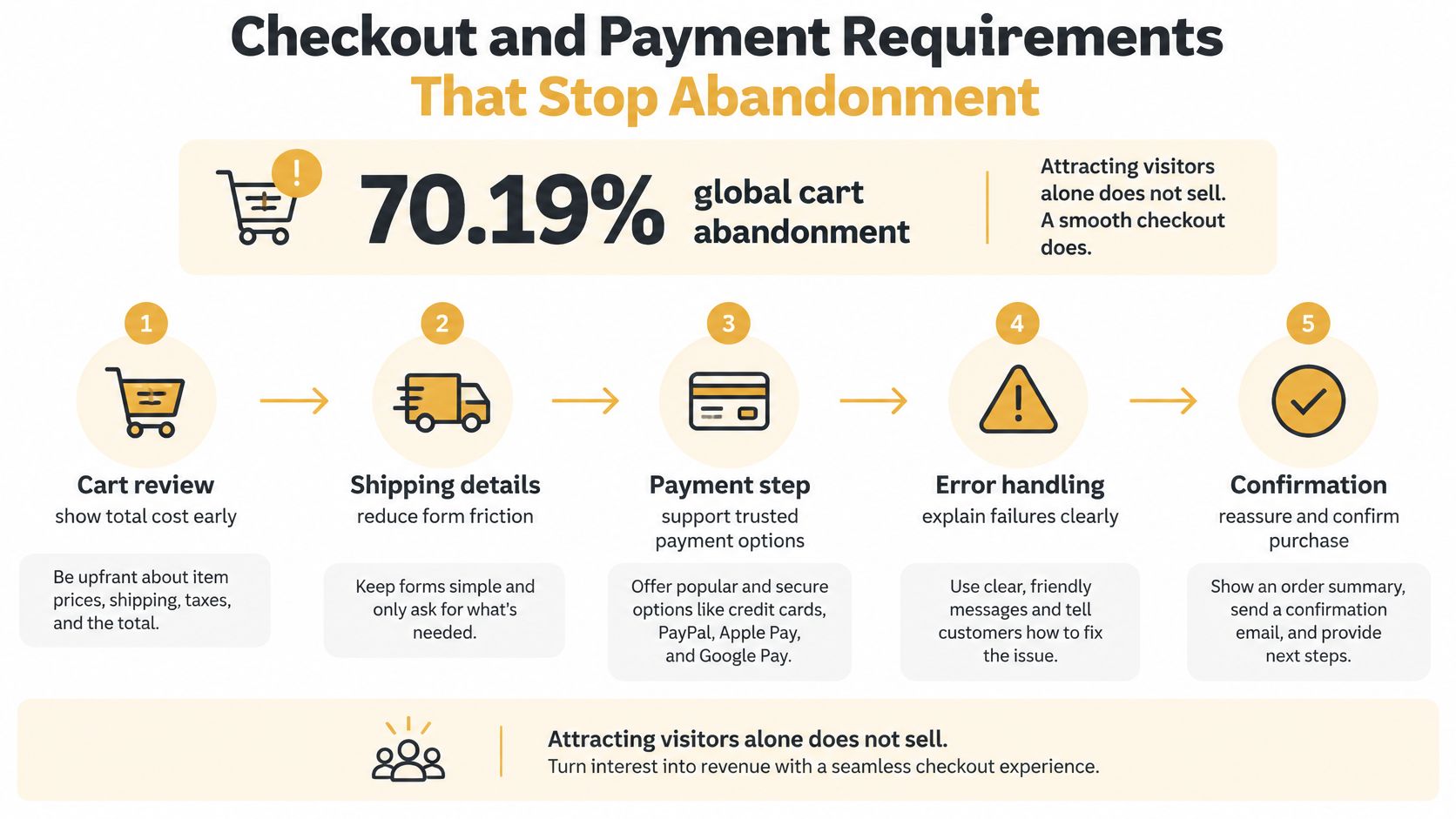
A shopper reaches the payment step and sees a higher total than expected. Or the form demands an account before showing delivery options. Baymard Institute's analysis of global abandonment studies puts cart abandonment at approximately 70.19% (Baymard Institute's ecommerce checkout usability report and benchmark). The reasons shoppers leave point to requirements you can specify and test.
| Reason shoppers left | US shoppers | Requirement that answers it |
|---|---|---|
| Extra costs such as shipping, taxes or fees | 48% | Show the full total before payment |
| Account creation required | 24% | Offer guest checkout |
| Delivery speed | 22% | Display delivery dates at checkout |
| Distrust with card details | 18% | Use provider-hosted card fields and visible security cues |
| Checkout too long or complicated | 17% | Keep the form short and linear |
| Total cost not visible early | 16% | Show totals in the cart |
These fixes belong in the build brief. Test them against the actual checkout, not just the design.
Set form size as a number, not a preference
Baymard's checkout usability research found that an ideal checkout can be as short as 12 to 14 form elements, while the average US checkout carried 23.48 default form elements. Reduce unnecessary work with address autocomplete, optional fields tucked behind a link, billing details that default to the shipping address with an explicit toggle, and inline validation. Preserve entered information when an error occurs.
The checkout flow, in order
- Cart shows totals, including estimated shipping and tax, with a way to edit quantities without reloading the page.
- Guest or account choice, with guest checkout as the default and account creation offered after payment.
- Shipping address and method, with delivery dates instead of vague windows.
- Payment, using provider-hosted card fields so card numbers do not touch your servers, plus the wallets your market uses.
- Review, with the full order and return policy link visible together.
- Confirmation and receipt email, sent immediately and readable on a phone.
The review screen should make the final order easy to check before payment. The DOM Studio checkout review block shows the elements a complete order summary can include.
Measure the funnel, not the design
Baymard's benchmark covers 344 top-grossing US and European sites and more than 30,000 manually reviewed checkout elements. It found that 65% deliver a mediocre-or-worse checkout while only 2% qualify as good. The research estimates that the average large site has roughly 32 solvable improvements and could lift conversion by about 35% through better checkout usability. Those findings are useful context, but your own funnel data should determine what to fix first.
Track drop-off at each step, field-level errors, payment failures by provider, and the same measures by device. Fix the largest source of friction, then measure again. A steady cycle of measurement and changes, guided by ecommerce checkout optimization, is more useful than redesigning without a clear problem to solve.
Give every checkout step a target completion rate and error rate. A step without a number is a step nobody owns.
Speed, SEO and Scalability Targets
Speed is the requirement everybody agrees with and almost nobody writes down. Put the thresholds in writing and they stop being an opinion.
| Metric | What it measures | Good threshold |
|---|---|---|
| Largest Contentful Paint (LCP) | How quickly the main content loads | 2.5 seconds or less |
| Interaction to Next Paint (INP) | How quickly the page responds to taps and clicks | 200 milliseconds or less |
| Cumulative Layout Shift (CLS) | How stable the layout stays while loading | 0.1 or less |
Measure all three on mobile at the 75th percentile, not on the best run of the day. The third metric catches a specific failure. A late-loading tag, a review widget or a recommendation carousel can leave the buy button shifting under a thumb at the exact moment the shopper commits, and that single script can undo a year of design work.
SEO requirements the platform has to carry
These are build decisions, not marketing tasks added after launch.
- Stable URLs. Category and product addresses survive catalog changes, and removed products redirect to a relevant category rather than a 404.
- Per-template metadata. Unique titles and meta descriptions generated from product attributes, not one template string repeated across 4,000 pages.
- Product structured data. Price, availability and reviews marked up so search results show them.
- A clean sitemap. Out-of-stock and noindexed pages excluded.
- Canonical handling for filtered, sorted and variant URLs, or you'll index forty versions of one category.
- Compressed images with text alternatives, served at the size they're displayed.
Getting the crawl and rendering layer right early is the difference between SEO work compounding and SEO work leaking. The technical SEO foundations for online stores cover the parts that can't be fixed with a plugin later.
Scalability is a multiple, not a number
Write down the largest load you expect, a sale, a newsletter send, a marketplace feature, and express it as a multiple of a normal Tuesday. Then test at twice the forecast peak. Specify the caching strategy for category and product pages, the autoscaling ceiling on your hosting plan, and what the checkout does when it hits the limit. Queueing the order and telling the shopper their order is being processed is survivable. A white screen at payment is not.
Run the speed test on a mid-range Android phone over 4G. A developer laptop on office Wi-Fi will tell you a comforting story that your customers never see.
Security and Privacy Operations to Plan
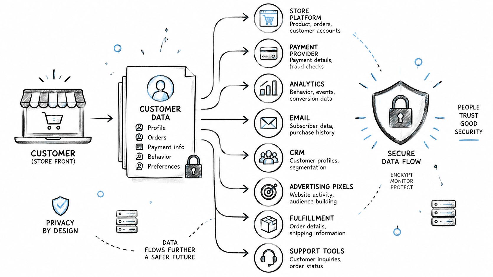
Start with a data map, not a privacy policy. Before anyone buys a consent banner, list every system that receives customer data: the store platform, the payment provider, analytics, email, CRM, advertising pixels, fulfilment, the helpdesk and backups. For each one, record what's sent, why, how long it's kept and who processes it.
That map is also the only way to answer a customer request without a scramble.
Security controls that belong in the build
- HTTPS everywhere, including legacy redirects and the checkout, with no mixed-content warnings.
- Role-based admin access with two-factor authentication, so a support hire can't export the customer list.
- Audit logs for admin actions and price changes, because disputes need a record.
- No card numbers on your own servers. Provider-hosted payment fields keep you out of the worst scope of PCI DSS.
- A patch cadence for the platform, plugins and dependencies, not a yearly scramble.
- Encrypted backups with a restore test you ran.
- Rate limiting on login, coupon and password-reset endpoints, which are the three that get attacked.
- A vulnerability scan before launch and after every major feature.
Privacy requests are a workflow, not a page
US state privacy guidance identifies recurring obligations: clear disclosure of what's collected, why and with whom it's shared, plus mechanisms for access, deletion, correction and portability. Requests have to be verified and completed within statutory deadlines, commonly around 45 days in many state regimes (Frame Legal's summary of 2025 state data privacy laws).
The hard case is a deletion request where order records must be kept for tax or fraud reasons. Write the exception rule first, decide which systems receive the deletion and which hold the record, and log every action so you can prove what happened.
Build the intake path early: an email address nobody monitors isn't a data request process. It's a deadline running against you.
Scope isn't a size question either. Some state laws key off revenue or data volume thresholds, while the GDPR can apply to a small seller handling EU residents' data. Where you sell decides which rules you're under. Then test it properly: submit a deletion request for a test customer and confirm every system in the map responds.
Accessibility and Cross-Border Compliance at Launch
Most requirement lists treat accessibility as alt text on product images and a keyboard check on the homepage. That reading is out of date for anyone selling into Europe, and it's the requirement that gets retrofitted most expensively.
Since June 28, 2025, the European Accessibility Act has applied to many consumer-facing ecommerce services, including websites, mobile applications, digital customer communications, payment flows and electronic contract completion (Taylor Wessing's review of 2025 ecommerce legal developments). That shifts accessibility from an enhancement to an architectural, QA and documentation obligation.
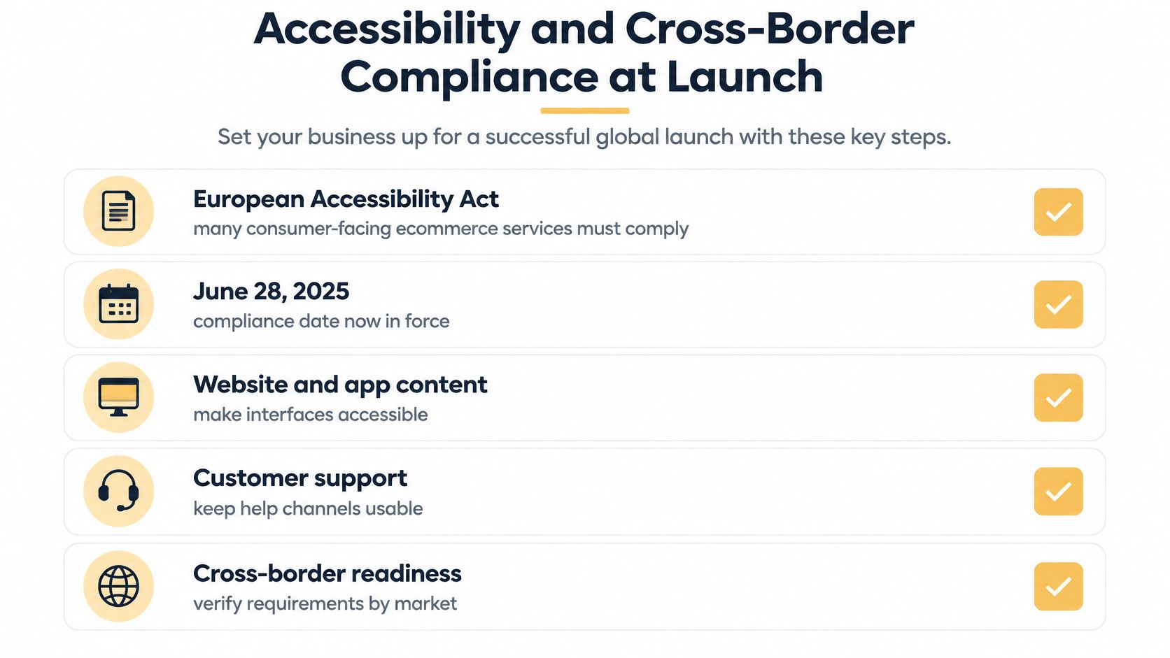
The practical gap is scope. Accessibility covers the entire buying journey, not just product pages, and it has to stay conformant as your checkout, payment provider, chat widget and promotional banners change.
Make the requirements testable
- Keyboard-only checkout, from cart to confirmation, with no focus traps.
- Screen-reader-announced validation errors, not colour alone.
- Accessible login and payment steps, including any third-party authentication screen.
- Readable order confirmations in plain HTML text.
- Accessible support channels, with a phone or email route that doesn't depend on a chat widget.
- Product images with text alternatives, visible focus states and sufficient contrast.
- A published accessibility statement naming the standard you meet.
Legal scope depends on where you sell, and exemptions can depend on business size and service type, so each market needs its own legal read. That's a short conversation with a lawyer, not a design decision.
A sequence that works
- Test the full checkout using only a keyboard.
- Test it with one screen reader, on the platform your customers use.
- Fix the errors that block completion first, then the ones that merely annoy.
- Re-test after any third-party script changes, and schedule that check into releases.
- Publish the accessibility statement and keep it current.
Payment and chat tools are the most common source of new barriers after launch, because the vendor updates them on their schedule, not yours.
Turn These Requirements Into a Build Brief
A build brief should fit on one page. Record the platform and why it fits, the functional requirements and their owners, speed and security targets, checkout flow, privacy and accessibility operations, and integration sync rules, including what happens when a sync fails.
Set checkout, privacy and accessibility requirements before choosing a platform. Those constraints can rule out options, and finding that out at the brief stage costs less than changing direction after development begins.
Give every requirement a test and record the result before launch. If a requirement has no recorded result, the store is not ready to launch.
Up North Media reviews your website, target market and goals before development starts. Fill out a short form with your website and market, and Up North Media replies within one business day to confirm scope and pricing.
Written requirements give developers a clear basis for estimating the work and testing the finished store. Up North Media's Web App Development service covers custom web applications, including e-commerce platforms. Send your website, target market and goals to start a build brief your developers can quote against. Visit Up North Media to get started.