
Baymard Institute's benchmark places global cart abandonment at 70.19%, based on 49 independent studies tracked across 14 years. In practical terms, roughly 7 in 10 shoppers who add an item to a cart leave without buying. That figure isn't a diagnosis of your store, but it does reframe ecommerce checkout optimization as a revenue discipline, not a cosmetic UX project. (Baymard checkout usability research)
A checkout can look polished and still lose orders because the delivery date is unclear, the preferred payment method is missing, or the final total changes too late. The stores that improve completion consistently treat checkout as a connected system, then adapt that system to customer type, device, basket complexity, geography, and purchase intent.
Why Checkout Optimization Is a Revenue System, Not a UX Tweak
A checkout problem appears after a shopper has chosen products and accepted the price well enough to start paying. That makes every failure more expensive than an early browsing issue. Marketing, merchandising, engineering, payments, fulfillment, fraud, and customer support all influence whether that order completes.
Baymard reports an average checkout flow of 5.1 steps and 11.3 form fields, and 17% of U.S. online shoppers said they had abandoned an order in the past quarter because checkout was too long or complicated. (Baymard checkout usability research) The practical lesson is narrower than “remove fields.” A shopper may enter contact details quickly, then leave when delivery costs appear late, a preferred wallet is missing, or the available shipping option does not meet the promised need.
A mid-market retailer can therefore lose orders for reasons that form simplification will not fix. If a meaningful customer segment reaches payment without its preferred method, the team should test payment fit and message clarity alongside field count. The right intervention depends on customer type, device, basket value and complexity, destination, and purchase urgency.
The decisions that determine completion
Map checkout by customer decisions rather than screens. Shoppers need clear answers about the basket, destination, arrival time, total cost, payment process, and what follows the final click.
| Stage | Customer decision | Common friction | Business dependency |
|---|---|---|---|
| Checkout entry | “Am I in the right place?” | Forced sign-in, unclear progress, distracting navigation | Account policy and checkout architecture |
| Delivery details | “Can this store deliver to me?” | Address errors, unavailable destinations, poor autofill | Address validation, inventory, carrier rules |
| Shipping selection | “When will it arrive?” | Vague speed claims, hidden cutoff times, missing options | Inventory location and carrier service levels |
| Payment selection | “Can I pay safely my way?” | Missing wallet or local method, declined payment, unclear security | Payment gateway and fraud controls |
| Review | “Is the total and order correct?” | Late fees, changed quantities, unclear returns | Tax, pricing, promotion, and returns systems |
| Confirmation and support | “Did it work, and what happens next?” | No order clarity, weak tracking, hard-to-find support | Order management and communication |
Baymard reported uncovering 1,350+ new checkout usability issues in 2024, while audits of 344 leading ecommerce sites found an average of 39 checkout usability issues per site. (Baymard's 2024 checkout research) The useful implication is specific: checkout work now covers trust, error recovery, guest purchasing, payment choice, delivery clarity, and post-purchase confidence, not only labels and fields.
Practical rule: Reduce uncertainty before reducing keystrokes.
Start with the moments where intent can change: checkout entry, payment selection, authentication, review, confirmation, and recovery. Compare new and returning customers, mobile and desktop visitors, local and cross-border orders, and simple and complex baskets. Rank issues by revenue at risk, affected order volume, customer reach, implementation effort, and operational risk. The goal is a trustworthy path in which the total, delivery expectation, payment choice, and next action remain clear for the customer in front of you.
Running a Checkout Friction Audit You Can Act On
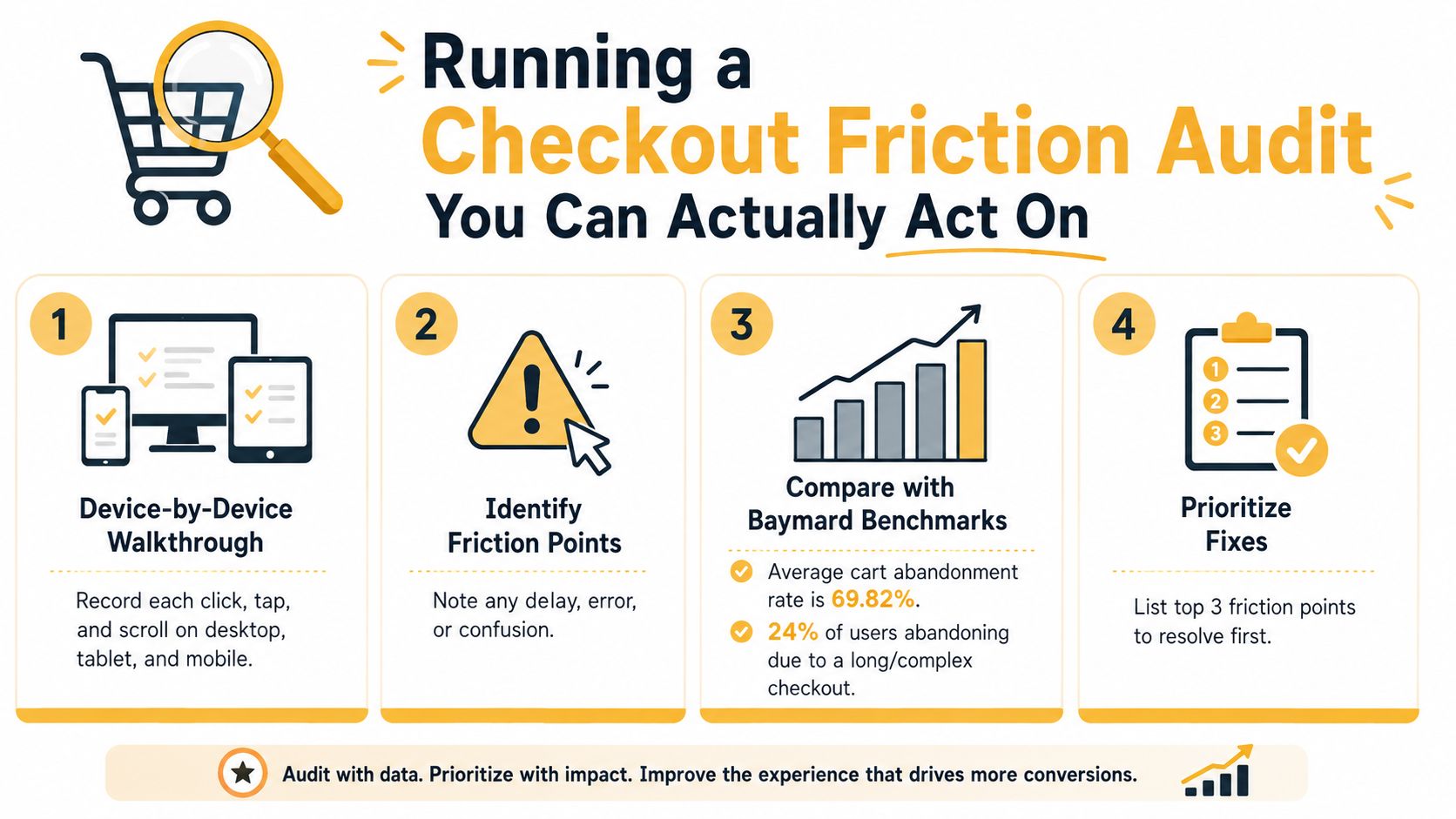
A useful audit starts with a real purchase, not a spreadsheet of generic recommendations. Walk through checkout on every supported device and record each tap, click, scroll, transition, loading state, field, validation message, and recovery path. Desktop behavior does not predict mobile behavior, and an audit that covers only an ideal card payment misses failures that affect actual orders.
Record the entire task
Use ordinary baskets first, then test conditions that expose weaknesses in the checkout system:
- Normal orders: Record the standard path from cart entry through confirmation.
- Discounted baskets: Check coupon discovery, invalid-code handling, and whether the total updates clearly.
- Complex orders: Test backorders, shipping exclusions, multiple quantities, and delivery restrictions.
- International addresses: Check currency, address format, tax treatment, duties messaging, and available payment methods.
- Payment failures: Use declined cards, expired sessions, interrupted wallet authentication, and retry paths.
- Real-world devices: Test autofill, slow connections, touch targets, keyboard behavior, and accessibility with actual hardware.
Field count is only a starting point. Remove a field when it creates work without supporting fulfillment, payment, fraud control, or customer communication. Keep it when the transaction requires the information, then explain why it is needed when that answer is not obvious. A shorter form can still perform poorly if a preferred wallet is missing, delivery costs appear late, or an address error clears information the customer already entered.
Separate observation from diagnosis
Session recordings can show hesitation, repeated taps, and backtracking. Analytics can show where customers exit. Support tickets can reveal confusion about shipping, refunds, or payment confirmation, while exit surveys can expose objections that event data cannot explain. None of these sources proves causality alone. Use them to identify patterns, then use controlled tests to establish impact.
Build an issue log with the affected segment, exact reproduction steps, likely customer objective, evidence, owner, and recommended fix. Score each issue by completion impact, order volume, reach, effort, and risk. A visually awkward label may be harmless. A silent payment failure or a delivery promise that changes after address entry can affect revenue and support workload.
Review results by customer type, device, and basket rather than relying on a blended average. A first-time mobile buyer may need clearer reassurance, while a returning customer with a saved wallet may need speed. The best fix is often a combination of interface changes, payment-method fit, delivery clarity, and dependable confirmation.
Ignore the happy path in isolation. Test slow networks, browser autofill conflicts, address mismatches, invalid promotion codes, declined cards, expired sessions, keyboard navigation, and screen-reader behavior. These conditions often reveal more useful work than another round of spacing and color adjustments.
Choosing Between One-Page and Multi-Step Checkout
One-page checkout isn't automatically better. Multi-step checkout isn't automatically worse. The correct structure depends on the customer's familiarity with the store, the device they're using, the number of decisions in the basket, and the level of reassurance required before payment.
A returning customer buying a familiar product may value a single, fast path with a saved address and wallet. A first-time buyer with a complex delivery requirement may benefit from a deliberate sequence that separates contact information, delivery, payment, and review. The same store can legitimately need both experiences.
Where one page earns its place
One-page checkout keeps the entire task visible and reduces transitions. It can work well for simple baskets, returning customers, express wallets, and purchases where customers don't need to compare many delivery or billing choices. Totals, shipping, and payment errors remain easier to inspect without forcing the customer to remember what appeared on a previous screen.
The trade-off is cognitive load. A long page can expose too many fields at once, make correction harder, and encourage excessive scrolling on mobile. Collapsible sections and a persistent order summary can reduce that burden, but they don't make a complex form simple by themselves.
Where multiple steps help
Multi-step checkout creates a sequence around meaningful decisions. “Contact,” “Delivery,” “Payment,” and “Review” can give customers a clear sense of progress when each stage has a distinct purpose. It can also reduce the initial visual load for first-time buyers and stores with complex shipping, billing, or fulfillment rules.
The danger is progression theater. Splitting one field group across several screens doesn't create clarity. Each extra transition introduces another opportunity for validation errors, session problems, loading delays, or abandonment. Use labels that tell customers what decision they're making, and let them return to earlier steps without losing entered information.
A shorter interface isn't always a shorter task.
Test both structures with realistic content, autofill, error states, delivery restrictions, and payment methods. Measure completion by customer type, device, and basket complexity, but also inspect time to purchase, error recovery, support contacts, and downstream delivery problems. A compressed hybrid often works well: contact and delivery details together, then a focused payment and review stage.
For businesses selling experiences or reservations, the payment flow has additional dependencies such as attendee details, date selection, availability, and cancellation terms. A resource on online payment for tours can help teams think through that kind of transaction without assuming a physical-product checkout model.
Designing Forms, Guest Checkout, and Payment UX Together
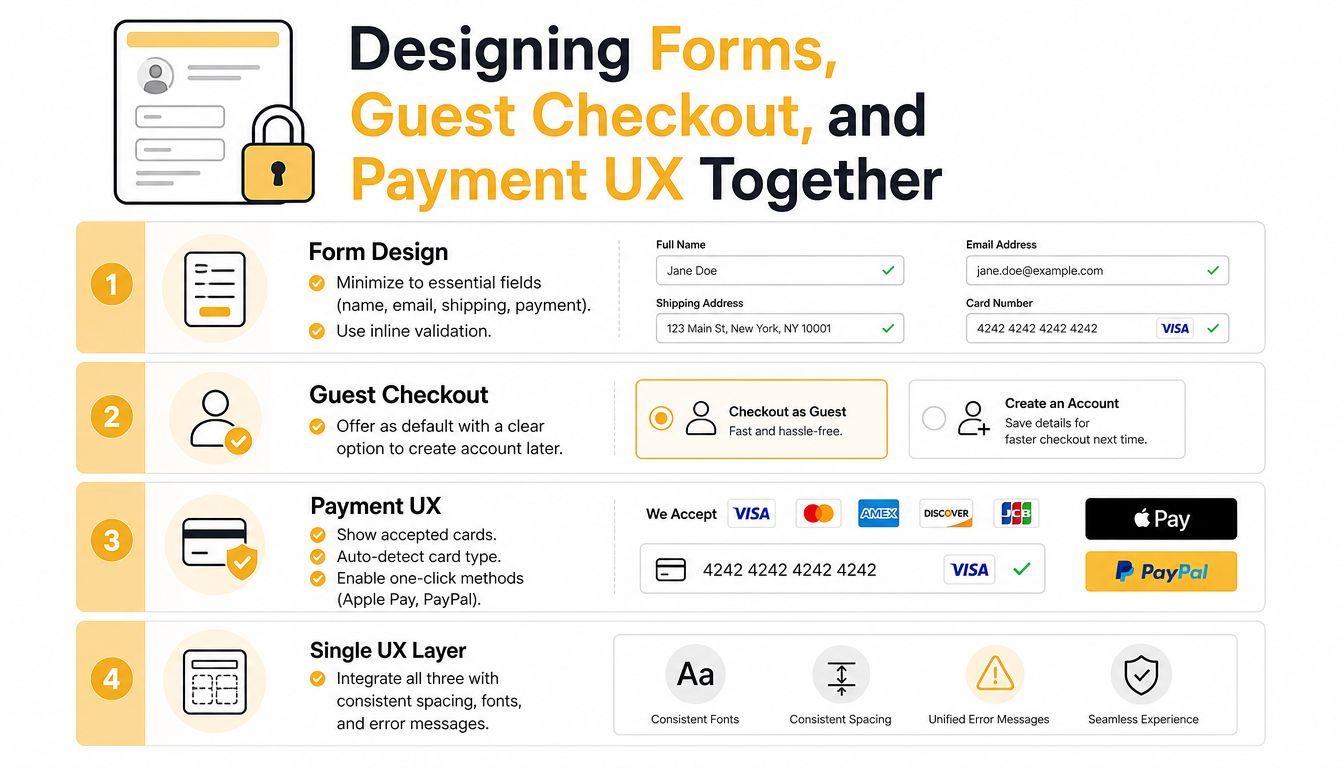
Forms, guest checkout, and payment selection belong to one interaction layer. Treating them as separate tickets creates gaps. A team may remove fields, then block the customer with a mandatory account prompt, or add wallets that few visitors reach because the address form fails first. Design the path around customer type, device, and basket complexity rather than applying the same form to every shopper.
Start with the minimum viable form
Keep visible fields tied to fulfillment, payment, fraud prevention, or a clear operational requirement. Use browser autofill and address lookup to reduce typing, while allowing customers to correct suggested values. Set suitable input types for email, telephone, postcode, and card fields so mobile keyboards support the task.
Inline validation should give a specific correction at the right moment. Validate the postcode after the customer leaves the field, then show an actionable message such as, “Enter a valid UK postcode, e.g., SW1A 1AA.” For a missing apartment detail, identify that field and explain why it is needed. Avoid validating every keystroke or replacing a useful value with a generic “Something went wrong” message.
Baymard's benchmarking indicates that the average U.S. ecommerce checkout contains 23.48 default form elements, while most sites can reduce displayed fields by 20–60% without losing necessary data. It also reports that 65% of sites score “mediocre” or worse for checkout usability. (Baymard UX statistics) Use those figures to prompt a field audit, not to remove fields mechanically. A billing address may be unnecessary for some baskets and required for others, so conditional logic matters more than a universal field count.
Make guest purchase the primary path
Account creation should follow the order, not stand between the shopper and payment. Put guest checkout in the main path, then offer account creation after confirmation, when the customer has received value. The invitation can explain order tracking, saved details, or easier returns without holding the order hostage.
Keep marketing consent separate from required checkout information. Do not bundle a newsletter opt-in into an account checkbox, and do not ask for a password before payment. Returning customers may benefit from saved details and express wallets, while first-time shoppers need a clear path that does not assume an existing account.
Let payment choice arrive at the right moment
Show saved methods and express wallets when they fit the customer's context, particularly for returning and mobile shoppers. Apple Pay, Google Pay, and PayPal can reduce data entry, but each needs a clear failure state and a visible fallback to card payment. Keep payment logos, card formatting, and security information close to the payment control, where reassurance supports the decision.
Teams that rely heavily on WordPress forms should review how plugins affect validation, field control, and maintainability. A practical comparison of why Kiwiform replaces Gravity Forms can inform that implementation decision when checkout-related forms need a lighter, more controlled setup.
Payment Methods, Delivery Promises, and Cost Transparency
For mid-market retailers, payment fit, delivery certainty, and total-cost disclosure often matter more than another round of button polish. These details sit beside the purchase decision. A tidy interface cannot compensate for a shopper who cannot use a preferred wallet or discovers an unexpected fee at the final step.
Start with the customer's context. Review payment selection by country, device, customer status, basket value, and authorization outcome. A retailer entering a new market might add that market's local wallet rather than adding more global options, then compare authorization rates and completed orders with its gateway data. The point is to test payment fit against commercial outcomes, not to treat a longer method list as progress.
Match payment methods to context
Place the methods customers are most likely to use near the top, while keeping card entry and alternative methods available as fallback paths. Each express option also needs a clear failure state, especially when authentication or a wallet handoff does not complete.
| Segment | Primary methods | Secondary methods |
|---|---|---|
| Returning customers | Saved card, Apple Pay, Google Pay | PayPal, local wallet |
| Mobile shoppers | Apple Pay, Google Pay, PayPal | Card payment |
| First-time customers | Card payment, PayPal | Guest wallet options |
| Cross-border visitors | Local market method, card payment | PayPal or regional wallet |
| Higher-consideration baskets | Card payment, PayPal | Appropriate installment option |
This table is a starting hypothesis based on typical authorization-rate patterns by segment. Validate it against your own gateway data, fraud rules, settlement requirements, and customer behavior before committing. Teams planning the technical layer can use this overview of payment gateway integration to connect checkout behavior with authorization, capture, refunds, and fraud-control workflows.
Sell a delivery promise, not just a shipping price
Show the cheapest available option, a faster paid option where it exists, and click-and-collect when the business supports it. Frame each choice around an estimated arrival date or date range calculated from inventory and carrier service levels. “Three to five days” is less useful than a delivery expectation tied to the customer's location and order time.
Show cutoff information when it changes the promise. Make exclusions visible before payment, including remote areas, oversized products, split shipments, and international duties. If inventory changes the delivery date, explain why before the customer reaches the final button.
Keep the total stable and visible
Customers should see product cost, shipping, tax, discounts, and applicable fees before they commit. Recalculate transparently when the address or shipping method changes, and explain each change in plain language. Dynamic pricing is manageable when the customer can see its cause. Surprise pricing remains a conversion problem.
Mobile, International, Trust Signals, and Analytics
Mobile checkout performance depends on context, not merely a shorter form. A flow that works on desktop can fail when customers use one thumb, a slower connection, a translated address format, or a payment method requiring another authentication step. Review device behavior, customer location, payment fit, trust, and measurement together because each can block completion.
Design for constrained conditions
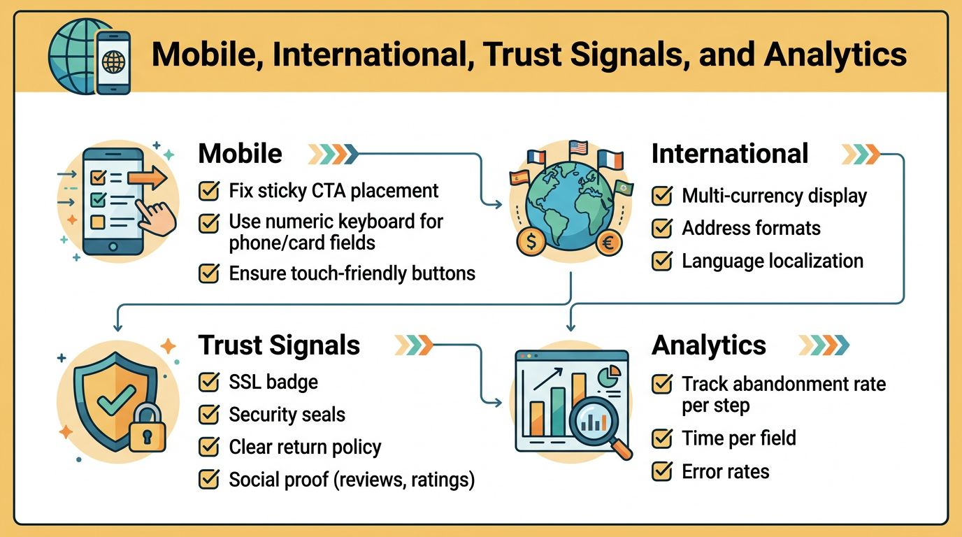
Use numeric keyboards for phone and card inputs, keep tap targets easy to use, and prevent sticky calls to action from covering fields or error messages. Test on real phones and variable connections, including interrupted or slow loading. A persistent order total can help during a long mobile flow, provided it does not compete with the field being completed.
International checkout needs more than translated cart copy. Localize currency, date format, address fields, tax presentation, and payment routing. Let a saved preference or reliable location signal set sensible defaults, while keeping country and currency changes obvious and reversible. Test these paths by customer type and basket, since a first-time cross-border buyer may need different guidance from a returning local customer.
Put trust beside the risk
Show the actual padlock or PCI-compliance statement, the specific payment logos supported by the gateway, clear returns guidance, and a reachable support route near the payment control. A generic “secure checkout” badge with no verifiable detail is weaker than a precise explanation of how payment data is handled. Avoid artificial urgency and stock messages unless they answer a genuine customer concern.
Payment security also includes the checkout implementation. Teams reviewing client-side threats can use this guide to protect payments from e skimming, then assign ownership across engineering, security, and payment providers.
Instrument decisions, not just page views
Name events for checkout entry, contact completion, delivery selection, payment display, payment submission, authorization result, review, confirmation, and recovery. Where privacy and governance allow, pass customer type, device, basket context, geography, and payment method into the data layer. Capture field-level errors and exits so analysts can separate a payment decline from an address or form problem.
A structured analytics implementation plan connects these events to reliable reporting. Review the results by device, customer type, geography, basket complexity, and payment method. Page-level conversion can improve while a specific mobile error, international routing issue, or unclear confirmation state still prevents completion.
Measuring, Testing, and Rolling Out Checkout Changes
Checkout measurement should answer four questions: How many customers complete each step? How long does purchase take? Where do payment errors occur? What support problems appear after the order? A blended conversion rate can tell you that performance changed, but it can't tell you whether a delivery selector, wallet authentication flow, or address field caused the movement.
Use a focused KPI set
Track step-level completion, time to purchase, payment error rate, and post-purchase support tickets together. A field reduction that increases completion but also creates more incorrect addresses may damage margin and customer experience. A payment method that improves authorization for one segment may create support volume if confirmation states are ambiguous.
Segment every result by new and returning customers, device, geography, basket complexity, and payment method. Averages conceal trade-offs. A one-page flow may look strong overall while creating confusion for high-consideration orders, or a new wallet may help mobile visitors while adding little value for desktop customers.
Test the whole experience
Define the primary outcome before launching a test, then select guardrails that protect margin, fulfillment quality, payment risk, and support capacity. Checkout traffic is often thinner at the final step than at the product page, so estimate the required sample size and runtime before making a decision. Don't stop a test because an early dashboard looks exciting, and don't switch between decision rules mid-test.
Use an interleaved holdout when a change could affect authorization, delivery cost, fraud exposure, or operational workload. Compare the treatment with a stable control, read results by segment, and inspect error recovery rather than only successful orders. For broader guidance on the behavioral causes and interventions involved, see this resource on how to reduce cart abandonment.
Roll out with a rollback plan
A practical sequence is:
- Shadow launch: Run the new logic without changing the customer-facing path, and verify events, totals, payment responses, and fulfillment rules.
- Small canary: Expose the experience to a limited share of traffic while monitoring the four core KPIs and operational guardrails.
- Controlled split: Compare treatment and control across meaningful customer segments, not only the aggregate dashboard.
- Full rollout: Expand only after payment, delivery, support, and analytics checks remain healthy.
- Rollback readiness: Define the conditions that trigger reversal, such as payment errors, missing confirmations, incorrect delivery promises, or a support spike.
Ecommerce checkout optimization works best as an operating loop. Audit the actual task, identify the highest-risk friction, test a context-appropriate change, measure downstream consequences, and keep the control logic ready until the evidence supports expansion.
Up North Media helps ecommerce teams improve checkout architecture, analytics, SEO, and custom web applications around measurable business goals. Visit Up North Media to discuss a checkout audit, conversion-focused development project, or data implementation plan for your store.