Most advice about pop ups is too blunt to be useful. “Never use them” sounds safe, but it ignores how many businesses still need a reliable way to capture leads, recover abandoning shoppers, and monetize content without rebuilding their entire site.
The better advice is narrower. Don’t use bad pop ups. Use interstitials carefully.
An interstitial pop up sits right at the fault line between conversion and search visibility. Used poorly, it blocks content, frustrates mobile users, and can create real SEO damage. Used well, it can become one of the highest-attention conversion tools on your site. That’s why this topic confuses so many SMB owners. Marketing teams see lift potential. SEO teams see penalty risk. Both are right.
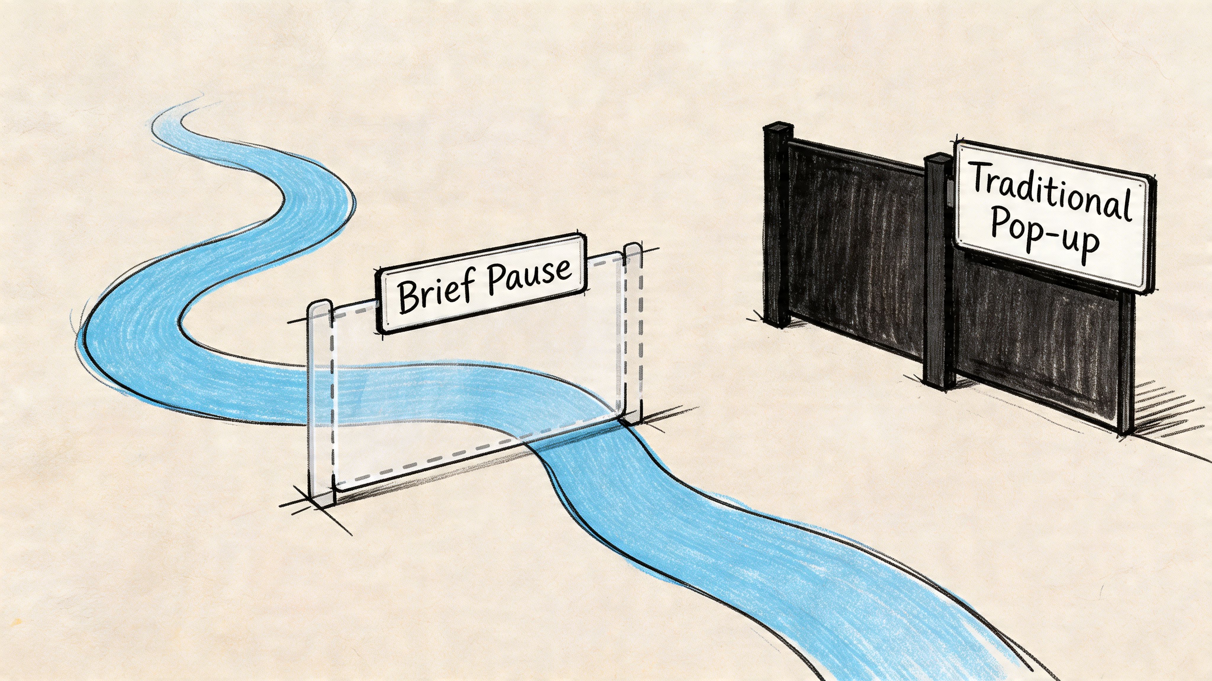
The practical question isn’t whether interstitials are good or bad. It’s whether your trigger, timing, design, and implementation respect user intent. A full-screen offer that appears the second someone lands from Google is risky. A dismissible interstitial that appears after meaningful engagement or on exit can be a smart, defensible conversion play.
That distinction matters for e-commerce stores, publishers, local service businesses, and SaaS teams alike. If you’re running paid traffic, publishing content, or trying to turn more visitors into subscribers and buyers, interstitials deserve a more serious look than they usually get.
The Pop Up Dilemma for Modern Businesses
Blanket advice to avoid pop ups sounds responsible. It also leaves money on the table for businesses that need more email signups, more quote requests, or more recovered carts from the traffic they already paid for.
The dilemma is operational. An interstitial can lift revenue because it forces attention at a high-intent moment. The same format can hurt organic performance if it blocks content too early, especially on mobile, or creates a poor first impression for visitors who came from search.
That tension matters because SMBs rarely have the luxury of treating SEO and conversion as separate projects. The store owner wants more orders. The publisher wants more subscribers and ad value. The SEO team wants pages that remain accessible and compliant. A good interstitial strategy has to satisfy all three.
Used carelessly, interstitials interrupt the visit before trust is established. Used with discipline, they can support boosting e-commerce sales, capture high-value leads, and increase subscriber growth without creating unnecessary risk.
The key question is simple: what user action has earned the interruption?
For an e-commerce site, that might be product engagement, cart activity, or exit intent from a category page. For a publisher, it might be a second pageview, a scroll threshold, or article completion. Those are defensible trigger points because they respect intent. Dropping a full-screen offer the moment a search visitor lands on a page is where businesses get into trouble.
Practical rule: If the interstitial appears before the visitor has received the value they came for, the timing is probably wrong.
That is why the pop up debate gets distorted. Conversion teams often focus on visibility and response rate. SEO teams focus on obstruction, page experience, and mobile usability. Both concerns are valid. The job is to configure the format so it captures attention after engagement, not before access.
Start there. If you cannot point to a specific moment in the journey where the message is more helpful than disruptive, the interstitial is not ready to launch.
Understanding Interstitials and Their Triggers
An interstitial pop up is a full-screen or near-full-screen overlay that appears at a transition point in the visit. It interrupts on purpose. That is why the format can drive strong response rates and also create SEO problems if the trigger is careless.
For an SMB, the practical question is not whether an interstitial gets attention. It will. The key question is whether it appears after enough user intent has been shown to justify the interruption. That distinction separates a useful conversion asset from the kind of obstructive UX Google has spent years discouraging. It is similar to the difference between a targeted offer and doorway pages built only to funnel visitors. Intent and access matter.
What makes an interstitial different
Interstitals are defined by two things. Screen dominance and timing.
A small modal in the corner usually supplements the page. An interstitial competes with it. The user has to make a choice before continuing, which is why the creative needs to be narrow and the offer needs to be relevant.
Common versions include:
- Full-screen offer overlays: Best for email capture, first-purchase offers, quote requests, or account creation.
- Lightbox-style interstitials: Softer visually, but still disruptive enough to reset attention.
- Welcome mats: Useful on direct, branded, or paid traffic. Higher risk on mobile organic entry pages.
For online sales, urgency mechanics often come into play here. A relevant companion tactic is boosting e-commerce sales with deadline-driven offers, but the deadline has to reinforce a legitimate offer, not excuse bad timing.
The triggers that make or break performance
The trigger defines the strategy.
In practice, interstitials usually fire from behavior signals, not design preferences. The strongest setups use actions that suggest interest or hesitation. The weakest ones rely on blunt timing rules that treat every visitor the same.
Here is how the main trigger types usually work:
| Trigger type | Best use case | Main risk |
|---|---|---|
| Scroll-based | Articles, long-form service pages, product detail pages | Firing before the visitor has engaged enough |
| Exit-intent | Cart recovery, pricing pages, lead capture on desktop | Poor mobile substitutes can feel random |
| Time delay | Considered purchases, service explainers, comparison pages | Arbitrary timing creates friction fast |
Scroll-based triggers work well for publishers and content-led businesses because they respect reading behavior. If someone reaches the midpoint of an article, a newsletter offer or content upgrade can fit the moment.
Exit-intent is often the best revenue trigger for desktop e-commerce, especially on cart, collection, and pricing pages. It catches abandonment without blocking the first interaction. On mobile, that same logic usually needs to shift toward scroll depth, page count, or cart activity because there is no cursor path to measure.
Time-delay triggers are the most overused. They can still work, but only when the delay lines up with the page’s decision window. A 15-second delay on a complex services page may be reasonable. A 5-second delay on a mobile blog post from search is usually a mistake.
How trigger strategy changes by business model
E-commerce and publishing sites should not use the same trigger map.
For e-commerce, the safest high-intent moments tend to be product views, cart additions, repeated category browsing, and exit behavior from commercial pages. Those users are already signaling purchase interest, so a discount, bundle offer, or email capture can support the sale rather than interrupt discovery.
For publishers, stronger triggers usually appear later in the session. Second pageview, article completion, or a meaningful scroll threshold are better fits because the visitor has already received value. That makes a subscription ask, newsletter prompt, or registration wall easier to justify.
A good trigger follows behavior the visitor already chose. A bad trigger interrupts before the page has earned attention.
What users should see
A strong interstitial keeps the decision simple. One message. One action. One clear exit.
If the overlay tries to collect too much information, stack multiple offers, or force a decision the visitor is not ready to make, response quality drops. You may still get raw conversions, but lead quality, user satisfaction, and organic performance usually pay the price.
Navigating Google’s Intrusive Interstitial Penalty
The SEO fear around interstitials isn’t overblown. It’s often just poorly explained.
Google’s concern is simple. If a mobile user clicks a search result and lands on a page where the main content is blocked by an overlay, that creates a bad experience. The user came for the page. Your site made them deal with something else first.
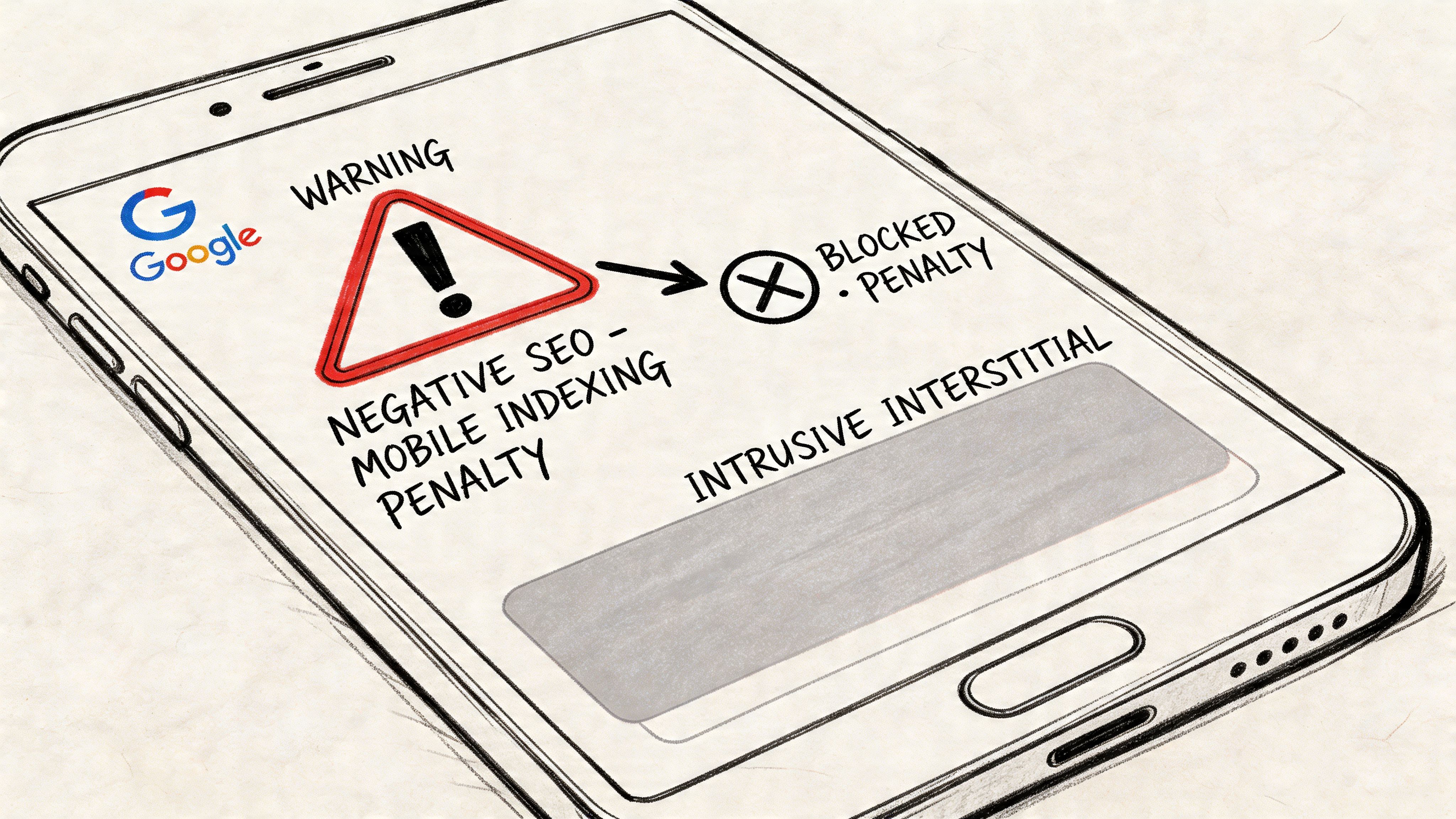
That’s the context behind Google’s intrusive interstitial guidance. This isn’t a blanket ban on overlays. It’s a penalty aimed at implementations that block access to primary content, especially right after a search click.
What puts you at risk
The clearest danger zone is an interstitial that appears immediately when someone lands from mobile search and covers the content they expected to read. Another common mistake is making the close action hard to find, hard to tap, or inconsistent across devices.
According to Lumar’s analysis of interstitial SEO risks, violating Google’s intrusive interstitial guidelines can lead to algorithmic demotions where affected pages lose up to 20% to 40% of their organic traffic, in part because Googlebot may fail to index the main content hidden behind the overlay.
That’s the piece many site owners miss. This isn’t only about user annoyance. It’s also about crawlability and indexation. If the underlying page value is obscured, your rankings can suffer because search engines don’t get a clean read on the page.
A similar issue appears in other manipulative page patterns. If you’ve dealt with thin location pages or misleading search-entry experiences, the logic will feel familiar. Up North Media’s overview of doorway page risks in SEO is useful here because the same principle applies. Google wants users to land on the content they were promised, not on a blocking layer or a detour.
What’s usually safe
Not every overlay is dangerous. Google generally allows interstitials tied to legal obligations or restricted access scenarios, along with smaller, dismissible elements that don’t materially block the page.
In practice, these implementations are usually lower risk:
- Cookie and privacy notices: Necessary in many jurisdictions and expected by users.
- Age verification gates: Common for regulated products.
- Login or paywall prompts: Acceptable when content isn’t publicly accessible.
- Delayed or interaction-based overlays: Safer when users can first engage with the page itself.
If a visitor can immediately access the page’s main content and dismiss the overlay without friction, you’re operating in much safer territory.
The simplest compliance test
Ask three questions before launch:
- Can a mobile visitor see meaningful page content before the interstitial appears?
- Is the close button obvious and easy to tap?
- Would a reasonable user say the message is relevant to what they’re doing?
If the answer to any of those is no, revise it.
A risky interstitial usually tries to hijack attention. A compliant one waits for context. That’s the whole game.
How to Create High-Converting Interstitials Safely
High-converting interstitials are usually simpler than business owners expect. The wins come from restraint, not aggression. If the prompt appears at the right moment, matches the page, and gives people an easy out, it can add leads or recover sales without creating the kind of mobile experience Google dislikes.
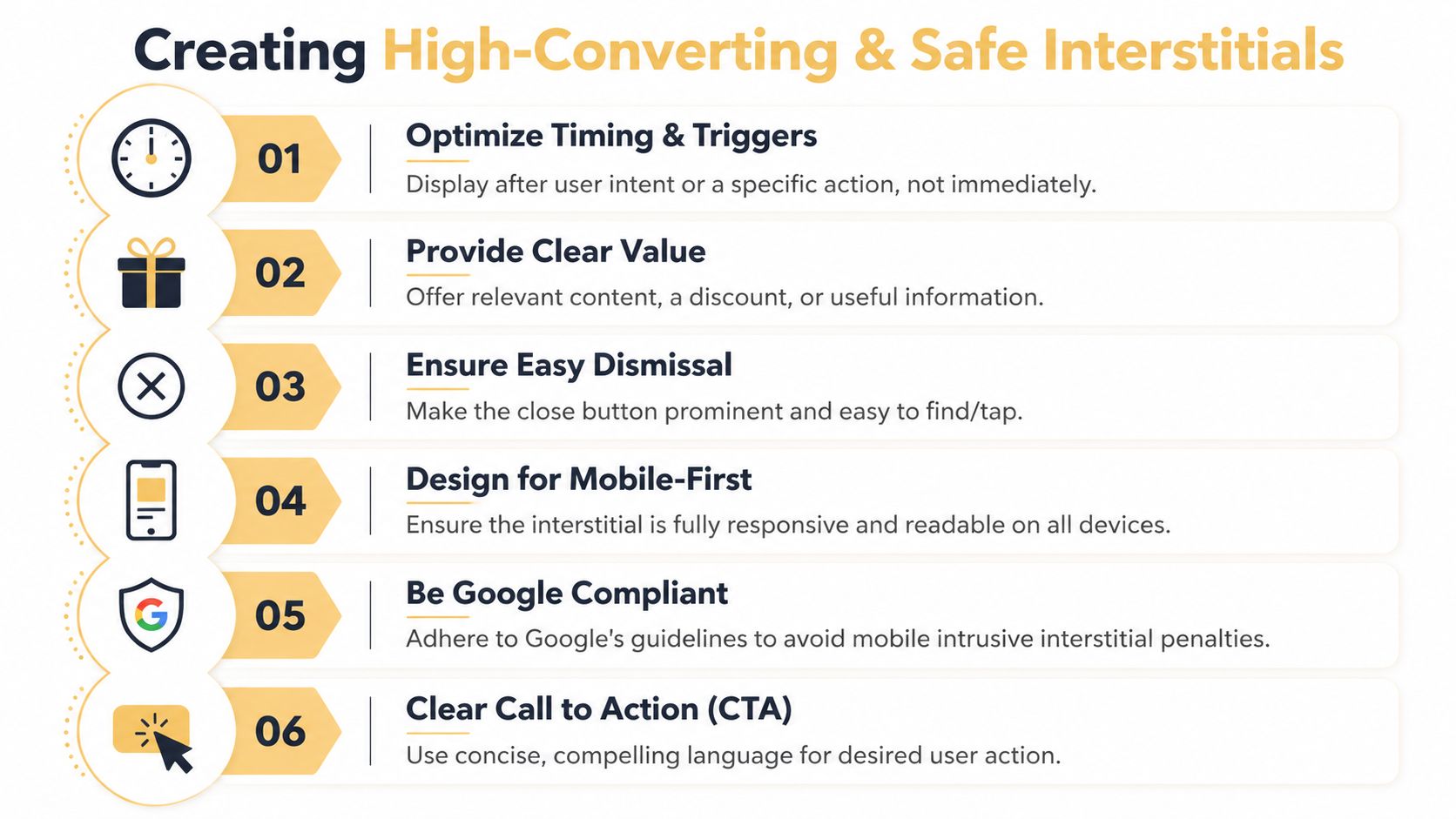
Start with timing, not creative
Many SMB teams start by debating colors, headlines, and coupon language. That is the wrong first decision. Trigger logic has more impact on both conversion rate and SEO risk than visual polish.
For search-driven pages, the safest setup is to wait for evidence of interest before showing anything. On blog posts, that usually means a real scroll threshold or time-on-page requirement. On product and pricing pages, it can mean exit-intent or a delayed prompt after active browsing. On cart pages, it should support recovery, not interrupt checkout.
Use simple trigger rules:
- For blog content: Show the interstitial after the visitor has consumed part of the article.
- For product pages: Trigger only after browsing behavior suggests consideration.
- For cart and checkout support: Use it for abandonment prevention, not immediate entry.
- For publishers: Trigger after article engagement, or use a clear content gate when the value exchange is obvious.
This requires making data-driven decisions instead of relying on internal opinions. A trigger that gets more email signups but causes people to abandon the page faster is often a bad trade.
Match the offer to the page and the visitor’s intent
Relevance does a lot of the conversion work. A generic newsletter prompt on every URL usually underperforms because it ignores why the person came in the first place. The better approach is page-level alignment.
| Page type | Strong interstitial message | Weak interstitial message |
|---|---|---|
| Blog post | Related guide, newsletter, content upgrade | Generic storewide discount |
| Product page | Product-specific incentive or bundle | Unrelated lead magnet |
| Cart page | Recovery offer or reassurance | Top-of-funnel ebook |
| Publisher article | Subscribe for more reporting | Random promo unrelated to content |
This is one of the clearest trade-offs in interstitial strategy. The more tightly the message fits the page, the less aggressive the format needs to be.
Design for fast decisions
A good interstitial answers three questions immediately: what is this, why should I care, and how do I close it?
Keep the layout tight:
- One headline: State the benefit in plain language.
- One CTA: Give the visitor one next step.
- One visible close option: Do not hide dismissal behind tiny icons or low-contrast text.
- Minimal form fields: Ask only for information you will use now.
- Mobile-first spacing: Make text readable and buttons easy to tap.
Mobile design matters more here than desktop design because the risk is higher. A large desktop modal can be annoying. A full-screen mobile overlay can block the page, create accidental taps, and push the experience into penalty territory. Many of the same conversion principles used on landing pages apply here, especially clear hierarchy and obvious next steps. Up North Media covers that well in its guide to landing page design best practices.
The best interstitials help a visitor act on existing intent. The worst ones try to manufacture intent by force.
Use specific recipes for your business model
An online store, a publisher, and a local service business should not run the same interstitial playbook. The trigger, offer, and risk tolerance are different.
E-commerce recipe
For e-commerce, the safest high-return use cases are usually first-purchase capture, cart recovery, and product-category offers shown after browsing signals.
A practical setup looks like this:
- Trigger on exit-intent from cart or high-intent product pages
- Offer one clear value point, such as a discount, bundle, or shipping incentive
- Keep the form short
- Add trust language if the shopper is close to purchase
- Make closing the prompt obvious
This works because it tries to recover value near the buying decision instead of interrupting discovery traffic from search. As noted earlier, interstitials can perform well when the setup is disciplined. The key is to protect the page experience while testing for incremental lift.
Here’s a short explainer if you want to see the mechanics in action:
Publisher recipe
Publishers need to protect reading flow. If an interstitial appears before the article delivers value, it hurts both engagement and trust. A better model is to wait until the reader has shown interest.
A workable setup often includes:
- A scroll-based trigger on long-form content
- Messaging tied to the article topic or subscription benefit
- A visible close button
- Frequency controls so regular readers are not repeatedly interrupted
Paid subscriptions and premium content are different. In those cases, a gate can make sense if the access rules are clear and the visitor understands what they get in return.
Local service and lead gen recipe
Local service businesses usually get better results by placing interstitials on high-intent pages, not broad entry pages. Pricing pages, service-detail pages, and quote flows are stronger candidates than the homepage.
Useful prompts include:
- “Need help choosing the right service?”
- “Get the checklist before you leave”
- “Request a callback”
Those offers match buyer hesitation. They also create a stronger lead signal than a generic “contact us” interruption.
Safety rules that matter in practice
Use this checklist before launch:
- Delay the prompt: Let people access the page first.
- Match message to context: Relevance reduces friction.
- Control frequency: Avoid repeated prompts in the same session.
- Build for mobile first: Large tap targets, readable copy, simple layout.
- Watch post-exposure behavior: A lift in captured emails does not justify damaged page performance.
That last point gets missed often. An interstitial is only profitable if it adds more value than it destroys. If conversions rise but page engagement, organic traffic, or checkout completion falls, the setup needs to be reworked.
Measuring Interstitial Performance and ROI
An interstitial pop up shouldn’t be judged by impressions alone. If it gets seen often but drags down page engagement or search performance, it’s not doing its job. The right measurement framework looks at both conversion outcome and page health.
What to track first
A small business doesn’t need a complicated dashboard to evaluate an interstitial. It needs a short list of metrics tied to business value.
Track these first:
- Conversion rate: Did the visitor complete the intended action?
- Lead quality or purchase quality: Did the signups turn into useful pipeline or revenue?
- Bounce behavior on the underlying page: Did people leave faster after the interstitial launched?
- Time on page and downstream engagement: Did users keep reading, browsing, or buying?
- Page-level organic trend: If the page relies on SEO, watch for deterioration after rollout.
If you’re unsure how to connect these numbers to business return, Up North Media’s primer on how to calculate marketing ROI is a useful framework.
The easiest A/B test to run
The fastest way to improve an interstitial is to test timing before you test cosmetic details. Most businesses jump to button color. Trigger strategy has much bigger impact.
A simple test setup:
| Version | Trigger | Goal |
|---|---|---|
| A | Immediate or short-delay popup | Baseline |
| B | Exit-intent or engagement-based trigger | Compare signups and behavior |
According to Popupsmart’s analysis of interstitial timing tests, A/B testing timing triggers like exit-intent can boost email signups by as much as 132% for SMB e-commerce sites compared to immediate popups, often with zero negative SEO impact when implemented correctly.
That’s why timing should be tested early. It affects both response rate and risk profile.
Don’t ask, “Did the popup convert?” Ask, “Did it convert better than the page would have on its own, without hurting the page?”
How to read the results
If conversions rise but bounce behavior worsens sharply, the interstitial may be extracting value while weakening the page. That can still be acceptable on some paid landing experiences, but it’s a warning sign on organic entry pages.
If conversions rise and page engagement remains stable, you likely have a viable model worth scaling.
If conversions stay flat and user behavior worsens, remove it. Don’t rescue a weak concept with more aggressive design.
A good optimization cycle usually follows this order:
- Test trigger
- Test message relevance
- Test CTA language
- Test form friction
- Test frequency controls
This order keeps you focused on behavior and business impact, not vanity tweaks.
Smarter Alternatives for Your Website
An interstitial pop up isn’t always the right tool. Some pages need a softer prompt, especially when the visitor is still exploring or when SEO sensitivity is high. In those cases, the smarter move is to use a format that keeps the path to content more open.
Three alternatives are especially useful.
Slide-ins for engaged readers
A slide-in box works well on blog posts and resource pages where you want to invite a subscription without taking over the screen. It’s visible, but it doesn’t force a decision the way a full-screen overlay does.
Use it when the goal is list growth from content readers who are still actively consuming the page.
Sticky bars for broad announcements
Sticky bars are good for sitewide notices, shipping promos, event registration, and lightweight lead capture. They stay present without breaking the session.
Choose this format when the message matters across many pages and doesn’t need the visual force of an interstitial.
Inline forms for high-intent offers
Inline forms are often the cleanest choice for webinars, demos, calculators, quote requests, or downloadable assets. They let the user opt in at the moment the content itself creates interest.
This is often the better play for service businesses and B2B sites where trust and continuity matter more than interruption.
A fourth option is conversational capture. For some businesses, implementing a chat widget can convert hesitant visitors more naturally than an overlay, especially on service, support, and high-consideration pages.
The best conversion systems don’t rely on one format. They use the least intrusive tool that still matches the user’s intent. Interstitials belong in that toolkit. They just shouldn’t be the default answer to every conversion problem.
If you want help choosing where an interstitial pop up belongs in your funnel, or whether another conversion pattern would perform better, Up North Media can help you map the trade-offs, test safely, and build a strategy that improves leads and revenue without creating avoidable SEO risk.