
Imagine a physical store with no signs, jumbled aisles, and a hidden checkout counter. Frustrating, right? That's what a poorly designed website navigation feels like to your visitors. It’s not just a menu of links; it's the digital map guiding users to their destination, whether that's a product, a piece of information, or a contact form. A confusing or illogical navigation structure is a direct path to high bounce rates, user frustration, and ultimately, lost revenue. Conversely, an intuitive and clear navigation system creates a seamless user journey that builds trust, encourages exploration, and drives conversions.
This guide moves beyond generic advice to deliver a comprehensive roundup of 10 essential website navigation best practices. Each point is designed to be immediately actionable, providing clear rules, practical examples of what to do (and what to avoid), and specific implementation tips. For Omaha-based retailers looking to boost online sales or tech startups needing a scalable design, these principles are foundational.
We will cover everything from crafting descriptive labels and ensuring mobile responsiveness to implementing logical information architecture and prioritizing accessibility. By the end, you will have a clear checklist to evaluate and improve your site’s navigational framework. Let's stop letting your website’s map mislead your customers and start building a better, more profitable roadmap for your users.
1. Clear and Descriptive Navigation Labels
The labels in your navigation menu are the signposts for your website. If they are unclear, users get lost. One of the most fundamental website navigation best practices is to use plain, user-friendly language that accurately describes the content behind each link. Avoid internal jargon, creative but confusing terms, or vague labels that force users to guess. The goal is clarity, not cleverness.

This approach immediately builds user trust and reduces cognitive load, allowing visitors to find what they need quickly. Clear labels directly support SEO by using relevant keywords that align with user search intent, helping search engines understand your site's structure.
Why This Practice Matters
Vague labels like "Resources" or "Solutions" can mean anything. Does "Resources" lead to a blog, case studies, or a support forum? This ambiguity creates friction and can cause users to abandon your site. In contrast, descriptive labels like "Blog," "Case Studies," or "Support" set clear expectations.
Key Insight: Your navigation isn't the place for creative branding. It's a functional tool. Prioritize clarity over clever wordplay to ensure users can accomplish their goals efficiently.
Implementation and Actionable Tips
To implement this practice effectively, put yourself in your user's shoes. What terms would they use to find your products or services?
- Conduct User Research: Use tools like card sorting or tree testing to discover how users naturally group your content and what terminology they prefer.
- A/B Test Your Labels: If you're unsure between two terms (e.g., "Pricing" vs. "Plans"), run an A/B test to see which label results in a higher click-through rate and better user engagement.
- Keep It Concise: Aim for labels that are 1-3 words long. This keeps the navigation clean and scannable, especially on mobile devices where space is limited.
- Review Your Analytics: Check your site's internal search data. If many users are searching for something that's already in your navigation, it’s a strong sign that your label isn't clear enough.
2. Consistent Navigation Placement and Structure
Users develop mental models of how websites work, and a crucial part of that model is knowing where to find the navigation menu. Placing your navigation in a predictable location and keeping its structure the same across all pages reinforces user expectations. This consistency is a cornerstone of effective website navigation best practices, as it drastically reduces the cognitive effort required for users to move through your site.
When users don't have to search for the menu on each new page, they can focus on their actual goal, whether it's finding product information or reading an article. This builds confidence and creates a seamless, intuitive experience. Think of how sites like Amazon or Wikipedia maintain their navigation; you always know exactly where to look, no matter how deep you are in the site.
Why This Practice Matters
Inconsistency creates disorientation. If a user clicks from your homepage, where the navigation is in a top header, to a blog post where it's suddenly in a left sidebar, they are forced to stop and re-learn your interface. This interruption breaks their flow and introduces unnecessary friction, which can lead to frustration and abandonment. Consistency ensures a stable and reliable framework for exploration.
Key Insight: Consistency isn't about being boring; it's about being reliable. By providing a predictable navigation structure, you free up the user's mental energy to focus on your content and offerings, not on how to use your website.
Implementation and Actionable Tips
Enforcing consistency is a foundational task that should be addressed from the earliest stages of design and development. It's about establishing rules and sticking to them.
- Standardize Placement: Stick to conventional placements. For most websites, this means a horizontal header at the top of the page. For content-heavy sites like blogs or documentation, a left-hand sidebar is also a widely understood convention.
- Use CSS and Component Libraries: Enforce consistency programmatically. By creating a single, reusable navigation component in your code, you ensure that any changes are automatically applied site-wide, preventing accidental variations.
- Document in a Style Guide: Your company's design system or style guide should explicitly define the navigation's placement, structure, and behavior. This serves as a single source of truth for designers and developers.
- Maintain Structure During Redesigns: Even when updating a specific section of your site, resist the urge to change the global navigation structure for just that area. A consistent user experience should always take priority.
3. Mobile-Responsive Navigation Design
With the majority of web traffic now coming from mobile devices, a navigation menu that works flawlessly on smaller screens is non-negotiable. Mobile-responsive navigation adapts intelligently to different screen sizes, ensuring users have a seamless experience whether they are on a desktop, tablet, or smartphone. This often means trading a traditional horizontal menu for more compact solutions like the "hamburger" icon, bottom tab bars, or a "priority+" pattern that shows key links and hides others.
This practice is a cornerstone of modern web design because it directly impacts usability, user retention, and even SEO. A clunky, hard-to-use mobile menu will frustrate users and cause them to leave, while a well-designed responsive navigation keeps them engaged and helps them find what they need.
Why This Practice Matters
A desktop navigation simply shrunk down to fit a mobile screen is a usability nightmare. Links become too small to tap, menus overlap content, and users are forced to pinch and zoom, creating a frustrating experience. A dedicated mobile navigation strategy respects the constraints and user behaviors of touch-based devices, such as the need for larger tap targets and one-handed accessibility. Websites like Target's mobile version effectively use a bottom tab bar for core functions, keeping essential actions within easy reach of a user's thumb.
Key Insight: Don't treat mobile navigation as an afterthought. Adopting a "mobile-first" mindset forces you to prioritize the most critical navigation elements, resulting in a cleaner, more focused experience for all users.
Implementation and Actionable Tips
To create a truly effective mobile navigation experience, you need to go beyond simply hiding links behind an icon. You must consider the entire user journey on a smaller screen.
- Prioritize a Mobile-First Approach: Design your navigation for the smallest screen first. This discipline forces you to identify the most essential links and build a cleaner, more efficient structure.
- Ensure Large Tap Targets: Make all clickable elements, like links and buttons, at least 48x48 pixels to prevent accidental taps and accommodate users with varying dexterity.
- Test on Real Devices: Browser emulators are useful, but they don't replicate the real-world experience of touch interaction or varying network speeds. Always test on actual smartphones and tablets.
- Simplify Menus: Avoid deep, multi-level dropdown menus on mobile. They are difficult to navigate on touch screens. Instead, flatten your hierarchy or use accordions to reveal sub-categories. For more ideas, you can explore these responsive web design examples.
- Optimize Performance: Test how quickly your navigation loads on slower 3G connections to ensure it remains accessible to all users, regardless of their network quality. To achieve consistent scaling, developers often use a REM converter tool to manage font sizes and spacing effectively across devices.
4. Logical Information Architecture and Hierarchy
Your website's navigation structure should mirror how users think about your content, not how your internal departments are organized. A logical information architecture (IA) is the backbone of intuitive navigation, organizing content hierarchically, grouping related items, and prioritizing key pages based on user goals. This is a core component of effective website navigation best practices.
When the IA is logical, users can predict where to find information without thinking. For instance, an e-commerce site groups products by category (e.g., Electronics > Laptops > Gaming Laptops), and software documentation guides users through a journey (e.g., Getting Started > Basic Features > Advanced Settings). This structure makes complex sites feel simple and manageable.
Why This Practice Matters
A disorganized navigation forces users to hunt for information, leading to frustration and high bounce rates. A strong IA, on the other hand, creates a clear path, making content discoverable and improving the overall user experience design. It also helps search engines crawl your site more effectively, understand the relationship between pages, and assign authority, which can positively impact your SEO rankings.
Key Insight: Great IA is invisible. Users don't notice it when it works, but they become immediately frustrated when it doesn't. Your goal is to create a structure so intuitive that users never have to second-guess their clicks.
Implementation and Actionable Tips
Building a logical hierarchy requires understanding your users' mental models and business objectives. Start by mapping out your content and user journeys.
- Conduct Card Sorting: Ask real users to group your page topics into categories that make sense to them. This user-centric exercise reveals their natural thought processes.
- Limit Main Navigation Items: Stick to 5-7 top-level menu items to avoid overwhelming users. This is based on Miller's Law, which suggests the average person can only keep about seven items in their working memory.
- Use Tree Testing: After creating a draft IA, validate it with a tree test. Ask users to find specific information within your proposed structure to see if it’s intuitive.
- Document Your IA: Create sitemaps or user flow diagrams to visualize the hierarchy. This document serves as a blueprint for designers, developers, and content creators, ensuring everyone is aligned.
5. Visual Hierarchy and Emphasis in Navigation
Not all navigation links are created equal. A strong visual hierarchy uses design principles like size, color, and whitespace to guide the user's eye toward the most important elements first. This is a crucial aspect of website navigation best practices because it helps users scan your menu efficiently, understand its structure at a glance, and find their desired destination without having to read every single label.

By intentionally emphasizing primary actions (like "Get a Quote" or "Shop Now") and de-emphasizing secondary ones (like "Careers" or "Login"), you create a more intuitive and goal-oriented experience. This strategic visual guidance reduces cognitive friction and subtly directs users toward key conversion points, aligning user behavior with your business objectives.
Why This Practice Matters
Without a clear visual hierarchy, a navigation menu becomes a flat, monotonous list of links. This forces users to expend mental energy processing every option equally, slowing them down and increasing the likelihood of choice paralysis. For example, Dropbox effectively uses size and button styling to make primary calls-to-action like "Try for free" stand out against less critical links.
Key Insight: Effective navigation isn't just about what you include; it's about how you present it. Use visual design as a tool to tell users what matters most and create a clear path for them to follow.
Implementation and Actionable Tips
Implementing a visual hierarchy requires a thoughtful approach to your site's overall design language. It's a core principle of good user interface design best practices that can transform your navigation from a simple list into a powerful guide.
- Use Size and Weight: Make your most important navigation items larger or bolder. This simple change naturally draws the user's eye.
- Employ Color and Contrast: Use a contrasting color for your primary call-to-action button (e.g., a "Contact Us" button) to make it pop. Ensure all text meets WCAG AA contrast standards for accessibility.
- Leverage Whitespace: Group related items together and use negative space to separate different sections of your navigation. This creates a clean, organized look that's easy to scan.
- Define Interaction States: Ensure that hover, focus, and active states for your links are visually distinct. This provides clear feedback to the user, confirming their actions and improving usability.
6. Breadcrumb Navigation for Context and Wayfinding
Breadcrumb navigation acts as a secondary navigation system, showing users a trail of links that illustrates their current location within your site's hierarchy. This simple "you are here" map is one of the most effective website navigation best practices, especially for large, content-heavy sites like e-commerce stores or complex B2B platforms. It reduces the number of actions a user needs to take to return to a higher-level page, preventing them from feeling lost.
This contextual aid enhances usability by providing a clear path back to previous sections without forcing users to rely on the browser's "back" button. For SEO, properly implemented breadcrumbs with structured data can appear in search results, giving users a better understanding of the page's context directly on the SERP.
Why This Practice Matters
Without breadcrumbs, a user who lands on a deep product page from a search engine may not understand where that page fits within the broader site structure. They might not know how to explore related product categories. For example, a user on a "Gaming Laptops" page benefits from seeing the path: Home > Electronics > Computers > Laptops > Gaming Laptops. This trail encourages exploration and reduces bounce rates by offering relevant, higher-level navigation options.
Key Insight: Breadcrumbs are not just a convenience; they are a powerful orientation tool. They give users confidence by showing them where they are and how they can easily backtrack, improving overall site engagement.
Implementation and Actionable Tips
Implementing breadcrumbs effectively requires a logical site structure. They are most valuable on websites with more than two levels of hierarchy.
- Make Every Level Clickable: Each part of the breadcrumb trail, except for the current page, should be a clickable link. This allows users to move up the hierarchy one step at a time.
- Use Structured Data: Implement the
BreadcrumbListschema.org markup. This helps search engines understand your site's structure and may result in enhanced listings in search results. - Place Them Consistently: Position breadcrumbs in the same location on every relevant page, typically at the top, just below the primary navigation menu.
- Keep It Tidy: Use a simple separator like a ">" or "/" symbol between levels to keep the design clean and easy to read. Don't over-style them; their function is more important than their form.
7. Search Functionality as Navigation Complement
While a well-structured menu is essential, it can't always lead every user directly to their goal, especially on content-heavy websites. An effective search function acts as a powerful alternative navigation method, allowing users to bypass hierarchical menus and pinpoint specific information quickly. This is a critical component of modern website navigation best practices, catering to users who arrive with a clear, specific intent.
Treating search as a core navigational tool rather than an afterthought significantly improves user experience and discoverability. For large e-commerce stores, extensive blogs, or knowledge bases, search is often the primary way users find what they need, making it indispensable for conversions and user satisfaction.
Why This Practice Matters
Without a robust search feature, users on large sites are forced to click through multiple layers of menus, which is inefficient and frustrating. If they can't find what they are looking for within a few clicks, they are likely to leave. Amazon's success, for example, is heavily reliant on its sophisticated search that provides autocomplete suggestions and relevant filters, guiding users effortlessly toward a purchase.
Key Insight: Your primary navigation guides users who are exploring, while your search bar serves users who know exactly what they want. Neglecting search means alienating a high-intent segment of your audience.
Implementation and Actionable Tips
To integrate search effectively, it must be visible, fast, and intelligent. Think of it as an on-site concierge ready to help your visitors.
- Make It Prominent: Place the search bar in a conventional, easy-to-find location, such as the top-right or center of your website header, where users expect to see it.
- Implement Autocomplete and Suggestions: As users type, provide intelligent suggestions to speed up their query and guide them toward relevant pages, products, or articles.
- Provide Advanced Filtering: For e-commerce or directory sites, allow users to refine search results with filters (e.g., price, category, size). This faceted search turns broad queries into specific findings.
- Analyze Search Queries: Regularly review your internal search analytics to understand what users are looking for. Frequent searches for an item not in your main navigation may indicate it deserves a dedicated menu link.
- Ensure Mobile Usability: On mobile devices, make the search icon easily tappable and ensure the search interface is clean and simple to use on a small screen.
8. Active Page Indication and User Location Awareness
Users should never feel lost on your website. A fundamental part of intuitive website navigation best practices is providing clear visual cues that show visitors exactly where they are. By highlighting the active page in your navigation menu, you create a digital "you are here" sign that reduces disorientation and builds confidence, allowing users to browse with a clear sense of place.
This simple yet powerful technique grounds the user's experience. Whether it’s through a color change, an underline, or bold text, this persistent indicator reinforces the site's structure and helps users understand how the current page fits into the broader information architecture. It's a small detail that significantly improves usability, especially for sites with multiple levels of navigation.
Why This Practice Matters
Without an active page indicator, users can easily become confused, especially when navigating deep into a site or arriving from an external link. They might question which section they're in, leading to unnecessary clicks and frustration. Platforms like LinkedIn and Slack excel at this; LinkedIn underlines the active top-level menu item, while Slack uses a distinct background color to show the currently selected channel, leaving no doubt about the user's location.
Key Insight: Providing a constant sense of location isn't just a courtesy; it's a core component of usability. It makes your site feel stable and predictable, empowering users to explore further without fear of getting lost.
Implementation and Actionable Tips
Implementing active state indicators is a straightforward process that pays dividends in user experience. The key is to make the visual change distinct but not distracting.
- Use Multiple Visual Cues: Combine indicators for stronger emphasis and accessibility, such as using bold text and a contrasting color or an underline.
- Ensure High Contrast: Your active state must be easily distinguishable from other links. Test the color contrast to ensure it meets WCAG accessibility standards, making it visible for all users, including those with visual impairments.
- Leverage CSS and ARIA: Use CSS pseudo-classes like
:activefor the moment a link is clicked and a dedicated class (e.g.,.activeor.current-page) for the current page. More importantly, implement thearia-current="page"attribute on the active link to communicate the user's location to screen reader users. - Maintain State Persistently: The indicator should remain visible on the active menu item until the user navigates to a different section. This persistent feedback is crucial for maintaining context throughout their session.
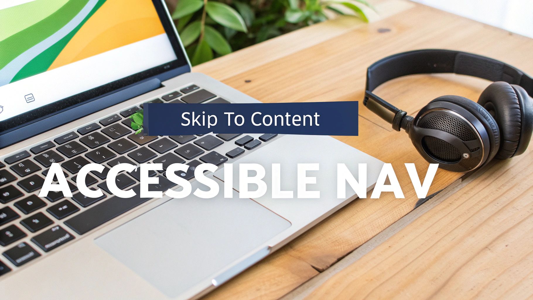
9. Accessibility-First Navigation Design
An accessible-first approach ensures your navigation is usable by everyone, including people with disabilities who rely on assistive technologies like screen readers or keyboard-only navigation. This practice involves building your navigation with semantic HTML and adhering to Web Content Accessibility Guidelines (WCAG). It's not an afterthought but a core component of inclusive design that benefits all users by creating a more robust and predictable experience.
Designing for accessibility from the start improves usability for everyone. For instance, clear focus indicators help keyboard users see where they are on a page, and this visual cue also aids sighted users navigating with a mouse. Properly structured, accessible navigation is also more easily understood by search engines, contributing positively to SEO.
Why This Practice Matters
When navigation is inaccessible, you effectively block a significant portion of the population from using your site. This can lead to legal risks, brand damage, and lost revenue. For example, without a "skip to main content" link, keyboard and screen reader users are forced to tab through the entire navigation menu on every single page just to reach the primary content. This creates immense frustration and is a major barrier to a good user experience.
Key Insight: Accessibility is not just a compliance checkbox; it is a fundamental aspect of user experience. An accessible navigation system is a sign of a high-quality, professional, and inclusive website.
Implementation and Actionable Tips
Building accessible navigation requires intentional coding and design choices. It’s a crucial website navigation best practice that should be integrated from day one.
- Use Semantic HTML: Structure your navigation with the correct tags:
<nav>for the navigation block,<ul>for the list of links, and<li>for each individual list item. This gives assistive technologies the context they need. - Provide a "Skip to Main Content" Link: This link should be the very first focusable item on the page, allowing users to bypass repetitive navigation blocks.
- Ensure Visible Focus Indicators: When a user tabs through your navigation, there must be a clear visual indicator (like a prominent outline) showing which link is currently active.
- Test with a Keyboard and Screen Readers: Navigate your entire site using only the Tab, Shift+Tab, Enter, and Spacebar keys. Then, test it with screen readers like NVDA (free) or JAWS to understand the experience for visually impaired users.
- Use ARIA for Clarity: Use ARIA (Accessible Rich Internet Applications) attributes like
aria-labelto provide context for non-descriptive links (e.g., a search icon) andaria-current="page"to indicate the user's current location.
10. Footer Navigation and Secondary Site Links
Often overlooked, the website footer acts as a crucial secondary navigation system and safety net for users. While the primary header navigation focuses on core user tasks, the footer provides a space for important but less-frequented links, such as legal information, company details, and support resources. A well-organized footer improves usability by offering users an alternative path to find information if they can't locate it in the main menu, preventing dead ends.
This practice enhances the user experience by de-cluttering the main navigation while still making comprehensive site information accessible. For search engines, a well-structured footer with relevant internal links helps distribute link equity across your site and provides additional context about your website's structure and key pages, which is a valuable component of modern website navigation best practices.
Why This Practice Matters
Users instinctively scroll to the footer when they are looking for "utility" links like contact information, career opportunities, or terms of service. Neglecting this area creates a frustrating experience. For example, a potential business partner might look for a "Media Kit" link, or a customer might seek "Shipping & Returns." Placing these in the footer meets established user expectations and keeps the primary navigation clean and focused on conversion goals.
Key Insight: The footer is your website's "table of contents" for everything else. It serves users who have specific, secondary goals and provides a comprehensive overview of your site's architecture.
Implementation and Actionable Tips
To create an effective footer, group links logically into categories that make sense to the user. Think about the secondary tasks a visitor might want to accomplish on your site.
- Organize Links into Categories: Group related links under clear headings like "Company," "Customer Service," "Legal," or "Resources." Aim for 4-6 categories maximum to avoid overwhelming users.
- Prioritize Essential Information: Always include legally required links (Privacy Policy, Terms of Service) and essential contact details (Contact Us, phone number, address). This builds trust and credibility.
- Optimize for Mobile: Ensure your footer design is responsive. Multi-column layouts should stack vertically into one or two columns on smaller screens for easy tapping and readability.
- Test for Accessibility: Verify that all footer links are keyboard-navigable and have sufficient color contrast. This ensures all users, regardless of ability, can access this critical information.
Top 10 Website Navigation Best Practices Comparison
| Navigation Pattern | 🔄 Implementation Complexity | ⚡ Resource & Performance | ⭐ Expected Effectiveness | 📊 Ideal Use Cases / Impact | 💡 Key Tips |
|---|---|---|---|---|---|
| Clear and Descriptive Navigation Labels | Low — copywriting + validation | Low — negligible perf impact | ⭐⭐⭐⭐ — improves clarity & SEO | Universal — increases discoverability and reduces bounce | Use A/B tests, 1–3 words, test with diverse users |
| Consistent Navigation Placement and Structure | Medium — design system & enforcement | Low — one-time setup, reusable components | ⭐⭐⭐⭐ — boosts learnability & speed | Multi-page sites where predictability matters | Document in style guide; enforce via components |
| Mobile-Responsive Navigation Design | High — multiple patterns & breakpoints | Medium–High — device testing, potential perf cost | ⭐⭐⭐⭐ — essential for mobile-first audiences | Mobile-heavy sites and apps; >60% mobile traffic | Test on real devices, ensure 48×48 tap targets, avoid deep nesting |
| Logical Information Architecture and Hierarchy | High — user research & restructuring | Medium — research tools and mapping effort | ⭐⭐⭐⭐⭐ — foundational for findability | Large content sites, e‑commerce, docs | Conduct card sorting, tree testing, limit 5–7 main items |
| Visual Hierarchy and Emphasis in Navigation | Medium — visual design + accessibility checks | Low–Medium — design iterations, accessibility testing | ⭐⭐⭐⭐ — guides scanning and CTA prominence | Marketing sites and product-driven interfaces | Use size/contrast, whitespace, meet WCAG AA, test colorblind |
| Breadcrumb Navigation for Context and Wayfinding | Low — template-driven for hierarchical sites | Low — minimal dev and UI space | ⭐⭐⭐ — clarifies location in deep hierarchies | Sites with 3+ levels (e‑commerce, documentation) | Make breadcrumbs clickable, use schema.org BreadcrumbList |
| Search Functionality as Navigation Complement | High — search infra and relevance tuning | High — indexing, hosting, analytics | ⭐⭐⭐⭐⭐ — fastest discovery for goal‑oriented users | Large inventories, content-heavy sites, power users | Provide autocomplete, monitor queries, optimize speed (Algolia/ES) |
| Active Page Indication and User Location Awareness | Low — CSS/ARIA + routing logic | Low — trivial runtime cost | ⭐⭐⭐⭐ — reduces disorientation, improves navigation flow | Multi-page flows, complex menus, dashboards | Use color+underline+aria-current, ensure contrast and persistence |
| Accessibility-First Navigation Design | High — standards knowledge & testing | Medium — tools, screen reader testing, dev time | ⭐⭐⭐⭐⭐ — inclusive, legally compliant, improves UX | Government, public services, large public sites | Use semantic HTML, skip links, keyboard support, run axe/Lighthouse |
| Footer Navigation and Secondary Site Links | Low — content grouping and layout | Low — static links; mobile stacking required | ⭐⭐⭐ — supports secondary discovery & legal needs | Sites needing legal/contact links and sitemaps | Limit categories, prioritize legal links, ensure keyboard access |
From Blueprint to High-Converting Navigation: Your Next Steps
We've explored the ten pillars of effective website navigation, from the foundational importance of clear labels and logical hierarchy to the nuanced power of breadcrumbs and accessibility. It's easy to see these as a simple checklist, but their true value lies in how they interconnect to form a cohesive, intuitive user journey. Think of your navigation not as a static menu, but as a dynamic conversation with your visitor. It's the digital handshake, the helpful store clerk, and the clear signage that guides them confidently toward their goal.
Mastering these website navigation best practices is a commitment to understanding user intent. It’s about anticipating their questions and providing answers before they even have to ask. When you prioritize a mobile-first design, you're not just shrinking a menu; you're respecting the context and needs of more than half your audience. When you implement ARIA labels and keyboard navigation, you're opening your digital doors to everyone, expanding your reach and building an inclusive brand.
Bridging the Gap Between Theory and Action
The journey from understanding these principles to implementing them can seem daunting, but it starts with a single, focused step. Don't feel pressured to overhaul your entire site overnight. Instead, adopt an iterative approach grounded in data and user feedback. This methodical process ensures your changes are impactful and sustainable.
Here is a practical roadmap to get you started:
- Conduct a Navigation Audit: Use the ten practices covered in this article as your audit checklist. Go through your site on both desktop and mobile, and be brutally honest. Where does it fall short? Are your labels generic? Is the active page indicator missing?
- Identify Low-Hanging Fruit: Pinpoint the easiest and most impactful changes you can make immediately. This could be as simple as renaming "Solutions" to "Marketing Services" or ensuring your footer contains links to your contact and privacy policy pages. Quick wins build momentum.
- Consult Your Analytics: Dive into your website's data. Use tools like Google Analytics to analyze user flow reports. Where are users dropping off? Which pages have high exit rates? This data provides clues about navigational friction points.
- Utilize Visual Feedback: Implement heatmaps and session recording tools. These visual aids show you exactly where users click, how far they scroll, and where their mouse hovers. This is invaluable for understanding how people actually interact with your navigation versus how you think they do.
The Long-Term Impact of Superior Navigation
Improving your site's navigation is one of the highest-leverage activities you can undertake. The benefits ripple across every key business metric. A clear path to products or services directly impacts conversion rates. A logical structure that helps users find information quickly reduces bounce rates and increases time on site, which are both positive signals for SEO.
For online retailers, this is especially critical. An intuitive navigation system is a core component of a positive shopping experience, and it's just one piece of the puzzle. For a holistic approach to improving user experience and boosting sales, exploring comprehensive ecommerce UX best practices can provide a wider framework for optimizing every touchpoint of the customer journey.
Ultimately, your website's navigation is the backbone of the user experience. It can be the difference between a frustrated visitor who leaves and never returns, and a satisfied customer who not only converts but becomes a loyal advocate for your brand. By continuously refining your navigation based on these best practices and real user data, you are investing directly in your site's performance, your brand's reputation, and your business's bottom line.
Ready to transform your website's navigation from a simple menu into a strategic conversion asset? The team at Up North Media specializes in custom web development and user-centric design that drives results. We help Omaha-based businesses and beyond build digital experiences that are not only beautiful but also intuitive, accessible, and optimized for growth. Contact Up North Media for a free consultation and let's build a website that guides your users and grows your business.