You're probably here because your business has outgrown its current logo, or because you're starting something new and don't want to make a branding decision you'll regret a year from now. Maybe your current mark looks fine on a website but falls apart on a sign. Maybe it came from a budget freelancer, a friend, or an online generator and now every vendor needs a different file version. Maybe you've realized your company looks less established than it is.
That's a common spot for Omaha businesses.
A logo feels small until it touches everything. It shows up on your storefront, truck, proposals, uniforms, sales sheets, invoices, social profiles, and search listings. In a market like Omaha, where local reputation still matters and buyers compare businesses quickly, your logo isn't decoration. It's a working business asset.
Good Omaha logo design isn't about making something flashy. It's about building a mark and a usable system that customers recognize, employees apply correctly, and vendors can reproduce without guessing.
Why a Strategic Logo Matters for Your Omaha Business
A weak logo creates friction you usually notice too late. It blends in with competitors, looks inconsistent across channels, and makes a solid business appear less credible than it is. A strong logo does the opposite. It gives people a fast visual cue that your company is established, intentional, and easy to remember.
That matters in Omaha because many buying decisions still happen through repeat exposure. A prospect might first see your van in traffic, then your Google listing, then your website, then your proposal. If those touchpoints don't look connected, trust drops. Not dramatically in one moment, but enough to make your company feel less dialed in.
Recognition beats decoration
A lot of owners start the logo conversation with preferences like “I want it modern” or “I want it bold.” Those preferences matter, but they're not the main job. The main job is recognition. Your logo needs to hold up in small sizes, on physical materials, and next to competitors that may all use the same tired visual shortcuts.
In practice, the logos that work best for Omaha businesses usually do three things well:
- They simplify the message: They don't try to explain the whole company in one mark.
- They stay readable: They survive on a storefront, favicon, invoice, and embroidered polo.
- They create consistency: They become the anchor for color, type, and layout decisions across the brand.
Practical rule: If a logo only looks good in one setting, it isn't finished.
There's also a bigger business point here. A logo should be built inside a broader identity system, not treated like a standalone graphic. Brand guides define how shapes, colors, fonts, and backgrounds behave in production, which reduces inconsistency and rework across email, web, and print, as noted by LGX Branding's overview of identity systems.
The Omaha market rewards clarity
Local companies often compete against two groups at once. One group is other Omaha businesses with strong local relationships. The other is regional or national firms entering the market with polished branding and tighter systems. If your logo feels improvised, you're giving up ground before the sales conversation starts.
That's why I push owners to think of logo design as infrastructure. You're not buying a pretty mark. You're investing in an asset that supports sales, hiring, signage, and digital marketing.
A strategic logo won't fix a weak business. But it will help a good business look as capable as it is.
The Professional Logo Design Process Demystified
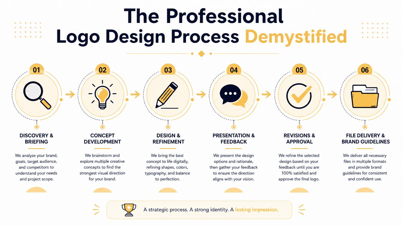
Most logo projects go better once the owner understands what the designer is doing. Professional logo design isn't a burst of inspiration followed by a file delivery. It's a sequence of business decisions, creative development, and production planning.
This visual sums up the process well:
What happens before anyone designs anything
The first stage is discovery. That means getting clear on what the business does, who it serves, what the market looks like, and where the logo will appear. A restaurant in Midtown has different needs than a manufacturer, law firm, or contractor serving clients across Nebraska and Iowa.
At this stage, the useful questions are practical:
- Where will the logo be used first: Website, sign, truck wrap, packaging, apparel, social, sales deck?
- Who are you trying to attract: Homeowners, procurement teams, walk-in traffic, investors, recruiting candidates?
- What can't this logo look like: Common local category clichés, close competitor styles, trend-heavy aesthetics?
A good brief saves rounds of subjective debate later.
Concept work is strategy in visual form
Once the brief is solid, concept development starts. Many weak projects falter at this stage when clients expect endless random options. That's not usually a sign of quality. Good concepts are filtered. They're based on positioning, not guesswork.
A designer may explore symbol directions, typography routes, or wordmark-only options depending on the business. Some companies need an icon that can stand alone on social profiles and signage. Others are better served by a strong typographic logo that reads clearly and stays clean.
For reference, looking at curated global brand logo products can be useful, not to copy, but to see how established brands solve clarity, spacing, and symbol simplicity across different markets.
The strongest concept usually isn't the one with the most effects. It's the one that still makes sense when reduced, printed, reversed, and repeated.
Feedback works best when it's tied to business goals
Review rounds are where owners can help or hurt the outcome. “I just don't love it” rarely moves the project forward. Better feedback sounds like this: “This feels too corporate for our audience,” or “The icon won't read well on our trucks,” or “This direction looks too close to three competitors.”
Useful feedback tends to focus on:
- Fit: Does it match the brand position?
- Function: Will it work where the business needs it?
- Distinctiveness: Does it avoid category sameness?
Final delivery should solve implementation, not just approval
A professional handoff includes more than a logo lockup pasted into a PDF. It should give the business usable assets and clear rules. That usually means approved versions, file organization, and guidance for internal teams or outside vendors.
If those pieces are missing, the project isn't really done. It's just approved.
Navigating Omaha Logo Design Pricing and What You Get
The first pricing question most owners ask is simple. “What does a logo cost in Omaha?” The answer is that the price depends on what problem you need solved. A quick mark for basic use costs less than a structured identity system that has to support signage, digital, print, apparel, and future growth.
The pricing graphic below reflects common market tiers:
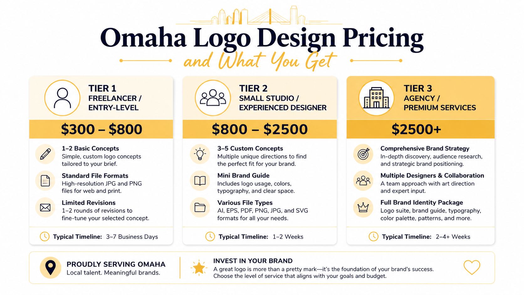
Those ranges are helpful as a rough visual, but the more important question is what's included.
What low-cost logo work usually buys you
At the low end, you're often paying for speed, not depth. That can mean a limited brief, fewer original concepts, weak revision structure, and file delivery that looks complete until you try to use it in actual use.
Here's where cheap logo work often breaks:
| Issue | What it causes |
|---|---|
| Raster-only files | Blurry enlargements and redraw requests |
| No color specifications | Inconsistent printing and digital use |
| One layout only | Awkward placements on social, signage, or merch |
| No usage guidance | Vendors improvise and the brand drifts |
That doesn't mean every freelancer is a bad choice. It means you need to judge the scope, not just the fee.
What actually drives the price
The cost usually rises when the designer or agency is doing more than making a mark. Price increases when the project includes strategy, competitive review, structured revisions, alternate logo versions, and implementation-ready files.
One technical requirement should never be treated as optional. A vector-first workflow is the standard because vector artwork can scale cleanly without pixelation, which is why professional deliverables typically include a vector master plus multiple color variants for print and digital use, as explained in this Omaha logo design workflow overview.
That single production decision affects everything from a favicon to a vehicle wrap.
What to expect at different levels
Instead of thinking only in terms of budget, think in terms of deliverables.
- Basic logo package: Usually enough for a new business that needs a clean start and limited applications.
- Mid-range identity package: Better for companies that need logo versions, file flexibility, and some rules around usage.
- Full brand system: Best for businesses with multiple channels, teams, vendors, or expansion plans.
Bottom line: If you're comparing two logo quotes, compare the implementation value. The cheaper quote may require more cleanup, reformatting, and redesign later.
In Omaha, the smartest buyers don't ask only “What's the logo cost?” They ask “What will this save us from having to fix later?”
How to Choose the Right Omaha Logo Designer or Agency
Hiring the wrong logo partner usually doesn't fail because the designer lacks taste. It fails because the process is vague, the business goals aren't clear, or the final deliverables don't hold up once the logo leaves the presentation deck.
This checklist is a good place to start when you're comparing options:
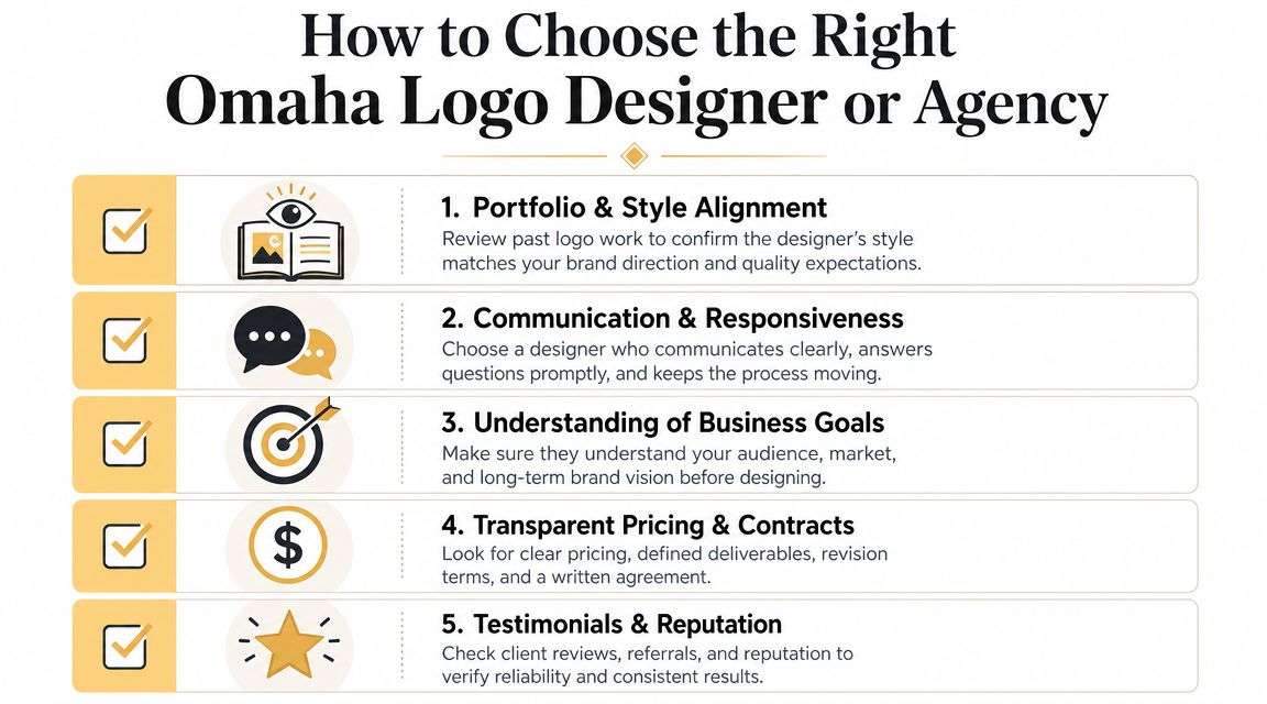
Ask better questions than “How many concepts do I get”
A large concept count sounds appealing, but it doesn't tell you whether the work is strategic, distinct, or production-ready. Better questions reveal whether the designer can think past aesthetics.
Ask things like:
- How do you learn the business before designing?
- What kinds of files and logo variations are included?
- How do you test whether a direction will work across web, print, and signage?
- What does revision feedback look like in your process?
- Who owns the final files and source assets?
If a designer struggles to answer those clearly, that's useful information.
Watch how they talk about originality and risk
A surprising number of logo conversations skip legal and long-term ownership issues. That's a mistake. Common guidance says to start with a trademark search, treat copying or close imitation as legal risk, and document Pantone, CMYK, RGB, and HEX values for consistent reproduction. One guide also notes that many solid logos last 5–10 years, which is a useful planning horizon for businesses that don't want to rebrand constantly, as outlined in Mountain Mojo Group's logo FAQ.
That means you should ask direct questions about:
- Trademark awareness: Do they design with conflict avoidance in mind?
- Expected lifespan: Is this a trend piece or something built to last?
- Documentation: Will you receive usable color codes and standards?
A logo that needs to be redone because it's too derivative wasn't a bargain.
Here's a short explainer that helps frame what to look for during the selection process:
Look for business fit, not just portfolio polish
A strong portfolio matters, but context matters more. A designer can produce attractive work and still be wrong for your company. If you run a B2B service firm, you don't need someone who only shows edgy restaurant branding. If you're scaling digital acquisition, your logo partner should understand how brand identity connects to site design, search presence, and campaign consistency. That's where resources like this article on choosing an Omaha digital marketing agency can help frame the broader fit between brand work and ongoing marketing execution.
Selection rule: Choose the partner who asks sharp questions about your business, not the one who only talks about style.
Good Omaha logo design starts with design skill. It finishes with judgment.
Inspiring Logos from Successful Omaha Businesses
The easiest way to understand logo quality is to look at companies people already recognize and ask why their marks work. Not because they're famous, but because their logos hold up in daily use.
The logos people remember aren't usually complicated
Look around Omaha and you'll notice a pattern. The strongest local business logos tend to be simple, repeatable, and tied to a larger identity system. They work on signs, menus, apparel, websites, and sponsorship banners without needing to be redesigned each time.
That logic tracks with the broader history of logo design. Modern corporate logo principles were shaped by milestones such as Paul Rand's 1956 IBM logo, which helped establish that logos can function as more than identifiers and should support reproducibility and brand consistency, as noted in VistaPrint's history of logos.
What successful Omaha brands tend to get right
Consider a few broad local categories.
A financial or professional services firm usually succeeds with restraint. Clean typography, disciplined spacing, and a mark that feels stable matter more than novelty. The logo needs to reassure.
A restaurant or consumer-facing brand often needs more warmth and personality, but the same rules still apply. If the mark can't read on a street-facing sign or a small social icon, personality doesn't help much.
Trade businesses have their own challenge. Contractors, logistics companies, and field-service brands need logos that survive on trucks, uniforms, invoices, and jobsite materials. Overbuilt detail usually fails there.
For business owners who want to see how design systems show up across real client work, browsing a local branding and website portfolio can help connect logo thinking to broader execution.
Good local logos don't try to say everything. They give the business a recognizable shape people can attach memory to.
That's why some of the best Omaha logos don't look trendy. They look usable. And usable tends to age better.
Putting Your New Logo to Work Across Your Business
A logo project doesn't create value when the files are approved. It creates value when the brand starts showing up consistently in the places customers interact with your company.
This rollout view is where many businesses either protect their investment or slowly dilute it:
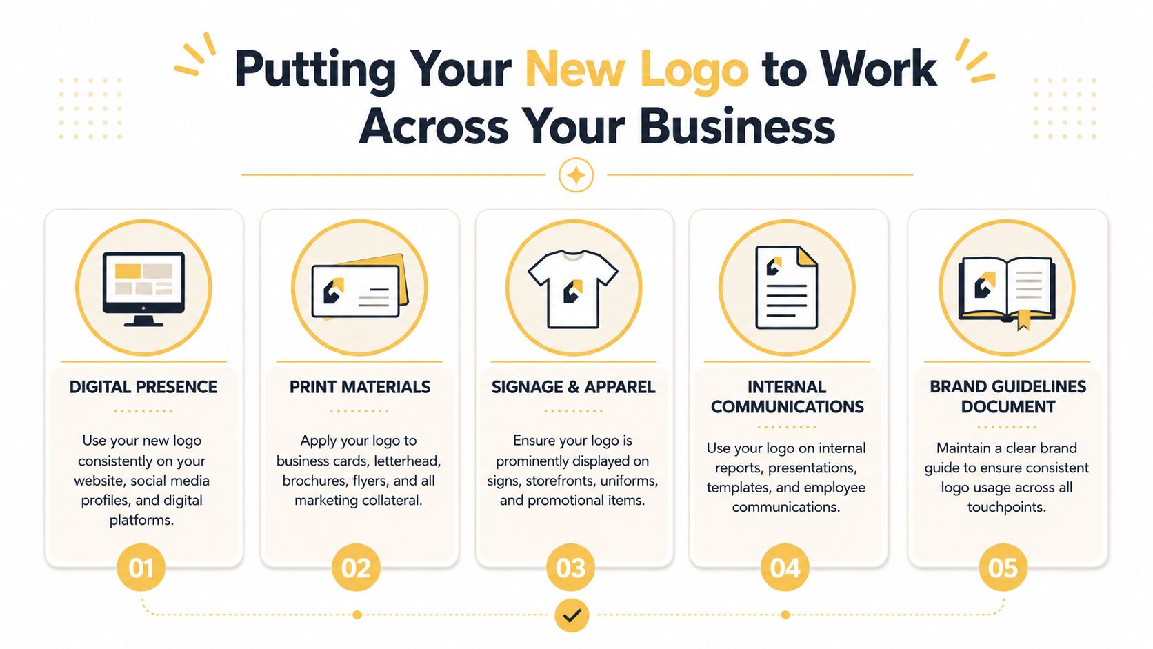
Your logo needs a system, not just a file folder
A common mistake is thinking one full-color horizontal logo is enough. It isn't. Real businesses need versions that work in different placements, sizes, and backgrounds.
Practitioners regularly stress logo system readiness. That includes versions for light and dark backgrounds, square app or social placements, and other real-world uses beyond the homepage, as discussed in Canva's logo planning guide.
The practical set usually includes:
- Primary logo: The main version for most brand uses.
- Reversed version: For dark backgrounds, signage, and overlays.
- One-color option: For embroidery, stamps, forms, and limited-production jobs.
- Icon or badge: For social profiles, favicons, and tight placements.
Rollout priorities for Omaha businesses
Once the logo is ready, update the high-visibility assets first. That usually means the website, Google Business Profile, social accounts, signage, proposal templates, and any vehicles or uniforms that create repeated local exposure.
I'd handle the rollout in this order:
-
Digital storefronts first
Website header, favicon, social avatars, email signatures, and directory listings should match right away. -
Sales and service materials next
Quotes, proposals, invoices, presentation decks, and printed collateral need the same identity rules. -
Physical brand touchpoints after that
Storefront signs, tradeshow materials, apparel, packaging, and fleet graphics should use approved versions only.
If local search matters to your business, pairing the rebrand with a clean profile update on Google is worth doing carefully. This practical guide on how to set up your Google Business Profile is a useful companion during rollout.
Consistency matters outside obvious marketing pieces
Businesses often remember the website and forget the less glamorous items. Internal docs, hiring materials, event banners, sponsorship signage, and even award items all reinforce the brand. If your company hosts tournaments, donor events, or client appreciation outings, the same identity standards should carry over to physical recognition pieces. For example, teams planning premium event merchandise may find Ecuadane's guide to premium golf awards useful when thinking through how branding appears on presentation items.
A logo system pays off when staff and vendors stop improvising.
That's the return. Fewer one-off fixes. Fewer “Can you send the right version?” emails. Less visual drift. More consistency where buyers notice it.
Start Your Omaha Logo Design Project Today
If your logo no longer matches the quality of your business, waiting usually makes the problem more expensive. The longer an inconsistent or weak identity stays in circulation, the more places it spreads. Then the project isn't just a redesign. It's a cleanup operation.
The good news is that Omaha logo design doesn't have to be confusing. Once you know what a solid process looks like, what files matter, how pricing really works, and what questions to ask before hiring, you can make a clear decision without getting distracted by flashy mockups or bargain pricing.
The businesses that get the most value from a logo project usually treat it as an operational asset. They build for usability, document the rules, and roll it out with discipline. That's what makes the logo hold up over time.
If you're evaluating options, Up North Media is one local choice that offers custom logo design as part of broader branding and digital work. That can be useful for businesses that want their logo, website, and marketing assets aligned from the start instead of handled in separate silos.
If you want a practical conversation about your logo, brand system, and where the identity needs to work next, contact Up North Media. A short consultation can clarify whether you need a full redesign, a cleanup of existing assets, or a more complete brand rollout plan.