A solid process for website redesign doesn't kick off with picking out cool fonts or a new color palette. It starts with a smart, strategic foundation. This first phase is all about auditing your current site to see what’s broken, setting goals you can actually measure, and nailing down a detailed plan before a single design element is created.
Setting the Stage for a Successful Redesign
Jumping into a redesign without a clear "why" is like starting a road trip with no destination in mind. You'll burn through a lot of time and money, and you definitely won't end up where you need to be. The initial discovery and planning phase is where you build the business case for the project, making sure every decision is tied to a real, measurable outcome. This isn’t just about making things look prettier; it's about building a website that works harder for your business.
This early stage is all about deep analysis. To get started on the right foot, you really need to use some comprehensive website audit tools to get a clear picture of your current site's strengths and weaknesses. A thorough audit gives you the hard data you need to make informed decisions instead of just guessing.
Auditing Your Current Website Performance
Your current website is an absolute goldmine of data. Digging into your analytics helps you pinpoint the exact friction points that are costing you customers and revenue. Don't just glance at the dashboard; look for the patterns that tell a story.
Start by flagging pages with unusually high bounce rates or shockingly low time-on-page. These are screaming that the content or user experience just isn't cutting it for your visitors. In the same way, take a hard look at your conversion funnels. Where are people dropping off? A huge drop-off on the checkout page, for instance, could point to a clunky form or surprise shipping costs.
This initial audit really sets the stage for everything that comes next, as this simple flow shows.
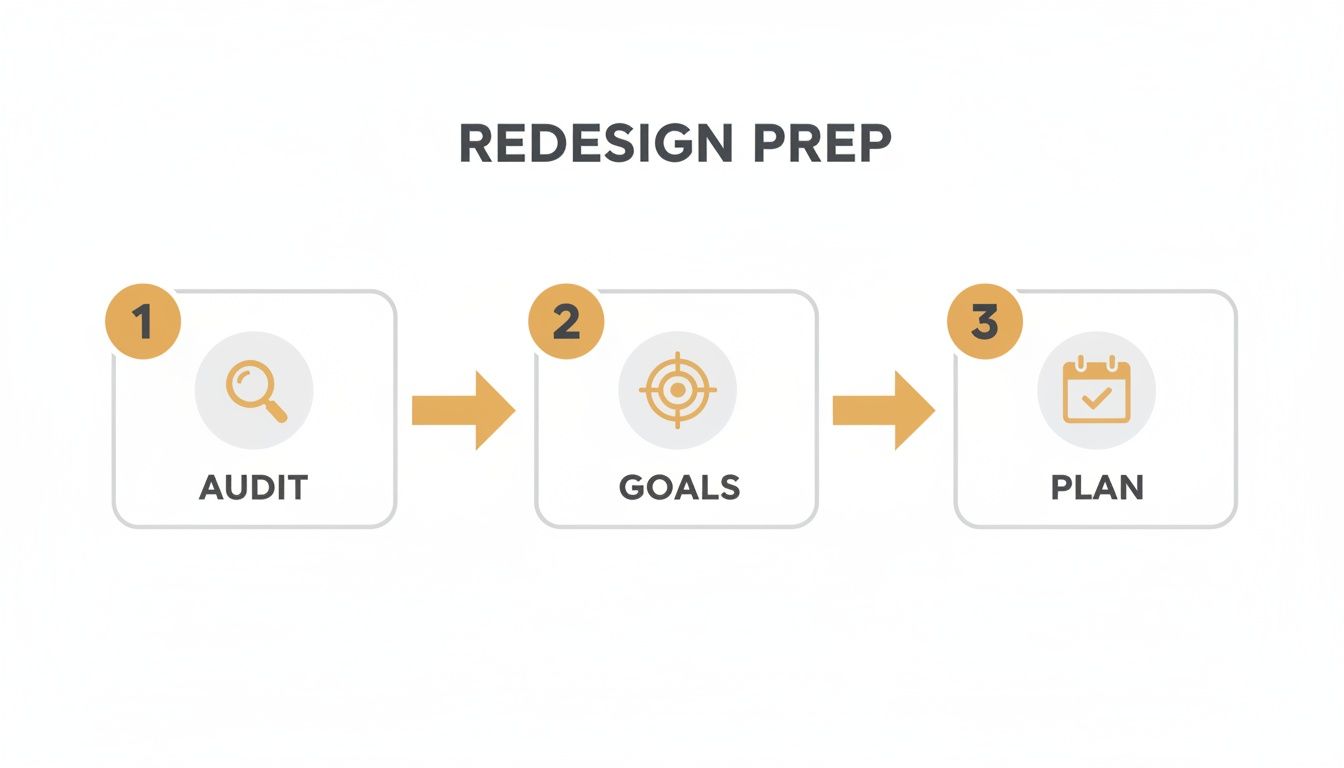
The image makes it clear: a successful redesign is built on a sequence of auditing, goal-setting, and planning. It’s all about letting strategy drive the execution.
Defining Clear and Measurable Goals
Once you know what’s broken, you can set specific goals for what "fixed" actually looks like. Vague objectives like "improve the user experience" are impossible to track. Instead, you need to create SMART goals (that’s Specific, Measurable, Achievable, Relevant, and Time-bound).
For example, much better goals would be:
- Increase qualified lead submissions through the contact form by 30% within six months of launch.
- Reduce shopping cart abandonment from 75% to 60% in the first quarter after the redesign.
- Improve mobile conversion rate by 25% by rolling out a mobile-first checkout process.
These metrics become your North Star. They guide every design and development decision throughout the entire process for website redesign and give you a clear benchmark for measuring the project's success and ROI down the line.
To keep these initial tasks organized, a simple checklist can be a lifesaver. It ensures all stakeholders are aligned from the very beginning.
Initial Website Redesign Discovery Checklist
| Task | Objective | Key Stakeholders |
|---|---|---|
| Review Analytics Data | Identify high bounce rates, low conversion pages, and user drop-off points. | Marketing Team, Project Manager |
| Conduct Stakeholder Interviews | Gather insights on business goals and pain points from all departments. | CEO, Sales, Marketing, Customer Service |
| Define SMART Goals | Establish specific, measurable targets for the redesign (e.g., increase leads by 30%). | Project Manager, Leadership |
| Analyze Competitor Websites | Identify industry best practices and opportunities for differentiation. | Marketing Team, Designer |
| Create a Project Brief | Document project scope, goals, budget, timeline, and technical requirements. | Project Manager, All Stakeholders |
| Assemble the Project Team | Assign roles and responsibilities for designers, developers, and content creators. | Project Manager, Department Heads |
This checklist isn't just a to-do list; it's a foundational document that prevents misunderstandings and keeps everyone focused on the same objectives.
Assembling Your Team and Timeline
With your goals in hand, you can finally define the project's scope, budget, and timeline. This means getting input from key people across different departments—think sales, marketing, customer service, and leadership. Their insights are invaluable for understanding different user needs and business requirements.
This collaborative approach helps prevent scope creep and gets everyone on the same page. And the data shows just how critical this planning is. Research reveals that 80.8% of businesses point to low conversion rates as their top reason for a redesign—a problem that a proper audit identifies right away. What's more, poorly planned projects often face massive delays; timelines stretch beyond six months for 54% of companies, with a staggering 80% of those projects going past the one-year mark.
A detailed project brief is your single most important document. It should clearly outline the project's purpose, goals, target audience, scope, technical needs, budget, and a realistic timeline. This document keeps the entire team—from designers to developers—pulling in the same direction.
Designing a User-Centric Experience
Now that you have a clear, data-backed set of goals, the website redesign process shifts from the "why" to the "how." This is where we stop talking strategy and start building an experience that feels completely intuitive. The goal is to guide users effortlessly toward their goals—and, of course, yours. It’s time to get into Information Architecture (IA) and User Experience (UX), the disciplines that turn business objectives into a website that actually works for people.
Forget about colors and fonts for a minute. This whole phase is about empathy and structure. You have to get inside your customers' heads and really understand what they need, what drives them crazy, and how they think. This deep-seated understanding is the foundation of a site that doesn't just look pretty but performs brilliantly.
Understanding Your Audience Through Research
You can’t just guess your way into a user-centric experience. You need real data from real users, but gathering these insights doesn't have to break the bank. There are plenty of practical, low-cost research methods that can give you a surprisingly clear picture of user behavior.
Start by looking at what’s happening on your current site. Heatmap tools are fantastic for this—they show you exactly where users click, how far down the page they scroll, and which parts they completely ignore. This visual data is often a wake-up call, revealing that a button you thought was critical is being overlooked, while users are repeatedly trying to click on something that isn't even a link.
Next, it's time to actually talk to your users. Here are a few simple ways to do it:
- Targeted Surveys: Use a tool to pop up short, simple surveys on key pages. Ask visitors what they came looking for and if they found it.
- Customer Interviews: Spend 15 minutes talking with a handful of your best customers. Ask them about their goals and what roadblocks they hit when using your site.
- Feedback Forms: Dig through the submissions from your existing contact forms. You'll often find a goldmine of common complaints and feature requests.
This qualitative feedback adds the human story to your analytics, giving you the "why" behind the numbers.
Crafting Personas and Journey Maps
Once your research is done, it's time to turn those insights into something your team can actually use. First up are user personas—these are fictional character profiles that represent your key customer segments. A good persona goes beyond demographics to include goals, motivations, and pain points. For example, you might create "eCommerce Emily," a busy working mom who values a lightning-fast checkout process and a no-hassle return policy.
With your personas defined, you can map out their entire experience. A customer journey map is a visual representation of the path a user takes to complete a goal on your site, from their very first interaction to the final conversion. It highlights their actions, thoughts, and feelings at each step, exposing moments of frustration or delight.
A journey map isn't just a flowchart. It's an empathy-building tool that forces your team to see the website through the customer's eyes. This perspective shift is critical for identifying friction points you would otherwise miss.
Building the Architectural Blueprint
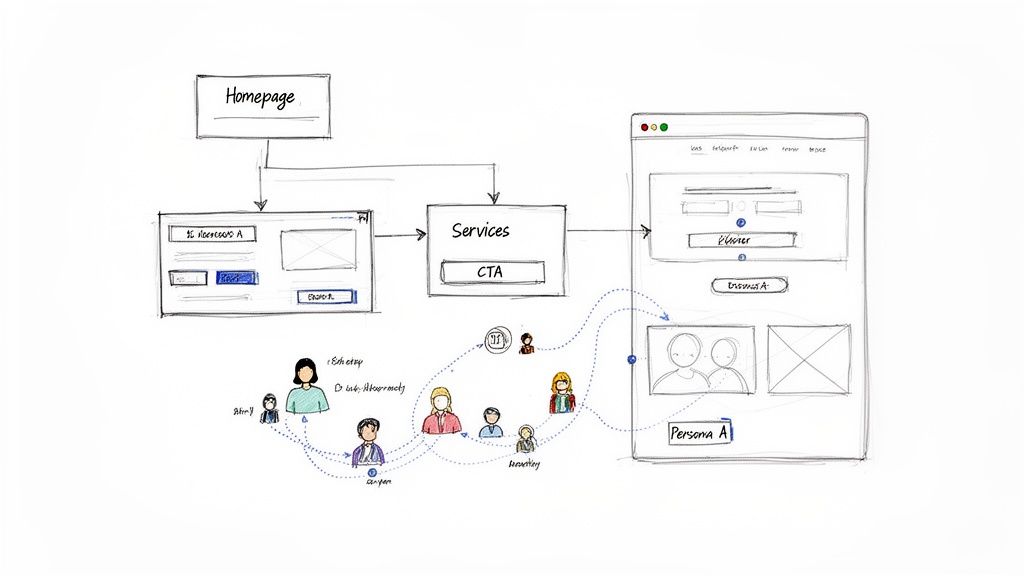
Your research, personas, and journey maps are now the official blueprint for your website's structure. This is where you translate all those user needs into a logical framework, starting with a sitemap. A sitemap is basically a hierarchical diagram of every single page on your website, showing how they all relate to one another. It's the key to ensuring your navigation feels natural and that people can find what they're looking for without getting lost.
From the sitemap, you move on to wireframing. A wireframe is a simple, black-and-white schematic of a webpage. It's all about outlining the placement of key elements—headers, navigation, content blocks, and call-to-action buttons—while focusing purely on structure and function, not looks. This step is absolutely essential for planning the user interface before you sink a single minute into visual design. For a deeper dive, check out our guide on how to create wireframes that effectively map out the user experience.
As you build this blueprint, think about integrating modern tools that improve the user journey. For instance, planning for an AI chatbot for customer support during the wireframing stage ensures it feels like a seamless part of the user flow, not a clunky add-on. By combining a logical sitemap with purposeful wireframes, you create a rock-solid foundation for a website that is both a breeze to navigate and ruthlessly effective at converting visitors into customers.
Protecting Your SEO During a Redesign
A website redesign is a massive opportunity to improve your rankings and organic traffic. But if you’re careless, it can wipe out years of hard-earned SEO progress in an instant. The entire process for website redesign has to treat your existing SEO authority as a precious asset—something to be protected and transferred, not tossed aside.
This means building a deliberate migration plan that tells search engines exactly how to find and rank your new pages.
This isn’t just about dodging a traffic catastrophe; it’s a strategic play to build an even stronger SEO foundation for the future. By carefully managing your content and technical signals, you ensure a smooth transition that both users and search engine crawlers will appreciate.
Auditing Your Existing Content
Before you can move anything, you have to know what you’re working with. A full content audit means crawling every single page on your current site and categorizing it based on performance and value. For every URL, you have to decide its fate.
Your main goal is to sort everything into one of three buckets:
- Keep: These are your all-stars. We’re talking about pages that rank well for target keywords, attract valuable backlinks, or drive significant conversions. This content gets migrated to the new site, often with minimal changes.
- Improve: This is content with potential that’s just not pulling its weight. It might be a blog post with solid information but a low ranking, or a service page that gets traffic but doesn’t convert. These pages will be rewritten, expanded, or combined to make them more competitive.
- Retire: This is for the outdated, low-quality, or irrelevant content providing zero value. Think old event announcements, thin blog posts, or redundant pages. These get removed, and their URLs are redirected to a relevant new page.
This audit becomes your roadmap for content migration. It stops you from accidentally deleting your most valuable pages while helping you clean up the digital clutter that might be holding your site back.
Mapping Old URLs to New Ones
Once you know what content is coming with you, the single most critical task in an SEO migration is creating a 301 redirect map. A 301 redirect is a permanent instruction telling browsers and search engine bots that a page has moved for good. It also passes most of the original page's ranking power, or "link equity," to the new URL.
Forgetting to implement 301 redirects is the number one cause of catastrophic traffic loss after a redesign. It's like moving to a new house without leaving a forwarding address—no one, including Google, will be able to find you.
Your redirect map is just a simple spreadsheet with two columns: "Old URL" and "New URL." You have to account for every single page from your audit that you decided to keep or improve. For retired pages, you should redirect the old URL to the next most relevant page—like a parent category or a related blog post—to preserve any link equity it might have.
To keep everything organized, we recommend a simple task planner. This helps your team see the big picture and ensures no critical SEO step falls through the cracks before, during, or after the launch.
SEO Migration Task Planner
| Phase | Key Task | Primary Goal |
|---|---|---|
| Pre-Launch | Content Audit & URL Mapping | Identify valuable assets and create a comprehensive 301 redirect plan. |
| Pre-Launch | Technical SEO Benchmark | Crawl the old site to record current metadata, canonicals, and errors. |
| Launch Day | Implement 301 Redirects | Ensure all old URLs correctly point to their new counterparts without chains. |
| Launch Day | Update XML Sitemap & Robots.txt | Submit the new sitemap to search engines and verify crawl rules. |
| Post-Launch | Monitor 404 Errors | Use Google Search Console to find and fix broken links immediately. |
| Post-Launch | Check Indexing Status | Verify that new pages are being crawled and indexed by search engines. |
This planner isn't exhaustive, but it covers the core tasks that prevent major SEO disasters. Staying on top of these items ensures a much smoother transition.
Finalizing Your Technical SEO Checklist
Beyond redirects, a few other technical tasks are absolutely essential for a clean launch. First, you need a new XML sitemap. This file is a guide for search engines, listing all the important pages on your new site that you want them to crawl and index. Submitting this via Google Search Console right after launch signals your site has changed and encourages faster discovery.
Next, you need to make sure your on-page SEO elements are properly transferred or updated. This includes:
- Title Tags: Ensure your new pages have unique, optimized title tags.
- Meta Descriptions: Write compelling descriptions for key pages to boost click-through rates.
- Internal Links: Update all internal links to point to the new URL structures, avoiding redirect chains that slow down crawlers.
Getting these details right is crucial. For more in-depth guidance, a complete guide on how to redesign a website can provide additional checklists to ensure nothing gets missed. Executing this technical SEO migration properly is what separates a seamless launch from a ranking disaster.
Bringing Your Brand to Life with Visual Design
Alright, you've got a solid blueprint and a smart SEO plan. Now for the fun part. This is where the process for website redesign shifts from abstract strategy and black-and-white wireframes into a living, breathing visual experience. It's time to craft a look and feel that doesn't just represent your brand but actually gets users to take action.
Visual design is so much more than picking pretty colors. It's a strategic game that uses color theory, typography, and imagery to make people feel something and guide their eyes where you want them to go. Nail this, and your website will connect with visitors on a deeper level, building the kind of trust that makes them want to stick around.
Forging a Cohesive Visual Identity
Your website has to feel like a natural extension of your brand. You can't have it looking like a distant cousin nobody recognizes. This all starts by defining a clear visual language that you'll apply consistently across the entire site. We're talking about a unified experience where every button, font, and photo works together.
Start by locking down the core components of this identity:
- Color Palette: Pick out primary, secondary, and accent colors that match your brand’s personality. An e-commerce shop selling organic skincare might use earthy greens and soft neutrals to build trust. A tech startup, on the other hand, would probably go for bold, energetic blues to signal innovation.
- Typography: Settle on a set of fonts for your headings, body text, and calls-to-action. The right typography makes everything easier to read—a huge factor in user experience—and reinforces your brand's voice. Is it modern and clean, or classic and elegant? Your fonts should reflect that.
- Imagery Style: Decide what your photos and illustrations will look like. Are you going with bright, professional product shots? Authentic lifestyle photos of real customers? Maybe custom graphics? Whatever you choose, consistency is what makes it look polished and professional.
These elements all come together to form a style guide. Think of it as a rulebook that ensures every new page or feature you add down the line maintains a consistent look and feel.
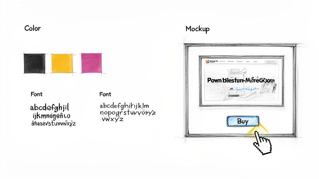
From Static Mockups to Interactive Prototypes
With a style guide in hand, designers can now bring the approved wireframes to life. This is where we create high-fidelity mockups—pixel-perfect, static images of exactly what each page will look like. Mockups are crucial for showing stakeholders how the final product will appear, right down to the spacing of buttons and the style of the images.
But a static picture only tells you half the story. The next step is a game-changer: turning those mockups into an interactive prototype.
A prototype lets your team click through the website as if it were live. You can test the navigation, interact with buttons, and experience the user flow firsthand. This is the single best way to gather real, actionable feedback before a single line of code gets written.
This is the stage where you catch the design flaws that look fine on paper but feel awkward in practice. Maybe a key call-to-action button is too easy to miss, or the main navigation menu is more confusing than helpful. Finding these problems during prototyping saves a ton of time and money compared to fixing them after the site is already built. This little feedback loop ensures the final design is as functional as it is beautiful, paving the way for a much smoother development phase.
Building and Testing for a Flawless Launch
Alright, the designs and prototypes have been signed off. Now for the fun part: turning those beautiful, static images into a living, breathing website. This is where the process for website redesign gets technical.
The development and Quality Assurance (QA) phases are where your vision meets reality. It’s a tight collaboration between developers and designers, ensuring the final product isn’t just pixel-perfect but also fast, stable, and ready for your audience the moment you go live.
Choosing the Right Technology
One of the first big calls you'll make here is the tech stack. This isn't a one-size-fits-all decision; it really depends on what you need the site to do and what your team is comfortable managing.
For a lot of businesses, a Content Management System (CMS) like WordPress is a no-brainer. It’s flexible, has a user-friendly backend for updates, and an absolutely massive ecosystem of plugins. But if you’re building a specialized e-commerce platform or a unique web app, a custom build using modern frameworks might be the smarter route.
No matter the path, the golden rule is clean, semantic code. Well-structured code is just easier to maintain and update down the road. More importantly, it helps search engine crawlers understand your site, which is a huge win for your long-term SEO.
The Critical Role of Quality Assurance
Once the first version of the site is built, it’s time for the most important pre-launch step: Quality Assurance. QA isn’t just about clicking around to find a few bugs. It's a systematic deep-dive to make sure every single link, form, and button works exactly as planned.
Seriously, don't skip this. A buggy launch is one of the fastest ways to kill user trust right out of the gate.
Your QA checklist should be thorough, covering a few key areas:
- Functional Testing: Do all the links go to the right place? Can users actually submit forms? Does the e-commerce checkout work without a hitch?
- Compatibility Testing: Does the site look and work correctly on Chrome, Firefox, and Safari? What about different operating systems?
- Responsive Testing: Pull out your phones and tablets. How does the site perform on a small smartphone screen versus a huge desktop monitor?
Think of QA as your final dress rehearsal. It’s your last chance to find and fix every broken link, awkward layout, and frustrating bug before your customers see it. A thorough testing process is non-negotiable for a professional launch.
This meticulous testing is what separates a smooth, professional launch from a frantic scramble to put out fires while your reputation takes a hit. If you want to build a rock-solid testing plan, it's worth learning more about quality assurance best practices to make sure nothing gets missed.
Performance and Speed Optimization
Beyond just working correctly, your site needs to be fast. A slow website is a conversion killer. In fact, studies show that 47% of consumers expect a webpage to load in two seconds or less. Any longer, and they're gone—often before they even see your homepage.
During the QA process, your team should be running the site through speed analysis tools to hunt down any bottlenecks. Common performance fixes usually include:
- Image Compression: Shrinking image file sizes without making them look grainy.
- Code Minification: Removing useless characters from code files to make them smaller and faster to load.
- Browser Caching: Telling a visitor’s browser to save parts of your site so it loads almost instantly on their next visit.
By first building the site with clean code and then putting it through its paces with rigorous testing, you ensure that on launch day, you're delivering an experience that's not just beautiful but also reliable, fast, and bug-free.
Launching and Iterating for Continuous Growth

Here's a hard truth: the launch isn't the finish line. It’s actually the starting block for the next race. After running through that final pre-flight checklist, pushing the site live should feel like a controlled deployment, not a chaotic scramble. This is where all your detailed planning pays off, ensuring a smooth transition for both your loyal users and the search engines.
Once the confetti settles, the real work begins. Your initial process for website redesign was all about making educated guesses based on research. Now it's time to see if those assumptions hold up against real, live user data. Your goal shifts from just building the site to constantly optimizing it.
This next phase is all about the data. It’s how you turn your website from a static brochure into a living, breathing business tool that adapts and gets better over time.
Monitoring and Measurement
Immediately after you go live, your attention needs to pivot straight to analytics. It’s absolutely critical to monitor key metrics to confirm the redesign is actually hitting the goals you defined way back in the discovery phase. Don't just get hypnotized by traffic numbers; look for meaningful shifts in how people are behaving.
Here are the essentials you should be tracking:
- Conversion Rate: Are more visitors actually filling out a form, buying a product, or taking that key action? This is the ultimate measure of success.
- Bounce Rate: Have you managed to lower the percentage of visitors who leave after seeing just one page? This is a great indicator of better first impressions and engagement.
- Pages Per Session: Are people digging deeper into your site? This suggests your new navigation and internal links are doing their job.
- Goal Completions: Keep a close eye on the specific goals you set up in Google Analytics, like newsletter sign-ups or demo requests.
Your analytics dashboard is now your most honest feedback mechanism. It provides unbiased proof of what’s working and what isn’t, guiding your next steps with hard data instead of guesswork.
The Cycle of Feedback and Refinement
With real data flowing in, you can start making targeted improvements. Honestly, this iterative approach is where you'll see the biggest long-term gains. You want to mix that quantitative data with qualitative feedback from actual users.
For example, maybe you notice a sharp drop-off on a brand-new service page. The numbers tell you what is happening, but not why. You can then use a tool like a heatmap to see exactly where users are getting stuck, or even deploy a simple on-page survey asking what information they feel is missing.
This continuous loop—launch, measure, refine—is what transforms your website into a powerful asset. Small, incremental changes, like A/B testing a call-to-action button or tweaking a headline, can lead to huge increases in performance over time. It’s how you ensure your initial investment delivers compounding returns.
Common Questions About the Website Redesign Process
Taking on a full redesign always kicks up a lot of questions, especially around timelines, costs, and things that can go wrong. It’s a big investment of time and money, so getting clear answers upfront is the only way to manage the project without losing your mind.
Let's dig into some of the most common worries we hear from businesses.
How Long Does This Actually Take?
This is usually the first question out of the gate. For a typical small-to-medium business website, you should budget for 12 to 16 weeks from start to finish. But honestly, that timeline can stretch.
The biggest things that slow a project down are its complexity, the number of unique page designs needed, and—most importantly—how fast your team can provide feedback and content. A simple brochure site might get done faster, while a custom e-commerce platform is a much bigger lift and will naturally take longer.
How Much Does a Website Redesign Cost?
And here’s the big one. The honest answer? It varies—a lot. The cost is tied directly to the scope of the project. If you're just putting a new coat of paint on a pre-existing template, you'll be on the lower end of the scale.
But if you’re talking about a completely custom design with a new sitemap, a ton of content to move over, and unique features built from scratch, you're looking at a much more significant investment.
To get a real number, you need a detailed project plan that outlines every single requirement. Be skeptical of any agency that throws out a firm price without a deep discovery phase. The final cost should reflect the value and ROI the new site will bring in, not just the hours it took to build.
Don't forget to account for your team's time. They'll be deep in the trenches providing feedback, writing or approving content, and helping with testing. This "soft cost" is a huge and often overlooked part of the total project investment.
What Are the Biggest Risks I Should Avoid?
Going over budget or past your deadline is painful, but the single biggest risk is watching your traffic and leads evaporate after launch. This almost always comes down to a botched SEO migration.
Forgetting to map out all your old URLs to the new ones with 301 redirects is the fastest way I’ve ever seen to tank years of hard-earned search engine authority. It's a killer.
Another classic pitfall is "design by committee," where too many stakeholders with clashing opinions grind the project to a halt. This is exactly why you need to lock in a single point of contact and a clear decision-making process before any design work begins. It’s non-negotiable.
Here are a few other common tripwires to watch out for:
- Scope Creep: This happens when new features and "wouldn't it be cool if" ideas get added halfway through without adjusting the timeline or budget.
- Poor Communication: Nothing sinks a project faster than a lack of regular, clear updates between your team and the agency.
- Ignoring Mobile Users: Still a surprisingly common mistake. Designing for the desktop first and treating the mobile experience as an afterthought is a recipe for failure.
If you can get ahead of these issues, you’ll be able to build a process for website redesign that stays on track and delivers a site that actually helps your business grow.
Ready to build a website that not only looks great but also delivers measurable results? The team at Up North Media specializes in creating data-driven web applications and SEO strategies that accelerate growth. Schedule your free consultation today!