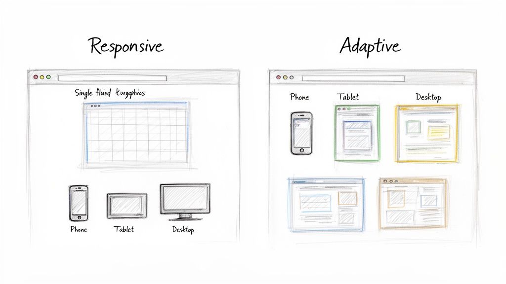
When you're deciding between responsive and adaptive design, it really boils down to a single, fundamental difference. Responsive design is built on one fluid layout that automatically adjusts to fit any screen size. Adaptive design, on the other hand, uses several different fixed layouts that are served up based on specific screen sizes.
For most businesses I work with today, responsive design is the clear winner and has become the industry standard. It's just a more efficient, future-proof, and SEO-friendly way to build a website.
Responsive and Adaptive Design Key Differences Explained
To figure out which one makes sense for your project, you have to get a handle on how they each operate at a core level.
Think of it this way: responsive design is like pouring water into a glass. The water (your website) takes the exact shape of whatever container it's in, whether it's a tall glass or a short mug. It's completely fluid. Adaptive design is more like having a set of Tupperware lids; you find the specific lid that's designed to snap perfectly onto a certain container.
By 2025, responsive design is no longer just a trend—it’s the default for modern web development. Over 90% of businesses have made the switch. That's because more than 65% of all internet traffic now comes from mobile devices, so having a site that works seamlessly everywhere isn't optional anymore.
Core Philosophies at a Glance
The approach you choose will ripple out and affect everything from the user experience to your budget and long-term maintenance headaches.
Responsive design aims for a universally consistent experience. The goal is to make sure your site is usable and looks good on any device, even ones that haven't been invented yet. Adaptive design is all about delivering a perfectly optimized, almost custom-tailored experience for the most common devices your audience actually uses. You can check out some fantastic responsive web design examples to see just how flexible this approach can be in the real world.
The fundamental trade-off is between the universal flexibility of responsive design and the targeted precision of adaptive design. Your decision hinges on whether you need a one-size-fits-all solution or a collection of custom-fit outfits.
Before we get into the nitty-gritty of the technical differences, performance, and SEO, let's start with a quick overview. This table breaks down the core concepts at a glance.
Quick Comparison Responsive vs Adaptive Design
| Attribute | Responsive Design | Adaptive Design |
|---|---|---|
| Flexibility | Highly flexible, fluidly adjusts to all screen sizes. | Less flexible, uses fixed layouts for specific breakpoints. |
| Approach | One layout for all devices ("one-size-fits-all"). | Multiple layouts for different devices ("custom-fit"). |
| Maintenance | Easier to maintain with a single codebase. | More complex, requires updating multiple layouts. |
| Initial Cost | Generally lower initial development cost and effort. | Higher upfront cost due to multiple design versions. |
| Performance | Can be slower if not optimized, as it loads all assets. | Potentially faster as it only loads device-specific assets. |
| Future-Proofing | Excellent; adapts to new screen sizes automatically. | Requires new layouts for future, unsupported devices. |
This table gives you a solid starting point, but the real decision comes down to the details. Let's dive deeper into how these two approaches actually work under the hood.
How Each Design Approach Technically Works
To really get to the heart of the responsive vs. adaptive debate, you have to look under the hood. This isn't just an aesthetic choice; it’s a decision rooted in two completely different technical philosophies that shape how a site gets built, delivered, and maintained. These mechanics influence everything from development timelines to how easily you can scale down the road.
One approach acts like a single, flexible organism, while the other is more like a collection of distinct, tailor-made outfits. Understanding this core difference is the key to making the right call for your business.
The Fluid Mechanics of Responsive Design
Responsive design is a client-side philosophy. In simple terms, the server sends a single package of code to the user's browser, and the browser does all the heavy lifting. It interprets the code and figures out how to best display the layout based on the screen it's on. This approach leans on three main technical pillars.
- Fluid Grids: Instead of old-school fixed pixel widths (like
960px), responsive layouts use relative units like percentages. An element might be set to 50% of the screen width, which means it will always occupy half the available space—whether on a huge monitor or a tiny phone. - Flexible Images: Just like the grids, images are sized with relative units. This keeps them from "breaking" the layout by being too big for a small screen. Developers use CSS rules to make sure images scale down proportionally without looking squished or distorted.
- CSS Media Queries: This is the real magic of responsive design. Media queries are CSS rules that kick in only when specific conditions are met, like the screen being a certain width. For example, a rule might say, "If the screen width is less than 768 pixels, stack the layout into a single column instead of three."
A responsive site sends one version of the website to every single device. The device's browser is responsible for reorganizing the content based on CSS instructions, much like a single set of blueprints that can be used to build different-sized models.
This client-side rendering makes development feel more streamlined because you're only managing one codebase. The entire focus is on creating a universally adaptable design from the get-go.
The Precision of Adaptive Design
Adaptive design takes a server-side approach. Instead of sending one flexible layout and hoping for the best, the web server detects the user's device before the page even loads. Based on that detection—mobile, tablet, or desktop—it serves up a specific, pre-built HTML and CSS file designed just for that screen size.
This method is built on a system of predefined breakpoints. Developers create several distinct, fixed-width layouts for common screen resolutions. Six common breakpoints are:
- 320px (Small mobile)
- 480px (Large mobile)
- 760px (Small tablet)
- 960px (Large tablet/small desktop)
- 1200px (Standard desktop)
- 1600px (Large desktop)
When a user lands on the site, the server identifies their screen size and sends the layout that matches. If their screen falls between breakpoints, it typically serves the next largest version. The result is an experience that feels pixel-perfect on those target devices, though it can feel a bit clunky on screens that don't quite fit the mold.
To make sure your chosen method is working correctly, it's essential to understand how to test your website on different devices. This step is non-negotiable for both approaches if you want to deliver a quality user experience. The trade-off here is clear: you get precision for specific devices but have to deal with the headache of managing multiple, separate codebases.
Comparing Performance and User Experience
When you get down to it, the whole responsive vs. adaptive debate comes down to what the user actually sees and feels. All the technical talk becomes real-world business outcomes—bounce rates, conversions, and whether someone gets frustrated and leaves your site for good. How your site loads and functions on different devices isn't just a detail; it's a critical piece of the puzzle.
The choice you make here sends performance down two very different paths. One approach is like a custom-tailored suit, delivering a hyper-specific, optimized package for each device. The other is more like a one-size-fits-all jacket that the browser has to adjust. This difference has a huge impact on how quickly a visitor can start interacting with your site.
The Speed Advantage of Adaptive Design
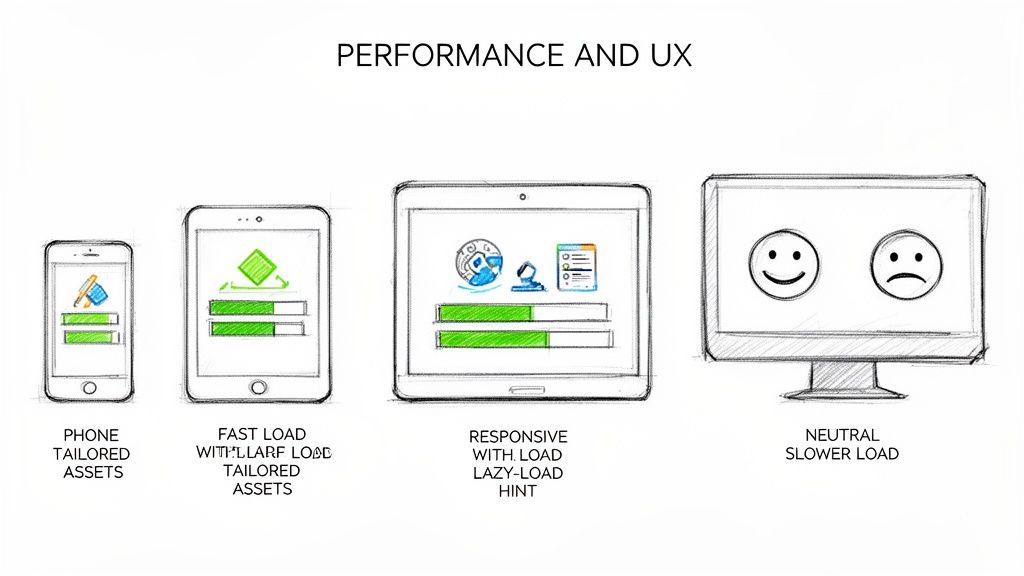
Adaptive design's biggest selling point is pure speed. It's built to deliver a lean, optimized experience because the server figures out what device the user is on first. It then sends only the assets needed for that specific screen. This means a mobile user gets a lightweight version of the site without having to download the massive, high-resolution images meant for a 27-inch desktop monitor.
This targeted delivery often leads to much faster initial load times. In situations where every millisecond counts, adaptive layouts can be 2-3 times faster than their responsive cousins by serving up only what's necessary. For mobile users on spotty connections, that's a game-changer.
By pre-optimizing everything on the server side, adaptive design cuts down on the amount of data transferred and takes a lot of the processing burden off the user's browser. It just works, and it works fast.
Optimizing Responsive Design Performance
Out of the box, a responsive site can feel a bit sluggish, especially on mobile. It sends the exact same HTML, CSS, and JavaScript to every device. A smartphone might end up downloading a huge desktop banner image, only for CSS to shrink it down or hide it completely. That’s wasted bandwidth and a slower experience.
But let's be clear: modern development techniques have pretty much closed this performance gap. With the right strategies, a responsive site can be just as fast—if not faster—than an adaptive one.
Here are a few essential tactics developers use to speed up responsive sites:
- Responsive Images: Using HTML attributes like
srcsetandsizes, the browser can be smart and download the most appropriate image size for the screen. This is a must-do, preventing phones from grabbing giant files they don't need. - Lazy Loading: This is a brilliant trick. It tells the browser not to load images or videos until they're just about to scroll into view. It dramatically speeds up the initial page load because the browser only grabs what's immediately visible.
- Code Splitting and Minification: Developers can break up big CSS and JavaScript files into smaller chunks and strip out all the unnecessary characters. This reduces the initial file size and helps the page render much more quickly.
These optimizations aren't just nice to have; they're crucial for meeting user expectations and Google's standards. To really understand why this matters, it's worth learning about what Core Web Vitals are and how they measure the health of your site.
A well-optimized responsive site is often the best of both worlds. It combines the easy maintenance of a single codebase with performance that can go toe-to-toe with a dedicated adaptive layout, all while being ready for whatever new devices come out next.
User Experience Beyond Load Times
Speed is a huge part of UX, but it's not everything. The overall experience also depends on how intuitive and consistent the site feels. This is where responsive design really shines. It offers a predictable and seamless experience as users jump between their laptop and their phone. The layout might reflow, but the core functionality and content are always the same, which creates a strong, unified brand feel.
Adaptive design, for all its speed, can sometimes create a disjointed experience. If a user’s device falls between the predefined breakpoints, they might get a layout that feels a little "off" for their screen. Even worse, the experience can feel fragmented if the mobile layout leaves out features or content that are available on the desktop version. This trade-off between a pixel-perfect layout and universal consistency is really at the heart of the responsive vs. adaptive design debate.
How Your Design Choice Hits SEO and Marketing
The design path you choose—responsive or adaptive—isn't just a technical decision. It has a direct, measurable impact on your search engine rankings and how effective your marketing efforts are. When you're weighing responsive design vs adaptive design, the SEO implications are one of the most important things to get right. This choice literally determines how easily customers can find you online.
Google hasn't been shy about its preference here. With the shift to mobile-first indexing, search engines now primarily use the mobile version of your website to decide how to rank it. This is where responsive design immediately pulls ahead. It serves up a single, unified version of your site to everyone, including search engine crawlers.
This single-URL, single-HTML approach is exactly what Googlebot loves. It makes the crawling, indexing, and ranking process much cleaner. All of your hard-earned SEO authority—like backlinks and social shares—gets funneled to one place, boosting its power.
Responsive Design: The Gold Standard for SEO
Google officially puts its weight behind responsive web design because it sidesteps a ton of common technical SEO headaches that pop up when you're juggling multiple site versions. A single, fluid site is just easier for algorithms to understand and for people to use, which sends all the right signals back to search engines.
Here's why it works so well:
- No Duplicate Content Drama: Adaptive design means different URLs or HTML for different devices. If you don't nail the implementation of canonical tags, search engines might see this as duplicate content, which can seriously water down your ranking potential.
- Consolidated Link Power: Every single backlink pointing to your website strengthens one URL. This concentrated authority is a massive ranking factor that’s much more difficult to manage when it's split across multiple adaptive versions.
- Better User Signals: A consistent experience across every device typically leads to lower bounce rates and people sticking around longer. Google sees these behaviors as strong signs that your site is valuable, which can give your rankings a nice lift.
With one URL, responsive design makes sure every marketing campaign—from social media pushes to email newsletters—drives traffic and authority to a single, canonical source. You get the maximum SEO bang for your buck.
The Marketing Headaches of Adaptive Design
While adaptive design can create a beautifully tailored user experience, it comes with baggage that can slow down your marketing and hurt SEO. Managing several fixed layouts means more developer time and more things that can go wrong when search engine crawlers come knocking.
The biggest risk is messing up redirection or canonicalization. If a crawler gets confused about which version of a page is the "real" one, you could end up with indexing errors or, even worse, split your SEO authority between different versions. This fragmentation weakens your overall search presence, making it that much harder to rank for the keywords that matter.
Thinking about the SEO impact of responsive versus adaptive is critical, but it also helps to consider platform-specific strategies. For a deep dive into getting top search rankings, check out this guide to static website SEO for dominant rankings.
For most businesses, the SEO benefits of responsive design are just too big to pass up. The simplicity of managing one website doesn't just align with what Google wants; it also supports a more cohesive and efficient digital marketing strategy. It ensures all your traffic and backlinks work together to build a single, powerful online presence.
Evaluating Cost Maintenance and Long-Term Scalability
When you're weighing responsive vs. adaptive design, it's easy to get lost in the technical weeds of performance and SEO. But the reality is, your choice has huge financial and operational consequences down the road. This isn't just a technical decision; it's a core business decision that impacts your budget, your team's time, and whether your website can grow with you.
For the vast majority of businesses, responsive design is simply the more financially sound choice for the long haul. Why? It's built on a single codebase that works for all devices. That unified structure makes development, updates, and day-to-day upkeep dramatically simpler, which means a much lower total cost of ownership.
Adaptive design, on the other hand, brings a level of complexity that directly translates to higher costs. You're not building one website; you're creating and managing multiple, distinct layouts for different screen sizes. That means more design hours and more development time right out of the gate, which inflates the initial project budget.
Breaking Down the Costs
The cost differences really come into focus when you look at the entire lifecycle of a website. With responsive design, most of the heavy lifting is done upfront to create that flexible, resilient framework. Once it's live, updates are a breeze. A quick CSS change or a content update automatically applies everywhere, on every device, all at once.
Adaptive design has a completely different cost structure. The initial build is more expensive because you might be creating six or more separate layouts. But the real kicker is the ongoing maintenance. A simple text change might need to be implemented across several different templates. A more significant design tweak can balloon into a major project, as each layout needs to be updated individually. This creates a constant drain on your resources.
The financial argument often boils down to this: responsive design is a "build once, deploy everywhere" model, while adaptive design is a "build multiple times, maintain multiple times" model. The latter almost always results in higher long-term operational expenses.
Future-Proofing and Scalability
Long-term scalability is where responsive design really proves its worth. Its fluid, percentage-based nature means it’s inherently ready for whatever comes next. When a new phone or tablet with a slightly different screen size hits the market, a responsive website just adapts. No new code, no redesign, no panic—it just works. This built-in resilience makes it a sustainable investment that grows with the market.
Adaptive design is far more rigid. Since it relies on fixed layouts triggered by specific breakpoints, it can be brittle when new technology emerges. If a popular new screen size falls between your predefined breakpoints, users on that device get a subpar experience. This forces you into a costly project to create yet another layout just to keep up.
Industry data consistently shows responsive is cheaper to build and maintain because of its single codebase. This allows for simple, universal updates, a sharp contrast to adaptive's per-layout tweaks that inflate expenses. You can learn more about how responsive design streamlines updates and maintenance on Composite Global.
Regular updates and maintenance are non-negotiable for any website's health and security. The simplicity of a responsive approach means these essential tasks take less time and are far less likely to introduce errors. To get a better handle on what these tasks involve, check out our detailed guide on website updates and maintenance.
Ultimately, while adaptive design offers pixel-perfect precision for very specific use cases, responsive design provides a more practical, cost-effective, and scalable foundation for the vast majority of businesses looking to build a sustainable digital presence.
Before you make a final call, it helps to map your business priorities directly to the strengths of each approach. We've put together a simple decision matrix to guide you.
Decision Matrix When to Choose Responsive vs Adaptive
This table is a practical guide to help you select the right approach based on your specific needs, priorities, and resources.
| Business Priority | Choose Responsive Design If... | Choose Adaptive Design If... |
|---|---|---|
| Budget & Cost | You have a limited budget and need to control long-term maintenance costs. | You have a significant upfront budget and can support higher ongoing maintenance. |
| Time to Market | You need to launch quickly and efficiently. | Speed to market is less critical than delivering a hyper-targeted user experience. |
| Team Resources | Your development and design team is small or you want to maximize their efficiency. | You have a dedicated team with the bandwidth to manage multiple, separate layouts. |
| Future-Proofing | You want your site to automatically work on future devices without major redesigns. | You're targeting a very specific set of current devices and are willing to update for new ones. |
| User Experience | A consistent, seamless experience across all devices is your main goal. | You need to deliver a completely different, optimized experience for mobile vs. desktop users. |
| SEO Strategy | You want to consolidate all your SEO efforts into a single URL for simplicity and authority. | You're running complex, device-specific SEO campaigns and can manage separate URLs. |
This matrix should make it clear that for most businesses, the path of least resistance and greatest long-term value points squarely toward responsive design. It's the pragmatic choice for building a website that's both powerful today and ready for tomorrow.
Making the Right Choice for Your Business
So, after digging into the technical weeds, performance stats, and costs, how do you actually decide between responsive and adaptive design? It really boils down to what your business needs right now and where you're headed. For the vast majority of businesses out there, one option is the clear front-runner.
Startups, small businesses, and even most large companies should go with responsive design. There's really no contest. It's flexible, cheaper to maintain, and comes with some serious SEO perks that make it the most practical and scalable choice. You're working with a single, fluid codebase, which makes updates a breeze and ensures your site is ready for whatever new device hits the market next year—without a complete, budget-draining overhaul.
The Clear Winner for Most Scenarios
Responsive design’s single URL structure is a huge win for SEO. It keeps all your link authority in one place and makes it way easier for Google to crawl and understand your site. This approach also creates a consistent experience for users, no matter if they're on a phone, tablet, or desktop, which helps build brand trust and improves key metrics like how long people stick around on your page. If you're focused on smart growth and not wasting resources, responsive design gives you the strongest possible foundation.
This isn't really about which technology is "better" in a vacuum. It's about which one fits your real-world operations. For nearly every business, the cost-efficiency, scalability, and SEO boost from responsive design make it the default, go-to solution.
This decision tree helps visualize the choice based on what you prioritize most.
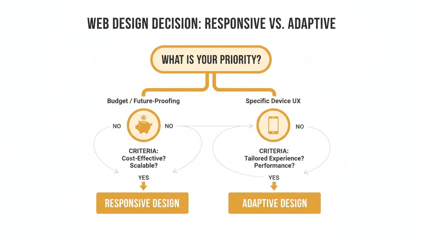
As the flowchart shows, if your focus is on keeping the budget in check and building something for the long haul, responsive design is the obvious path forward.
When to Consider an Adaptive Approach
Okay, so is there ever a time when the massive investment in adaptive design makes sense? Absolutely, but it’s a very specific, high-stakes scenario. You should only consider this route when a pixel-perfect, hyper-optimized experience on a handful of key devices is a non-negotiable competitive advantage.
Think about going adaptive only if you're a:
- Massive e-commerce platform like Amazon, where shaving a few milliseconds off load times in specific mobile shopping funnels can literally translate into millions of dollars in revenue.
- Complex web application that needs a fundamentally different interface and feature set for desktop users compared to mobile users.
In these rare situations, the budget required to build and maintain multiple, separate layouts is a calculated business decision. For everyone else, the powerful, all-in-one benefits of responsive design make it the clear and confident choice for building a successful website that’s ready for the future.
Frequently Asked Questions
Even after weighing the pros and cons, a few practical questions always seem to pop up. Let's tackle some of the most common ones to clear up any lingering confusion and help you decide which path makes sense for your website.
Can You Combine Responsive And Adaptive Techniques?
Absolutely, and honestly, it’s becoming more common. Think of it as a hybrid approach. Developers can use a responsive framework for the overall site structure—keeping things flexible and easy to manage—while plugging in adaptive elements for specific, high-impact components. For instance, a site might be fully responsive, but serve up different ad banners or highly optimized video files depending on the device it detects.
This "best of both worlds" strategy tries to balance the simple maintenance of responsive design with the targeted performance boosts of adaptive. It's definitely a more advanced technique, but when it's done right, the user experience can be phenomenal.
Is One Design Better For Ecommerce?
For the vast majority of e-commerce businesses, responsive design is the right place to start. Its single URL structure is a huge win for SEO, making sure all your product pages build up their ranking authority in one place. Plus, the lower maintenance costs and future-proof scalability are exactly what a growing online store needs.
Now, if you're a massive retailer like Amazon, an adaptive approach might be justifiable. At that kind of scale, creating hyper-optimized shopping funnels for specific mobile devices can nudge conversion rates up in a big way, making the hefty development cost a worthwhile investment. For small to mid-sized stores, though, responsive design strikes a much better balance between cost, performance, and marketing.
The real question for e-commerce isn't just about the tech; it's whether the tiny conversion gains from an adaptive layout justify the massive jump in complexity and long-term maintenance headaches.
How Do I Know If My Current Website Needs An Upgrade?
Your website is probably due for an overhaul if you're noticing any of these red flags:
- A Terrible Mobile Experience: If your visitors have to pinch, zoom, or scroll sideways on their phones, your site is frustrating them. With over 58% of all web traffic now coming from mobile devices, you can't afford to ignore this.
- A High Mobile Bounce Rate: Jump into your analytics. If people on mobile are leaving your site way faster than desktop users, that’s a loud and clear signal that the mobile experience just isn't working.
- Slow Mobile Load Times: A slow website is a conversion killer. If your site isn't built for mobile performance, you're not just losing customers—you're hurting your search engine rankings, too.
- Inconsistent Branding: Does your mobile site look and feel like a completely different company from your desktop version? That kind of disjointed experience can wear down brand trust and just plain confuse people.
If any of this sounds familiar, it's time to invest in a modern, responsive design. It’s the best way to make sure your website works for everyone, no matter how they find you.
Ready to build a powerful, future-proof website that actually drives results? The team at Up North Media specializes in creating custom responsive web applications and data-driven SEO strategies that accelerate growth. Schedule your free consultation today!