

Baymard's synthesis puts average online cart abandonment at 70.22%, so roughly seven out of every ten carts don't become completed orders, across ecommerce sites rather than Shopify stores alone (Baymard benchmark summary). That figure is useful, but it doesn't tell you whether your store has a checkout problem, a weak product page, low purchase intent, or poor-quality traffic.
That distinction matters. Shopify's published benchmark summary places global ecommerce purchase conversion at 1.4% in the first quarter of 2026 according to Statista, while Dynamic Yield reports 2.66% using data from more than 400 brands (Shopify's ecommerce conversion rate guide). Those figures aren't competing targets. They use different populations and may differ by traffic source, geography, device mix, product category, returning-customer share, and denominator.
The practical approach to Shopify conversion optimization is to diagnose the failing layer first, then test the smallest change that addresses it. Start with funnel instrumentation, isolate the source of abandonment, repair checkout and product-page friction, and only then scale experimentation.
Why Shopify Conversion Rate Is a Funnel Problem in 2026
A 0.4-point lift on 100,000 visits produces 400 additional orders. That commercial impact explains why Shopify conversion optimization starts with segmentation, not with chasing a universal benchmark.
A single purchase-conversion rate blends high-intent product searches with broad social clicks, returning customers with first-time visitors, and mobile shoppers with desktop users. Improving that blended figure can hide the underlying failure. Separate checkout friction, intent mismatch, and traffic-quality problems before choosing a test.
Define the denominator first. A session-based rate compares completed orders with visits. A visitor-based rate compares orders with individual people. User-based reporting can also vary with identity resolution, consent, and returning visits. Keep one definition across periods and experiments.
The benchmark spread remains useful as a planning reference:
| Purchase conversion rate | Orders from 100,000 visits | Change vs 1.4% baseline |
|---|---|---|
| 1.4% | 1,400 | Baseline |
| 1.8% | 1,800 | Approximately 28.6% more orders |
| 2.66% | 2,660 | Benchmark comparison, not a target |
The table shows why a modest lift on the same traffic base can matter commercially. The figures come from different populations and should frame investigation rather than set a blanket target. Shopify's benchmark context is documented in Shopify's benchmark context.
Measure each decision point separately
Track product views, add-to-cart events, checkout starts, payment attempts, and completed orders as separate stages. Strong product engagement followed by weak cart progression points to a different owner and test than payment failures after checkout begins.
Use purchase rate as the outcome, not the diagnosis. Resources covering conversion stats for listicles can clarify how conversion data is presented across content and ecommerce contexts, while your segmented funnel should set priorities.
Practical rule: Approve a sitewide CRO change only after identifying the funnel stage it should improve.
Instrumenting the Shopify Funnel Before You Test Anything
A test is only as credible as the events behind it. Before changing a button, theme section, payment option, or checkout flow, confirm that the store records the path from product discovery to payment completion without duplicating or losing events.
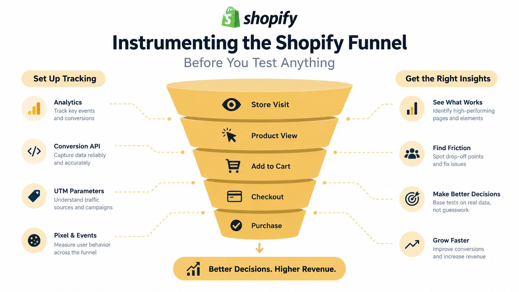
Build the event layer around five actions:
- Product view: Record product ID, variant, collection, landing page, device, and source.
- Add to cart: Capture the product, quantity, price context, and whether the action came from a product page, collection, recommendation, or quick-add component.
- Checkout started: Preserve cart value, item count, discount state, currency, and customer status.
- Payment step reached: Separate users who reach payment from users who fail earlier because of shipping, address, or form validation.
- Order completed: Use the order ID to deduplicate purchases and reconcile analytics with Shopify's order records.
Segment every event by device, traffic source, geography, product, and new versus returning customer. Those dimensions expose problems that aggregate reports conceal. If paid mobile traffic reaches product pages but rarely starts checkout, the issue may be message match or page usability. If returning desktop users convert while first-time visitors don't, the store may need stronger product education or trust information rather than a shorter form.
Shopify Analytics can provide the commercial baseline, while Google Analytics 4 can add event-level exploration and path analysis when configured correctly. Server-side or platform-native pixel events can help preserve important actions when browser restrictions or consent choices limit client-side tracking. Third-party scripts deserve their own audit because an app can slow the storefront, fire duplicate purchase events, or interfere with attribution.
Baymard's benchmark finds that 65% of ecommerce sites have mediocre-or-worse checkout UX and only 2% reach a good rating, which makes instrumentation a diagnostic baseline rather than a forecast of improvement (Baymard checkout usability research). Your developer should also document event names, parameters, firing conditions, deduplication rules, consent behavior, and the source of truth for revenue. A useful implementation reference is Up North Media's guide to analytics implementation.
Diagnosing Where Conversion Is Actually Breaking
Treat abandonment as a classification problem. The four useful categories are low intent, product-page friction, checkout friction, and traffic quality. Each category leaves a different pattern in the data.
Low intent often appears as broad browsing with limited product engagement, weak add-to-cart activity, and similar behavior across devices. Product-page friction tends to show strong product views but weak add-to-cart rates on particular products, templates, or traffic sources. Checkout friction appears later, after shoppers have demonstrated buying interest. Traffic-quality problems usually cluster around a campaign, audience, keyword group, placement, or geography.
Baymard's 2025 research provides a practical diagnostic map. It identifies unexpected costs at 48%, forced account creation at 24%, slow delivery at 22%, security concerns at 18%, and an overly complex checkout at 17% among cited abandonment triggers (Baymard's current checkout UX research). These figures tell you what to investigate, not what your store's mix must be.
Use segment comparisons instead of guesses
Run the same funnel report across cohorts:
- Device split: If mobile is materially weaker, inspect page weight, sticky elements, tap targets, address entry, and accelerated payment behavior.
- Traffic source: If paid traffic underperforms organic traffic, compare landing-page promise with ad language and search intent before changing checkout.
- Customer status: If returning customers convert but new visitors stall, examine trust, returns, delivery, reviews, and product education.
- Checkout path: Compare standard checkout with express-wallet users, and separate shipping, payment, and order-completion errors.
- Product group: A low rate concentrated in one product family may indicate price, fit, variant, availability, or merchandising friction.
Don't change the homepage, product template, cart drawer, and checkout together. That destroys causality. A structured CRO framework for SaaS offers a useful reminder to define the problem, form a hypothesis, and measure an intended outcome, even though Shopify's buying journey has different mechanics.
For a store-level review, an ecommerce conversion rate optimization audit should connect event data with recordings, customer interviews, and error logs. A simple decision rule works well: if the largest drop occurs before add-to-cart, investigate intent and product pages; if it occurs between cart and checkout, investigate cost and delivery disclosure; if it occurs inside checkout, investigate form, account, payment, and trust friction.
Auditing Product Pages for Real Friction
Product pages often lose buyers without producing an obvious error. The page loads, the variant selector works, and the add-to-cart button is visible, yet shoppers still can't answer the questions that block commitment: What exactly am I buying, when will it arrive, what happens if it doesn't work, and why should I trust this store?

Start the audit by counting decision elements rather than admiring the design. List variant selectors, quantity controls, subscription toggles, review widgets, financing messages, recommendation blocks, bundle offers, pop-ups, metafields, badges, and app-injected content. Then label each element as required, useful, distracting, or redundant.
Baymard reports that the average U.S. ecommerce checkout displays 23.48 default form elements, while usability testing indicates an effective flow can be as short as 12–14 elements. It also found that 17% of U.S. online shoppers had recently abandoned an order because checkout was too long or complicated (Baymard form and checkout UX statistics). The lesson transfers to product pages: every extra decision needs a job.
Review the purchase sequence
Above the fold, make the product, price, primary action, essential variant choices, and the clearest delivery or returns information easy to find. On mobile, check whether a shopper must scroll through lifestyle imagery, reviews, or promotional content before reaching the buying controls.
Then inspect the information hierarchy:
- Images: Show the product in context and provide enough detail to evaluate finish, scale, fit, or use.
- Copy: Lead with the buyer outcome, then support it with specifications, care instructions, compatibility, or sizing.
- Variants: Make unavailable combinations obvious and preserve the selected state as shoppers move through options.
- Delivery: State the relevant shipping expectation near the purchase decision, not only inside a policy page.
- Returns: Explain the practical terms where hesitation occurs, especially for products with fit, compatibility, or quality uncertainty.
- Apps: Remove widgets that repeat reviews, recommendations, urgency, or payment messaging without adding evidence.
Avoid fake scarcity and aggressive countdowns. They may create short-term clicks while weakening trust, especially when the core issue is unclear product information. Test one meaningful page change at a time, such as moving delivery information beside the price or simplifying variant selection, and judge it against add-to-cart rate plus completed-order conversion.
Repairing the Shopify Checkout in the Right Order
Checkout work should start with the question that blocks purchase most often: total cost, delivery confidence, or form effort. Fixing the wrong layer wastes traffic. A store with hidden shipping fees needs cost clarity before it needs another payment option, while a store with accurate costs but repeated address errors needs a form repair.
Baymard's checkout analysis and Shopify's benchmark summary measure different populations, which is why unexpected costs appear at 48% in one study and 39% in the other. The Shopify-specific summary reports that 21% of U.S. consumers who abandoned checkout cited slow delivery, 19% cited forced account creation, and 18% cited a checkout process that was too long or complicated (Shopify conversion benchmark context). Use both datasets to rank investigation, not to forecast your store.
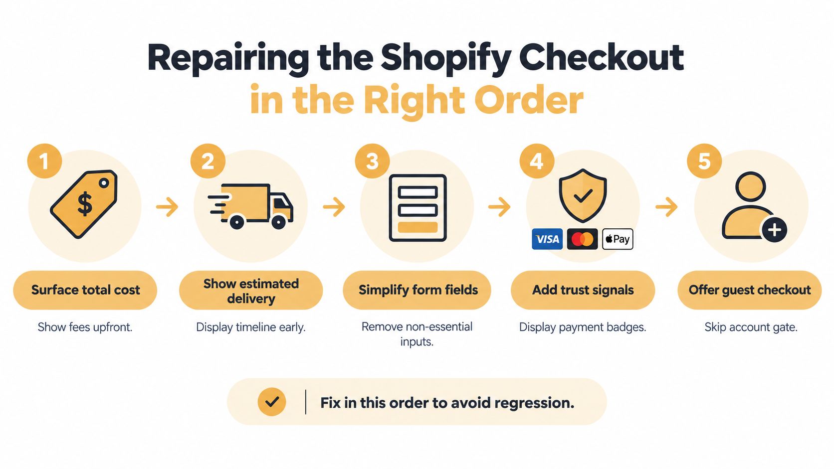
Apply repairs in this order:
- Surface total cost early. Show shipping rules, taxes where possible, fees, discounts, and currency expectations before the final payment step. If the exact total depends on an address, explain the calculation before the shopper commits time to the form.
- Set delivery expectations. Display a credible arrival range before checkout starts, then keep the wording consistent through payment and confirmation. A vague promise can create hesitation even when fulfillment is reliable.
- Reduce form effort. Tie every field to a business requirement. Remove duplicate inputs, defer optional data, and use inline validation that explains how to correct an error.
- Place trust information beside commitment. Make payment security, returns, contact access, and delivery terms easy to verify at the point where the shopper submits the order.
- Allow guest checkout. Treat account creation as a post-purchase invitation. Ask for registration after the order only when the customer can see a practical benefit.
Express options such as Shop Pay, Apple Pay, Google Pay, and other supported wallets can reduce repeated entry for eligible shoppers. Test them only after the standard path is reliable. Check accelerated buttons, discount-code behavior, address autocomplete, inventory states, tax and shipping calculations, and third-party gateways. App scripts can slow the experience or break event tracking while the visible checkout still appears correct.
Use the following matrix to choose the next test:
| Diagnostic signal | Likely root cause | First change to test |
|---|---|---|
| Cart value drops sharply before checkout | Cost uncertainty | Show shipping, tax, and fee expectations earlier |
| Checkout starts but delivery questions remain | Fulfillment uncertainty | Display estimated arrival information before checkout |
| Form errors cluster around address or phone fields | Input friction | Remove nonessential fields and improve validation |
| Standard checkout underperforms express paths | Payment or entry friction | Test supported accelerated payment options |
| New visitors abandon while returning visitors complete | Trust or intent gap | Improve delivery, returns, and payment clarity |
For implementation details, see this ecommerce checkout optimization guide. Product presentation can support confidence earlier in the funnel. Resources on ai model outfit e-commerce may help teams evaluate that layer, but better imagery cannot repair hidden checkout costs.
Running Shopify A/B Tests That Actually Decide Anything
A useful test begins with a falsifiable hypothesis, not a list of design preferences. For example: “Showing an estimated delivery range on the product page will increase checkout starts for mobile visitors arriving from paid search because delivery uncertainty is delaying commitment.” That statement identifies the audience, intervention, mechanism, and event to monitor.
Choose one primary KPI, either completed-order conversion rate or revenue per visitor. Add guardrails before launch: average order value, refund rate, checkout errors, and contribution margin. A variant that increases orders while lowering margin or increasing refunds isn't automatically a win.
Build the test before building the variant
Write down the baseline period, audience eligibility, traffic allocation, exclusion rules, attribution window, and minimum detectable effect. The test should run through several complete business cycles so weekday behavior, promotions, paydays, operational interruptions, and returning visits don't distort the result.
A strong test sequence looks like this:
- Hypothesis: Identify the diagnosed friction and expected behavior change.
- Instrumentation check: Confirm exposure, primary conversion, and guardrail events.
- Controlled exposure: Split eligible traffic consistently and prevent users from switching variants.
- Quality review: Check errors, payment failures, refunds, fulfillment issues, and tracking integrity.
- Decision: Keep, revise, or retire the change based on the predefined KPI and guardrails.
A short-term lift isn't enough. If the variant performs well during a promotion but loses its advantage afterward, the promotion may have caused the difference. If completed orders rise while contribution margin falls, the test exposed a commercial trade-off rather than a clean improvement.
Shopify's native capabilities can suit straightforward rollout and experimentation workflows. A third-party platform becomes more useful when you need complex audience rules, cross-page variants, advanced statistics, or stronger experiment governance. Neither tool fixes a weak hypothesis. The operating discipline matters more than the interface.
Test discipline: A losing experiment is valuable when it prevents the team from repeating an attractive but ineffective idea.
A 90-Day Conversion Operating Plan
A CRO program needs a cadence that turns evidence into decisions. The first month should reduce uncertainty, the second should repair the largest diagnosed friction, and the final stretch should create a repeatable testing rhythm.
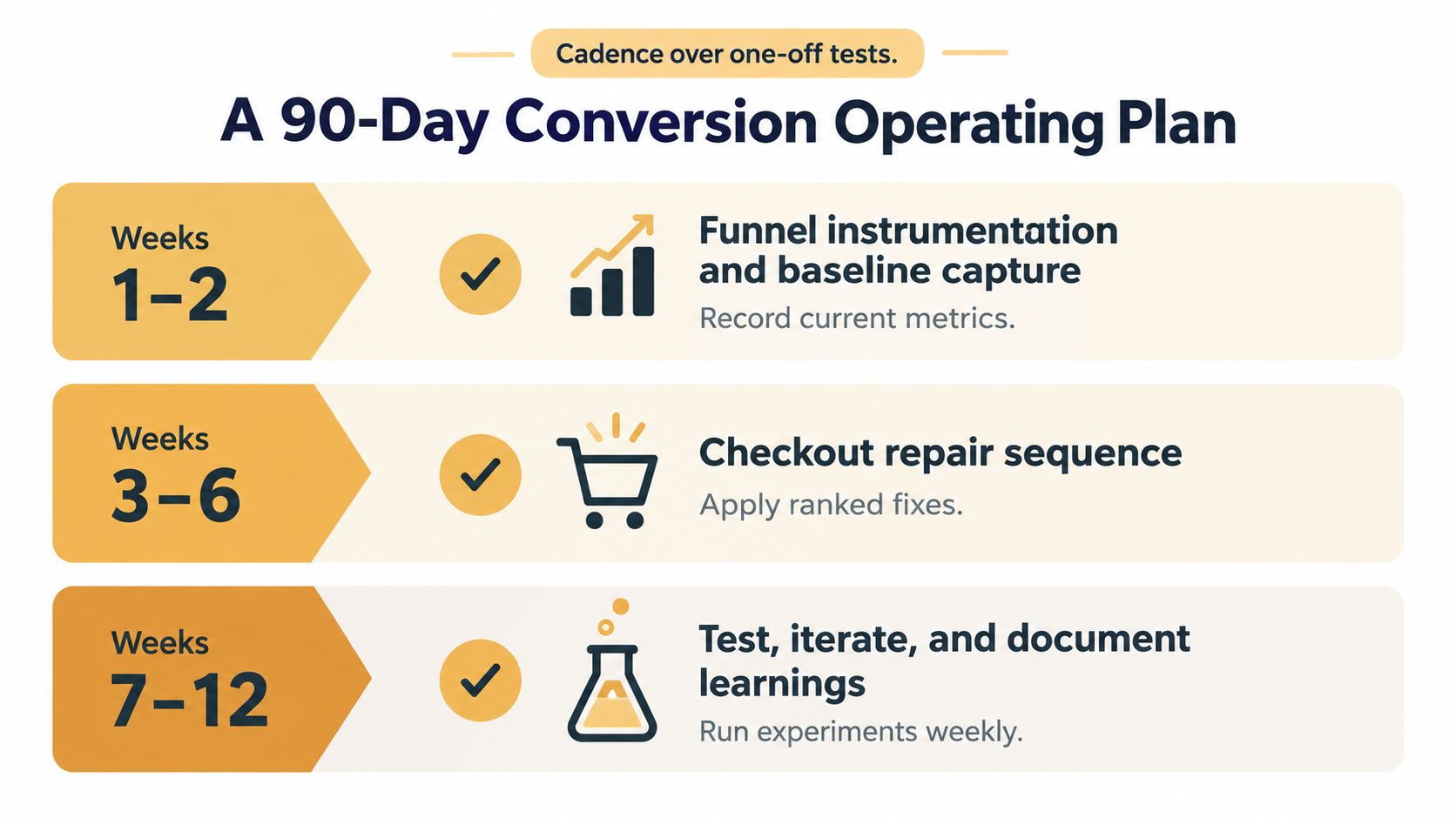
Weeks one and two
Capture the baseline before releasing redesigns. Verify product views, add-to-cart, checkout starts, payment attempts, and orders. Segment by device, source, geography, product, and customer status, then reconcile analytics revenue with Shopify orders.
Review recordings and usability sessions on the highest-volume paths. Record checkout errors, payment failures, shipping surprises, and app behavior. Assign each defect an owner and rank it by affected users, revenue impact, and implementation effort.
Weeks three through six
Apply the ranked checkout sequence. Start with total-cost and delivery clarity, then address form friction, trust information, and guest checkout according to the diagnostic signal. In parallel, audit the highest-traffic product pages for unclear variants, weak imagery, missing delivery or return information, duplicated app blocks, and slow third-party scripts.
Don't launch a broad theme rebuild unless the evidence points to a structural problem. A focused repair is easier to validate and less likely to introduce unrelated tracking, merchandising, or checkout regressions.
Weeks seven through twelve
Run controlled tests with one primary KPI and explicit guardrails. Document the hypothesis, audience, implementation, dates, result, and follow-up decision. Retire losers instead of leaving them in an ambiguous backlog, and promote winners only after checking operational and commercial effects.
Watch for stalled programs:
- Unowned backlog: Ideas accumulate without a responsible person, deadline, or evidence.
- Unstable tracking: Purchase totals, payment events, or attribution change after app releases.
- Repeated underpowered tests: Experiments end before the store can distinguish signal from normal variation.
- Flat revenue per visitor: Traffic grows, but commercial output doesn't improve.
- Channel disagreement: Paid, organic, mobile, and returning cohorts move in opposite directions while the team reports only the blended rate.
A Monday morning checklist is simple: open the segmented funnel report, identify the largest revenue-relevant drop, inspect recordings or customer feedback for that cohort, and select one testable repair. Up North Media can support Shopify-focused CRO, ecommerce web development, analytics, SEO, and AI consulting when your team needs help connecting storefront changes to measurable funnel outcomes.
Up North Media helps Shopify retailers audit product pages, checkout flows, analytics, and conversion-focused web experiences instead of applying the same CRO checklist to every store. Visit Up North Media to discuss a practical Shopify optimization plan based on your funnel data and commercial priorities.