A shopper finds your store from Instagram while standing in line for coffee. They like the product, tap through, and land on a page built for a laptop. The text is tiny. The size selector sits half off-screen. The add-to-cart button looks clickable but isn't easy to hit with a thumb.
They try anyway.
At checkout, the form fields jump around, the keyboard covers the shipping options, and one required field throws an error with no clear explanation. That customer didn't decide they disliked your product. Your site made buying harder than it should've been.
That's the core issue with responsive web design for ecommerce. It isn't about keeping up with design trends. It's about removing friction at the exact moment someone is ready to spend money, and making sure the same store feels trustworthy on a phone, a tablet, a laptop, and a large desktop monitor.
Your Customer Is on Their Phone Right Now
A buyer sees your ad during lunch, taps through, and gives you about ten seconds. That window is short, especially on mobile, where attention is split between messages, work, and whatever is happening around them.
Mobile sales usually slip away through a chain of small annoyances, not one dramatic flaw. A product page loads, but the key details sit below an oversized image. The variant selector is cramped. The sticky add-to-cart bar covers part of the content. Checkout works, but every step asks for a little more precision and patience than a thumb-driven visit can support.
Those small points of friction add up fast. They slow product discovery, weaken confidence, and push shoppers to compare prices somewhere else. In ecommerce, that means lower conversion rates, more abandoned carts, and more paid traffic wasted before it has a chance to produce revenue.
I see the same pattern in audits. Stores often invest in attractive creative and solid product positioning, then lose the sale on layout decisions that looked acceptable on a laptop preview but feel awkward on a phone.
Common problems include:
- Navigation that hides buying paths such as search, category access, and cart visibility
- Product pages that collapse poorly on smaller screens so images, descriptions, reviews, and purchase actions compete for space
- Touch targets that are too tight which leads to mis-taps on filters, swatches, dropdowns, and form fields
- Checkout flows that create avoidable effort with long forms, unclear errors, or payment options buried too late
- Trust signals placed in the wrong order so delivery details, returns information, and reviews appear after the moment of hesitation
Mobile deserves the attention it gets, but there is a second mistake brands miss. They design for the smallest screen and stop there. For B2B ecommerce and luxury purchases, large desktop monitors often drive higher average order values because buyers are comparing specs, reviewing policies, and sharing screens with colleagues. A responsive store has to scale up well too, giving those shoppers room to evaluate without making the page feel sparse or unfinished.
If you want to compare how strong responsive decisions look in practice, these responsive web design examples show the difference between layouts that resize and layouts that support buying behavior.
The commercial question is straightforward. If a customer is ready to buy on a phone, your site should make that easy. If they return later on a 27-inch monitor to place a larger order, the experience should feel just as considered.
What Is Responsive Web Design for Ecommerce
A buyer starts a quote request on a phone during a commute, reviews product details later on a laptop, then approves the purchase on a large desktop monitor back at the office. Responsive web design makes that journey feel like one store, not three different versions stitched together.
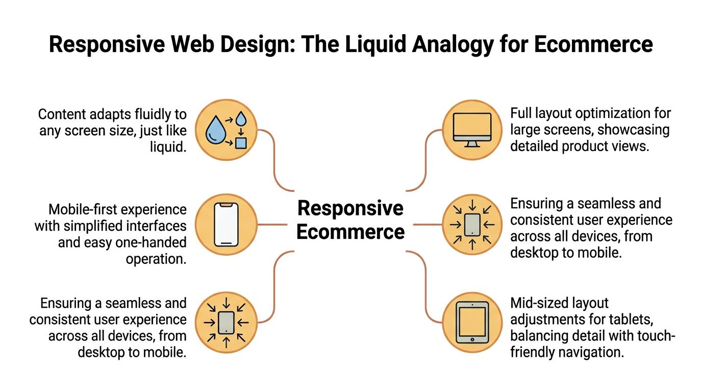
Responsive web design for ecommerce is the practice of building a single storefront that adjusts its layout, content hierarchy, and interactions to fit the screen being used. The products, pricing, and brand stay consistent. The presentation changes so shoppers can browse, compare, and buy without friction on small screens, mid-size devices, and large displays.
That differs from the older model of maintaining separate mobile and desktop experiences. Separate builds can still make sense in edge cases, but they usually add development cost, QA overhead, and content inconsistencies. One responsive codebase is easier to maintain, faster to update, and less likely to create gaps between what customers see on different devices.
The three parts that matter
At a practical level, responsive ecommerce design relies on three components:
- Flexible grids that let product cards, content blocks, and checkout elements expand, tighten, or stack based on available space
- Fluid media so images, videos, and banners resize cleanly without breaking the layout or hiding key product detail
- Media queries that apply different layout and styling rules at specific screen widths and device conditions
The important point is not the code itself. It is what the code protects. Product information stays readable. Calls to action remain visible. Forms stay usable. Those details affect conversion rates more than design teams sometimes expect.
Good responsive design also scales upward, not just downward. That matters for B2B ecommerce, technical products, and luxury retail, where buyers often make higher-value decisions on larger monitors. A well-designed desktop experience can use extra space for richer comparison tables, stronger imagery, clearer financing or delivery information, and better support for multi-step evaluation. If that space is left underused, the page can feel thin at the exact moment a customer wants reassurance.
Responsive and adaptive design solve similar problems in different ways. If you are weighing those trade-offs before a redesign, this guide to responsive design vs adaptive design gives a useful breakdown.
Practical rule: Responsive design works best when it shapes content priority and interaction patterns from the start, not after the storefront is already built.
The Business Case for a Responsive Store
A shopper finds your store on a phone during lunch, saves the product, then returns on a 27-inch monitor later that day to compare options before placing a larger order. If the mobile experience is clumsy, you lose the first visit. If the desktop experience wastes space and hides useful detail, you lose the higher-value purchase.
That is the business case in plain terms. Responsive design protects revenue across the full buying journey, not just on small screens.
Where the ROI shows up
Responsive ecommerce improves three commercial outcomes: more completed sessions, fewer drop-offs, and stronger trust at the point of purchase.
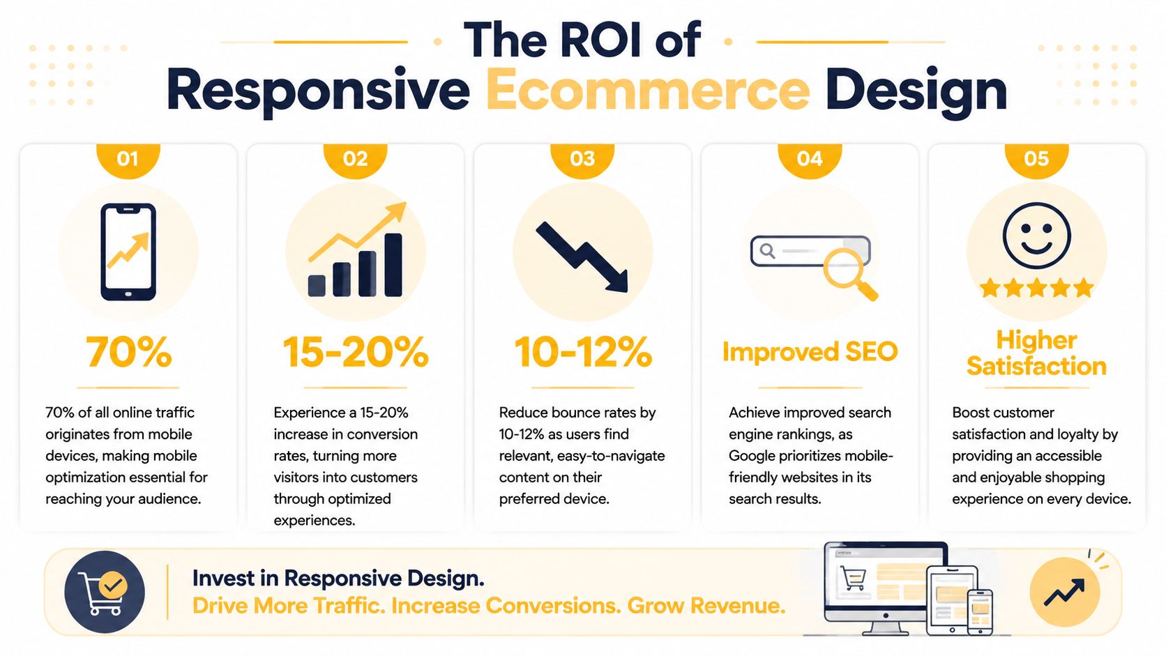
According to the business-focused statistics collected by We Are Tenet, responsive websites see higher conversion and engagement rates, and design quality has a direct effect on whether people view a business as credible. That aligns with what teams see after redesigns. Revenue usually improves because customers can move through the buying process with less friction, not because the site looks newer.
Other research points to the same conclusion from different angles. Google's Consumer Insights on mobile users found that people are less likely to buy from a brand after a poor mobile experience. Baymard Institute's checkout usability research continues to show that avoidable checkout friction is a major reason carts are abandoned. Put those together and the commercial risk is clear. A store that is hard to use on a phone loses demand early. A store that feels thin or confusing on a large desktop loses confidence later, often on higher-margin orders where buyers want more proof before they commit.
In practice, I would watch these pressure points first:
- Product discovery: weak search, cramped filters, or product grids that break at common screen sizes reduce product views and category-to-product clickthrough.
- Decision confidence: inconsistent layouts, missing specs, and awkward image behavior make the store feel less trustworthy, especially for technical, custom, or premium products.
- Checkout completion: forms, payment options, and error states that work poorly across devices create abandonment that shows up directly in revenue reports.
- Desktop upscaling: on larger monitors, extra screen space should support comparison, reassurance, and order value. If the layout just stretches, buyers get less help at the exact moment they are evaluating expensive purchases.
That last point is under-discussed.
For B2B ecommerce and luxury retail, the desktop experience often carries disproportionate revenue weight. Buyers reviewing a five-figure equipment order or a premium furniture purchase are more likely to compare specifications, shipping terms, lead times, warranties, and financing details on larger screens. A responsive strategy that only shrinks content for mobile leaves money on the table. The better approach is to scale upward with purpose, using wider layouts to present richer information without clutter.
A short explainer can help clarify what responsive decisions look like in practice:
What inaction really costs
Treating responsiveness as a cosmetic project is expensive.
When product pages, carts, or checkout forms break trust, shoppers do not separate design problems from business capability. They assume the same carelessness may show up in payment security, delivery accuracy, returns, or support. That affects conversion rate in the short term and repeat purchase rate after that.
Responsive design works like store layout in a physical showroom. If the aisles are blocked, the signage is unclear, and the premium products are poorly displayed, fewer people buy. Ecommerce has the same problem, just expressed through breakpoints, form fields, image behavior, and content hierarchy.
The useful question is not whether a responsive redesign sounds modern. The useful question is where friction is suppressing conversion, average order value, and customer trust across mobile and large-screen sessions.
Key UX Patterns for Product and Checkout Pages
The strongest responsive stores don't just shrink gracefully. They change priorities based on the device.
On a phone, the job is clarity and tap accuracy. On a large desktop monitor, the job is depth, comparison, and confidence. While the first part is frequently handled well, the second is often overlooked.
Product pages that help people decide
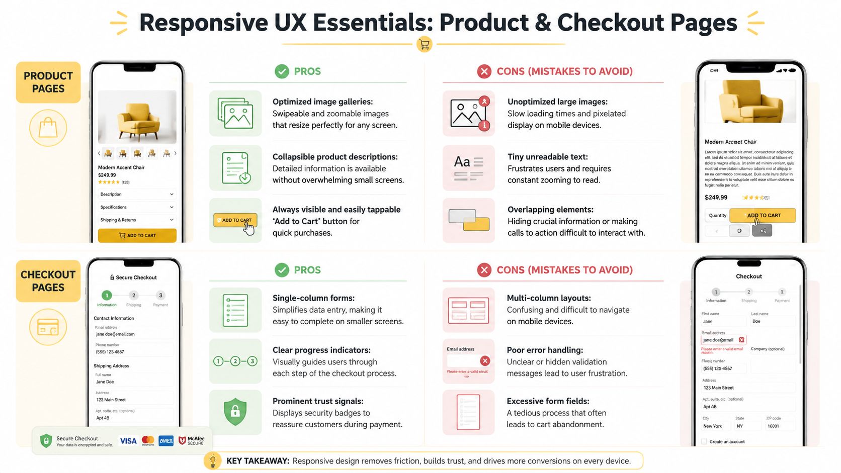
A responsive product page should answer three questions fast. What is it? Is it right for me? How do I buy it?
On mobile, that usually means a clean image gallery, obvious price and variant controls, a prominent add-to-cart button, and product details organized so they don't bury the purchase path. Accordion sections often work better than long uninterrupted text because they keep the page scannable without hiding useful information.
On desktop, especially on wide screens, many stores waste valuable real estate. They stretch the same mobile-downscaled experience across a larger canvas, which makes the page feel oddly sparse and forces unnecessary scrolling.
That's where responsive upscaling matters.
According to Smashing Magazine's research on large-screen ecommerce design, packaging the same content differently for larger viewports, including increased thumbnail sizes and prominent add-to-cart placement, increases conversion by 22%. The same source notes that 78% of responsive design articles ignore this upscaling opportunity.
For B2B ecommerce and luxury retail, that's a major miss. Larger screens let you show more context without clutter. Buyers can compare finishes, inspect product detail, review shipping information, and keep the path to purchase visible at the same time.
A practical large-screen layout often includes:
- Larger product thumbnails so visual inspection feels intentional, not cramped
- A persistent purchase panel with price, variants, and add-to-cart held in a stable position
- Supplementary detail panels for specs, shipping, returns, or bulk-order information
- Related products or bundles displayed without pushing the main CTA too far down
Checkout that removes effort
Checkout is where responsive design either earns its keep or exposes every weakness in the build.
What works on mobile is usually plain and disciplined:
| Checkout element | What works | What fails |
|---|---|---|
| Form layout | Single-column flow | Side-by-side fields that compress badly |
| Error handling | Immediate, clear, visible messages | Hidden errors after submit |
| Buttons | Large, obvious, thumb-friendly targets | Small CTAs near competing links |
| Order review | Collapsible but accessible summary | Summary hidden until late in the process |
Good checkout design also respects context. On mobile, fewer visible fields at once often helps. On desktop, especially wider screens, a persistent order summary can reduce uncertainty because shoppers don't have to jump between steps to confirm totals, shipping, or item details.
If a shopper has to stop and decode the interface during checkout, the design is doing extra work and the customer is doing too much.
The common mistake is assuming responsive means “everything stacks.” It doesn't. It means each page should use available space in a way that supports the buying decision on that specific screen.
How Responsiveness Impacts Performance and SEO
A shopper taps a product ad on their phone while standing in a store, commuting, or sitting on the sofa at 9 p.m. If the page stalls, shifts around as it loads, or buries the buying action under heavy assets, the visit is wasted before the product has a chance to sell itself. Responsive design affects that moment directly. It shapes speed, search visibility, and whether the experience feels credible enough to keep a customer engaged.
Performance starts in the layout
Performance is not a cleanup task for developers after the designs are approved. It starts with choices about image sizes, video behavior, carousels, custom fonts, third-party apps, and how much UI appears before the main content. A responsive store that adapts nicely at different widths can still underperform if every device downloads the same heavy page.
Google's documentation on Core Web Vitals metrics and thresholds is useful here because it turns technical issues into business ones. Slow largest-content rendering delays product comprehension. Layout shift causes misclicks near add-to-cart buttons. Poor input responsiveness makes filters, variant selectors, and checkout fields feel unreliable.
The commercial effect is straightforward. Faster pages usually keep more sessions alive long enough to browse, compare, and buy.
Search performance is tied to usability
Search engines reward pages that are accessible, stable, and easy to use on mobile devices. Responsive design supports that by keeping content under one URL, simplifying indexing, and reducing the friction that comes with separate mobile and desktop experiences. It also helps preserve authority signals such as links and shared content equity on a single page version.
That said, responsive design alone does not improve rankings. A heavy build can still hurt crawl efficiency and user satisfaction. A thin mobile layout can still hide useful content. A desktop layout stretched across a large monitor can still waste valuable screen space where higher-consideration purchases often happen.
That last point gets missed in a lot of ecommerce advice. Mobile drives a large share of traffic, but many B2B, wholesale, and luxury purchases are reviewed and approved on wide desktop screens. Responsive design should scale up with purpose. More space can support side-by-side comparisons, clearer specification tables, trust signals, and visible contact or quote options without forcing extra clicks.
If your team is aligning UX and organic growth, the MDS ecommerce SEO playbook is a useful reference for how technical quality connects to category visibility, product discovery, and revenue from search.
What high-performing responsive stores usually get right
The strongest builds are selective about what loads, when it loads, and what each screen needs.
- Right-sized media so phones are not forced to download oversized desktop imagery
- Clear content priority so product titles, pricing, imagery, and buying actions appear early
- Stable page rendering so buttons and fields stay where users expect them
- Template-level testing across collection pages, product pages, cart, and checkout
- Large-screen upscaling that uses extra space to improve confidence, not just add whitespace
A useful way to frame it with stakeholders is simple. Responsive design is part storefront presentation, part delivery logistics. The page still has to look right, but it also has to arrive quickly, in the right format, for the device in front of the customer. That affects both rankings and revenue.
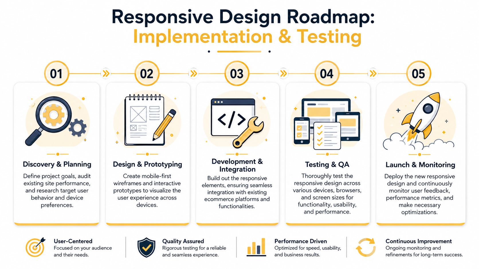
A Practical Guide to Implementation and Testing
A responsive redesign succeeds when it is planned like an ecommerce operations project. The goal is not to make pages resize nicely. The goal is to protect conversion paths on every screen where customers research, compare, and buy.
That means defining what must work first on each template. On a phone, that is usually product imagery, price, variants, delivery details, and the primary call to action. On a large desktop monitor, the job changes. Extra space should help customers compare options, review specifications, confirm trust signals, and move toward a higher-value purchase with less hesitation.
Build around content breakpoints
Breakpoints should follow content failure points, not a checklist of device sizes. If product cards become cramped, filters hide key options, or checkout fields start competing for space, the layout needs to change there.
A practical rollout usually follows this sequence:
- Audit the current store and find where shoppers slow down or drop off. Product pages, cart, and checkout usually deserve attention first.
- Design mobile first to force clear content priorities and simpler buying paths.
- Scale up intentionally for tablet, laptop, and wide desktop screens so the layout uses added space to increase clarity and confidence.
- Prototype the money pages early, including collection browsing, product detail, cart edits, and payment steps, before full development starts.
This part matters because responsive design can fail in two directions. On small screens, teams hide too little and create clutter. On large screens, they spread content too thin and leave buyers hunting for details that should be visible at a glance.
Get the technical details right
Implementation choices shape page speed, stability, and how usable a store feels in the first few seconds. Responsive image delivery through srcset, paired with CSS rules such as max-width: 100%, helps prevent mobile users from downloading desktop-sized assets. Gravitate Design's responsive web design guidance gives a good overview of that setup.
Those details affect revenue. If a product gallery shifts while someone tries to tap a thumbnail, or if checkout fields reflow mid-entry, trust drops fast.
If you are evaluating an internal team or agency partner, ask how they handle:
- Responsive image delivery for collection grids and product galleries
- Component behavior across breakpoints, not only full-page layouts
- Form validation and error states during mobile checkout
- Cross-device QA on real phones, tablets, laptops, and large monitors
Up North Media is one example of an agency that handles responsive web applications and ecommerce builds alongside SEO and technical strategy.
Test the buying journey on the devices your customers use, not just in a desktop browser narrowed to mimic a smaller screen.
Treat launch as the start
Launch is the first live test, not the final proof that the work is done.
Review session recordings, analytics, cart abandonment patterns, device-level conversion data, and support tickets after release. If phone users struggle with coupon codes, shipping selectors, or payment fields, fix those paths first. If desktop users spend time comparing products but stall before adding to cart, revisit how the larger layout presents specs, reassurance, financing, or quote options.
The strongest responsive stores improve in cycles. Teams observe behavior, adjust templates, test again, and keep refining the experience where revenue is won or lost.
Responsive Design in Action for SMBs
Responsive design shows its value fastest in the day-to-day realities of smaller ecommerce brands.
A local boutique does not need enterprise complexity. It needs a storefront that works during quick phone sessions, where someone is checking new arrivals between errands or comparing sizes while standing in line. On mobile, the job is clarity and speed. On desktop, especially on larger monitors, the opportunity shifts. Extra screen space can support richer lookbooks, fabric detail, cross-sells, and stronger visual storytelling that helps justify higher-margin purchases.
A regional parts distributor operates differently. Buyers may research products on a wide office monitor, checking specs, compatibility, and order quantities, then place a reorder later from a tablet or phone. In that setup, responsive design supports revenue by keeping the path consistent across devices. If SKU lookup is easy on desktop but frustrating in the field, customers delay the order, contact support, or buy from a competitor with a clearer interface.
For a specialty food brand, confidence often decides the sale. A phone experience should make product images, shipping details, and checkout feel clear and low-risk. A larger-screen layout should use the added room well, showing ingredient information, subscription options, bundle logic, and cart visibility without turning the page into a cluttered shelf.
The common thread is simple. Responsive web design for ecommerce should adapt to buying context, device by device, and it should scale up as deliberately as it scales down.
That second point gets missed. Many teams focus on making a desktop site fit a phone. Stronger ecommerce teams also optimize for large screens, where B2B orders, luxury purchases, and comparison-heavy buying sessions often happen. On those screens, responsive design can improve product evaluation, reduce hesitation, and increase average order value because the layout has room to support the decision.
Small and mid-sized businesses rarely need more features. They need fewer points of friction, clearer merchandising, and a store that feels credible wherever the purchase starts and wherever it finishes.
If your store looks acceptable on one device but underperforms on others, fix the system behind the templates instead of patching isolated pages. As noted earlier, Up North Media works on responsive ecommerce builds, custom web applications, and SEO strategy with a focus on tying design decisions to conversion and revenue outcomes.