
A large-scale checkout benchmark found that 65% of leading e-commerce sites deliver a mediocre or worse checkout experience, while only 2% qualify as good. That reframes conversion rate optimization for e-commerce. The biggest gains usually don't come from changing a button color or adding another badge. They come from removing the points where shoppers hesitate, get confused, or have to work harder than the purchase requires.
Effective CRO is a disciplined process of finding those friction points, ranking them against business value and implementation effort, and testing the changes that can improve revenue without destabilizing the store. The most overlooked opportunities tend to sit in three places: bloated checkout forms, device-specific product page problems, and experiments that never reach a reliable conclusion.
Why Most E-Commerce CRO Efforts Fall Short
The checkout benchmark from Baymard's e-commerce checkout usability research shows that 65% of top e-commerce sites are mediocre or worse, only 35% are decent or better, and just 2% are good. Baymard estimates that the average large e-commerce site could achieve a 35.26% conversion-rate increase by fixing the checkout issues it documented, with an average of 32 unique improvements identified per site.
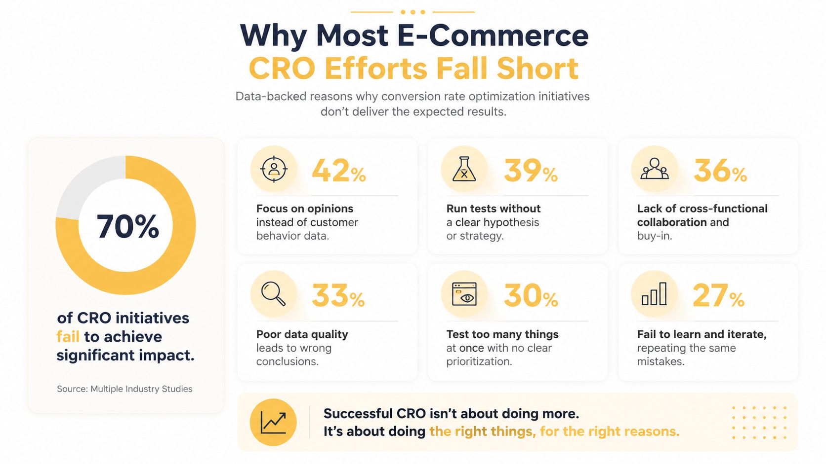
That evidence points to a structural problem. Many teams still spend their limited development capacity on visible, low-risk changes, such as button styling, promotional banners, trust badges, or generic personalization. Those changes can help when they address a known objection, but they rarely compensate for a checkout that asks for unnecessary information, hides delivery costs, or rejects valid form entries without explaining why.
A cosmetic change modifies what shoppers see. A structural fix changes what they must do.
Audit the journey, not isolated screens
A product page can look polished while sending poorly qualified shoppers into a confusing cart. A cart can work correctly while shipping costs appear too late. A checkout can have a clean design while forcing account creation before payment. CRO teams should therefore map the complete route from landing page through purchase, then identify where intent weakens.
A useful audit includes:
- Page-level behavior: Compare product views, variant selections, add-to-cart events, cart visits, checkout starts, and purchases.
- Device context: Separate mobile, tablet, and desktop behavior instead of treating all visitors as one audience.
- Traffic quality: Review paid, organic, email, referral, and direct traffic independently because each group arrives with different expectations.
- Interaction evidence: Use recordings, heatmaps, form analytics, and customer feedback to understand why visitors abandon a step.
- Commercial impact: Evaluate revenue per visitor and completed purchases, not only clicks or engagement.
Teams with smaller budgets can also use practical guidance such as CRO strategies for small businesses to structure an audit before investing in a large testing program. The principle is simple, fix the highest-friction step first, then validate the change with controlled testing.
Practical rule: Prioritization beats volume. One well-supported checkout fix is more valuable than a backlog of attractive but weakly connected UI ideas.
The e-commerce conversion rate benchmarks guide can help teams establish comparison points, but benchmarks shouldn't replace diagnosis. A store's real opportunity comes from the mismatch between customer intent and the experience the site delivers. If shoppers repeatedly struggle with form validation or can't find essential product information on mobile, a benchmark alone won't tell you which fix deserves development time.
Conducting a Conversion Funnel Audit
A reliable audit starts with a question most dashboards can't answer: where does shopper intent turn into friction? Begin by defining the primary conversion as a completed purchase, then add supporting events such as product engagement, variant selection, add-to-cart, cart review, checkout start, payment submission, and purchase completion.
Establish clean measurement first
Event names should describe business actions consistently across the store. Don't let one platform call an event begin_checkout while another treats the same action as a page view. Confirm that events fire once, carry the correct product and order details, and persist across the transition from storefront to checkout or payment provider.
Your baseline should include:
- Purchase completion, the primary outcome.
- Add-to-cart behavior, which isolates product page and offer quality.
- Checkout progression, which exposes abandonment by step.
- Revenue per visitor, which captures the commercial value of both conversion rate and order value.
- Error events, especially payment, address, coupon, shipping, and inventory errors.
Server-side measurement can reduce gaps created by browser restrictions and blocked scripts. The server-side tracking explanation is useful when an analytics audit shows inconsistent totals across platforms. Better tracking won't improve conversion by itself, but it prevents teams from testing against unreliable evidence.
Segment before interpreting
An overall funnel can hide a device-specific failure. Compare the same step across mobile and desktop, then examine traffic source, new versus returning visitors, geography, browser, and product category. A checkout that performs acceptably overall may still fail for mobile visitors because a keyboard covers the form button, a payment option isn't available, or address validation behaves differently on a smaller screen.
Session recordings add the missing explanation. Look for repeated backtracking, rage clicks, stalled form completion, taps on elements that don't respond, and visitors opening shipping or returns information immediately before leaving. Heatmaps can reveal ignored calls to action, but recordings show the sequence that produced the hesitation.
Turn observations into a ranked backlog
Don't write vague tasks such as “improve checkout UX.” Record the specific behavior, the affected audience, the likely cause, the proposed change, and the measurement plan.
| Opportunity | Evidence to collect | First action |
|---|---|---|
| Form validation failure | Repeated corrections, error events, abandoned fields | Rewrite the message and validate inline |
| Unclear checkout progress | Backtracking or exits between steps | Show the current stage and remaining work |
| Forced account creation | Account prompt followed by abandonment | Offer guest checkout before registration |
| Unexpected cost | Exit after shipping or tax appears | Surface the full estimate earlier |
| Variant confusion | Repeated taps or returns to selectors | Make availability and selected options persistent |
Rank each opportunity by potential impact, evidence strength, and delivery effort. High-intent pages deserve attention before low-intent pages, and repeated behavioral evidence should outweigh a stakeholder's personal preference. The result should be a short queue of testable hypotheses, not a redesign brief with no measurable endpoint.
Designing A/B Tests That Actually Win
The uncomfortable truth about experimentation is that most tests don't produce a statistically significant winner. Independent benchmark data covering 1,055 audited tests found that only 36.3% of e-commerce A/B tests produce a statistically significant winner. Among decisive outcomes, 62.1% are wins, and winning tests deliver a median +2.77% revenue-per-visitor uplift, with the top quartile reaching +5.21% or more. These figures come from the independent A/B testing benchmark.
That isn't a reason to abandon testing. It's a reason to stop treating every experiment as a guaranteed improvement. A mature program expects inconclusive outcomes and uses them to improve the next hypothesis.
Choose the metric before the variant
A test should have one primary commercial outcome. Revenue per visitor is often more informative than click-through rate because a prominent button can generate more clicks without creating more orders or revenue. Secondary metrics can diagnose the mechanism, but they shouldn't replace the business result.
A strong hypothesis connects an observed problem to a specific intervention:
Because mobile shoppers struggle to compare variants, keeping the selected option visible near the purchase control should reduce uncertainty and increase revenue per visitor without increasing returns.
That statement gives the team something concrete to implement and a reason to inspect downstream effects. It also prevents the common mistake of testing a collection of unrelated changes and then guessing which one caused the result.
Power the test and protect the conclusion
Before launch, estimate whether the page receives enough conversions to support a meaningful decision. The benchmark's e-commerce dataset reports a median control conversion rate of 4.7% across 567 e-commerce tests, but that number is a reference point, not a target for every store or product category. Your own baseline, traffic allocation, margin, seasonality, and minimum worthwhile effect should determine the design.
Set the duration and stopping rules in advance. Don't stop because a dashboard briefly shows a winner, and don't extend a test indefinitely because the result is inconvenient. Watch for campaign traffic, product availability changes, tracking failures, and device-level divergence. A result that wins overall but loses consistently on mobile deserves investigation before rollout.
The benchmark indicates that a mature team should expect roughly 14 A/B tests per year as a median operational cadence, not a test launched every day. Build a pipeline with a mix of low-effort diagnostic tests and larger strategic changes, but reserve engineering time for analysis and implementation of validated winners.
The A/B testing guide can help teams align test structure with measurement discipline. The goal isn't to produce more experiment reports. It's to make fewer, better-supported decisions that improve commercial performance.
Product Page and UX Improvements That Drive Revenue
Product detail pages fail for different reasons on different devices. Desktop shoppers can compare specifications beside imagery, move between tabs, and scan several information blocks at once. Mobile shoppers often encounter a long vertical sequence, small selectors, delayed media, and a purchase control that disappears while they evaluate the product.
Recent coverage identifies mobile-first PDP redesigns associated with conversion lifts of 14% to 22%, while also reporting an 8.4% conversion increase per 0.1 seconds saved for page-speed changes. Those claims appear in recent CRO trend coverage, but the practical lesson is more useful than treating either figure as a universal forecast: test the device-specific bottleneck instead of applying a generic mobile checklist.
Start with the purchase decision
On a mobile product page, the first screen should answer the questions that block action. What is the product, what does it cost, is it available, when will it arrive, and what option is selected? Push secondary editorial content lower if it delays those answers.
A better mobile hierarchy often includes:
- Clear product identity: Keep the title, price, rating context, and key differentiator close together.
- Touch-friendly variant selection: Make size, color, or configuration states obvious, and preserve the selected state while shoppers scroll.
- Accessible guidance: Link the size guide or compatibility information beside the relevant selector, not buried below reviews.
- Persistent purchase access: Use a sticky add-to-cart control only when it doesn't obscure essential content or create accidental taps.
- Useful media: Allow tap-to-zoom, show the product in context, and ensure images don't delay the first meaningful interaction.
Test the friction you can observe
A gallery that receives repeated taps but no zoom needs an interaction fix. A size selector that causes users to return to the description needs clearer guidance. A product page with strong add-to-cart activity but weak checkout completion probably doesn't need more persuasive copy. It needs the downstream audit described earlier.
Page speed deserves the same discipline. Compressing media, delaying nonessential scripts, and reducing layout shifts can help, but teams shouldn't make speed work a vague technical project. Identify the slowest template, connect the performance issue to a measurable funnel step, and validate whether the change improves completed purchases rather than only a laboratory score.
For merchants with limited development capacity, prioritize changes that affect the buying decision and can be isolated cleanly. A clearer variant selector may be more valuable than a full visual redesign. A visible size guide may outperform a new recommendation carousel. The right sequence depends on observed behavior, product complexity, and the device where the loss occurs.
Checkout Optimization Beyond Payment Options
Adding payment methods can help, but it cannot compensate for checkout friction elsewhere. A 2025 benchmark summary reports global checkout conversion around 52% and abandonment around 68%, with 28% of abandonment tied to cost and 18% tied to complexity. The checkout conversion benchmark coverage reports these figures and highlights a common prioritization error: merchants add another payment option before addressing pricing surprises, field overload, or form errors.

Remove work without removing necessary information
Baymard's benchmark research identifies 12 to 14 form elements as a possible ideal checkout range, while the average U.S. checkout contains 23.48 default form elements. That gap suggests many stores can reduce default fields by 20% to 60%, provided they retain information required for payment, delivery, fraud controls, and legal compliance.
Audit each field by asking who uses the data and at what stage. Remove fields that do not support fulfillment or customer communication, combine related inputs where appropriate, use address autocomplete, and add inline validation that explains how to fix an error. Keep required information visible through clear labels, and preserve entered data after a mistake.
Guest checkout should be easy to find, not treated as an afterthought. Offer account creation after order confirmation, when customers have a reason to save details and track delivery. A progress indicator should show the current step, what remains, and whether shoppers can review or change information without losing progress.
Expose the full cost earlier
Show shipping charges, taxes, delivery timing, returns, and available discounts before the final payment action whenever the store can calculate them. “Free shipping” language that changes after an address is entered damages trust, even when the final price is legitimate. Clear estimates reduce the gap between the product-page promise and the amount charged.
Short checkout tests often fail to produce a clear winner, so prioritize friction that appears consistently across sessions and devices. A mobile address form may create more loss than a desktop payment choice, while a country-specific delivery charge may affect only one market. Segment the audit before assigning development time.
Payment options still deserve a device and market review. Offer methods customers use, make eligibility clear, and test placement. A payment icon row will not repair a broken address form, and a wallet button will not explain an unexpected delivery charge.
Use the following video as a visual reference for evaluating checkout friction and interaction patterns.
Building Your CRO Implementation Roadmap
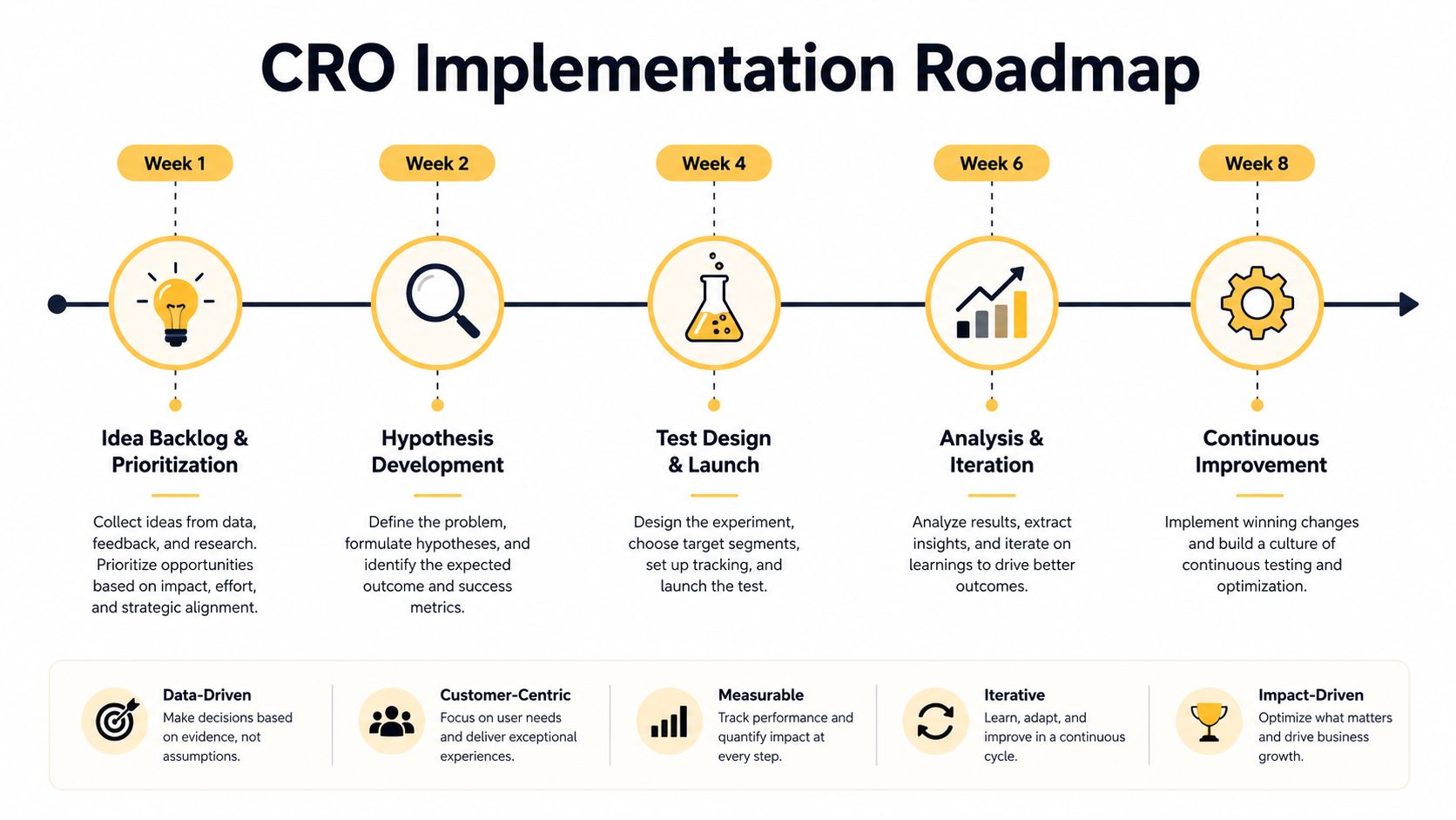
A workable CRO roadmap connects evidence to delivery. Start with the audit backlog, score each issue for likely commercial value, confidence in the diagnosis, and engineering effort, then select work that the team can ship and measure without interrupting core operations.
Use a staged operating plan
Weeks one and two should focus on instrumentation, funnel definitions, device segmentation, recordings, and a ranked backlog. Fix tracking defects before interpreting behavioral patterns.
Weeks three and four can address obvious implementation issues, such as broken mobile interactions, unclear error messages, missing cost information, or unnecessary fields. These fixes don't always need an A/B test when the existing experience is demonstrably defective, but they should still be monitored against revenue outcomes.
Weeks five through eight should run controlled experiments on the highest-value hypotheses. Keep a decision log containing the problem, hypothesis, primary metric, audience, launch date, stopping rule, result, and rollout decision. That record prevents the team from repeating failed ideas and helps stakeholders understand why an inconclusive test still produced useful information.
Tools can be assembled according to need. Google Analytics can support baseline funnel reporting, Microsoft Clarity can provide qualitative recordings and heatmaps, and dedicated experimentation platforms can manage variant allocation and analysis. Up North Media offers conversion-focused web design, custom e-commerce development, SEO marketing, and CRO support that includes A/B testing and website optimization, making it an option for teams that need implementation and measurement work coordinated.
Measure completed purchases, revenue per visitor, average order value, checkout completion, and error rates. Report results in commercial language, and separate a shipped fix from a proven winner. A sustainable program doesn't promise that every test will lift conversion. It creates a repeatable way to find friction, learn quickly, and invest development time where shoppers are most likely to benefit.
Visit Up North Media to discuss a conversion-focused e-commerce audit, targeted web application improvements, or a testing roadmap built around your store's actual funnel data. Their team can help connect product page UX, checkout performance, analytics, and development into a practical CRO program.