

A polished storefront can still lose the sale before a shopper reaches the payment screen. Baymard Institute's long-running research places average cart abandonment at about 70.19% to 70.22%, meaning roughly 7 in 10 shoppers who add items to a cart don't complete the purchase (Baymard's ecommerce UX statistics). The problem usually isn't one dramatic design flaw. It's a chain of small obstacles, unclear product information, slow pages, confusing navigation, weak trust signals, awkward mobile controls, and a checkout that asks for too much.
The ten ecommerce user experience best practices below follow the customer journey from first interaction to post-purchase support. Each recommendation connects a practical improvement to business impact, identifies whether it's a quick win or a longer-term investment, and suggests metrics worth monitoring. The roadmap works for a small retailer with a focused catalog, a growing mid-sized store, or a service business that sells appointments, subscriptions, or digital products online.
Start with the fixes closest to revenue, then invest in discovery, relevance, content, and service as your data shows where customers struggle.
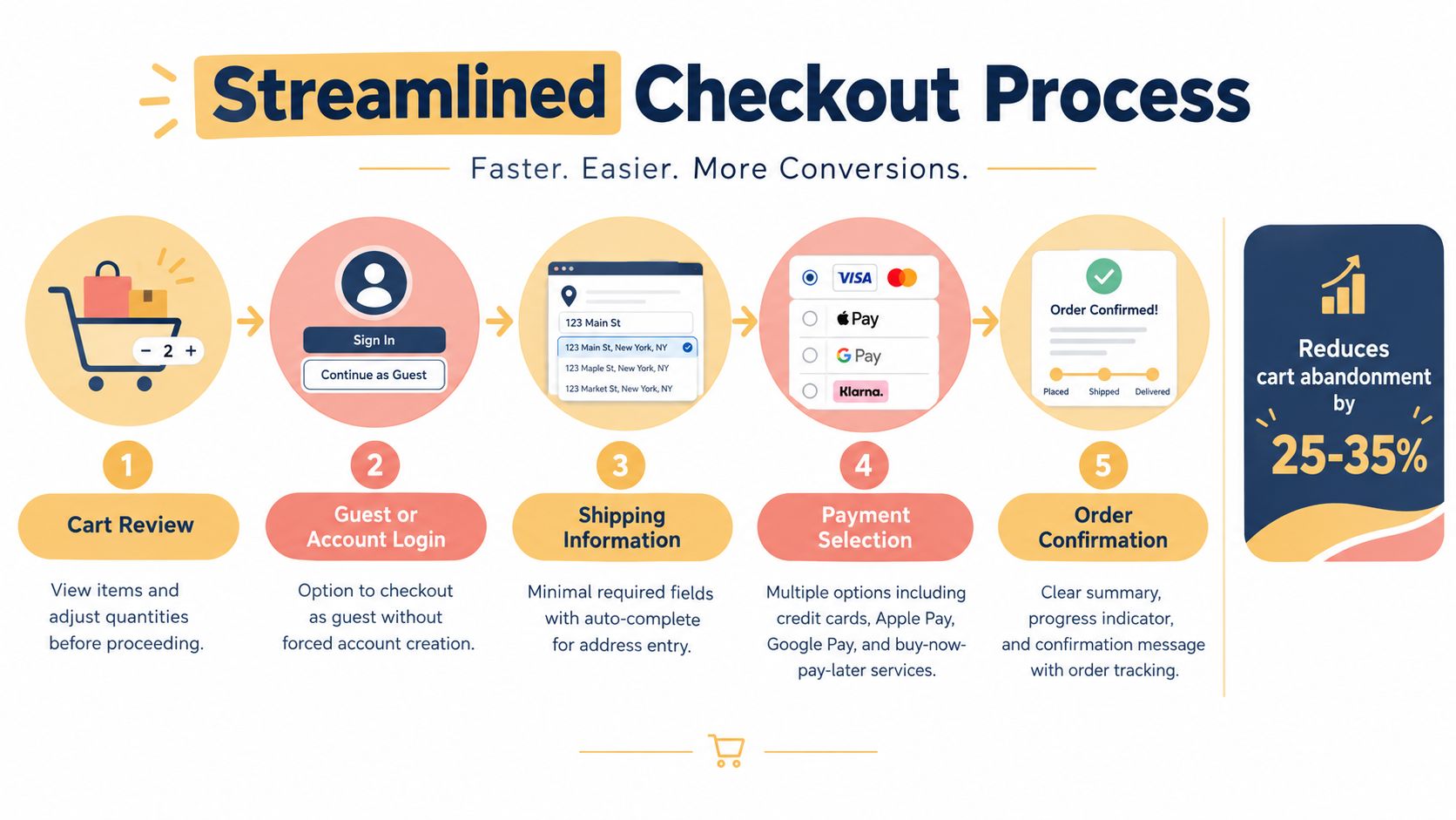
1. Simplified Checkout Process
Checkout should preserve purchase intent rather than introduce a second task. Baymard's research indicates that fixing checkout usability alone can lift conversion by 35.26% for a large ecommerce site, while 17% of U.S. online shoppers reported abandoning an order because checkout was too long or complicated (Baymard's UX statistics). Smaller retailers should treat those findings as a direction, not a promise. Catalog complexity, audience, traffic quality, and fulfillment rules all affect the result.
Remove anything that does not help customers submit an accurate order. Offer guest checkout, limit required fields, add address autocomplete, and show the total cost, delivery timing, and return policy before payment. A progress indicator can clarify a multi-step flow. For simple orders, a compact single-page layout may reduce movement between screens. Test both where practical, then review hesitation, errors, and exits with real customer sessions.
For a local apparel retailer, a sensible first release might include:
- Guest purchasing: Allow payment without forcing account creation.
- Clear field labels: Identify required and optional inputs explicitly.
- Address assistance: Add autocomplete and keyboard layouts suited to mobile entry.
- Payment reassurance: Put relevant security and payment indicators beside payment fields.
- Abandonment tracking: Record exits by step, field error, device, and payment method.
These are quick wins when the commerce platform supports them. Custom checkout logic, saved profiles, unusual fulfillment rules, and broad experimentation require longer-term development. Use checkout process optimization guidance to structure the audit. Track checkout-start-to-purchase completion, form-error frequency, guest versus account completion, and cart abandonment. Review the metrics by device and payment method so a strong overall rate does not hide a weak customer segment.
2. Mobile-First Responsive Design
Mobile deserves design priority because shoppers often discover, compare, and buy from a phone. Industry benchmark data cited for 2026 indicates that mobile can account for roughly 84% of ecommerce sessions, while mobile conversion rates are often about 1.2% to 2.87%, compared with 1.9% to 4.51% on desktop (the cited mobile ecommerce benchmark). Another benchmark cited by the same source places mobile at about 66% of global ecommerce revenue in 2026, while mobile conversion performance remains roughly half that of desktop. These figures make mobile usability a commercial priority, not a visual afterthought.
Design the narrowest practical experience first. Use flexible layouts with CSS Grid or Flexbox, responsive images through srcset, lazy loading for below-the-fold media, and touch targets that are easy to activate without precision tapping. Test on actual phones and real network conditions. A browser emulator won't reveal every issue caused by thumb reach, virtual keyboards, sticky bars, or interrupted connections.
Quick wins and deeper investments
A quick win might be removing an intrusive mobile popup, improving tap spacing, or making the cart button persistent without covering content. A larger project could involve rebuilding a theme, changing navigation architecture, or creating a mobile-specific product comparison flow. Keep the trade-off clear. A heavily customized mobile interface can improve task completion, but it also increases maintenance and testing costs.
Monitor mobile product-page engagement, add-to-cart activity, checkout completion, error rates, and performance by device type. For implementation detail, see responsive web design for ecommerce. The best design is the one that helps people browse comfortably with one hand, understand the offer quickly, and complete the purchase without fighting the interface.
3. High-Quality Product Imagery and Video
Online shoppers can't hold a product, inspect its finish, or judge its scale in person. Product media must compensate for that missing physical interaction. Use a consistent primary image, then add views that answer practical questions, such as how the item looks from the side, how it closes, how thick it is, or how it fits in a real setting.
For a handbag retailer, a useful gallery might include a neutral-background image, a lifestyle photograph, close-ups of the hardware and stitching, an interior view, and a person carrying the bag. Keep the visual system consistent across the catalog so customers can compare products without relearning the page. Add descriptive alt text, enable zoom where detail affects the purchase decision, and invite customers to submit photographs with reviews.

A short demonstration video can show movement, fit, setup, or use more effectively than a gallery alone. Keep the opening focused on the product and provide captions or an equivalent text explanation. Don't autoplay a large video with sound, especially on mobile. Media should increase confidence without slowing the page.
Practical rule: Every image should answer a customer question, not merely decorate the product page.
Compress files without visibly damaging quality, deliver appropriate dimensions, and test the gallery on slower connections. A small retailer can begin by standardizing photography and rewriting alt text. A larger catalog may need a media pipeline, automated transformations, and structured content governance. Use web image optimization guidance, then track gallery interaction, video plays, product-page exits, returns linked to fit or appearance, and conversion differences between products with complete media and products with minimal media.
4. Trust Signals and Security Indicators
Customers need a reason to believe that the business will deliver the product, protect their information, and resolve problems if something goes wrong. Trust isn't created by placing every available badge on the page. It comes from matching the right reassurance to the customer's concern.
Show recognizable payment marks near payment choices, explain returns in plain language, and place contact options where shoppers make high-risk decisions. Product reviews should be easy to find and connected to the item being evaluated. If your store has testimonials, use verifiable context such as the customer's name or business, with permission. Respond to negative feedback professionally. A defensive reply can undermine more trust than the original complaint.
Match reassurance to the buying moment
On a product page, customers may want evidence that the item is genuine, durable, or suitable for their use. Near checkout, they may care more about payment security, delivery timing, refund conditions, and customer service access. A small retailer selling specialty equipment could place a warranty summary beside the purchase button, then repeat the return and support details during checkout.
Trust indicators should support, not distract from, the transaction. Avoid unexplained third-party logos, exaggerated guarantees, or reviews that lack useful detail. Keep privacy policies, terms, shipping information, and business credentials accessible from the footer and relevant page areas.
Track product-page interaction with reviews, returns, support questions about delivery or refunds, checkout exits near policy content, and payment failure recovery. These signals show whether customers are finding reassurance at the moment they need it. A badge alone rarely fixes a credibility problem. Clear policies, accurate expectations, and visible human support do more.
5. Intelligent Search and Filtering
Search is the fastest route for shoppers who know what they want, while filtering supports people who need to compare options. Both fail when the catalog's language doesn't match the customer's language. A shopper may search for “waterproof commuter backpack” while the product data uses “weather-resistant urban pack.” Your search system needs enough structure to connect those expressions.
Start with autocomplete, typo tolerance, useful “did you mean” suggestions, and product results that reflect inventory. Record zero-result searches and review them regularly. They can reveal missing products, inconsistent naming, unavailable stock, or descriptions that need new synonyms. For a furniture store, filters might include dimensions, material, room, assembly requirements, and delivery method. Show result counts where they help customers understand the effect of a selection.
Mobile filtering needs particular care. Keep filter access visible, use plain-language labels, make selected filters easy to review and remove, and avoid forcing shoppers through a deep overlay with no sense of what changed. Multi-select can help comparison-heavy shoppers, but too many facets at once can create decision fatigue.
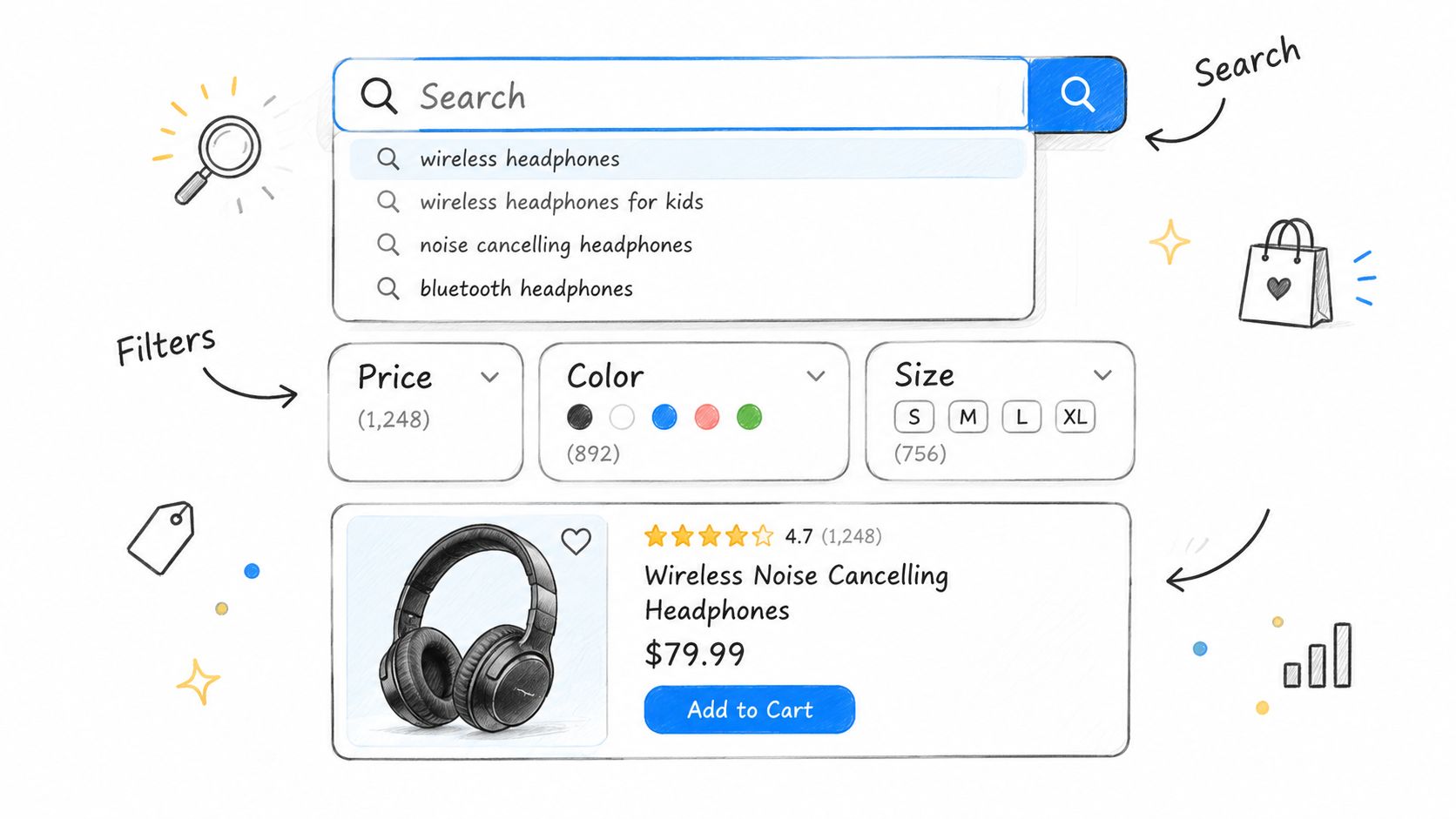
A basic implementation is a quick win on a platform with built-in search analytics. Natural-language processing, merchandising rules, personalized ranking, and catalog-wide attribute cleanup are longer-term investments. Measure search usage, zero-result queries, search exits, filter application, product discovery from category pages, and conversion after search. Don't judge search by clicks alone. A result that receives clicks but leads to quick exits may be relevant in wording but poor in product fit.
6. Personalization and Recommendations
Personalization works best when it removes effort rather than showing off the technology. A small specialty retailer can begin with “recently viewed,” “frequently bought together,” or related products based on shared attributes. Those rules are often easier to explain and maintain than a complex model trained on limited behavioral data.
A larger catalog may benefit from recommendations based on browsing behavior, purchase history, product metadata, and customer segments. The placement matters as much as the algorithm. Recommendations on a product page can support comparison, while recommendations in the cart can increase basket relevance. Recommendations after purchase can help replenishment, but poorly timed offers can make the customer feel that the store is pushing rather than helping.
Be transparent about data use and comply with applicable privacy requirements. Explain recommendations in plain language where appropriate, such as “Because you viewed hiking boots” or “Pairs well with this item.” Give customers control over marketing preferences, and don't treat every visitor as if they have enough history for individualized predictions.
Start with a measurable experiment
Test one recommendation module against a relevant baseline. Monitor impressions, clicks, add-to-cart activity, purchases, revenue contribution, and whether recommendations increase or reduce interaction with the primary product. A clothing retailer could test fit-first matching by connecting shoppers to styles that share size, cut, or use-case attributes, using ClothME's fit-first product matching as a relevant example of that direction.
Personalization is a longer-term investment when it requires clean event tracking, consent management, a reliable product taxonomy, and model evaluation. Don't add AI before fixing inaccurate inventory, weak descriptions, or broken category relationships. A more advanced system can only personalize the choices your underlying data represents correctly.
7. Clear Product Information and Descriptions
Strong product copy answers the questions that stop customers from buying. Include dimensions, materials, compatibility, care instructions, included components, use cases, shipping details, and limitations. Organize the information so a quick scanner can find the answer without reading a dense block of marketing language.
Write for the customer's knowledge level. A technical buyer may need specifications and compatibility details, while a first-time buyer may need a short explanation of what those specifications mean in practice. A power-tool retailer could pair “18V brushless motor” with a practical explanation of the jobs the tool supports, the battery requirements, and what comes in the box.
Use benefits and facts together. “Lightweight” is a claim that needs context. “Folds into a carry bag for commuting” gives the shopper a use case. Include measurements in the units your audience expects, identify model differences clearly, and link to assembly or care instructions when they affect ownership.
- Lead with decision-critical facts: Put fit, dimensions, compatibility, and availability where customers can see them.
- Use scannable structure: Combine short paragraphs, bullets, comparison content, and expandable detail.
- Reflect customer questions: Update copy when reviews and support conversations reveal recurring confusion.
- Support search discovery: Use natural primary and related terms without repeating keywords unnaturally.
- Add structured data carefully: Mark up product information accurately so search engines can interpret the page.
This is usually a quick-to-medium content project. A full catalog rewrite becomes a longer investment when product data is inconsistent across suppliers or systems. Track returns associated with misunderstanding, product-page support contacts, internal search queries, review questions, and conversion by page-content completeness. Clear information can reduce uncertainty before it becomes a support ticket or a refund request.
8. Fast Page Load Speed and Performance
A slow page interrupts intent. Customers may abandon a product page before the gallery appears, lose their cart after a delayed interaction, or avoid returning to a store that feels unreliable. Performance problems often come from several sources at once, including oversized images, third-party scripts, unused code, slow APIs, and inefficient data queries.
Begin with a technical audit using tools such as Google PageSpeed Insights, Lighthouse, and WebPageTest. Test representative pages, not just the homepage. A product page with reviews, personalization, video, variant selection, and inventory calls may behave very differently from a static landing page.
Prioritize the largest sources of delay
Compress and resize images, serve them in appropriate formats, lazy-load content that isn't immediately visible, and review every script added by an app or marketing vendor. Browser caching and a content delivery network can help repeat visitors and geographically distributed audiences. Server-side rendering may improve the initial experience for some dynamic stores, but it introduces architectural complexity and should follow a clear performance diagnosis.
Test on actual mobile connections and devices. Don't optimize only for a developer laptop or a high-speed office network. Monitor Core Web Vitals and connect changes to business metrics, including mobile engagement, product-page exits, add-to-cart activity, checkout completion, and support contacts about pages not working.
Performance work often produces quick wins through media and script cleanup. Platform migration, rendering changes, API redesign, and database optimization are longer-term investments. The trade-off is straightforward: aggressive optimization can reduce visual richness or marketing flexibility, so protect the content that helps customers decide while removing delay that contributes nothing to the purchase.
9. Frictionless Payment Options
Payment flexibility matters because customers have different preferences, devices, financial arrangements, and levels of trust. A store that accepts only one method may create a final obstacle even after the shopper has chosen the product, understood the delivery terms, and reached checkout.
Offer the payment methods your customers use. Credit and debit cards remain important, while digital wallets can reduce typing on mobile. PayPal and other recognizable options may reassure customers who don't want to enter card details directly. Installment products can support certain audiences, but they also add legal, operational, and customer-support considerations. Don't add every available method without understanding fees, settlement timing, dispute handling, eligibility, and the customer experience after payment.
Display accepted methods before the last step so customers aren't surprised. Keep the billing descriptor clear, explain any payment-specific terms, and test every path on mobile. Monitor authorization failures separately from customer abandonment. A payment failure caused by a processor response needs a different fix from a customer who deliberately chooses another method.
Improve recovery, not just acceptance
Save payment details only through secure, compliant provider tools, and give returning customers a clear way to manage saved methods. When a transaction fails, show an actionable message and preserve the cart and entered information where safe. A customer shouldn't have to reconstruct the order because a bank declined one attempt.
For a small retailer, adding a digital wallet and improving error messaging may be a quick win. Multi-provider routing, localized methods, subscriptions, fraud controls, and installment integration are longer-term work. Track payment success by method and device, failed transactions, retries, support contacts, and completion after a failed attempt. The right payment mix is the one that improves access without creating avoidable operational risk.
10. Responsive Customer Support and Communication
Support is part of the shopping experience, especially when customers have questions that product pages can't answer. Make contact options easy to find on product pages, in the cart, and after purchase. A customer choosing between two sizes may need a quick answer before buying, while a customer with a delivery issue needs a reliable path to resolution.
Use channels according to your capacity. Live chat can work during peak shopping hours, email can handle detailed questions, and phone support may be important for high-consideration or high-value purchases. A chatbot can triage common requests, but it shouldn't trap customers in a loop or pretend to solve a problem it can't access. State response expectations clearly and give customers a route to a human.
A small retailer can start with a well-maintained FAQ, visible email contact, saved replies, and ownership for unanswered questions. A growing store may need help-desk software, order-history integration, social listening, and routing by issue type. Train support staff to solve problems within defined limits. An attempted upsell during a complaint can damage trust, even if the recommendation is relevant.
Support conversations are product research. Repeated questions usually point to a missing explanation, a confusing policy, or a process that needs redesign.
Review conversations for recurring patterns and feed them back into product descriptions, filters, shipping content, and checkout. Measure response time, first-contact resolution, satisfaction, unanswered contacts, refund requests, and sales assisted by support. For a service business, also track inquiry-to-booking completion and missed-lead recovery. Responsive communication doesn't replace good UX, but it gives customers a safety net when the interface can't answer their question.
Top 10 E-commerce UX Best Practices Comparison
| Item | Implementation Complexity 🔄 | Resource Requirements ⚡ | Expected Outcomes 📊 | Ideal Use Cases 💡 | Key Advantages ⭐ |
|---|---|---|---|---|---|
| Streamlined Checkout Process | Medium, frontend + backend adjustments, A/B testing | Medium, payments, UX dev, analytics | Reduces cart abandonment 25–35%; higher conversion | High-traffic retail sites; mobile-first stores | Faster checkouts, higher conversions, lower support |
| Mobile-First Responsive Design | Medium-High, redesign and testing across breakpoints | Medium, design, QA, performance work | Improved SEO (mobile indexing), higher mobile conversions | Sites with majority mobile traffic; SEO-focused stores | Better mobile UX, lower bounce, broader reach |
| High-Quality Product Imagery and Video | Medium, production workflow and integration | High, photography/videography, editing, hosting | Reduces returns 25–30%; higher engagement and time-on-page | Visual products (fashion, home goods, electronics) | Stronger purchase confidence, social content, SEO |
| Trust Signals and Security Indicators | Low-Medium, add badges, reviews, policy pages | Low-Medium, certifications, review tools | Increases conversions 10–20%; reduces security-related abandonment | New brands, small merchants, high-trust purchases | Builds credibility, lowers hesitation, boosts retention |
| Intelligent Search and Filtering | High, search infra, tuning, UX design | High, search engine/service, analytics, indexing | Cuts product-finding time 50%+; increases discovery & AOV | Large catalogs, marketplaces, complex inventories | Better discoverability, higher cross-sell, analytics |
| Personalization and Recommendations | High, data pipelines, ML models, testing | High, CDP/AI tools, data engineering, privacy controls | Increases conversion 10–30%; boosts AOV & CLTV | Repeat customers, large catalogs, subscription models | More relevant UX, higher retention, targeted marketing |
| Clear Product Information and Descriptions | Medium, content creation and maintenance | Medium, copywriters, spec collection, SEO work | Reduces returns; improves SEO and informed purchases | Technical products, size-sensitive goods, B2B catalogs | Fewer support requests, better search visibility |
| Fast Page Load Speed and Performance | High, optimization, monitoring, infra changes | Medium-High, CDN, hosting, dev performance work | Improves conversions 3–7%; boosts SEO and CWV metrics | All e-commerce sites, especially mobile-heavy traffic | Faster pages, lower bounce, improved rankings |
| Frictionless Payment Options | Medium, integrate multiple gateways and BNPL | Medium, payment providers, compliance, testing | Reduces checkout abandonment 5–10%; higher conversion | International sellers, mobile shoppers, youth demographics | Accommodates preferences, increases AOV and conversions |
| Responsive Customer Support and Communication | Medium-High, staffing, tooling, processes | High, agents, helpdesk software, training | Increases conversions, loyalty; reduces negative reviews | High-consideration products, service-focused brands | Builds trust, resolves issues, enables upsell opportunities |
Turn UX Improvements Into a Measurable Roadmap
Ten recommendations can become ten disconnected projects unless the business ranks them by customer journey stage and commercial impact. Start with the path closest to revenue. Audit performance, mobile usability, product clarity, trust, and checkout friction first. These areas often produce practical quick wins because teams can improve media delivery, field requirements, content structure, policy visibility, and checkout behavior without rebuilding the entire commerce stack.
Use evidence from your own analytics rather than assuming the most attractive redesign will perform best. Baymard's aggregated benchmark reports an average cart abandonment rate of 70.22% across 50 studies and notes that 42% of U.S. online shoppers have abandoned a cart because they were just browsing or weren't ready to buy (Baymard's UX benchmark). That doesn't mean every abandoned cart represents a recoverable sale. It does mean your team should separate unavoidable low-intent behavior from friction that the business can remove.
A practical sequence looks like this:
- First, establish a baseline: Record conversion, cart abandonment, mobile conversion, checkout completion, page performance, search exits, returns, support contacts, payment success, and recommendation engagement.
- Next, choose one high-impact change: Fix a specific problem, such as a confusing checkout field, slow product gallery, unclear return policy, or hard-to-use mobile filter.
- Then, validate the behavior: Combine analytics with session review, accessibility testing, customer support evidence, and task-based testing with real users.
- Finally, measure the result: Compare the relevant journey stage and business outcome, while checking that an improvement in one metric hasn't created problems elsewhere.
Prioritize search, payment expansion, support systems, richer imagery, and personalization after the basics are stable. Catalog complexity should influence the order. A small store with a narrow range may gain more from clearer product information and fast checkout than from an advanced recommendation engine. A retailer with many variants and comparison-heavy shopping may need search, filtering, product attributes, and recommendation logic sooner.
Accessibility belongs in every stage, not in a final compliance pass. Independent research on 100 large ecommerce sites found that teams need automated audits, manual testing, and ongoing training because design updates can reintroduce accessibility problems (Upqode's ecommerce UX guidance). Test keyboard navigation, screen-reader announcements, focus order, error recovery, labels, contrast, and mobile assistive tools in real product-discovery and checkout flows. An interface that works for the average shopper but blocks an assistive-technology user is not finished.
Treat UX as an operating system for revenue, not a one-time visual redesign. Up North Media can support businesses that need custom web application development, data-driven SEO, or AI consulting tied to measurable goals. For Omaha-based small and mid-sized companies, the right partner should help connect customer behavior to technical priorities, then make improvements that are observable in the funnel.
Up North Media offers web app development, data-driven SEO marketing, and AI consulting for businesses improving ecommerce discovery, responsive product experiences, checkout flows, and operational efficiency. Visit Up North Media to discuss a measurable UX roadmap and request a consultation for your next digital project.