

Baymard Institute's long-running benchmark puts average cart abandonment at 70.22% across 50 studies, meaning roughly seven in ten shoppers who add an item to a cart don't complete the purchase. Baymard's checkout research also shows that the rate has remained near 70% for years. Modern wallets, browser autofill, and one-click buttons haven't removed the underlying problem. They've only solved selected parts of it.
That's why checkout process optimization should be treated as a revenue discipline, not a visual polish exercise. The work is finding structural friction that varies by device, region, customer intent, payment preference, and fraud risk. A shorter form can help, but it won't compensate for unexpected delivery costs, a declined legitimate card, an invisible local wallet, or a mobile keyboard that makes basic data entry painful.
Why Checkout Friction Remains a Revenue Problem
A high abandonment rate doesn't mean every departing shopper was ready to buy. Some visitors are browsing, comparing prices, checking delivery availability, or using the cart as a temporary shortlist. Others have already made a purchase decision and leave because the checkout introduces uncertainty at the worst possible moment.
Baymard's reason-based research identifies several structural drivers. Extra costs such as shipping, taxes, and fees affect 40% of users who abandon, while 20% leave because delivery is too slow. Nineteen percent don't trust the site with their credit card information, 18% quit when forced to create an account, and 17% abandon because the checkout is too long or complicated. Each figure points to a different intervention, so treating all abandonment as a form-length problem produces weak prioritization. Baymard's checkout usability research provides the evidence behind these drivers.
Structural friction beats cosmetic polish
Legacy commerce platforms often collect information because a field exists in the default template, not because fulfillment requires it. Fraud systems may reject a legitimate buyer because their billing and shipping patterns look unusual. Regional payment methods can sit below the fold, while an international card form receives the most visual emphasis.
Those issues survive redesigns because teams often optimize the page as a single experience. A buyer on a phone in the UAE, a returning desktop customer in the United States, and a first-time shopper using a regional wallet may face entirely different risks and expectations. A universal “minimal checkout” rule misses that distinction.
Practical rule: Optimize the next decision the shopper has to make, not just the number of fields on the screen.
Intent matters, too. A low-intent browser may leave after seeing shipping costs, while a high-intent buyer may leave because the site asks for an account before revealing delivery options. Product information can reduce some uncertainty before checkout. For apparel and other fit-sensitive categories, a resource explaining how a virtual fitting room helps answer fit questions can address hesitation earlier, rather than forcing checkout to carry every burden.
| Abandonment Driver | Avg. Impact on Conversion | Fix Complexity | Revenue Recovery Potential |
|---|---|---|---|
| Extra costs and weak price transparency | 40% of abandonment reasons | Medium | High |
| Slow or unclear delivery | 20% of abandonment reasons | Medium | High |
| Payment trust concerns | 19% of abandonment reasons | Medium to high | High |
| Forced account creation | 18% of abandonment reasons | Low to medium | High |
| Long or complicated checkout | 17% of abandonment reasons | Low to high | High |
The table isn't a reason to implement every popular tactic at once. It's a prioritization tool. Start by separating preventable friction from normal shopping behavior, then use funnel data to identify where high-intent sessions fail. A practical companion to this work is this guide to reducing cart abandonment, especially when your team needs to connect checkout changes with broader cart recovery work.
Auditing Your Checkout Flow for Hidden Complexity
The most useful checkout audit is unglamorous. It examines every input, transition, validation rule, redirect, and message until the team can explain why it exists. If nobody can state what a field enables, the field is a candidate for removal, deferral, or conditional display.
Start with a field-necessity matrix. Put every input into one of three categories:
- Legally required, such as information needed for tax or regulatory treatment in a specific transaction.
- Operationally essential, such as delivery information or payment data required to authorize the order.
- Legacy or optional, such as data retained for reporting, marketing, or an old integration.
That classification prevents a common mistake: calling a field “required” because an internal system prefers it. A phone number may support carrier communication in one market, but it may be unnecessary for a digital product or an order fulfilled without phone contact. Company name can be useful for B2B buyers and confusing for a consumer purchasing a personal item.
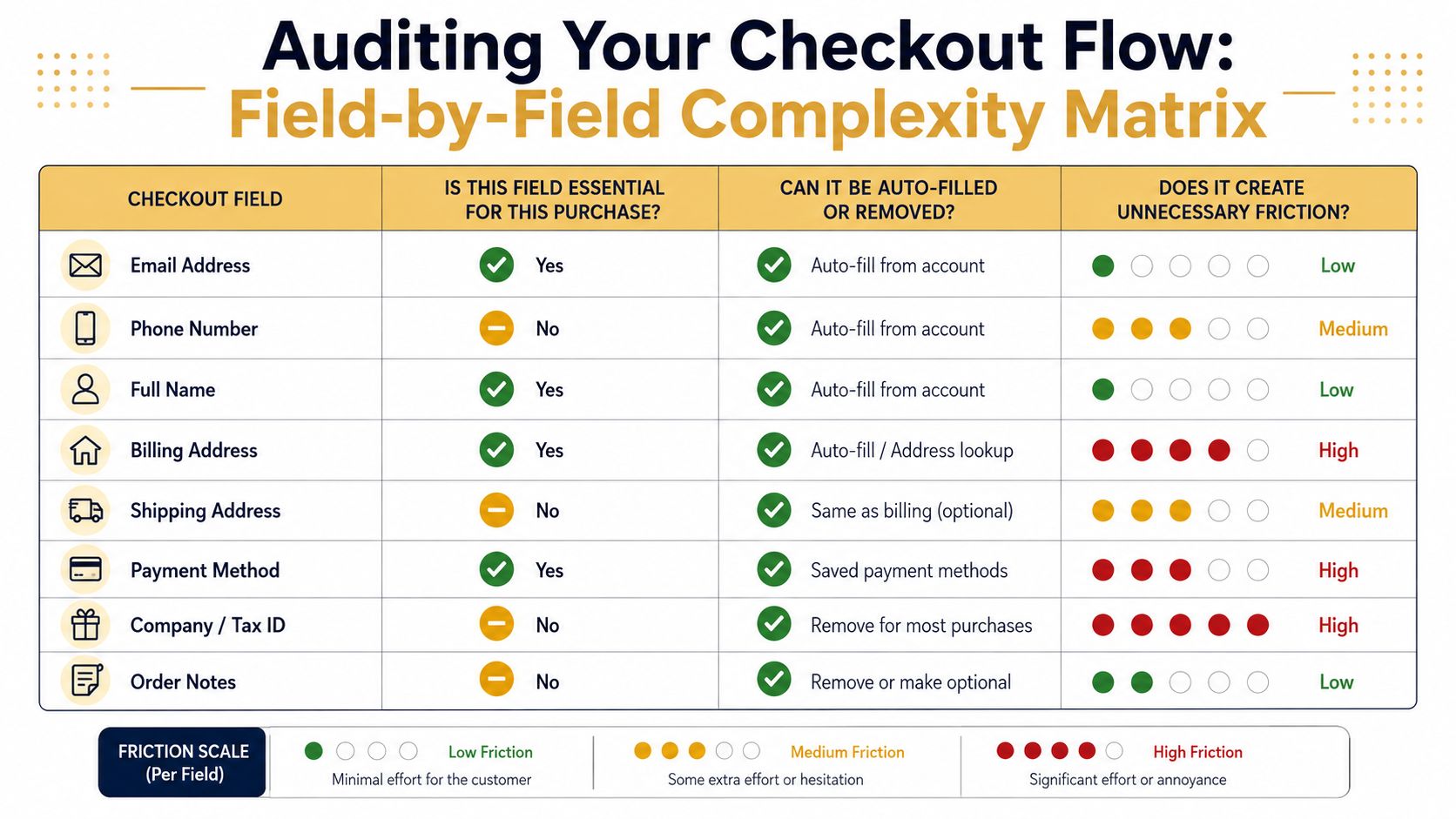
Audit the form before redesigning the architecture
For each field, ask four questions:
- Purpose: What decision, fulfillment task, compliance requirement, or fraud check depends on it?
- Timing: Does the business need it before payment, or can the team collect it after the order?
- Input method: Can browser autofill, address autocomplete, a wallet, or a remembered customer profile supply it?
- Failure cost: What happens when the shopper enters it incorrectly or skips it?
Pay close attention to address handling. Billing and shipping addresses shouldn't be duplicated when a clear “same as shipping” option can remove the second interaction. Optional address lines should stay optional and visually secondary. Error messages should appear near the problem, explain what went wrong, and preserve already entered data.
The flow itself needs the same scrutiny. A single-page layout can reduce navigation, but it can also create a long, intimidating scroll on a smaller screen. A multi-step flow can make complex delivery choices easier to understand, but it needs clear progress information and reliable back navigation. Choose based on order complexity and customer behavior, not a blanket preference.
Test real combinations, not just the ideal browser
Complete test purchases across at least three meaningful device and browser combinations, including a real mid-range phone. Record the time required for each step, every validation error, unexpected layout shift, redirect, and moment when you had to stop and interpret the interface.
Then review the flow by segment:
- Device: desktop, tablet, iOS, and Android.
- Region: shipping destination, currency, language, and local payment availability.
- Customer status: guest, returning customer, and logged-in customer.
- Payment preference: card, wallet, bank method, and other available options.
The audit output should be a friction map with owners and priorities. “Reduce friction” isn't an actionable ticket. “Remove company name for consumer orders, preserve it for business accounts, and test fulfillment impact” is.
For platform-specific controls, customizing your checkout can help teams understand which changes are available without a full rebuild. The key is to document the operational consequence before removing any field, not after an order fails.
Balancing Payment Options and Fraud Prevention
Payment selection is a trade-off between choice, speed, trust, and control. Too few methods exclude shoppers who don't want to use a card. Too many methods make the decision harder and give fraudsters more paths to probe. The right mix depends on where buyers live, what devices they use, the value and risk of the order, and how each method performs after authorization.
The UAE and GCC illustrate why wallet visibility deserves its own audit. Recent Visa coverage reports that 40% of shoppers in the region cite security concerns as their biggest checkout frustration, while 37% dislike manually entering card details. Visa's regional guidance points toward visible preferred payment methods and fewer forced login or authentication steps. The practical lesson isn't to copy one wallet arrangement everywhere. It's to surface the payment method most likely to resolve the local combination of trust and input friction.
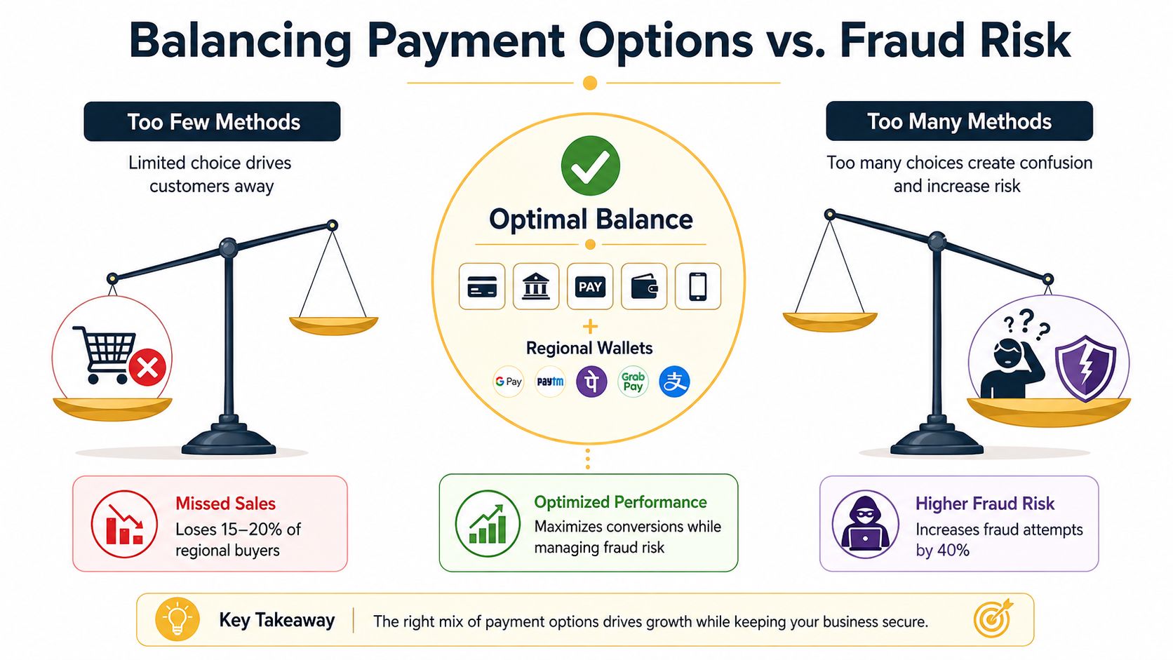
Make the payment decision locally relevant
For each major market, rank methods using four criteria:
| Decision factor | What to examine | Practical implication |
|---|---|---|
| Adoption and preference | Which methods customers already use | Put familiar methods first |
| Input friction | Card entry, redirects, app handoffs, or authentication | Reduce unnecessary transitions |
| Fulfillment data | Whether the method supplies a usable address | Validate shipping details before order submission |
| Risk performance | Approval, decline, dispute, and review behavior | Avoid treating every transaction identically |
Wallets often reduce card-entry friction, but they don't remove responsibility for address validation. A wallet may return a shipping address that doesn't match a serviceable region, delivery rule, or inventory location. Validate the returned data before confirming the order, and explain the correction without forcing the shopper to start again.
Authentication requires similar judgment. Stronger checks can reduce fraud exposure, but an unnecessary challenge interrupts a legitimate purchase. Configure authentication around transaction risk, customer history, geography, and the signals available from your payment provider. A high-risk order may justify more scrutiny, while a familiar returning customer with consistent details may deserve a lower-friction path.
Fraud control should be proportional to risk. A blanket challenge policy protects the rule and can damage the customer experience.
Teams should monitor approval quality, not just fraud loss. A fraud rule that lowers chargebacks while rejecting legitimate orders may look successful in a narrow dashboard and still reduce revenue. Review declines by device, country, payment method, customer status, and reason code. If a regional wallet performs well for legitimate buyers but receives suspicious attempts from a narrow segment, segment the control rather than removing the wallet entirely.
When you need to connect providers, routing, retries, and reporting, document the business rules before selecting an integration approach. Payment gateway integration guidance is useful for framing that work, but the final method mix should come from your own geography and risk data.
Designing Mobile-First Checkout Experiences
Mobile checkout fails in small places. The card field opens the wrong keyboard. The “continue” button sits below an expanding order summary. A validation message appears at the top while the shopper is looking at the bottom. None of these defects looks dramatic in a design review, yet together they create hesitation and rework.
Start with the input itself. Assign the correct input type for email, telephone, postal code, and card data so the operating system can provide a relevant keyboard. Support browser and wallet autofill, but don't assume autofill works identically across iOS Safari and Android Chrome. Test whether the address returned by a wallet can be edited, whether focus moves predictably, and whether the keyboard obscures the active field.
Build around the thumb and the task
A mobile checkout should make the next action obvious without requiring shoppers to remember what they entered. Use large, separated tap targets, persistent order totals, and inline validation that appears close to the field in error. Keep coupon entry collapsed unless a shopper actively wants it. An always-visible promotion field can encourage customers to leave checkout and search for a code.
A single-page flow isn't automatically mobile-first. If it creates a long scroll with dense sections, progressive disclosure may work better. Reveal shipping options after the address is valid, show payment details after the method is selected, and preserve completed sections so shoppers can review them without losing context.
Use this checklist during a real-device walkthrough:
- Keyboard behavior: Confirm each field opens the appropriate keyboard and preserves focus.
- Tap accuracy: Check that controls are easy to select without zooming or accidental taps.
- Wallet placement: Surface relevant digital wallets near the beginning of the flow, not after a long form.
- Order visibility: Keep the total available while shoppers enter payment details.
- Error recovery: Let shoppers correct one field without re-entering surrounding information.
- Performance: Test on variable connections and a non-flagship phone, not only a developer device.
A fixed purchase action can help on a long mobile form, but only when the button state is clear. It should remain disabled until required data is valid, explain what still needs attention, and avoid covering payment fields or legal text. The design should also respect browser safe areas and the on-screen keyboard.
The most useful mobile test isn't a screenshot comparison. It's an observed purchase attempt. Watch where the shopper pauses, scrolls backward, changes orientation, or switches applications to retrieve a payment detail. Those moments reveal friction that responsive breakpoints won't catch.
Measuring Impact with the Right KPIs and Tests
Checkout measurement should answer three practical questions: Where do shoppers stop, which shoppers stop, and what revenue consequence follows? A checkout-start rate alone cannot separate a broken field from a declined payment or a regional delivery issue. Use event-level data that connects checkout stages, field interactions, payment methods, errors, approvals, and completed orders.
Track the path from cart entry to order confirmation, then add diagnostic measures that explain movement. Field completion time can expose an input that works technically but demands too much effort. Field-level error rates can identify validation rules that reject common formatting. Payment-method selection shows whether shoppers use the options presented to them, while authorization and decline data can reveal a mismatch between fraud controls and legitimate demand.
| KPI | Definition | Target Benchmark | Segmentation |
|---|---|---|---|
| Checkout start rate | Sessions that begin checkout relative to cart activity | Establish a baseline before changes | Device, traffic source, customer status |
| Step completion rate | Shoppers advancing from one checkout stage to the next | Compare each stage with the prior baseline | Device, region, flow variant |
| Field error rate | Validation errors divided by field interaction | Reduce avoidable errors over time | Field, browser, device |
| Field completion velocity | Time between field focus and valid completion | Identify unusually slow inputs | Field, customer type, device |
| Payment authorization rate | Payment attempts that receive authorization | Monitor by method and risk segment | Method, region, order type |
| Checkout completion rate | Completed orders divided by checkout starts | Evaluate the full revenue outcome | Device, region, new versus returning |
| Net revenue per checkout start | Revenue after relevant payment and fulfillment effects divided by starts | Use as the commercial guardrail | Segment, method, experiment variant |
Treat these as operating benchmarks, not universal targets. Establish the baseline by product category, customer mix, delivery model, device, region, and payment environment. A higher completion rate is not a clean win if it accompanies more fulfillment errors, payment disputes, or fraud losses.
Test one meaningful hypothesis at a time
A useful hypothesis names the mechanism and its boundary. “Removing the company field will improve conversion” is weaker than “Removing company name for consumer orders will reduce unnecessary input without affecting fulfillment data.” The second version identifies the relevant segment, the expected behavior, and the operational risk to monitor.
Use controlled testing when traffic and implementation quality support it. Keep audience allocation, eligibility rules, event definitions, and surrounding experience stable. Avoid changing payment methods, shipping prices, copy, and form structure in one experiment unless the goal is a bundled redesign. That approach may improve the total flow, but it will not show which change produced the result.
Segment results before declaring success. An overall lift can hide a mobile decline, a payment failure in one region, or an improvement limited to returning customers. A neutral overall result can also contain a meaningful gain for a high-value segment and a loss for another. Review confidence intervals alongside practical business impact, authorization quality, and net revenue, rather than relying on a pass or fail significance label.
A checkout experiment isn't finished when the button metric improves. It's finished when the result survives segment review and the operational consequences are understood.
Long-running tests require controls for seasonality, campaign changes, inventory shifts, and payment-provider incidents. Maintain an experiment log containing release dates, traffic changes, outages, eligibility adjustments, and decision notes. For event-layer planning and implementation details, this analytics implementation resource can help structure the data needed to diagnose checkout performance.
Use the same measurement discipline across devices, regions, and payment preferences. A universal “minimal form” winner may reduce fields for one audience while removing context or payment access another audience needs. The strongest decision is the one that improves commercial results without hiding those segment-level costs.
Implementation Checklist for SMBs and Platforms
Small and mid-sized retailers should not begin with a custom checkout rebuild. Start with changes that are reversible, measurable, and close to the actual failure point. A platform limitation alone does not justify migration. Check whether the current system supports guest checkout, visible wallets, address validation, conditional fields, and usable event tracking before replacing it.
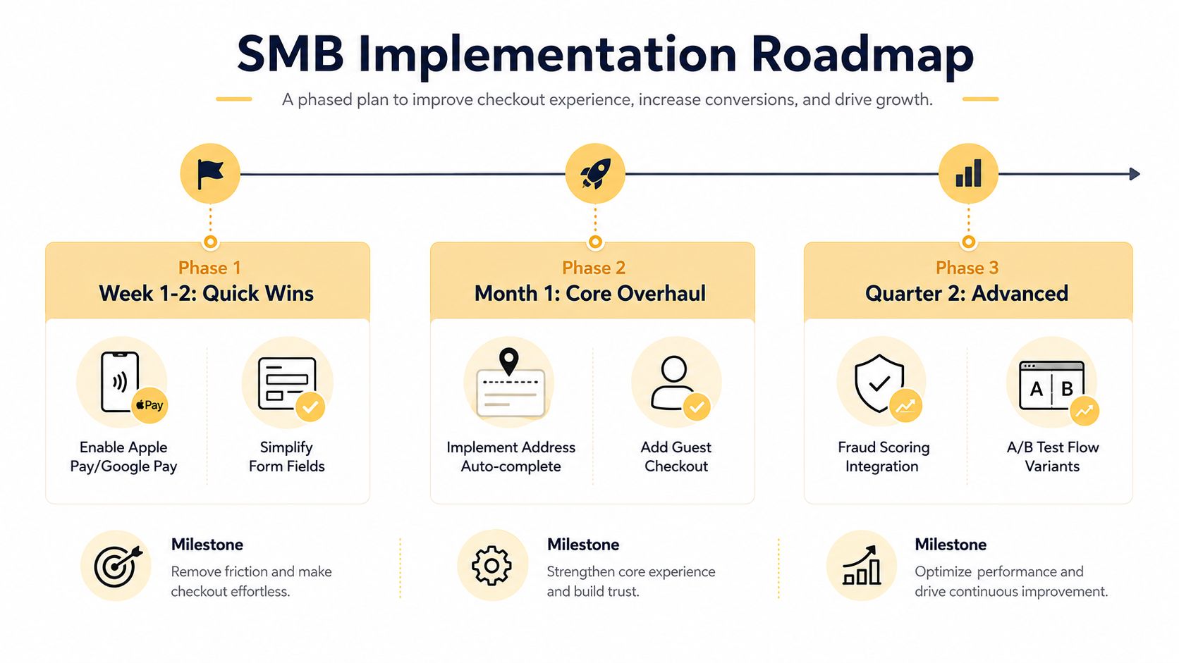
Start with low-risk corrections
Review these items before commissioning structural development:
- Guest access: Let shoppers buy without creating an account, then offer account creation after confirmation.
- Cost visibility: Show shipping, taxes, and applicable fees as soon as the business can calculate them.
- Field inventory: Remove fields that do not support the order, or show them only when the order requires them.
- Error recovery: Replace generic messages with specific instructions while preserving entered data.
- Payment prominence: Display the cards, wallets, and regional methods most relevant to each shopper.
- Trust context: Place accurate security and returns information near the payment decision.
Shopify and BigCommerce stores should begin with native settings and supported extensions. Unsupported checkout overrides can create maintenance and upgrade risk. WooCommerce teams should inspect theme templates, gateway behavior, and plugin conflicts before adding another optimization plugin. Magento implementations need careful review of checkout modules, address rules, and payment customizations. Headless teams own the full interaction among frontend state, tax, inventory, payment, and fulfillment services.
Sequence structural work carefully
Audit the flow before changing its architecture. An uncompetitive delivery promise will not be fixed by switching from a multi-step checkout to a one-page layout. A wallet hidden below the fold may need better placement, not a full redesign.
A practical rollout sequence is:
- Baseline: Capture funnel, field, device, region, and payment data.
- Correct: Remove unnecessary fields, expose guest checkout, improve errors, and surface appropriate methods.
- Validate: Test real devices, browsers, address formats, and payment responses.
- Experiment: Compare meaningful flow variants with guardrails for authorization, fulfillment, and support.
- Scale: Roll out the winning pattern by segment instead of applying it automatically to every market.
- Monitor: Review completion, declines, errors, and unusual regional changes each week.
The sequence should remain segment-aware. A mobile wallet improvement may matter more than a desktop form reduction, while a regional payment method can improve one market and add fraud or support complexity in another.
For SMBs, the expensive mistake is funding a large redesign before identifying the failure mode. For larger platforms, it is optimizing the frontend while payment routing, fraud rules, or fulfillment validation erase the gain.
Up North Media provides e-commerce web development, analytics implementation, SEO marketing, and AI consulting, including conversion-focused web applications and checkout measurement. Teams that have identified checkout friction but lack product, data, or engineering capacity can use that support to audit the flow, prioritize changes, and create a measurement plan tied to commercial goals.
Book a checkout audit to identify field, payment, device, and regional friction before investing in a redesign. The roadmap should connect checkout completion with payment performance and revenue, while documenting the trade-offs introduced by fraud controls and operational constraints.