

More charts don't make a Google Analytics KPI dashboard more useful. They often make it harder to see what changed, why it changed, and what someone should do next.
A practical dashboard is a diagnostic instrument, not a gallery of attractive visualizations. It should bring a small set of trusted signals into one view, connect acquisition with engagement and conversion, and make data problems visible before they influence a budget or an executive decision. GA4 can support that job, but only when the implementation underneath the dashboard is reliable.
Rethinking the Google Analytics KPI Dashboard
Google Analytics began as a free web analytics product on November 14, 2005, after Google acquired Urchin Software. Its early purpose was straightforward, consolidating visitor, traffic-source, and conversion reporting so teams could understand website performance in one place. This history of Google Analytics helps explain why dashboards remain centered on high-level monitoring rather than replacing every detailed report.
That distinction matters. A reporting repository stores information. A KPI dashboard helps a team decide whether performance is healthy and where to investigate next. Google describes dashboards as a way to create custom visualizations and bring actionable insights onto a consolidated page, which makes them useful for monitoring several signals and spotting relationships between them. Google's dashboard guidance supports that focused use.
A dashboard should answer operational questions
A useful Google Analytics KPI dashboard should help answer questions such as:
- Is qualified traffic arriving? Review users, sessions, acquisition sources, geography, and device type.
- Are visitors finding value? Examine engagement, page performance, and the behavior of important landing pages.
- Are marketing activities producing business outcomes? Track key events, conversion rate, revenue, or lead outcomes.
- Where should the team investigate? Compare the same signals by channel, landing page, device, or region.
The dashboard doesn't need every available dimension. It needs enough context to distinguish a traffic problem from an engagement problem, and an engagement problem from a measurement problem.
Sessions are a good example of why definitions matter. A session count can tell you that activity changed, but it can't explain whether visitors were qualified or whether the tracking is counting the intended behavior. A useful measurement guide from Come Together Media LLC provides context for understanding what a session represents before you use it as a headline KPI.
Reporting volume isn't decision quality
Universal Analytics followed the classic tracking model, while GA4 introduced an event-based approach and became the standard reporting framework for modern website and app measurement after Universal Analytics processing ended for standard properties in July 2023. That evolution gives teams more flexibility, but it also creates more opportunities to define events inconsistently or expose metrics without enough business context.
The strongest dashboards therefore behave like a triage screen. They surface the signals that deserve attention, preserve enough segmentation to identify a likely cause, and send analysts into detailed reports only when deeper investigation is necessary.
Practical rule: If a card doesn't change a decision, support a diagnosis, or confirm a business outcome, it probably doesn't belong on the primary dashboard.
The Hidden Data Quality Gap in GA4
A polished dashboard can still be wrong. It may show attractive trend lines while missing a conversion event, recording duplicate purchases, failing to account for refunds, or disagreeing with the CRM that owns the customer record.
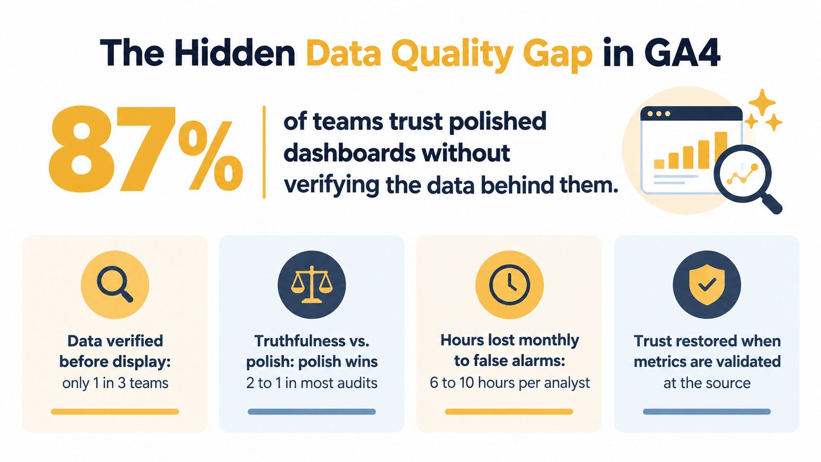
A 2026 audit cited by LoudScale found quality issues in 59% of GA4 properties, while 63% were missing at least one key conversion event. The same audit reported an average gap of 14.7% between GA4-reported and backend conversions. Even properties that teams rated as fully accurate showed an 8.4% median reconciliation gap. These figures come from LoudScale's marketing analytics data quality guide.
Those gaps aren't cosmetic. If a dashboard overstates purchases, an e-commerce team can scale a channel that isn't producing the reported revenue. If a lead event fires on a form view instead of a completed submission, a demand-generation team may overestimate campaign quality. If refunds never reach the reporting layer, revenue can remain inflated after the customer relationship has changed.
Reconcile before you visualize
Before adding cards, compare GA4 with the system that records the business outcome. For an online store, that may be the e-commerce platform or order database. For a B2B organization, it may be the CRM and the sales-qualified pipeline. The purpose isn't to force every platform to show identical totals. Different attribution rules and processing models can produce legitimate differences. The purpose is to understand those differences and document which source governs each KPI.
Use a validation pass that checks:
- Event completeness: Confirm that each important conversion has a defined event and that the event fires at the intended point in the journey.
- Event uniqueness: Check whether refreshes, duplicate submissions, payment callbacks, or tag conflicts can create multiple conversions for one outcome.
- Value integrity: Compare transaction values, currencies, discounts, refunds, and cancellations with the backend record.
- Identity and attribution: Confirm that source, medium, campaign, and landing-page dimensions remain usable after consent choices and cross-domain journeys.
- Time alignment: Compare matching date ranges and account for processing or update differences before interpreting a mismatch.
Server-side tracking can help some organizations control data collection and improve resilience, but it doesn't remove the need for reconciliation. A useful technical primer on server-side tracking can help teams evaluate whether that architecture fits their consent, privacy, and measurement requirements.
Treat trust as a dashboard field
A dashboard should communicate not only the KPI value, but also the status of the measurement behind it. Add a data-quality note or validation indicator outside the main visual layer. Record the event owner, source of truth, known exclusions, and last reconciliation date in the dashboard documentation.
The most important design decision happens before the first chart. Don't optimize the presentation of an unverified metric. Validate the event, reconcile the result, document the rule, and only then decide how prominently the KPI should appear.
Selecting the Right KPIs for Your Business Model
A retailer, a lead-generation firm, and a publisher can all use GA4, but they shouldn't use the same primary dashboard. The right KPI depends on the business outcome, the customer journey, and the event that represents meaningful progress.
GA4's event-based model makes it possible to define those interactions directly, but flexibility can encourage vague event naming and shallow reporting. Start with the conversion that matters to the business, then work backward through the behavior that leads to it. A product purchase, a qualified form submission, and a returning reader are not interchangeable outcomes.
| Business Model | Primary KPIs | Secondary Diagnostic KPIs |
|---|---|---|
| E-commerce | Revenue, purchases, conversion rate, key product or checkout events | Traffic source performance, device type, landing-page engagement, product-page performance |
| Lead generation | Form submissions, qualified leads, conversion rate, key pipeline events | Acquisition source, landing-page engagement, device type, page-level performance |
| Digital publishing | Engaged users, returning users, key subscription or registration events, engagement rate | Acquisition sources, article performance, geography, device type, content landing pages |
E-commerce needs outcome and quality signals
Revenue and purchases belong near the top because they represent commercial results. But they aren't sufficient. A sudden increase in purchases may reflect duplicate transaction events, while a revenue decline may come from a payment problem, a product mix change, or missing value parameters.
Use traffic source and device breakdowns to isolate the change. Then inspect product and checkout behavior to determine whether visitors are failing to progress or whether the implementation stopped recording a valid transaction. Cart behavior can be useful, but it should remain diagnostic unless the business has defined that event consistently.
Lead generation needs lead quality context
A form submission is only a useful KPI if it represents a genuine submission. Many implementations accidentally count button clicks, validation attempts, or visits to a confirmation page that users can reload. Define the key event around the completed action, then connect it to CRM outcomes when possible.
The primary dashboard should show acquisition source, landing-page performance, and conversion rate together. That arrangement prevents the team from celebrating cheap traffic that produces weak leads or dismissing a channel whose value appears later in the sales process.
For a broader framework on connecting marketing activity with business outcomes, this guide to measuring digital marketing performance offers useful planning context.
Publishers need engagement without confusing attention for value
Digital publishers often have a large volume of page activity, but pageviews alone don't explain whether content satisfied the reader or contributed to a subscription, registration, or return visit. Use engaged users, engagement rate, article performance, and acquisition sources to understand content quality.
The dashboard should distinguish discovery from loyalty. A page that attracts search traffic may be valuable for acquisition, while another page with fewer users may support registration or repeat readership. Those pages deserve different interpretations and shouldn't compete on a single traffic ranking.
Designing Layouts That Tell a Diagnostic Story
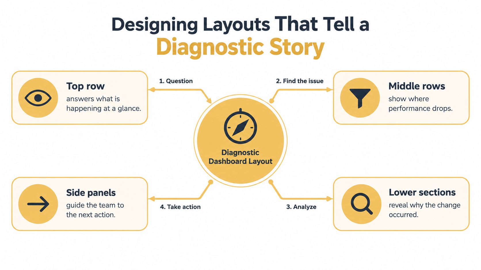
A dashboard layout should follow the order in which a marketer investigates a change. Put the overall state first, the likely location of the problem next, and the supporting detail after that. Random placement forces users to compare unrelated cards mentally.
Start with the funnel stage
Use a simple reading path:
- Acquisition: Place users, sessions, and traffic source performance together. This shows whether reach and channel mix changed.
- Engagement: Add engaged sessions, engagement rate, average engagement time, and important page-level signals. These metrics indicate whether visitors interact meaningfully with the site.
- Conversion: Show key events, conversion rate, revenue, or lead outcomes. The business result should sit close enough to engagement metrics for users to compare them.
- Diagnosis: Use tables or breakdowns by channel, landing page, device, geography, or campaign to locate the source of the change.
GA4 defines an engaged session as one lasting at least 10 seconds, containing one or more conversion events, or including two or more pageviews. That definition makes engagement rate more behaviorally informative than raw session volume in many situations, because it considers whether the session met a meaningful engagement condition. The definition and the practical case for prioritizing these metrics are described in this GA4 KPI dashboard analysis.
Use proximity to express cause and effect
Place traffic source performance beside engagement rate when channel quality is a recurring concern. Put landing-page performance near conversion rate when the team needs to identify page friction. Keep device breakdowns close to the KPI they might explain, such as conversion rate or average engagement time.
Don't use visual complexity to compensate for missing context. A clean table can diagnose a channel shift better than a decorative map, especially when the team needs to compare exact values across campaigns or landing pages.
A dashboard earns its space by reducing the distance between a signal and the next investigation.
Design for action, not decoration
Use color sparingly. Reserve strong colors for exceptions, meaningful changes, or status indicators, and keep the default state visually quiet. Label comparison periods and filters clearly so users don't mistake a date-range change for a performance change.
Every primary card should have an owner and an expected response. If conversion rate drops, someone should know which report to open and which implementation check to perform. If no action follows a card, move it to a supporting report or remove it.
Building Your Dashboard in the Native GA4 Interface
Google's native dashboard layer is useful for teams that want KPI monitoring inside the analytics property rather than in a separate reporting platform. Google describes dashboards as a flexible way to view KPIs in one report, making the feature suitable for a focused operational view. The official dashboard documentation is the right place to confirm the current interface and property-specific behavior.
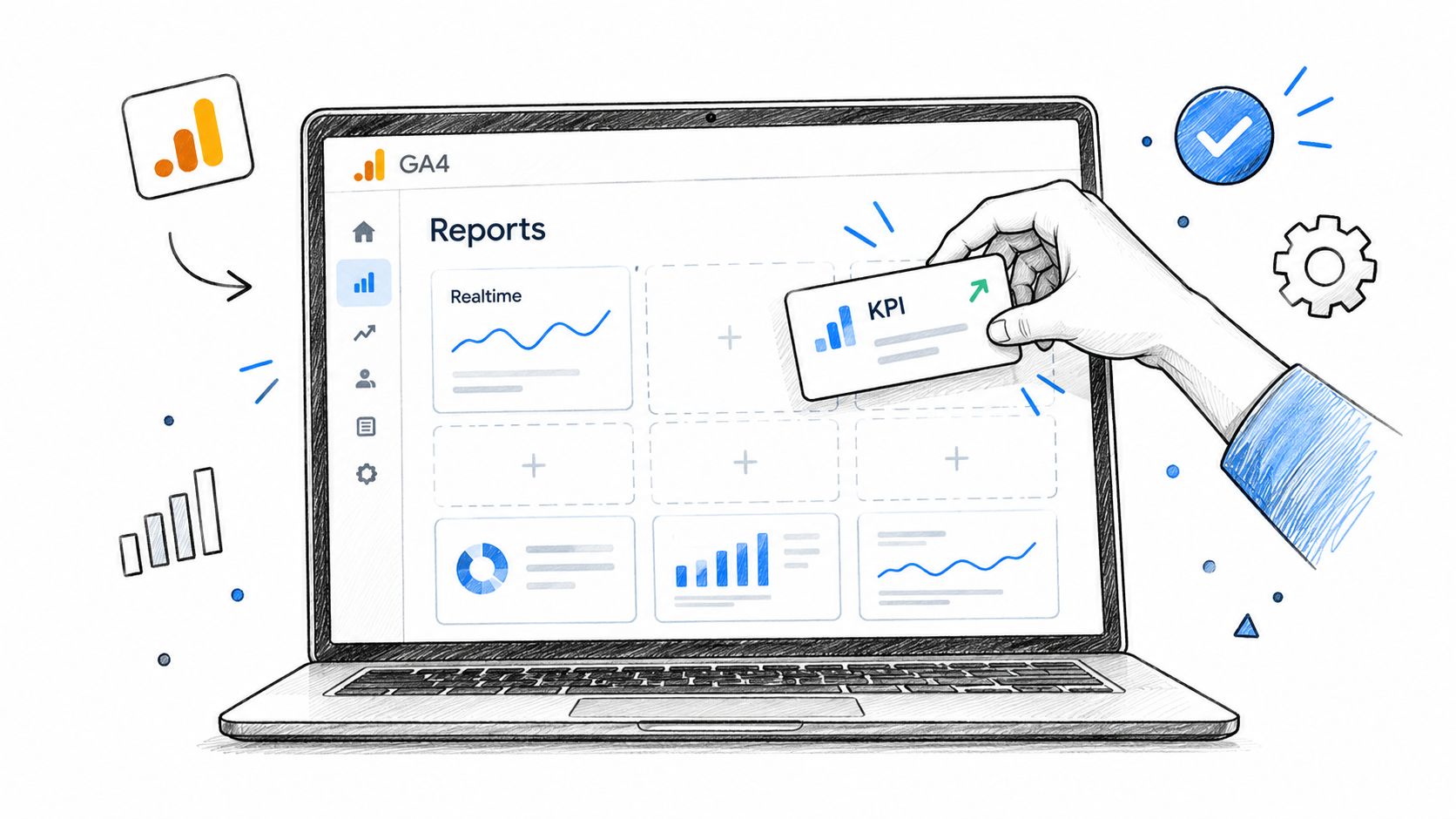
Start with the business question, not the available card types. Create a short list of approved KPIs, confirm their definitions, and then add cards that support the acquisition, engagement, conversion, and diagnosis sequence. Name the dashboard for its audience, such as “E-commerce performance” or “Lead generation health,” rather than using a generic label that encourages uncontrolled additions.
Work within the native builder
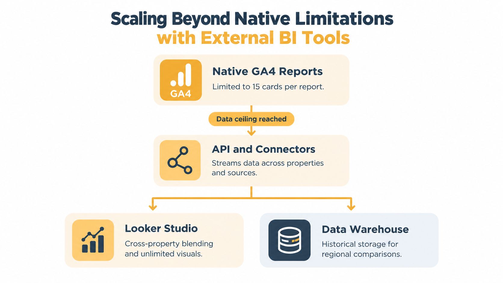
The native layer arrived in September 2026, according to the verified product context provided for this guide. Standard properties are capped at 15 cards, and independent coverage identifies important limitations, including the lack of segments, independent card-level comparisons, custom calculated metrics, cross-property blending, and API access. Those constraints mean the native dashboard works best as a compact monitoring layer, not as a complete analytics environment.
Configure each card with a clear title and a known date range. Avoid placing two metrics next to each other if they use different definitions or scopes without explaining the difference. For example, a revenue card needs a note about refunds, transaction validation, and the system used for reconciliation.
Before sharing the dashboard, test filters and permissions with the people who'll use it. Confirm that the visible values match the underlying GA4 reports and your agreed source of truth. For implementation planning, Up North Media's analytics implementation guidance provides relevant context on measurement setup and tracking decisions.
A native dashboard is valuable when it remains small, understandable, and trustworthy. It becomes counterproductive when users try to force every audience, property, comparison, and calculation into the same constrained view.
Scaling Beyond Native Limitations with External BI Tools
The native GA4 dashboard is a sensible starting point, but one view rarely serves executives, channel managers, content teams, sales leaders, and analysts equally well. Each audience asks different questions and needs different levels of segmentation.
The better architecture is usually role-based reporting. Keep a small native view for routine health checks, then use an external BI tool when the team needs cross-property analysis, blended sources, persistent history, custom calculations, or more flexible visual exploration.
Choose the tool based on the analytical job
Looker Studio can suit teams that need accessible reporting, shareable views, and connections across common marketing sources. Tableau or another enterprise BI platform may fit organizations that need more advanced exploration, governance, and data modeling. A data warehouse becomes important when the team needs durable historical storage, complex joins, regional comparisons, or a governed semantic layer.
The tool doesn't solve bad definitions. If the GA4 purchase event is duplicated, a connector will move the duplication into another chart. If the CRM and analytics platform use different lead stages, blending them can create a more elaborate disagreement rather than a clearer answer.
Build a reliable hybrid layer
Use GA4 for collection and core behavioral reporting. Define the business KPI in a controlled data model, then bring validated data into the external reporting environment. Keep a documented mapping between GA4 events, CRM stages, e-commerce transactions, and executive metrics.
A practical hybrid setup often includes:
- Native monitoring: A compact dashboard for daily acquisition, engagement, and conversion health.
- Role-based reports: Separate views for content, paid media, e-commerce, sales, or leadership.
- Validation reporting: A reconciliation view comparing GA4 events with backend outcomes.
- Historical analysis: Warehouse or BI storage for trends that shouldn't depend on a single interface's current limits.
Teams evaluating performance reporting can also use an Amazon performance dashboard guide as a reference for organizing operational metrics around business questions rather than visual volume.
External BI adds flexibility, but it adds governance responsibilities too. Establish ownership for metric definitions, refresh behavior, access controls, and reconciliation. More charts won't compensate for an unclear data contract.
Maintaining Dashboard Trust and Relevance Over Time
A dashboard changes whenever the website, campaign structure, consent experience, CRM, checkout, or business priorities change. Treating it as a finished asset guarantees that some cards will eventually lose their meaning.
Schedule a recurring reconciliation review, and perform an additional check after a migration, analytics configuration change, checkout release, or major consent update. Compare the primary GA4 conversion events with the backend source, inspect unusual shifts by device and channel, and record the explanation for any persistent difference.
Use a maintenance checklist
- Review definitions: Confirm that every KPI still represents a current business decision.
- Check event coverage: Look for missing, duplicated, or unexpectedly renamed key events.
- Reconcile outcomes: Compare purchases, revenue, leads, or registrations with the system that owns the result.
- Prune unused cards: Remove visualizations that no longer change an action.
- Test segmentation: Verify that channel, device, geography, and landing-page breakdowns remain interpretable.
- Document changes: Record the date, owner, definition, and reason for each material update.
The strongest Google Analytics KPI dashboard isn't the most colorful or feature-packed. It's the one a marketer can use confidently because the team knows what each metric means, where it comes from, how it was validated, and what action follows a change.
Up North Media helps businesses plan GA4 measurement, connect analytics with conversion reporting, and build data-informed SEO and digital strategies around reliable KPIs. Visit Up North Media to discuss a dashboard and analytics setup that your marketing and executive teams can trust.