

A lot of SMB owners are dealing with the same problem without naming it correctly. Sales look softer than they should. Leads start forms and disappear. Customers call support for things the website should already make obvious. Staff members patch issues manually, then wonder why the business still feels slower than it should.
That problem is usually friction.
In practice, friction is anything that makes a customer or employee work harder than necessary to complete a task. On the customer side, it shows up as confusing navigation, clunky forms, weak mobile checkout, and vague calls to action. Inside the business, it shows up as manual handoffs, disconnected systems, delayed updates, and rework. If you want to learn how to reduce friction, you have to address both.
The Friction Audit How to Pinpoint Where You Lose Customers
Most businesses guess at friction. They rely on opinions, internal preferences, or the loudest complaint from a customer or team member. That usually leads to cosmetic changes instead of useful fixes.
A better approach is a friction audit. Start by mapping the actual path a customer takes, not the ideal path you think they take. That means separating mobile and desktop journeys, then listing each step from landing page to form submission, checkout, or contact request. A rigorous approach to friction quantification involves listing every step, assigning a friction score to each, and summing it into a baseline. It also recommends monthly friction detection rituals such as reviewing 20–30 session recordings on high-traffic conversion pages and analyzing heatmaps for 1–2 hours to uncover new friction points consistently, according to this friction scoring methodology.
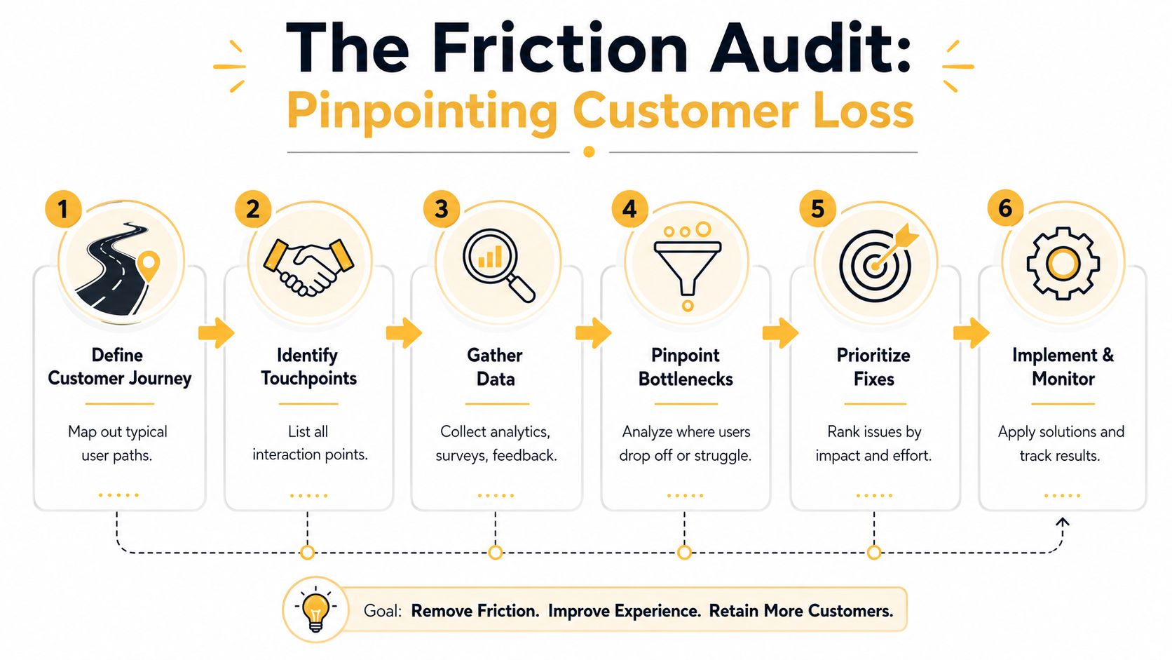
What to audit first
If you're an SMB, don't try to inspect everything at once. Start with the paths closest to revenue and intent.
- High-intent pages matter most. Product pages, service pages, quote forms, and cart steps usually expose the most expensive friction.
- Mobile journeys deserve separate review. Mobile users behave differently, and a path that feels acceptable on desktop can feel broken on a phone.
- Drop-off points deserve direct observation. Analytics can tell you where users leave. Session recordings and heatmaps help explain why.
A simple journey map often reveals more than a long analytics report. If a visitor lands on a service page, clicks pricing, opens a form, gets stuck on a required field, and leaves, you already have a fix path.
Practical rule: Count clicks, fields, waits, and decisions. If a step doesn't directly help the customer reach their goal, treat it as a friction candidate.
What the tools actually show
Heatmaps are useful for spotting hesitation. You can see where users stop scrolling, click non-clickable elements, or ignore content you assumed was obvious. Session recordings add context. They reveal rage-clicking, backtracking, long pauses, and abandoned forms.
Surveys and interviews help too, but only when they're specific. Ask customers what stopped them from finishing, what they expected to happen next, and what felt unclear. Broad questions produce broad answers.
If you need a more structured way to document the path, this guide to customer journey mapping is a good companion to the audit process.
How to prioritize what you find
Not every friction point deserves immediate action. A typo on a low-traffic page isn't as urgent as a broken mobile payment step. The best audit outcome is a short list of issues ranked by impact.
Use a simple lens:
| Friction point | Customer impact | Business impact | Fix effort |
|---|---|---|---|
| Long lead form | High | High | Low to medium |
| Confusing navigation label | Medium | Medium | Low |
| Mobile checkout bug | High | High | Medium |
| Blog page layout issue | Low | Low | Medium |
That keeps the audit practical. The goal isn't to create a perfect report. The goal is to find where you're leaking demand and fix that first.
Streamlining the First Impression Onboarding and UX Fixes
The first few interactions decide whether a visitor keeps moving or starts resisting. That's why so many onboarding problems aren't branding problems at all. They're effort problems.
Consider two sign-up experiences. In the first, a new visitor clicks "Get Started" and hits a form with a full name field, phone number, company size, role, industry, website, password creation, and a few dropdowns that don't feel necessary yet. In the second, the user enters an email or chooses a simple login option, then sees the next questions only when they become relevant. The second experience feels lighter because it is lighter.
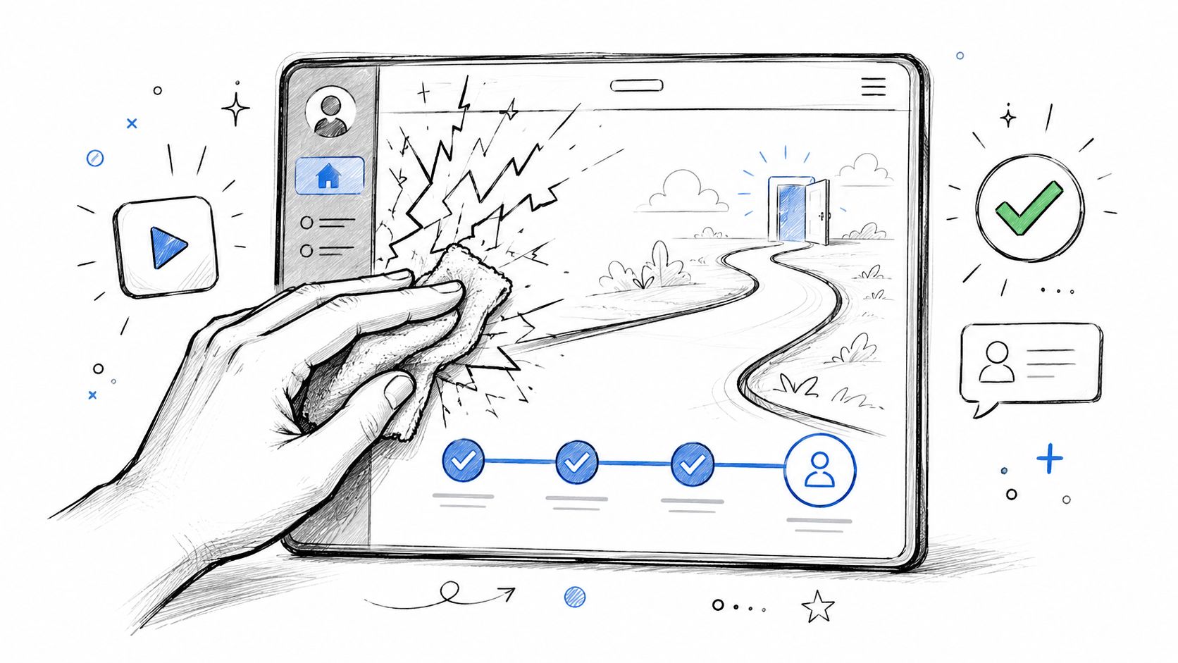
Data indicates that every additional form field, click, or decision point directly reduces the completion rate of a transaction or process. The same analysis notes that smart defaults and progressive disclosure consistently improve completion and reduce cognitive load without requiring a full redesign, as explained in this guide on reducing customer friction for business leaders.
What a lower-friction onboarding flow looks like
A stronger first impression usually comes from subtraction, not decoration.
- Remove nonessential fields. If sales doesn't need a phone number at the first step, don't ask for it.
- Use smart defaults where they help. Prefill common selections, remembered details, or likely preferences when appropriate.
- Reveal complexity gradually. Progressive disclosure keeps the first action simple and introduces additional inputs only when the user has context.
A lot of SMB sites ask for internal convenience up front. That's the wrong trade-off. Customers don't care that your CRM has ten useful fields. They care about getting through the task with as little effort as possible.
Respect intent, not internal process
I've seen service businesses bury the actual next step under too many choices. A visitor wants an estimate, but the site offers four competing buttons, a generic contact page, a newsletter popup, and a chatbot asking unrelated questions. That isn't engagement. It's interference.
A cleaner approach is to align the page with likely intent. If someone is reading a service page, give them one clear next action. If they're evaluating a product, answer the obvious concerns near the action point instead of sending them hunting through menus.
A smooth onboarding experience doesn't need flashy UX. It needs fewer decisions, clearer sequencing, and less wasted motion.
For teams reviewing their own interfaces, these user experience design best practices can help sharpen what to simplify first.
Optimizing the Finish Line Erasing Friction from Your Checkout
A shopper adds two products to the cart, reaches checkout, and pauses. Shipping cost is unclear. The button says “Continue” instead of telling them what happens next. A promo field pulls attention away from payment. In less than a minute, intent turns into hesitation.
That loss rarely starts at the button itself. Checkout friction often reflects internal decisions behind the scenes. Teams collect fields because the ERP wants them. Shipping rules stay vague because operations has exceptions nobody translated into customer-facing language. Payment options stay limited because finance and web teams never aligned on implementation.
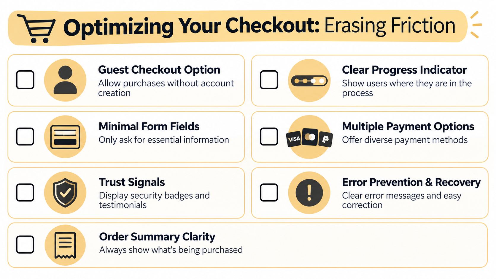
What to fix near the buy button
The final step needs clarity, not extra decisions. Buyers should see the order total, delivery timing, return terms, and payment reassurance without hunting through links or opening separate pages. If those answers sit in your footer, help docs, or policy pages, the checkout is doing extra work for the customer at the worst possible moment.
Clear button labels matter for the same reason. “Continue” creates uncertainty. “Review order,” “Continue to payment,” or “Place order” reduces hesitation because each action is explicit.
Microcopy helps when it removes a specific doubt. A short note under the card field, next to shipping speed, or beside the return policy can prevent abandonment. Generic reassurance copy usually adds noise. Useful reassurance answers the exact question the customer has in that step.
A practical checkout checklist
Use this as a working standard for your cart and checkout flow:
- Offer guest checkout. Account creation can happen after purchase.
- Keep the full order summary visible. Product, quantity, shipping, taxes, and total should stay easy to confirm.
- Show delivery timing before payment. Do not wait until the final review screen.
- Support the payment methods your customers already prefer. Cards may be enough for some stores. Mobile wallets often matter on phone-heavy traffic.
- Write buttons that describe the next action. Remove vague labels.
- Validate errors clearly and close to the field. Help people recover fast.
- Use address lookup carefully. It speeds entry, but only if manual correction is easy.
- Remove distractions. Promo fields, coupon hunting, and secondary offers can pull buyers out of completion mode.
A common trade-off for SMBs is whether to ask for more information now or clean up missing data later. In most cases, letting the order through wins. A manual follow-up on the small percentage of edge cases usually costs less than losing ready-to-buy customers at checkout.
This walkthrough offers a useful visual reference for checkout flow decisions:
Common checkout mistakes that look harmless but aren't
Some checkout problems look minor in an internal review because the team already knows how the process works. Customers do not.
| Problem | What the customer feels | Better fix |
|---|---|---|
| Forced account signup | Extra work before purchase | Let them complete checkout first |
| Vague CTA copy | Uncertainty about the next step | Use explicit action labels |
| Hidden shipping details | Suspicion about final cost | Show cost and timing before payment |
| Coupon box shown too early | Pressure to leave and search for discounts | Collapse it behind a link or place it later |
| Operations-driven fields | Frustration with irrelevant questions | Remove anything the customer does not need to complete the order |
If your team is seeing too many unfinished purchases, review these practical ways to reduce cart abandonment in your checkout flow.
Beyond the Interface Technical Fixes That Eliminate Hidden Friction
A customer taps "Add to cart" on a phone during lunch. The page hangs for a second, the button jumps as another script loads, and a chat widget covers the bottom of the screen. On your side, the team sees a decent-looking site and assumes the problem must be pricing or traffic quality. In practice, a lot of lost sales come from technical drag that never shows up in a design mockup.
That drag often starts with decisions made for internal convenience. A plugin stays because one department wants the popup. A tracking script stays because nobody is sure who owns it. Product images stay oversized because no one has time to resize them after each upload. Customers feel the result immediately, even if the cause sits in your workflow, not your layout.
The technical issues customers notice right away
Hidden friction usually comes from a short list of repeat offenders:
- Slow page rendering. The page appears, but the main action is still loading or unresponsive.
- Layout instability. Buttons, menus, and form fields shift while someone is trying to tap them.
- Script overload. Popups, chat tools, review widgets, trackers, and embedded apps compete for attention and slow down key pages.
- Weak mobile execution. Small tap targets, sticky bars that block content, and form fields that trigger the wrong keyboard make simple tasks take longer.
- Frontend problems caused by backend shortcuts. Real-time inventory, shipping estimates, account data, or pricing rules may lag because systems are loosely connected or updated manually.
The last one gets missed a lot. A product page can look clean and still create friction if stock status is stale, delivery dates are unreliable, or promo logic breaks at checkout because tools are not syncing properly.
Customers do not separate interface problems from operations problems. They just experience a site that feels harder to buy from.
What to check without a huge budget
Start with one task and one device. Use a real phone on cellular data and try to complete the same actions a customer would: land on a product page, choose a variant, add to cart, start checkout, submit a form, or check order status.
Watch for hesitation points. Does the page become interactive quickly? Do buttons stay in place? Does anything block the screen? Do shipping estimates, inventory messages, or promo codes update correctly, or do they depend on a delayed backend process?
Then review the fixes that usually produce the fastest gains:
- Compress and resize images at upload. This cuts load time without changing your design.
- Remove scripts that do not help conversion or service. If a widget exists because "someone wanted it once," review it.
- Set fixed space for banners, images, and embeds. This reduces layout shifts on mobile.
- Check forms field by field. Use the right input types so phone users get the correct keyboard for email, phone number, and ZIP code.
- Audit system handoffs behind the page. If pricing, inventory, booking slots, or shipping data rely on batch updates or copy-paste work, expect customer-facing errors.
A simple rule helps here. If a feature creates work for your team and delay for the customer, it needs a better setup, not better wording.
What improves results faster than a rebuild
A full redesign can help, but it often hides the underlying issue. I have seen SMB sites spend heavily on new templates while keeping the same bloated scripts, manual product updates, and disconnected systems underneath. Conversion barely moves because the friction was operational as much as visual.
Technical cleanup tends to pay back faster. Remove unnecessary apps. Tighten image handling. Fix unstable page elements. Connect the systems that feed customer-facing information, or at least shorten the delay between internal updates and what shoppers see online.
The useful test is simple. Can a customer complete the task quickly, on a real device, with accurate information shown at each step? If the answer is no, start with the technical and operational bottlenecks before you approve another redesign.
Connecting the Dots How Internal Friction Hurts Your Customers
A customer places an order, gets a confirmation email, and assumes the job is done. Then the problems start. Stock was updated late, the warehouse did not get the right note, support cannot see what sales promised, and the customer ends up chasing your team for answers.
From the customer's side, that feels like poor service. From your side, it often started with a spreadsheet, an approval queue, or two systems that do not talk to each other.
Take a common SMB retail setup. Inventory lives in one tool, online orders land in another, and staff fix the gaps by hand once or twice a day. That choice saves money in the short term, but it creates oversells, delay emails, refund work, and support tickets. The website did not cause the frustration by itself. The operating process did.
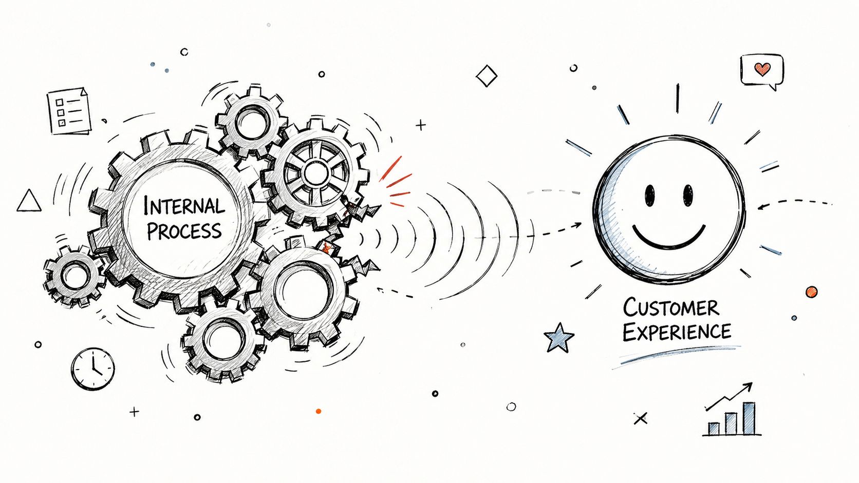
Where internal drag shows up externally
Customer friction often begins well before the customer clicks anything.
- Manual order handling slows fulfillment and creates conflicting status updates.
- Data silos make customers repeat the same details to sales, support, and fulfillment.
- Slow approvals delay quotes, onboarding, refunds, and service recovery.
- Disconnected tools force staff to copy and paste information, which creates errors customers eventually see.
This is why some front-end fixes produce weak results. A cleaner page layout helps, but it will not solve late shipments caused by manual picking lists or refund delays caused by three layers of sign-off.
I usually tell owners to look for the points where staff say, "We have to check with someone," or "That lives in another system." Those are friction signals. They cost your team time first, then they cost you trust.
How to prioritize internal fixes
Not every internal issue deserves the same response. A small annoyance that affects one order a month can wait. A broken handoff that creates daily delays, rework, and customer complaints should move to the top of the list.
A practical way to sort this is to score each issue on four factors: how often it happens, how much delay it creates, how much rework it creates, and how hard it is to fix. That keeps the team from wasting time on low-impact cleanup while bigger bottlenecks keep hurting sales and service.
| Internal issue | Customer symptom | Priority signal |
|---|---|---|
| Manual inventory updates | Out-of-stock surprises | High frequency and delay cost |
| Re-entering lead data | Slow follow-up and errors | High rework cost |
| Approval bottleneck for quotes | Slow sales cycle | High delay cost |
| Disconnected support tools | Repeated customer explanations | High frequency |
The trade-off is real. Full system replacement sounds attractive, but many SMBs do better with targeted fixes first. Connect two key tools. Remove one approval step. Create a shared source for order status. Standardize how notes are captured so support, sales, and ops are looking at the same record.
Build a review rhythm that sticks
Internal friction comes back when teams add tools, patch around exceptions, or create workarounds during busy periods. That is normal. It also means one cleanup project is not enough.
A simple operating rhythm works better than a big process overhaul. Review one customer-affecting bottleneck each week. Then use a monthly meeting to approve fixes that require budget, policy changes, or system updates. Keep the focus narrow: where did the team lose time, where did the customer feel it, and what can be removed or automated without adding new complexity?
Clean customer journeys usually come from clean operating systems. If your team is improvising behind the scenes, customers will feel it at the surface.
For SMBs, the best starting point is usually one recurring issue that hurts both staff efficiency and customer confidence. Map the steps. Mark every handoff. Cut duplicate entry. Automate the parts that do not require judgment. Then check whether tickets drop, fulfillment gets faster, or fewer customers need to ask what is happening with their order.
If you're trying to reduce friction across your website, checkout flow, and internal operations, Up North Media can help you find the blockers that are costing you sales and time. Their team works on web development, SEO strategy, and AI-driven automation, which makes them a strong fit for SMBs that need cleaner customer journeys and better back-end systems without overcomplicating the solution.