

A retailer can spend six months rebuilding its ecommerce site, only to discover that the problem was a confusing checkout form, weak product information, or an analytics setup nobody trusted. The new interface may look sharper, but rankings, customer habits, and valuable experimentation can suffer during the transition.
That's why an ecommerce website redesign is a decision problem before it's a build problem. Global ecommerce conversion rates generally sit in the low single digits, while mobile conversion can trail desktop materially, according to this 2026 ecommerce design and conversion benchmark. At that baseline, removing one meaningful source of friction can matter more than replacing every visual component.
Do You Need a Full Redesign
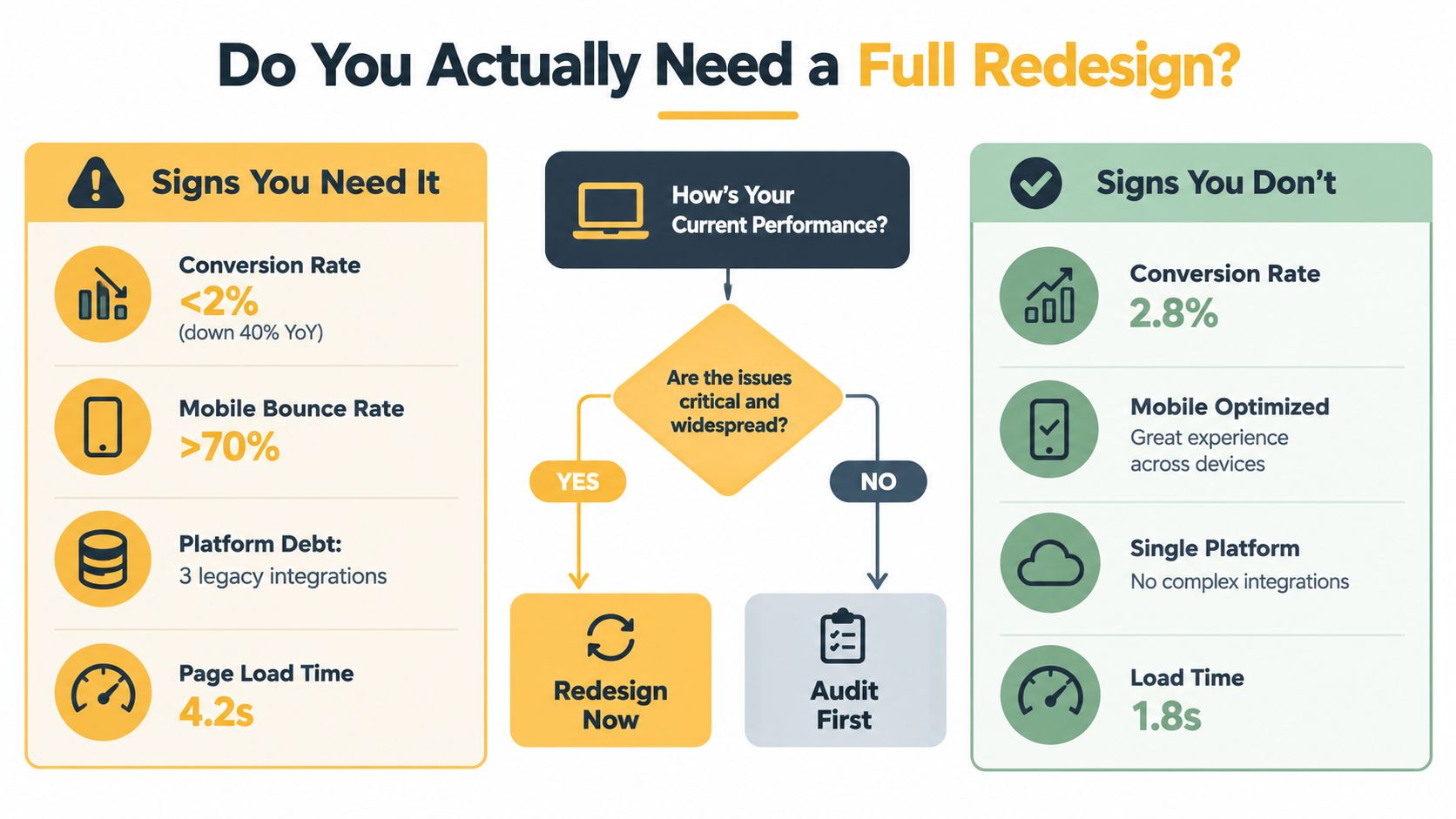
A retailer can spend months rebuilding an ecommerce site and still leave the actual leak untouched. The problem may be a confusing checkout, weak product information, or a restrictive platform rather than the visual design. A sharper interface does not compensate for unclear navigation, missing data, or a migration that loses search visibility.
A full redesign is justified when several structural problems reinforce one another. The platform may block required integrations, the information architecture may hide products, mobile checkout may fail, and the content model may limit growth. If the issue sits in one template, product page, filter system, or payment step, targeted optimization usually delivers value sooner with less migration risk.
Practical rule: Rebuild the foundation only when it prevents you from fixing the highest-value problems.
A founder's afternoon triage
Answer three questions before approving a rebuild:
- Is conversion materially weak? Compare purchase conversion and revenue per visitor with your historical baseline and relevant category context. Published conversion benchmarks place many stores near the low single digits, so a weak result should trigger investigation, not an automatic rebuild.
- Can the platform support the next stage? Score its ability to handle payments, inventory, search, merchandising, analytics, internationalization, and customer accounts. If the platform blocks core commercial requirements, the constraint is larger than a design issue.
- Is the journey broken or inefficient? Broken means customers cannot complete an important task. Inefficient means they can complete it but face unnecessary effort. A broken journey supports a rebuild more strongly than a journey that needs focused improvements.
A full ecommerce website redesign also carries costs that rarely appear in the headline estimate. Include agency or development fees, internal team time, content migration, SEO monitoring, stakeholder reviews, and the opportunity cost of pausing smaller experiments while the new release takes priority. Search visibility can suffer as well. Independent migration research reports that 17% of websites never fully recover lost traffic, while average recovery can take about 523 days. Incomplete redirect mapping is identified as a major failure driver in this website migration guide.
Price the alternative before committing. Replacing a template, simplifying checkout, improving product taxonomy, or running a performance sprint may solve the commercial issue without changing every URL and customer habit. For broader budgeting context, review this guide to ecommerce website development cost, then compare that investment with the value of fixing the specific leak already visible.
Discovery and Baseline Research
Discovery should produce decisions, not a decorative strategy document. A useful ecommerce redesign begins with four audits, completed in sequence, so each one narrows the scope of the next.
Start with the evidence you already collect
An analytics audit should verify tracking before anyone trusts the results. Use GA4, Shopify reports, or your equivalent commerce analytics to segment performance by device, traffic source, landing page, product category, and checkout step. The output isn't merely a dashboard. It's a ranked list of pages and journeys where redesign work could influence revenue.
Next, run a focused UX research sprint. Test the existing checkout and leading category or product pages with real customers or representative users. Pair those sessions with heatmaps, session recordings, support tickets, and a heuristic review covering navigation, product clarity, form usability, error handling, accessibility, and trust signals.
Inventory the content and search structure
A content and product taxonomy inventory often reveals problems that visual reviews miss. Record every product detail page, category, filter, guide, and editorial asset. Flag thin descriptions, duplicate product pages, inconsistent attributes, overlapping categories, and navigation labels customers may not understand.
Finish with an SEO baseline. Capture priority rankings, organic landing pages, indexed URL patterns, backlink targets, internal links, canonical signals, structured data, and Core Web Vitals. The baseline protects strong assets during the build and gives the team a defensible comparison after launch.
| Audit | Data Source | Key Output | Design Decision It Informs |
|---|---|---|---|
| Analytics | GA4, Shopify, payment and checkout data | Funnel leaks segmented by device and source | Which journeys deserve priority |
| UX research | User tests, recordings, heatmaps, support tickets | Usability issues ranked by severity | Which interactions need redesign |
| Content and taxonomy | Product catalogue, CMS, sitemap, search data | Duplicate, thin, or poorly grouped content | Navigation, templates, and merchandising structure |
| SEO baseline | Search Console, crawler, rank tracker, backlink tools | Protected URLs and technical risks | Migration, metadata, linking, and performance requirements |
Keep the baseline simple enough that the team will use it. Purchase conversion rate or revenue per visitor should anchor the commercial view, supported by add-to-cart rate, checkout completion, average order value, organic landing-page performance, and device-level results.
For teams planning external development support, the 2026 nearshore salary data can help frame staffing assumptions before you compare agency, freelance, and internal delivery models. The important point is not the lowest rate. It's matching capability to the platform, integrations, analytics, SEO, and QA risk involved.
UX Priorities That Move Conversion
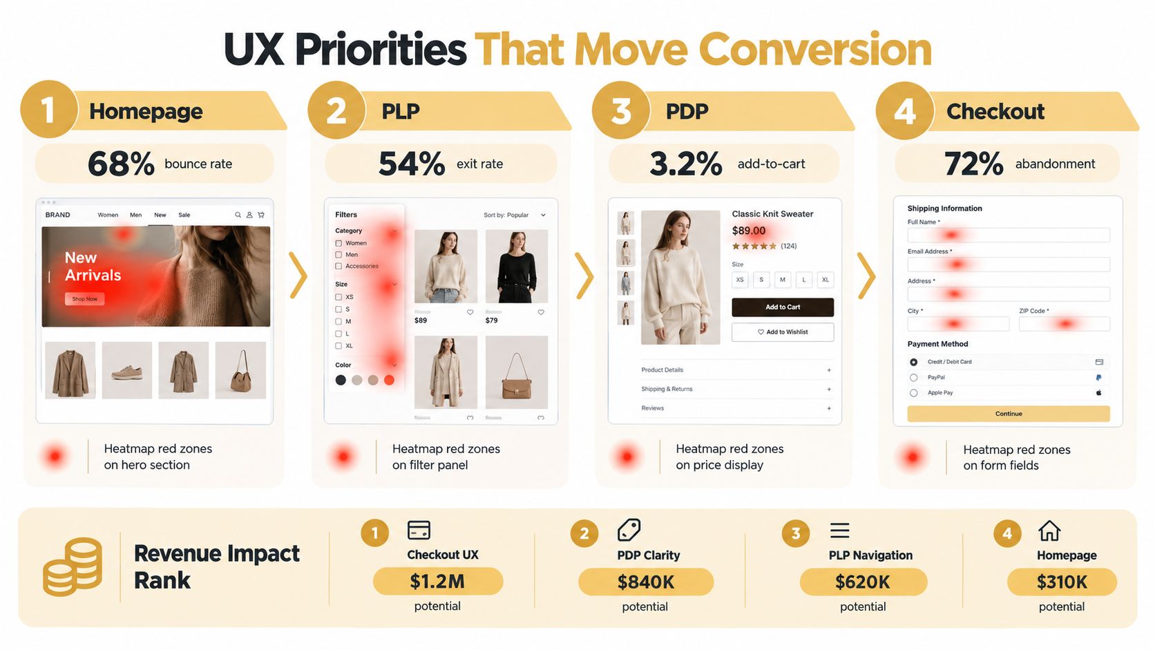
A redesign can lose revenue while looking more polished. If shoppers still struggle to find products, understand fit, or complete payment, new colours and typography have little commercial value. Rank each UX change against a measurable funnel problem, then decide whether the evidence supports a full rebuild or a targeted fix.
A homepage issue should appear in engagement or onward navigation. A category issue should affect product discovery and add-to-cart behaviour. Product detail issues should show up in product-page conversion or add-to-cart activity. Checkout work should connect to abandonment at specific steps.
Fix the journey in commercial order
Homepage and landing pages should answer three questions quickly: what the store sells, who it serves, and where the visitor should go next. A striking hero that delays product discovery is weaker than a clear proposition with relevant category paths.
PLPs and navigation need a sound taxonomy, useful filters, understandable sorting, and stable product cards. Search and filtering deserve close attention because shoppers often arrive with a specific need rather than a wish to browse the full catalogue.
PDPs should reduce purchase uncertainty. Photography, variant selection, sizing or compatibility details, stock status, delivery expectations, returns, reviews, and clear calls to action need to work as one system. Shoppers should not have to search tabs or footer links for information that determines whether a product fits their needs.
Cart and checkout can produce larger gains than a brand-led visual overhaul. Show shipping and returns early, preserve the cart, support guest purchase where appropriate, reduce form effort, present payment choices clearly, and place error messages beside the fields that need correction.
Mobile needs its own workstream, not a final responsive check. Mobile drives roughly 70% to 75% of ecommerce traffic, while mobile conversion often trails desktop by a wide margin, as reported in this ecommerce conversion summary. Design for thumb reach, quick scanning, persistent purchase controls, readable selectors, and payment completion on a small screen.
Prioritise changes in waves instead of making one large, untested bet. Test checkout friction first, then product-page clarity, then category discovery, provided the measurement setup can isolate each change. Use this ecommerce user experience best practices guide for supporting principles, while your own funnel and customer evidence determine the final order.
Migration and SEO Preservation
A redesign becomes an SEO project the moment URLs, templates, internal links, rendering, or content structure change. Treat cutover as a controlled migration, not a celebratory switch.
Build the URL map before development ends
Export the current site's indexable URLs, including product pages, categories, guides, blog posts, image references, and important parameter patterns. Map each old URL to its direct equivalent. Mark pages that will remain, consolidate, redirect, or disappear, and document the business reason for every removal.
Use a direct 301 redirect whenever a URL changes. Avoid redirect chains. An old URL should point straight to the final destination, not through several intermediate locations. Test the map with a crawler before launch and check both high-value pages and long-tail URLs.
Preserve existing SEO assets unless research supports a deliberate rewrite. Carry forward or document changes to:
- Title tags and meta descriptions, especially on pages already attracting organic visits.
- H1 structure and body copy, including product attributes that help searchers choose.
- Canonical tags, schema markup, and indexation controls, with platform-specific testing.
- Internal links, breadcrumbs, faceted navigation, and XML sitemap inclusion.
- Core Web Vitals and rendered content, particularly on mobile product and category pages.
Make staging safe and testable
Use a staging environment that mirrors production as closely as possible. It should use the same CMS behaviour, templates, integrations, server settings, tracking configuration, and checkout logic. At the same time, keep it away from search engines with noindex controls and appropriate robots restrictions, then verify that the controls work as intended.
Run a pre-launch crawl covering broken links, redirect responses, canonicals, hreflang where relevant, structured data, sitemap validity, orphan pages, and accidental indexation. Test search templates and filters because ecommerce platforms often create unexpected URL variants.
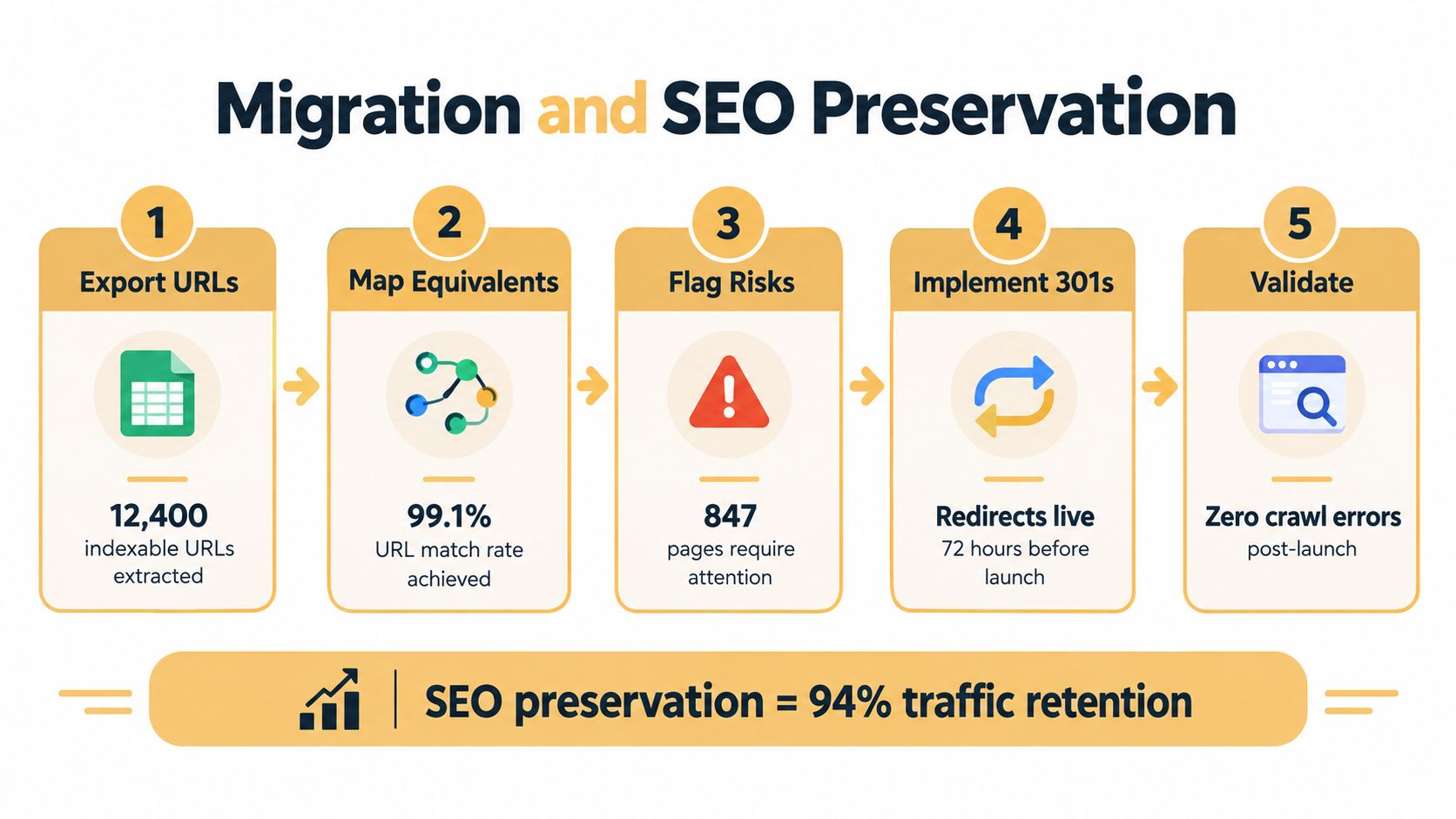
Schedule the release during a period when the team can monitor orders, crawl activity, analytics, and customer support. Keep a rollback plan specific enough for the technical team to execute, including the platform and DNS steps required to restore the previous experience. The technical SEO for ecommerce guide provides a useful reference for the audit work, but your migration workbook should remain the operational source of truth.
QA, Soft Launch, and Cutover
Launch quality depends on coordination between design, development, merchandising, operations, analytics, and SEO. A page can look perfect while payment, inventory, tax, shipping, or attribution fails without notice.
Test the business, not just the interface
Functional QA should cover the complete purchase path. Test product selection, variants, discounts, cart persistence, payment gateways, tax and shipping calculations, account creation, guest checkout, order confirmation, refunds, inventory synchronisation, search, forms, emails, and analytics events.
Review the experience across major browsers and real phone sizes. Check keyboard navigation, focus states, contrast, labels, alternative text, error messaging, and screen-reader compatibility. Accessibility isn't a decorative compliance task. It affects whether customers can understand and complete the journey.
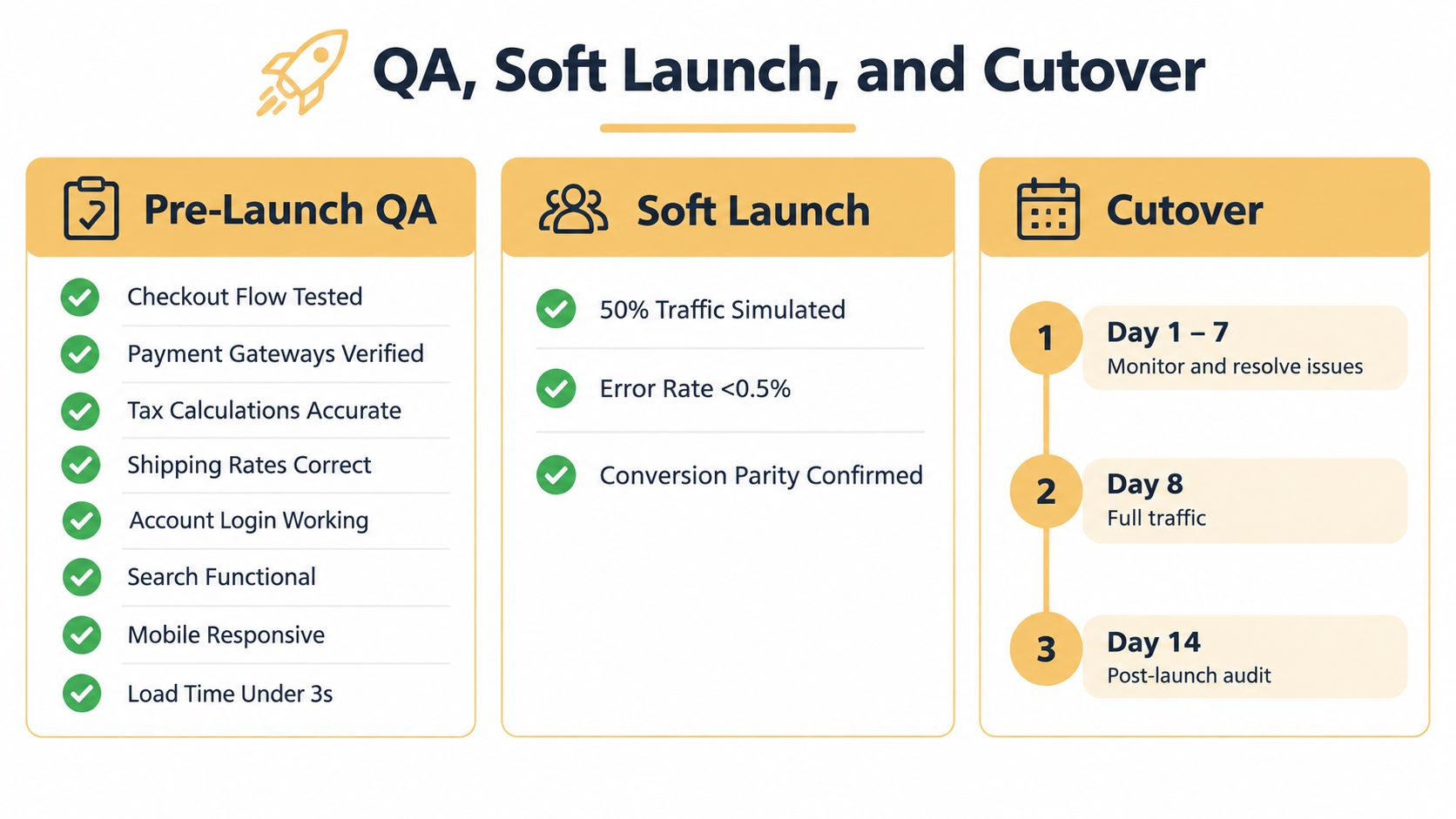
A soft launch exposes issues that scripted QA misses. Send a controlled audience to the new experience, or use a beta environment that reproduces production traffic and transactions. Monitor purchase conversion, revenue per visitor, error rates, page performance, checkout events, customer complaints, indexation, and search visibility for at least the first 48 to 72 hours, following the controlled testing guidance in the ecommerce conversion design methodology.
Agree on rollback criteria before anyone goes live. A material checkout failure, a 20% or greater conversion decline against baseline, or any data-loss incident should trigger an immediate review and, where necessary, restoration of the legacy site. Keep the old infrastructure warm for at least two weeks after cutover so delayed problems don't become emergencies.
Post-Launch Optimization
The new site doesn't prove itself on launch day. It earns confidence by matching or improving the baseline under real traffic, real orders, and real search conditions.
During the first 30 days, watch priority rankings, Google Search Console index coverage, crawl errors, redirects, 404s, page speed, device-level conversion, average order value, bounce rate, and support contacts. Separate technical problems from customer adaptation. A shopper who has used the old navigation for years may need time to recognise the new structure.
Turn assumptions into tests
Once the release is stable, treat the redesign as a testing programme. Each experiment should name the baseline metric, the audience, the change, the expected mechanism, and the decision rule. Test the assumptions that shaped the build:
- Product detail page layout and media order.
- Checkout field sequence and error treatment.
- Navigation labels, category grouping, and filter placement.
- Shipping and returns messaging.
- Recommendation and post-add-to-cart experiences.
Don't change several major variables in one test if you need to know what caused the result. Test uncertain changes one variable at a time where possible, and use a significance threshold of 95% confidence or higher when the testing method and sample support it, as recommended in the conversion design research framework.
Keep a shared experiment log. Record the hypothesis, segment, result, implementation status, and what the team learned. This prevents every new stakeholder from reopening settled questions and helps successful improvements compound instead of disappearing into a redesign handoff.
A Small Retailer Redesign in Practice
Consider a fictional outdoor gear retailer with declining add-to-cart activity and a team preparing to approve a full replatform. The first review showed that the store's product pages loaded slowly, product attributes were inconsistent, and the taxonomy had grown through years of one-off category additions. Customers could find popular products, but comparing similar items was harder than it needed to be.
The analytics audit showed where the commercial damage concentrated. UX sessions exposed uncertainty around sizing, delivery timing, and compatibility. The content inventory found duplicated product information and inconsistent filter values. The SEO baseline showed that several established category and guide pages already brought in valuable search traffic.
A full rebuild would have changed too much at once. The team chose a targeted redesign of product pages and checkout while retaining the existing platform and URL structure. Developers improved media delivery, standardised product attributes, clarified delivery and returns content, simplified variant selection, and reduced checkout friction. SEO staff preserved metadata, canonicals, internal links, and existing page addresses.
The soft launch caught a 12% drop in mobile conversion before full cutover. The cause was a mobile variant selector that obscured the purchase control after an interaction. The team fixed the component, retested the journey, and held the release until mobile performance returned to baseline.
Over the following four months, the test programme produced a 23% lift in revenue per visitor, using the retailer's own baseline and experiments rather than a universal benchmark. Those figures belong to this fictional scenario, not to a general industry claim. The useful lesson is the sequence: discovery identified the leaks, targeted work reduced migration risk, and controlled tests turned the redesign into an operating discipline.
Two thresholds governed the decision. A full redesign became justified only when platform limits prevented the team from addressing the highest-value problems. The redesign stopped being an active project when the critical journeys were stable, the migration signals were healthy, and new tests no longer required foundational changes.
Up North Media works with retailers on ecommerce web development, SEO, analytics, and conversion-focused redesign decisions, from platform assessment through post-launch testing. If your store needs a clear rebuild-versus-optimization recommendation, visit Up North Media to discuss the current journey, technical constraints, and next measurable improvement.